Simple adaptation of large data screen
1 Introduction
Recently, while visiting github, I saw the Geeker-Admin open source framework, which implements the function of a large data screen, so I also want to imitate it, but it is not that simple in practice, because the most important thing for a large data screen is to Solve its adaptation problem first.
2. Common solutions for large data screen adaptation
After reading various schemes on the Internet, there are currently three kinds of schemes used by everyone:
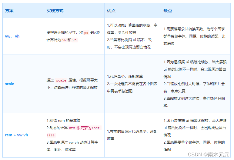
among these three schemes, the simplest way is the scale scheme.
However, its main disadvantage is that when the ratio of the large screen to the ui draft is different, there will be a blank space around it. However, if you want to be simple and the customer can agree to leave blank, you can choose scale.
The Geeker-Admin open source framework uses scale to solve the problem of large data screen adaptation, and then begins to analyze its code.
3. Geeker-Admin solution
How does Geeker-Admin use scale to solve the problem of large screen adaptation?
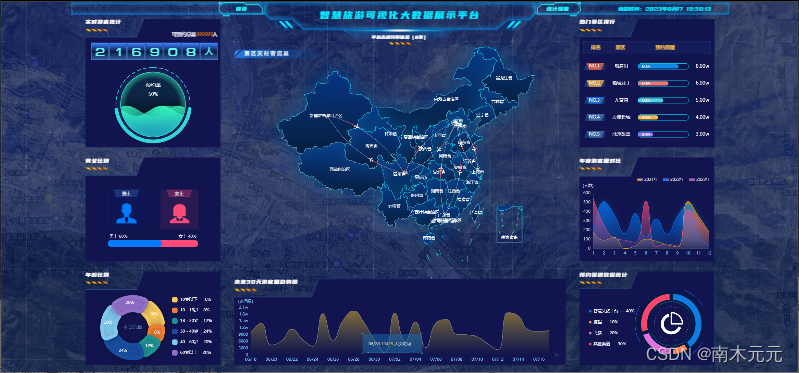
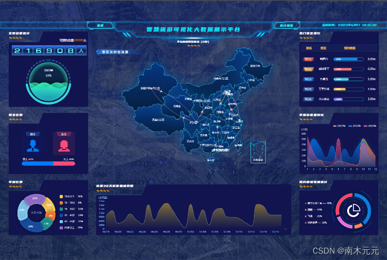
3.1 Achievement effect
Let’s take a look at the implementation effect of the data large screen in Geeker-Admin:
3.2 Code Analysis
After analysis, the key code to solve the adaptation problem is concentrated in the following two parts:
- 1. js part
const dataScreenRef = ref<HTMLElement | null>(null);

onMounted(() => {


  // 初始化时为外层盒子加上缩放属性,防止刷新界面时就已经缩放
  if (dataScreenRef.value) {


    dataScreenRef.value.style.transform = `scale(${

      getScale()}) translate(-50%, -50%)`;
    dataScreenRef.value.style.width = `1920px`;
    dataScreenRef.value.style.height = `1080px`;
  }
  // 初始化 echarts
  initCharts();
  // 为浏览器绑定事件
  window.addEventListener("resize", resize);
});

// 根据浏览器大小推断缩放比例
const getScale = (width = 1920, height = 1080) => {


  let ww = window.innerWidth / width;
  let wh = window.innerHeight / height;
  return ww < wh ? ww : wh;
};

// 监听浏览器 resize 事件
const resize = () => {


  if (dataScreenRef.value) {


    dataScreenRef.value.style.transform = `scale(${

      getScale()}) translate(-50%, -50%)`;
  }
  // 使用了 scale 的echarts其实不需要需要重新计算缩放比例
  Object.values(dataScreen).forEach(chart => {


    chart && chart.resize();
  });
};
- 2. css part
.dataScreen-container {


	  width: 100%;
	  height: 100%;
	  background: url("./images/bg.png") no-repeat;
	  background-repeat: no-repeat;
	  background-attachment: fixed;
	  background-position: center;
	  background-size: 100% 100%;
	  background-size: cover;
	  .screen {


	       position: fixed;
		   top: 50%;
		   left: 50%;
		   z-index: 999;
		   display: flex;
		   flex-direction: column;
		   overflow: hidden;
		   transition: transform 0.3s;
		   transform-origin: left top;
	  }
}
- Realize thinking analysis
First prepare a container dataScreen-container, set width = 100%, height = 100%, and set a background image as the background of the entire large screen display.
The most important part of js is the following code:
// 根据浏览器大小推断缩放比例
const getScale = (width = 1920, height = 1080) => {


  let ww = window.innerWidth / width;
  let wh = window.innerHeight / height;
  return ww < wh ? ww : wh;
};
What this code means is, to calculate the scaling factor based on the browser size:
- Assuming that the size of the current design draft is 1920✖1080, that is, the aspect ratio is 16:9, then the page can be displayed in full screen as long as it is zoomed in and out according to the ratio of 16:9.
- If the width of the current viewport becomes smaller or the height of the viewport becomes larger, that is, when the aspect ratio is less than 16:9, it will be scaled according to the scaling ratio of the width, and there will be blank spaces at the top and bottom of the page.
- If the width of the current viewport becomes larger or the height of the viewport becomes smaller, that is, when the aspect ratio is greater than 16:9, it will be scaled according to the scaling ratio of the height, and there will be blank spaces on the left and right sides of the page.
The most critical part of the css is the following code:
.screen {


     position: fixed;
     top: 50%;
     left: 50%;
     transform-origin: left top;
 }
position: fixed; top: 50%; left: 50%; These lines are easy to understand, that is, to fix the upper left corner of the current large data screen at the middle of the entire screen.
- So what does transform-origin: left top; this code mean?
In CSS3 variants, any element has a central origin. By default, the central origin of the element is located at 50% of the x-axis and y-axis, as shown in the following figure: By default,
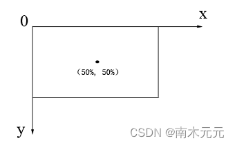
various deformations of CSS3 (translation, scaling, tilting, etc.) are deformed based on the central origin of the element of.
In CSS3, you can use the transform-origin attribute to change the center origin of the element, then transform-origin: left top means to set the zoom center point of the element to the upper left.
The meaning of the above css part code is to fix the upper left corner of the current large data screen at the middle of the entire screen, and then set the zoom center to the upper left corner of the element, then the upper left corner of the large data screen is still in the middle of the screen after zooming. It is convenient for subsequent centering.
During initialization and every time the window size changes, it needs to be scaled according to the calculated scaling ratio. translate(-50%,-50%) will move 50% of its own length and width, so that the current data large screen is centered.
dataScreenRef.value.style.transform = `scale(${

      getScale()}) translate(-50%, -50%)`;
The whole implementation idea can be summarized as follows : through the scale attribute of transform in css, according to the size of the screen, the chart is scaled proportionally as a whole, so as to achieve an adaptive effect.
3.3 Try it yourself
After analyzing the above code, start to try it yourself.
- the code
 <template>
  <div class="container">
    <div class="screen" ref="screen">
    </div>
  </div>
</template>

<script setup lang="ts">
import {

     onMounted, ref } from 'vue'
let screen = ref()
onMounted(() => {


  screen.value.style.transform = `scale(${

      getScale()}) translate(-50%, -50%)`
})
//监听视口变化
window.onresize = () => {


  screen.value.style.transform = `scale(${

      getScale()}) translate(-50%, -50%)`
}
//定义大屏缩放比例,假设当前设计稿是 1920 * 1080(宽高比16:9)
const getScale = (w = 1920, h = 1080) => {


  const ww = window.innerWidth / w //Window.innerWidth获取窗口的视口宽度,宽度缩放比
  const wh = window.innerHeight / h //window.innerHeight获取窗口的视口高度,高度缩放比
  //如果当前视口宽度变小或者视口高度变大,就按照宽度的缩放比例缩放,上下会有留白
  //如果当前视口宽度变大或者视口高度变小,就按照高度的缩放比例缩放,左右会有留白
  return ww < wh ? ww : wh
}
</script>

<style scoped lang="scss">
.container {


  width: 100vw;
  height: 100vh;
  background: url('./images/bg.png') no-repeat;
  background-size: cover;
  //让当前大屏左上角固定在屏幕中间,进行缩放,缩放完成再平移回去
  .screen {


    position: fixed;
    width: 1920px;
    height: 1080px;
    left: 50%;
    top: 50%;
    //改变元素的中心原点为左上,默认在元素中心
    transform-origin: top left;
    background-color: red;
  }
}
</style>
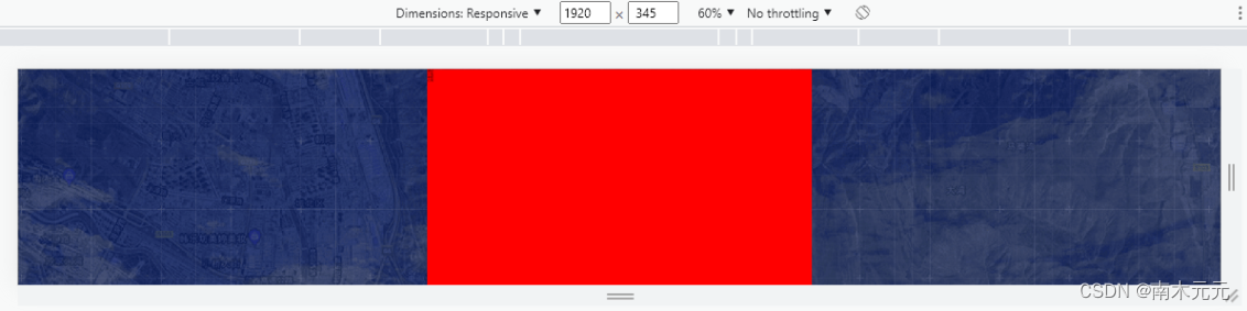
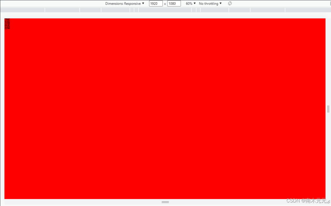
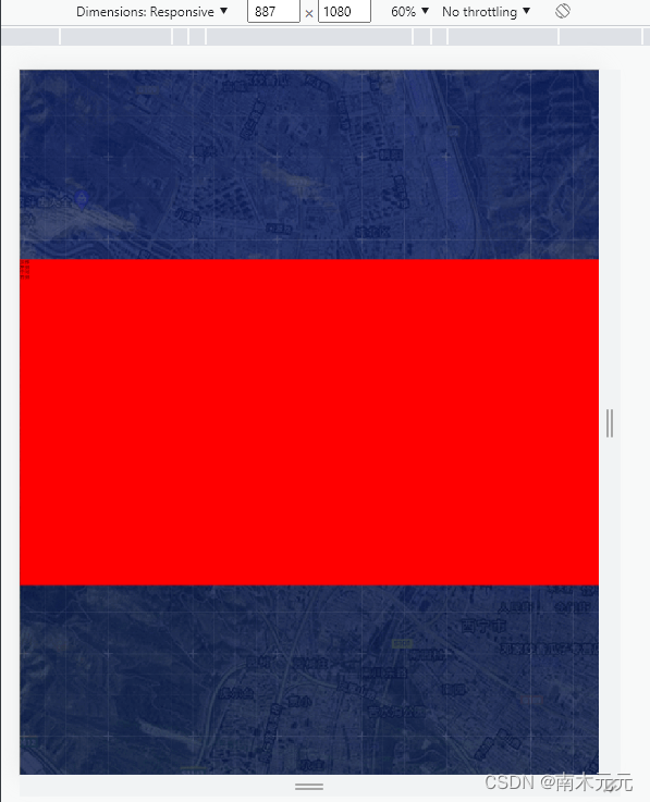
- Effect
The red part is equivalent to the content part of the big data screen. When the screen aspect ratio is exactly 16:9, the page can be displayed in full screen.
When the screen aspect ratio is less than 16:9, the top and bottom of the page are left blank.
When the aspect ratio of the screen is greater than 16:9, the left and right sides of the page are left blank.