1. Echarts version
"echarts": "^5.3.3",
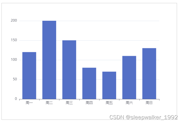
2. The simplest Cartesian coordinate system, take the histogram as an example.
A common Cartesian coordinate system, set type: 'category' on the x-axis, which is a category axis, and is suitable for discrete category data; set type: 'value' on the y-axis, which is a value axis, and is suitable for continuous data.
<template>
  <div ref="barChart" class="chart-content">暂无数据</div>
</template>
<script>
import * as echarts from 'echarts';
export default {
  name: 'bar',
  data() {
    return {};
  },
  mounted() {
    this.draw();
  },
  methods: {
    draw() {
      this.chart = echarts.init(this.$refs.barChart);
      var option = {
        xAxis: {
          type: 'category',
          data: ['周一', '周二', '周三', '周四', '周五', '周六', '周日'],
        },
        yAxis: {
          type: 'value'
        },
        series: [
          {
            data: [120, 200, 150, 80, 70, 110, 130],
            type: 'bar'
          }
        ]
      };
      this.chart.setOption(option);
    },
  },
};
</script>
<style scoped>
.chart-content {
  width: 600px;
  height: 400px;
  box-sizing: border-box;
  border: 1px solid #ccc;
}
</style>
Rendering result:
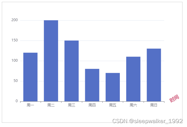
3. Coordinate axis name related settings
          name: '时间', // 坐标轴名称
          nameLocation: 'end', // 坐标轴名称显示位置,可取值'start'、'middle' 或 'center'、'end'
          // 坐标轴名称文字样式设置
          nameTextStyle: {
            color: '#d46c89',
            fontWeight: 'bold',
            fontSize: '16px',
          },
          nameGap: 20, // 坐标轴名称与轴线之间的距离,默认值15
          nameRotate: 30, // 坐标轴名称旋转,角度值
Only set the x axis, rendering effect:
4. Coordinate axis related settings
          // 坐标轴轴线相关设置
          axisLine: {
            show: true, // 是否显示坐标轴轴线
            symbol: ['none', 'arrow'], // 轴线两边的箭头,none表示没有箭头,arrow表示有箭头,可取值为字符串或长度为2的数组:默认不显示箭头 'none'。两端都显示箭头 'arrow',只在末端显示箭头 ['none', 'arrow']
            symbolSize: [15, 20], // 轴线两边的箭头的大小,第一个数字表示宽度(垂直坐标轴方向),第二个数字表示高度(平行坐标轴方向),默认值[10, 15]。
            symbolOffset: 20, // 轴线两边的箭头的偏移,如果是数组,第一个数字表示起始箭头的偏移,第二个数字表示末端箭头的偏移;如果是数字,表示这两个箭头使用同样的偏移。
            // 坐标轴轴线样式设置
            lineStyle: {
              color: '#21a6e6',
              width: 2,
              type: 'dashed',
            }
          },
The x-axis and y-axis are all set, and the rendering effect is:

5. Coordinate axis scale related settings
          // 坐标轴刻度相关设置
          axisTick: {
            show: true, // 是否显示坐标轴刻度。
            interval: 0, // 坐标轴刻度的显示间隔,在类目轴中有效。不设置时默认同 axisLabel.interval 一样。设置成 0 强制显示所有标签。如果设置为 1,表示『隔一个标签显示一个标签』,如果值为 2,表示隔两个标签显示一个标签,以此类推。
            inside: true, // 默认值false。true 表示坐标轴刻度朝内,false 表示坐标轴刻度朝外
            // 坐标轴刻度样式设置
            lineStyle: {
              color: '#d96c67',
              width: 6,
            }
          },
Only set the X axis, rendering effect:

6. Coordinate axis scale label related settings
          axisLabel: {
            show: true, // 是否显示坐标轴刻度标签。
            interval: 0, // 坐标轴刻度标签的显示间隔,在类目轴中有效。设置成 0 强制显示所有标签,如果设置为 1,表示『隔一个标签显示一个标签』,如果值为 2,表示隔两个标签显示一个标签,以此类推
            inside: false, // 默认值false。true 表示坐标轴刻度标签朝内,false 表示坐标轴刻度标签朝外
            rotate: 30, // 刻度标签旋转的角度,旋转的角度从 -90 度到 90 度
            margin: 20, // 刻度标签与轴线之间的距离
            color: '#d46c89', // 刻度标签文字的颜色。不设置就默认取 axisLine.lineStyle.color,即与轴线颜色一样
          },
Only set the x axis, rendering effect:

7. Set the text style of a category label
          type: 'category',
          data: [{ // 类目数据,在类目轴(type: 'category')中有效
            value: '周一',
            // 突出周一
            textStyle: {
              fontSize: 20,
              color: 'red'
            }
          }, '周二', '周三', '周四', '周五', '周六', '周日'],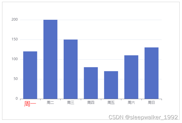
8. Coordinate axis indicator related settings
linear indicator
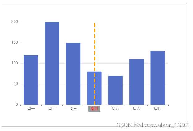
          axisPointer: {
            show: true, // 默认不显示。但是如果 tooltip.trigger 设置为 'axis' 或者 tooltip.axisPointer.type 设置为 'cross',则自动显示 axisPointer。坐标系会自动选择显示哪个轴的 axisPointer,也可以使用 tooltip.axisPointer.axis 改变这种选择
            type: 'line', // 'line' 直线指示器,'shadow' 阴影指示器,'none' 无指示器
            // 坐标轴指示器的文本标签设置
            label: {
              show: true, // 是否显示文本标签。如果 tooltip.axisPointer.type 设置为 'cross' 则默认显示标签,否则默认不显示
              color: 'red',
              backgroundColor: '#999',
            },
            // type: 'line'时坐标轴指示器线的设置
            lineStyle: {
              color: 'orange', // 线的颜色
              width: 3, // 线的宽度
            },
          }
Only set the X axis, hover the mouse to render the effect:
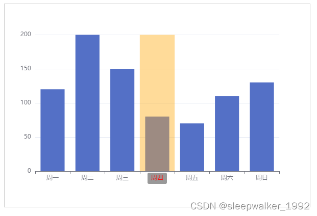
shadow indicator
          axisPointer: {
            show: true, // 默认不显示。但是如果 tooltip.trigger 设置为 'axis' 或者 tooltip.axisPointer.type 设置为 'cross',则自动显示 axisPointer。坐标系会自动选择显示哪个轴的 axisPointer,也可以使用 tooltip.axisPointer.axis 改变这种选择
            type: 'shadow', // 'line' 直线指示器,'shadow' 阴影指示器,'none' 无指示器
            // 坐标轴指示器的文本标签设置
            label: {
              show: true, // 是否显示文本标签。如果 tooltip.axisPointer.type 设置为 'cross' 则默认显示标签,否则默认不显示
              color: 'red',
              backgroundColor: '#999',
            },
            // type: 'shadow'时坐标轴指示器填充区域的设置
            shadowStyle: {
              color: 'orange', // 填充的颜色
              opacity: 0.4,
            },
          }
Only set the X axis, hover the mouse to render the effect:
9. Realize axis scale line and label alignment
          boundaryGap: true, // 类目轴中boundaryGap可取值,true或false,默认true。
          axisTick: {
            alignWithLabel: true, // 类目轴中在 boundaryGap 为 true 的时候有效,可以保证刻度线和标签对齐。
          },
Only set the X axis, rendering effect:

10. Set the minimum scale value, maximum scale value, and division interval of the coordinate axis
          min: 50, // 坐标轴刻度最小值
          max: 250, // 坐标轴刻度最大值
          interval: 40, // 强制设置坐标轴分割间隔
Only set the y axis, rendering effect:

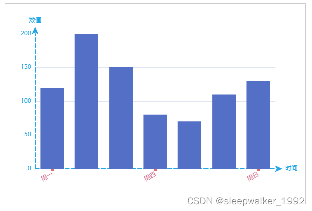
11. Complete example
      var option = {
        xAxis: {
          type: 'category',
          data: ['周一', '周二', '周三', '周四', '周五', '周六', '周日'],
          name: '时间',
          nameGap: 20,
          axisLine: {
            symbol: ['none', 'arrow'],
            symbolOffset: 14,
            lineStyle: {
              color: '#21a6e6',
              width: 2,
              type: 'dashed',
            }
          },
          axisTick: {
            alignWithLabel: true,
            lineStyle: {
              color: '#d96c67',
              width: 6,
            }
          },
          axisLabel: {
            interval: 2,
            rotate: 30,
            margin: 10,
            color: '#d46c89',
          },
        },
        yAxis: {
          type: 'value',
          name: '数值',
          nameGap: 20,
          axisLine: {
            show: true,
            symbol: ['none', 'arrow'],
            symbolOffset: 14,
            lineStyle: {
              color: '#21a6e6',
              width: 2,
              type: 'dashed',
            }
          },
        },
        series: [
          {
            data: [120, 200, 150, 80, 70, 110, 130],
            type: 'bar'
          },
        ]
      };
Rendering effect: