This tutorial is better eaten with the official example ! ! !
Table of contents
Start with an existing project
foreword

ColorUI is a css library! ! ! After you introduce the style, you can call the component according to the class
Get started quickly
Developed with UniApp
start
Download the source code and unzip it to get /Colorui-UniAppthe folder, copy the folder in the directory /colorui to your project root directory
App.vue Import key CSS main.css icon.css
<style>
@import "colorui/main.css";
@import "colorui/icon.css";
@import "app.css"; /* 你的项目css */
....
</style>
Use a custom navbar
As a common component, the navigation bar is simply encapsulated. Of course, you can also directly copy the code structure and modify it yourself to achieve personalized purposes.
App.vue get system information
onLaunch: function() {
	uni.getSystemInfo({
		success: function(e) {
			// #ifndef MP
			Vue.prototype.StatusBar = e.statusBarHeight;
			if (e.platform == 'android') {
				Vue.prototype.CustomBar = e.statusBarHeight + 50;
			} else {
				Vue.prototype.CustomBar = e.statusBarHeight + 45;
			};
			// #endif
			// #ifdef MP-WEIXIN
			Vue.prototype.StatusBar = e.statusBarHeight;
			let custom = wx.getMenuButtonBoundingClientRect();
			Vue.prototype.Custom = custom;
			Vue.prototype.CustomBar = custom.bottom + custom.top - e.statusBarHeight;
			// #endif
			// #ifdef MP-ALIPAY
			Vue.prototype.StatusBar = e.statusBarHeight;
			Vue.prototype.CustomBar = e.statusBarHeight + e.titleBarHeight;
			// #endif
		}
	})
},
pages.json Configure to cancel the system navigation bar
"globalStyle": {
	"navigationStyle": "custom"
},
The copied code structure can be used directly, pay attention to the acquisition of global variables.
Using encapsulation, when main.js introducing cu-custom components.
import cuCustom from './colorui/components/cu-custom.vue'
Vue.component('cu-custom',cuCustom)
page.vue The page can be called directly
<cu-custom bgColor="bg-gradual-blue" :isBack="true">
	<block slot="backText">返回</block>
	<block slot="content">导航栏</block>
</cu-custom>
| parameter | effect | type | Defaults |
|---|---|---|---|
| bgColor | Background color class name | String | '' |
| isBack | Whether to open return | Boolean | false |
| bgImage | background image path | String | '' |
| slot block | effect |
|---|---|
| backText | text on return |
| content | middle area |
| right | The right area (the available range of the applet terminal is very narrow!) |
Use native applet development
Start with an existing project
Download the source code and extract it /demo, copy the folder in the directory /colorui to your project root directory
App.wxss Import key CSS main.wxss icon.wxss
@import "colorui/main.wxss";
@import "colorui/icon.wxss";
@import "app.css"; /* 你的项目css */
....
Start with a new project
Download the source code and unzip it /template, copy /templateand rename it to your project, import it into the applet development tool and start your new project
Use a custom navbar
As a common component, the navigation bar is simply encapsulated. Of course, you can also directly copy the code structure and modify it yourself to achieve personalized purposes.
App.js get system information
 onLaunch: function() {
    wx.getSystemInfo({
      success: e => {
        this.globalData.StatusBar = e.statusBarHeight;
        let custom = wx.getMenuButtonBoundingClientRect();
        this.globalData.Custom = custom;
        this.globalData.CustomBar = custom.bottom + custom.top - e.statusBarHeight;
      }
    })
},
App.json Configure to cancel the system navigation bar and introduce components globally
"window": {
	"navigationStyle": "custom"
},
"usingComponents": {
    "cu-custom":"/colorui/components/cu-custom"
}
page.wxml The page can be called directly
<cu-custom bgColor="bg-gradual-pink" isBack="{

   {true}}">
	<view slot="backText">返回</view>
	<view slot="content">导航栏</view>
</cu-custom>
| parameter | effect | type | Defaults |
|---|---|---|---|
| bgColor | Background color class name | String | '' |
| isBack | Whether to open return | Boolean | false |
| isCustom | Whether to open the left capsule | Boolean | false |
| bgImage | background image path | String | '' |
| slot block | effect |
|---|---|
| backText | text on return |
| content | middle area |
| right | The right area (the available range of the applet terminal is very narrow!) |
components
basic element
layout layout
Flex layout
Parent add class name flex
- fixed size
Set the column size by adding the class name basic-{ {options}} , options can take five values, namely xs , sm , df , lg , xl

<view class="padding bg-white">
	<view class="flex flex-wrap">
		<view class="basis-xs bg-grey margin-xs padding-sm radius">xs(20%)</view>
		<view class="basis-df"></view>
		<view class="basis-sm bg-grey margin-xs padding-sm radius">sm(40%)</view>
		<view class="basis-df"></view>
		<view class="basis-df bg-grey margin-xs padding-sm radius">df(50%)</view>
		<view class="basis-lg bg-grey margin-xs padding-sm radius">lg(60%)</view>
		<view class="basis-xl bg-grey margin-xs padding-sm radius">xl(80%)</view>
	</view>
</view>
- proportional layout
Set the size of the column by adding the class name flex-{ {options}} , options can take values sub , twice , treble , respectively represent the proportion of 1, 2, 3
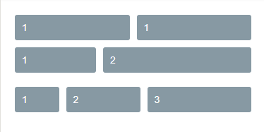
<view class="padding bg-white">
	<view class="flex">
		<view class="flex-sub bg-grey padding-sm margin-xs radius">1</view>
		<view class="flex-sub bg-grey padding-sm margin-xs radius">1</view>
	</view>
	<view class="flex">
		<view class="flex-sub bg-grey padding-sm margin-xs radius">1</view>
		<view class="flex-twice bg-grey padding-sm margin-xs radius">2</view>
	</view>
	<view class="flex">
		<view class="flex-sub bg-grey padding-sm margin-xs radius">1</view>
		<view class="flex-twice bg-grey padding-sm margin-xs radius">2</view>
		<view class="flex-treble bg-grey padding-sm margin-xs radius">3</view>
	</view>
</view>
- horizontal alignment (justify)
Set the horizontal alignment of the box by adding the class name justify-{ {options}} , options can take values start , end , center , between , around , the effect can refer to the container property justify-content in the flex layout layout ( Flex layout tutorial )

<view class="bg-white">
	<view class="flex solid-bottom padding justify-start">
		<view class="bg-grey padding-sm margin-xs radius">start</view>
		<view class="bg-grey padding-sm margin-xs radius">start</view>
	</view>
	<view class="flex solid-bottom padding justify-end">
		<view class="bg-grey padding-sm margin-xs radius">end</view>
		<view class="bg-grey padding-sm margin-xs radius">end</view>
	</view>
	<view class="flex solid-bottom padding justify-center">
		<view class="bg-grey padding-sm margin-xs radius">center</view>
		<view class="bg-grey padding-sm margin-xs radius">center</view>
	</view>
	<view class="flex solid-bottom padding justify-between">
		<view class="bg-grey padding-sm margin-xs radius">between</view>
		<view class="bg-grey padding-sm margin-xs radius">between</view>
	</view>
	<view class="flex solid-bottom padding justify-around">
		<view class="bg-grey padding-sm margin-xs radius">around</view>
		<view class="bg-grey padding-sm margin-xs radius">around</view>
	</view>
</view>
- vertical alignment (align)
Set the vertical alignment of the box by adding the class name align-{ {options}} , options can take values start , end , center , and the effect can refer to the container attribute align-item in the flex layout layout ( Flex layout tutorial )

<view class="bg-white">
	<view class="flex solid-bottom padding align-start">
		<view class="bg-grey padding-lg margin-xs radius">ColorUi</view>
		<view class="bg-grey padding-sm margin-xs radius">start</view>
	</view>
	<view class="flex solid-bottom padding align-end">
		<view class="bg-grey padding-lg margin-xs radius">ColorUi</view>
		<view class="bg-grey padding-sm margin-xs radius">end</view>
	</view>
	<view class="flex solid-bottom padding align-center">
		<view class="bg-grey padding-lg margin-xs radius">ColorUi</view>
		<view class="bg-grey padding-sm margin-xs radius">center</view>
	</view>
</view>
Grid layout
Add the class name grid to the parent
- equal column
Grid layout can be realized by adding class name col-{ {options}} , options can take values 1 , 2 , 3 , 4 , 5

<view class="bg-white padding">
	<view class="grid margin-bottom text-center" v-for="(item,index) in 5" :key="index" :class="'col-' + (index+1)">
		<view class="padding" :class="indexs%2==0?'bg-cyan':'bg-blue'" v-for="(item,indexs) in (index+1)" :key="indexs">{

   {index+1}}</view>
	</view>
</view>- Contour
Set the height of the box content by adding the class name grid-square , add col-{ {options}} to set the number of columns, options can take values 1 , 2 , 3 , 4 , 5 , and divide the box into equal parts
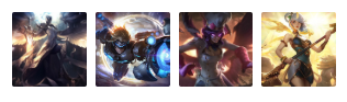
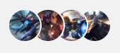
<view class="bg-white padding">
	<view class="grid col-4 grid-square">
		<view class="bg-img" v-for="(item,index) in avatar" :key="index" :style="[{ backgroundImage:'url(' + avatar[index] + ')' }]"></view>
	</view>
</view>

----------------------------------------------------------------------------------------

data() {
	return {
		avatar: ['https://ossweb-img.qq.com/images/lol/web201310/skin/big10001.jpg',
			'https://ossweb-img.qq.com/images/lol/web201310/skin/big81005.jpg',
			'https://ossweb-img.qq.com/images/lol/web201310/skin/big25002.jpg',
			'https://ossweb-img.qq.com/images/lol/web201310/skin/big99008.jpg'
		],
	}
},
Layout related classes
| class | illustrate | optional value |
|---|---|---|
| flex | Required value for flex layout | —— |
| basic-{ {options}} | set column size | xs/sm/df/lg/xl |
| flex-{ {options}} | Set column size proportionally | sub/twice/treble |
| justify-{ {options}} | horizontal alignment | start/end/center/between/around |
| align-{ {options}} | vertical alignment | start/end/center |
| grid | Required value for grid layout | —— |
| col-{ {options}} | grid layout | 1/2/3/4/5 |
| grid-square | Contour | —— |
| fl | left floating | —— |
| fr | floating right | —— |
| margin-{ {options}} | Margin | xs/sm/df/lg/xl |
| padding-{ {options}} | Padding | xs/sm/df/lg/xl |
| margin-lr-{ {options}} | horizontal margin | xs/sm/df/lg/xl |
| padding-lr-{ {options}} | horizontal padding | xs/sm/df/lg/xl |
| margin-tb-{ {options}} | vertical margin | xs/sm/df/lg/xl |
| padding-tb-{ {options}} | vertical padding | xs/sm/df/lg/xl |
| margin-top-{ {options}} | top margin | xs/sm/df/lg/xl |
| padding-top-{ {options}} | top padding | xs/sm/df/lg/xl |
| margin-right-{ {options}} | right margin | xs/sm/df/lg/xl |
| padding-right-{ {options}} | 右内边距 | xs/sm/df/lg/xl |
| margin-bottom-{ {options}} | 下外边距 | xs/sm/df/lg/xl |
| padding-bottom-{ {options}} | 下内边距 | xs/sm/df/lg/xl |
| margin-left-{ {options}} | 左外边距 | xs/sm/df/lg/xl |
| padding-left-{ {options}} | 左内边距 | xs/sm/df/lg/xl |
注:lr,left-right;tb,top-bottom;
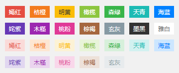
Background背景
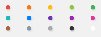
颜色背景
- 深色
通过添加class名bg-{ {options}}设置背景

<view class="grid col-3 padding-sm">
	<view class="padding-sm" v-for="(item,index) in ColorList" :key="index">
		<view class="padding radius text-center shadow-blur" :class="'bg-' + item.name">
			<view class="text-lg">{

   {item.title}}</view>
			<view class="margin-top-sm text-Abc">{

   {item.name}}</view>
		</view>
	</view>
</view>
- 浅色
通过添加class名bg-{ {options}}设置背景颜色,添加class名light表示相应的浅色

<view class="grid col-3 bg-white padding-sm">
	<view class="padding-sm" v-for="(item,index) in ColorList" :key="index" v-if="index<12">
		<view class="padding radius text-center light" :class="'bg-' + item.name">
			<view class="text-lg">{

   {item.title}}</view>
			<view class="margin-top-sm text-Abc">{

   {item.name}}</view>
		</view>
	</view>
</view>
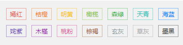
- 渐变
通过添加class名bg-gradual-{ {options}}设置渐变背景颜色

<view class="grid col-2 padding-sm">
	<view class="padding-sm">
		<view class="bg-gradual-red padding radius text-center shadow-blur">
			<view class="text-lg">魅红</view>
			<view class="margin-top-sm text-Abc">#f43f3b - #ec008c</view>
		</view>
	</view>
	<view class="padding-sm">
		<view class="bg-gradual-orange padding radius text-center shadow-blur">
			<view class="text-lg">鎏金</view>
			<view class="margin-top-sm text-Abc">#ff9700 - #ed1c24</view>
		</view>
	</view>
	<view class="padding-sm">
		<view class="bg-gradual-green padding radius text-center shadow-blur">
			<view class="text-lg">翠柳</view>
			<view class="margin-top-sm text-Abc">#39b54a - #8dc63f</view>
		</view>
	</view>
	<view class="padding-sm">
		<view class="bg-gradual-blue padding radius text-center shadow-blur">
			<view class="text-lg">靛青</view>
			<view class="margin-top-sm text-Abc">#0081ff - #1cbbb4</view>
		</view>
	</view>
	<view class="padding-sm">
		<view class="bg-gradual-purple padding radius text-center shadow-blur">
			<view class="text-lg">惑紫</view>
			<view class="margin-top-sm text-Abc">#9000ff - #5e00ff</view>
		</view>
	</view>
	<view class="padding-sm">
		<view class="bg-gradual-pink padding radius text-center shadow-blur">
			<view class="text-lg">霞彩</view>
			<view class="margin-top-sm text-Abc">#ec008c - #6739b6</view>
		</view>
	</view>
</view>
图片背景
- 透明背景(文字层)
通过bg-img设置图片背景,bg-mask设置透明遮罩层
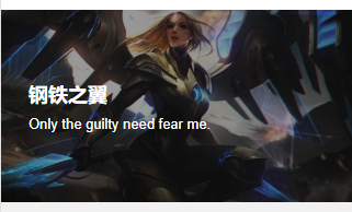
<view class="bg-img bg-mask flex align-center" style="background-image: url('https://ossweb-img.qq.com/images/lol/web201310/skin/big10006.jpg');height: 414upx;">
	<view class="padding-xl text-white">
		<view class="padding-xs text-xxl text-bold">
			钢铁之翼
		</view>
		<view class="padding-xs text-lg">
			Only the guilty need fear me.
		</view>
	</view>
</view>
通过bg-shadeTop设置遮罩层上阴影,bg-shadeBottom设置遮罩层下阴影
<view class="grid col-2">
	<view class="bg-img padding-bottom-xl" style="background-image: url('https://ossweb-img.qq.com/images/lol/web201310/skin/big10007.jpg');height: 207upx;">
		<view class="bg-shadeTop padding padding-bottom-xl">
			上面开始
		</view>
	</view>
	<view class="bg-img padding-top-xl flex align-end" style="background-image: url('https://ossweb-img.qq.com/images/lol/web201310/skin/big10001.jpg');height: 207upx;">
		<view class="bg-shadeBottom padding padding-top-xl flex-sub">
			下面开始
		</view>
	</view>
</view>
背景相关class
| class | 说明 | 可选值 |
|---|---|---|
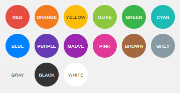
| bg-{ {options}} | 设置背景色 | red/orange/yellow/olive/green/cyan/blue/purple/mauve/pink/ brown/grey/gray/black/white |
| light | 浅色背景,配合bg-{ {options}}使用,取值前12个 | —— |
| bg-gradual-{ {options}} | 渐变色背景 | red/orange/green/blue/purple/pink |
| bg-img | 图片背景 | —— |
| bg-mask | 遮罩层 | —— |
| bg-shadeTop | 遮罩层上阴影 | —— |
| bg-shadeBottom | 遮罩层下阴影 | —— |
| shadow-blur | 外阴影 | —— |
Text文字
文字大小
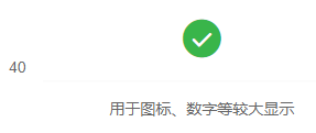
通过添加class名text-{ {size}}设置文字大小,size取值xs、sm、df、lg、xl、xxl、sl、xsl
文字颜色
通过添加class名text-{ {color}}设置文字颜色,color取值red、orange、yellow、olive、green、cyan、blue、purple、mauve、brown、grey、gray、black、white
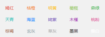
<view class="grid col-5 padding-sm">
	<view class="padding-sm" v-for="(item,index) in ColorList" :key="index">
		<view class="text-center" :class="'text-' + item.name">
			{

   {item.title}}
		</view>
	</view>
</view>
文字阴影
通过添加class名text-shadow设置文字阴影
<view class="grid col-5 padding-sm">
	<view class="padding-sm" v-for="(item,index) in ColorList" :key="index">
		<view class="text-center text-shadow" :class="'text-' + item.name">
			<view class="cuIcon-ellipse text-xxl"></view>
		</view>
	</view>
</view>
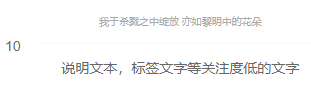
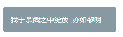
文字截断
通过添加class名text-cut设置文字长度溢出显示省略号
<view class="padding bg-white">
	<view class="text-cut padding bg-grey radius" style="width:220px">我于杀戮之中绽放 ,亦如黎明中的花朵</view>
</view>
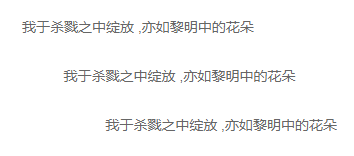
文字对齐
通过添加class名text-{ {position}}设置文字长度溢出显示省略号,position取值left、center、right
<view class="padding bg-white">
	<view class="text-left padding">我于杀戮之中绽放 ,亦如黎明中的花朵</view>
	<view class="text-center padding">我于杀戮之中绽放 ,亦如黎明中的花朵</view>
	<view class="text-right padding">我于杀戮之中绽放 ,亦如黎明中的花朵</view>
</view>
特殊文字
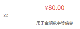
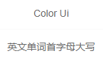
通过添加class名text-price表示价格,会显示¥符号,text-Abc设置英文首字母大写,text-ABC设置英文大写,text-abc设置英文小写
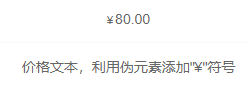
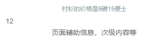
<view class="padding text-center">
<view class="padding-lr bg-white">
<view class="solid-bottom padding">
<text class="text-price">80.00</text>
</view>
<view class="padding">价格文本,利用伪元素添加"¥"符号</view>
</view>
<view class="padding-lr bg-white margin-top">
<view class="solid-bottom padding">
<text class="text-Abc">color Ui</text>
</view>
<view class="padding">英文单词首字母大写</view>
</view>
<view class="padding-lr bg-white margin-top">
<view class="solid-bottom padding">
<text class="text-ABC">color Ui</text>
</view>
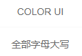
<view class="padding">全部字母大写</view>
</view>
<view class="padding-lr bg-white margin-top">
<view class="solid-bottom padding">
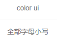
<text class="text-abc">color Ui</text>
</view>
<view class="padding">全部字母小写</view>
</view>
</view>
文字相关class
| class | 说明 | 可选值 |
|---|---|---|
| text-{ {size}} | 文字大小 | xs(20upx)/sm(24upx)/df(28upx)/lg(32upx)/xl(36upx)/xxl(44upx)/sl(80upx)/xsl(120upx) |
| text-{ {color}} | 文字颜色 | red/orange/yellow/olive/green/cyan/blue/purple/mauve/brown/grey/gray/black/white |
| text-shadow | 文字阴影 | —— |
| text-cut | 文字截断 | —— |
| text-bold | 文字加粗 | —— |
| text-{ {position}} | 文字对齐 | left/center/right |
| text-price | 带¥符号 | —— |
| text-Abc | 首字母大写 | —— |
| text-ABC | 全部大写 | —— |
| text-abc | 全部小写 | —— |
Icon图标
通过添加class名cuIcon-{ {iconName}},直接设置图标


Button按钮
按钮必选class cu-btn
按钮形状
通过添加class名设置按钮不同形状,默认只需要添加cu-btn,round为圆角,cuIcon为圆形用来包裹图标
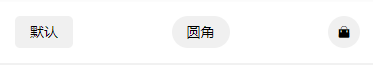
<view class="padding flex flex-wrap justify-between align-center bg-white">
	<button class="cu-btn">默认</button>
	<button class="cu-btn round">圆角</button>
	<button class="cu-btn cuIcon">
		<text class="cuIcon-goodsfill"></text>
	</button>
</view>
按钮尺寸
sm小尺寸,lg大尺寸
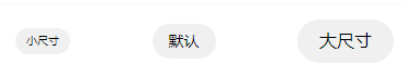
<view class="padding flex flex-wrap justify-between align-center bg-white">
	<button class="cu-btn round sm">小尺寸</button>
	<button class="cu-btn round">默认</button>
	<button class="cu-btn round lg">大尺寸</button>
</view>
按钮颜色
添加背景class名就可以,用法参考背景组件的介绍
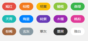
<view class="grid col-5 padding-sm">
	<view class="margin-tb-sm text-center" v-for="(item,index) in ColorList" :key="index">
		<button class="cu-btn round" :class="'bg-' + item.name ">{

   {item.title}}</button>
	</view>
</view>
幽灵按钮
通过line-{ {color}}或者lines-{ {color}}设置镂空的幽灵按钮
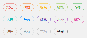
<view class="grid col-5 padding-sm">
	<view class="margin-tb-sm text-center" v-for="(item,index) in ColorList" :key="index" v-if="item.name!='white'">
		<button class="cu-btn round" :class="'line-' + item.name">{

   {item.title}}</button>
	</view>
</view>
禁用按钮
添加disabled禁用按钮
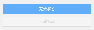
<view class="padding">
	<button class="cu-btn block bg-blue margin-tb-sm lg" disabled type="">无效状态</button>
	<button class="cu-btn block line-blue margin-tb-sm lg" disabled>无效状态</button>
</view>
自定义图标按钮
可以直接在button标签class内添加图标名,或者在text等其他标签内添加class,其他标签要包裹在button标签内
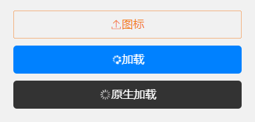
<view class="padding-xl">
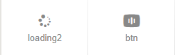
<button class="cu-btn block line-orange lg cuIcon-upload"><text class="cuIcon-upload"></text> 图标</button>
<button class="cu-btn block bg-blue margin-tb-sm lg"><text class="cuIcon-loading2 cuIconfont-spin"></text> 加载</button>
<button class="cu-btn block bg-black margin-tb-sm lg" loading> 原生加载</button>
</view>
按钮相关class
| class | 说明 | 可选值 |
|---|---|---|
| cu-btn | 按钮必选值 | —— |
| round | 圆角按钮 | —— |
| cuIcon | 圆形 | —— |
| sm | 小尺寸按钮 | —— |
| lg | 大尺寸按钮 | —— |
| line-{ {color}} | 幽灵按钮,细边框 | 参考背景色 |
| lines-{ {color}} | 幽灵按钮,粗边框 | 参考背景色 |
| disabled | 禁用 | —— |
Tag标签
标签必选class cu-tag
标签形状
通过添加class名设置标签不同形状,默认只需要添加cu-tag,round为椭圆,radius为圆角
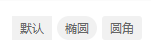
<view class="padding bg-white solid-bottom">
	<view class='cu-tag'>默认</view>
	<view class='cu-tag round'>椭圆</view>
	<view class='cu-tag radius'>圆角</view>
</view>
标签尺寸
sm小尺寸
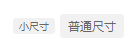
<view class="padding bg-white">
	<view class='cu-tag radius sm'>小尺寸</view>
	<view class='cu-tag radius'>普通尺寸</view>
</view>
标签颜色
添加背景class名就可以,用法参考背景组件的介绍
<view class='padding-sm flex flex-wrap'>
	<view class="padding-xs" v-for="(item,index) in ColorList" :key="index" v-if="item.name!='gray'">
		<view class='cu-tag' :class="'bg-' + item.name">{

   {item.title}}</view>
	</view>
	<view class="padding-xs" v-for="(item,index) in ColorList" :key="index" v-if="item.name!='gray' && item.name!='black' && item.name!='white'">
		<view class='cu-tag light' :class="'bg-' + item.name">{

   {item.title}}</view>
	</view>
</view>
幽灵标签
通过line-{ {color}}设置镂空的幽灵按钮
<view class='padding-sm flex flex-wrap'>
	<view class="padding-xs" v-for="(item,index) in ColorList" :key="index" v-if="item.name!='white'">
		<view class='cu-tag' :class="'line-' + item.name">{

   {item.title}}</view>
	</view>
</view>
胶囊样式
通过cu-capsule设置为胶囊样式,内部设置自己想要的样式
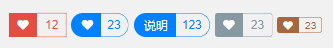
<view class="padding">
	<view class="cu-capsule">
		<view class='cu-tag bg-red'><text class='cuIcon-likefill'></text></view>
		<view class="cu-tag line-red">12</view>
	</view>
	<view class="cu-capsule round">
		<view class='cu-tag bg-blue '><text class='cuIcon-likefill'></text></view>
		<view class="cu-tag line-blue">23</view>
	</view>
	<view class="cu-capsule round">
		<view class='cu-tag bg-blue '>说明</view>
		<view class="cu-tag line-blue">123</view>
	</view>
	<view class="cu-capsule radius">
		<view class='cu-tag bg-grey '><text class='cuIcon-likefill'></text></view>
		<view class="cu-tag line-grey">23</view>
	</view>
	<view class="cu-capsule radius">
		<view class='cu-tag bg-brown sm'><text class='cuIcon-likefill'></text></view>
		<view class="cu-tag line-brown sm">23</view>
	</view>
</view>
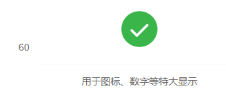
数字标签
通过badge设置角标
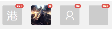
<view class="padding flex justify-between align-center">
	<view class='cu-avatar xl radius'>港<view class="cu-tag badge">99+</view></view>
	<view class='cu-avatar xl radius' style="background-image:url(https://ossweb-img.qq.com/images/lol/web201310/skin/big10001.jpg)">
		<view class='cu-tag badge'>9</view>
	</view>
	<view class='cu-avatar xl radius'>
		<view class='cu-tag badge'>99</view>
		<text class='cuIcon-people'></text>
	</view>
	<view class='cu-avatar xl radius'>
		<view class='cu-tag badge'>99+</view>
	</view>
</view>
标签相关class
| class | 说明 | 可选值 |
|---|---|---|
| cu-tag | 标签必选值 | —— |
| round | 椭圆 | —— |
| radius | 圆角 | —— |
| sm | 小尺寸标签 | —— |
| line-{ {color}} | 幽灵标签 | 参考背景色 |
| cu-capsule | 胶囊标签 | —— |
| badge | 数字角标 | —— |
Avatar头像
头像必选class cu-avatar
头像形状
通过round和radius设置头像形状
<view class="padding">
	<view class="cu-avatar round" style="background-image:url(https://ossweb-img.qq.com/images/lol/web201310/skin/big10001.jpg)"></view>
	<view class="cu-avatar radius margin-left" style="background-image:url(https://ossweb-img.qq.com/images/lol/web201310/skin/big81005.jpg);"></view>
</view>
头像尺寸
通过sm 、lg、xl设置不同大小的头像
<view class="padding">
<view class="cu-avatar sm round margin-left" style="background-image:url(https://ossweb-img.qq.com/images/lol/web201310/skin/big10001.jpg)"></view>
<view class="cu-avatar round margin-left" style="background-image:url(https://ossweb-img.qq.com/images/lol/web201310/skin/big81005.jpg);"></view>
<view class="cu-avatar lg round margin-left" style="background-image:url(https://ossweb-img.qq.com/images/lol/web201310/skin/big25002.jpg);"></view>
<view class="cu-avatar xl round margin-left" style="background-image:url(https://ossweb-img.qq.com/images/lol/web201310/skin/big99008.jpg);"></view>
</view>
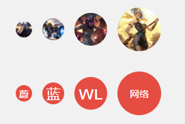
<view class="padding">
<view class="cu-avatar sm round margin-left bg-red"> 蔚</view>
<view class="cu-avatar round margin-left bg-red">蓝</view>
<view class="cu-avatar lg round margin-left bg-red"><text>wl</text></view>
<view class="cu-avatar xl round margin-left bg-red">
<text class="avatar-text">网络</text>
</view>
</view>
内嵌文字
头像内部不仅仅是图片,也可以是自定义文字和图标等
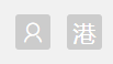
<view class="padding">
	<view class="cu-avatar radius">
		<text class="cuIcon-people"></text>
	</view>
	<view class="cu-avatar radius margin-left">
		<text>港</text>
	</view>
</view>
头像颜色
设置背景色即可
<view class="padding-sm">
	<view class="cu-avatar round lg margin-xs" :class="'bg-' + item.name" v-for="(item,index) in ColorList" :key="index">
		<text class="avatar-text">{

   {item.name}}</text>
	</view>
</view>
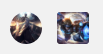
头像组
设置了cu-avatar外部的盒子添加cu-avatar-group的class
<view class="padding">
	<view class="cu-avatar-group">
		<view class="cu-avatar round lg" v-for="(item,index) in avatar" :key="index" :style="[{ backgroundImage:'url(' + avatar[index] + ')' }]"></view>
	</view>
</view>
头像标签
在头像标签内部添加数字标签的角标即可
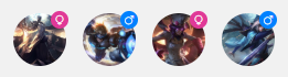
<view class="padding">
	<view class="cu-avatar round lg margin-left"  v-for="(item,index) in avatar" :key="index" :style="[{ backgroundImage:'url(' + avatar[index] + ')' }]">
		<view class="cu-tag badge" :class="index%2==0?'cuIcon-female bg-pink':'cuIcon-male bg-blue'"></view>
	</view>
</view>
头像相关class
| class | 说明 | 可选值 |
|---|---|---|
| cu-avatar | 头像必选值 | —— |
| cu-avatar-group | 头像组,包裹cu-avatar | —— |
| round | 圆形 | —— |
| radius | 圆角 | —— |
| sm | 小尺寸头像 | —— |
| lg | 大尺寸头像 | —— |
| xl | 超大尺寸头像 | —— |
Progress进度条
进度条必须值为cu-progress
进度条形状
进度条默认为方形,radius为圆角,round为圆形;代码中loading只是一个变量,初始值为false,页面初始化时赋值为true,即给进度条赋值,使进度条有一个动画效果。
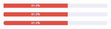
<view class="padding bg-white">
	<view class="cu-progress">
		<view class="bg-red" style="width:61.8%">61.8%</view>
	</view>
	<view class="cu-progress radius margin-top">
		<view class="bg-red" :style="[{ width:loading?'61.8%':''}]">61.8%</view>
	</view>
	<view class="cu-progress round margin-top">
		<view class="bg-red" :style="[{ width:loading?'61.8%':''}]">61.8%</view>
	</view>
</view>
进度条尺寸
sm为小尺寸,xs为超小尺寸
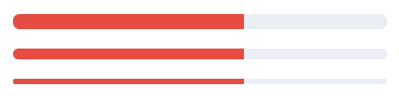
<view class="padding bg-white">
	<view class="cu-progress round">
		<view class="bg-red" :style="[{ width:loading?'61.8%':''}]"></view>
	</view>
	<view class="cu-progress round margin-top sm">
		<view class="bg-red" :style="[{ width:loading?'61.8%':''}]"></view>
	</view>
	<view class="cu-progress round margin-top xs">
		<view class="bg-red" :style="[{ width:loading?'61.8%':''}]"></view>
	</view>
</view>
进度条颜色
添加背景色即可
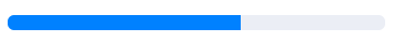
<view class="padding" :class="color=='white'?'bg-grey':'bg-white'">
	<view class="cu-progress round">
		<view :class="'bg-' + color" :style="[{ width:loading?'61.8%':''}]"></view>
	</view>
</view>
进度条条纹
添加striped设置条纹样式,active设置条纹动态效果

<view class="padding bg-white">
	<view class="cu-progress round sm striped active" >
		<view class="bg-green" :style="[{ width:loading?'60%':''}]"></view>
	</view>
	<view class="cu-progress round sm margin-top-sm striped" >
		<view class="bg-black" :style="[{ width:loading?'40%':''}]"></view>
	</view>
</view>
进度条比例
在给定class为cu-progress的标签内按需放置元素并进行分段设计即可
<view class="padding bg-white">
	<view class="cu-progress radius striped active">
		<view class="bg-red" :style="[{ width:loading?'30%':''}]">30%</view>
		<view class="bg-olive" :style="[{ width:loading?'45%':''}]">45%</view>
		<view class="bg-cyan" :style="[{ width:loading?'25%':''}]">25%</view>
	</view>
</view>
进度条布局
结合布局、图标等内容,可根据个人所需可以设置不同进度显示的样式
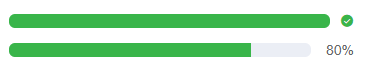
<view class="padding bg-white ">
	<view class="flex">
		<view class="cu-progress round">
			<view class="bg-green" :style="[{ width:loading?'100%':''}]"></view>
		</view>
		<text class="cuIcon-roundcheckfill text-green margin-left-sm"></text>
	</view>
	<view class="flex margin-top">
		<view class="cu-progress round">
			<view class="bg-green" :style="[{ width:loading?'80%':''}]"></view>
		</view>
		<text class="margin-left">80%</text>
	</view>
</view>
进度条相关class
| class | 说明 | 可选值 |
|---|---|---|
| cu-progress | 进度条必选值 | —— |
| radius | 圆角 | —— |
| round | 圆形 | —— |
| sm | 小尺寸 | —— |
| xs | 超小尺寸 | —— |
| striped | 条纹 | —— |
| active | 结合striped使用,设置动态条纹效果 | —— |
Border&Shadow边框阴影
默认shadow是根据背景色设置的阴影,shadow-lg为长阴影,但是我肉眼没看出来二者的区别,真是在下愚钝,shadow-warp为翘边阴影(在下愚钝,它翘一点???),shadow-blur根据背景图片设置的阴影,有点意思,挺好。关于边框border没什么好展开的,直接看下面表格class说明就好。


<view class="padding text-center">
	<view class="padding-xl radius shadow bg-white">默认阴影</view>
	<view class="padding-xl radius shadow bg-gradual-red margin-top">根据背景颜色而改变的阴影</view>
	<view class="padding-xl radius shadow shadow-lg bg-white margin-top">长阴影</view>
	<view class="padding-xl radius shadow shadow-lg bg-blue margin-top">长阴影</view>
	<view class="padding-xl radius shadow-warp bg-white margin-top">翘边阴影</view>
	<view class="padding-xl radius shadow-blur bg-red margin-top bg-img" style="background-image:url(https://ossweb-img.qq.com/images/lol/web201310/skin/big91005.jpg);">
		<view>根据背景图而改变的阴影</view>
	</view>
</view>
边框阴影相关class
| class | 说明 | 可选值 |
|---|---|---|
| solid/solids | The border around the solid line, solid is a thin border, solids is a thick border | —— |
| solid/solids-{ {options}} | Borders in different directions (top, bottom, left, right) | top/right/bottom/left |
| shadow | Default shadow (varies according to background color) | —— |
| shadow-lg | long shadow | —— |
| shadow-wrap | warped shadow | —— |
| shadow-blur | Shadows that change based on the background image |
LoadingLoading
Load required value cu-load
loading status
loading is loading, over loading is complete, erro loading failed
<view class="cu-load bg-blue loading"></view>
<view class="cu-load bg-blue over"></view>
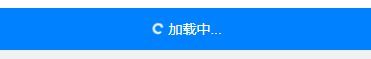
<view class="cu-load bg-red erro"></view>popup loading
Set the button, pop up a bullet box, display the loading status, and set the load-modal in the bullet box template

<view class="cu-bar bg-white margin-top">
	<view class="action">
		<text class="cuIcon-title text-blue"></text>弹框加载
	</view>
	<view class="action">
		<button class="cu-btn bg-green shadow" @tap="LoadModal">
			点我
		</button>
	</view>
</view>
<view class="cu-load load-modal" v-if="loadModal">
	<image src="/static/logo.png" mode="aspectFit"></image>
	<view class="gray-text">加载中...</view>
</view>


<script>
	export default {
		data() {
			return {
				loadModal: false
			};
		},
		methods: {
			LoadModal(e) {
				this.loadModal = true;
				setTimeout(() => {
					this.loadModal = false;
				}, 2000)
			}
		}
	}
</script>
progress bar loading
When setting the progress bar to load, you need to add load-progress , the variable loadProgress is the progress of the loading progress bar, load-progress-bar represents the loading progress bar style, and load-progress-spinner represents the rotating circle style during loading
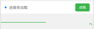
<view class="action">
	<button class="cu-btn bg-green shadow" @tap="LoadProgress">
		点我
	</button>
</view>
<view class="load-progress" :class="loadProgress!=0?'show':'hide'" style="top:100px">
	<view class="load-progress-bar bg-green" :style="[{transform: 'translate3d(-' + (100-loadProgress) + '%, 0px, 0px)'}]"></view>
	<view class="load-progress-spinner text-green"></view>
</view>

<script>
    export default{
        data(){
            return{
                loadProgress:0
            }
        },
        methods:{
            LoadProgress(e) {
				this.loadProgress = this.loadProgress + 3;
				if (this.loadProgress < 100) {
					setTimeout(() => {
						this.LoadProgress();
					}, 100)
				} else {
					this.loadProgress = 0;
				}
			}
        }
    }
</script>
Load related classes
| class | illustrate | optional value |
|---|---|---|
| with-load | Loading required values (except progress bar loading) | —— |
| loading | Loading | —— |
| over | Loading completed | —— |
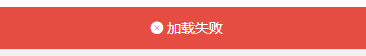
| error | Failed to load | —— |
| load-modal | popup loading | —— |
| load-progress | Set progress bar loading | —— |
| load-progress-bar | progress bar loading style | —— |
| load-progress-spinner | Rotate loading style | —— |
| hide | hide | —— |
| show | show | —— |
interactive components
This blog is too long, let’s write another article about the introduction of interactive components, Interactive Components of ColorUI Component Library Simple Tutorial
This is just my personal understanding. If there is any deficiency, I hope the boss will advise and correct it in time!