The official example is here! ! ! The official example is here! ! ! The official example is here! ! !
This is mainly developed based on uni-app, so please read more uni-app documents to understand some tags and attributes, so that you can use this component better
Table of contents
interactive components
Bar operation bar
bottom bar
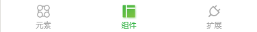
We can use the Bar operation bar to customize the tabBar at the bottom of the applet, let's take the official sample code as an example.
When we want to customize the tabBar, the tabBar configuration in the pages.json file is not written, and the code is directly on the home page. The first item in the pages array in the pages.json file represents the application startup page, that is, the home page. In the example, the variable PageCur is used to switch between different tabBar pages to control the style switching of the tabBar icon text.
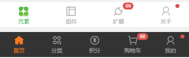
The bottom operation bar includes the tabBar at the bottom and the operation bar for adding the shopping mall applet to the shopping cart. The cu-bar and tabbar in the bottom operation bar are necessary classes, and the foot sets the operation bar to be fixed at the bottom of the page.
<template>
	<view>
		<basics v-if="PageCur=='basics'"></basics>
		<components v-if="PageCur=='component'"></components>
		<plugin v-if="PageCur=='plugin'"></plugin>
		<view class="cu-bar tabbar bg-white shadow foot">
			<view class="action" @click="NavChange" data-cur="basics">
				<view class='cuIcon-cu-image'>
					<image :src="'/static/tabbar/basics' + [PageCur=='basics'?'_cur':''] + '.png'"></image>
				</view>
				<view :class="PageCur=='basics'?'text-green':'text-gray'">元素</view>
			</view>
			<view class="action" @click="NavChange" data-cur="component">
				<view class='cuIcon-cu-image'>
					<image :src="'/static/tabbar/component' + [PageCur == 'component'?'_cur':''] + '.png'"></image>
				</view>
				<view :class="PageCur=='component'?'text-green':'text-gray'">组件</view>
			</view>
			<view class="action" @click="NavChange" data-cur="plugin">
				<view class='cuIcon-cu-image'>
					<image :src="'/static/tabbar/plugin' + [PageCur == 'plugin'?'_cur':''] + '.png'"></image>
				</view>
				<view :class="PageCur=='plugin'?'text-green':'text-gray'">扩展</view>
			</view>
		</view>
	</view>
</template>

<script>
	export default {
		data() {
		return {
				PageCur: 'basics'
			}
		},
		methods: {
			NavChange: function(e) {
				this.PageCur = e.currentTarget.dataset.cur
			}
		}
	}
</script>
The icon in the operation bar can be a custom imported picture, or an icon in this component. The corner mark is the label component cu-tag, badge , background color and text icon color introduced in the basic elements in the previous chapter. You can add the corresponding color class to customize
<view class="cu-bar tabbar bg-white">
	<view class="action">
		<view class="cuIcon-cu-image">
			<image src="/static/tabbar/basics_cur.png"></image>
		</view>
		<view class="text-green">元素</view>
	</view>
	<view class="action">
		<view class="cuIcon-cu-image">
			<image src="/static/tabbar/component.png"></image>
		</view>
		<view class="text-gray">组件</view>
	</view>
	<view class="action">
		<view class="cuIcon-cu-image">
			<image src="/static/tabbar/plugin.png"></image>
			<view class="cu-tag badge">99</view>
		</view>
		<view class="text-gray">扩展</view>
	</view>
	<view class="action">
		<view class="cuIcon-cu-image">
			<image src="/static/tabbar/about.png"></image>
			<view class="cu-tag badge"></view>
		</view>
		<view class="text-gray">关于</view>
	</view>
</view>

<view class="cu-bar tabbar margin-bottom-xl bg-black">
	<view class="action text-orange">
		<view class="cuIcon-homefill"></view> 首页
	</view>
	<view class="action text-gray">
		<view class="cuIcon-similar"></view> 分类
	</view>
	<view class="action text-gray">
		<view class="cuIcon-recharge"></view>
		积分
	</view>
	<view class="action text-gray">
		<view class="cuIcon-cart">
			<view class="cu-tag badge">99</view>
		</view>
		购物车
	</view>
	<view class="action text-gray">
		<view class="cuIcon-my">
			<view class="cu-tag badge"></view>
		</view>
		我的
	</view>
</view>
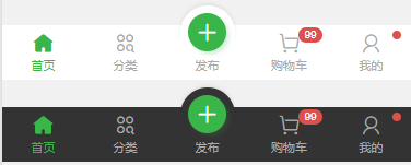
This kind of operation bar is to set a midButton in the middle, just add class add-action to the middle view , and the other settings are the same as above, so I won’t go into details
<view class="cu-bar tabbar margin-bottom-xl bg-white">
	<view class="action text-green">
		<view class="cuIcon-homefill"></view> 首页
	</view>
	<view class="action text-gray">
		<view class="cuIcon-similar"></view> 分类
	</view>
	<view class="action text-gray add-action">
		<button class="cu-btn cuIcon-add bg-green shadow"></button>
		发布
	</view>
	<view class="action text-gray">
		<view class="cuIcon-cart">
			<view class="cu-tag badge">99</view>
		</view>
		购物车
	</view>
	<view class="action text-gray">
		<view class="cuIcon-my">
			<view class="cu-tag badge"></view>
		</view>
		我的
	</view>
</view>
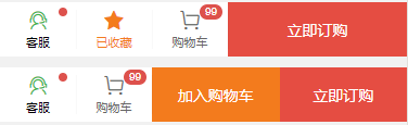
The shop class name is added to the operation bar of adding to the shopping cart , but I don’t know what is the difference between adding shop or not. I deleted it, but the style does not seem to have changed. Some big guys know how to look for advice. The submit class name is used for operations such as adding to the shopping cart and buying immediately, and the style can be expanded and filled.
<view class="cu-bar bg-white tabbar border shop">
	<button class="action" open-type="contact">
		<view class="cuIcon-service text-green">
			<view class="cu-tag badge"></view>
		</view>
		客服
	</button>
	<view class="action text-orange">
		<view class="cuIcon-favorfill"></view> 已收藏
	</view>
	<view class="action">
		<view class="cuIcon-cart">
			<view class="cu-tag badge">99</view>
		</view>
		购物车
	</view>
	<view class="bg-red submit">立即订购</view>
</view>
This style is to replace the above one with a button label and set it to a round circle
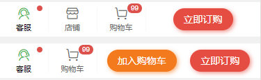
<view class="cu-bar bg-white tabbar border shop">
	<button class="action" open-type="contact">
		<view class="cuIcon-service text-green">
			<view class="cu-tag badge"></view>
		</view> 客服
	</button>
	<view class="action">
		<view class="cuIcon-cart">
			<view class="cu-tag badge">99</view>
		</view>
		购物车
	</view>
	<view class="btn-group">
		<button class="cu-btn bg-orange round shadow-blur">加入购物车</button>
		<button class="cu-btn bg-red round shadow-blur">立即订购</button>
	</view>
</view>
title bar
Look at the code comments below, one corresponds to one, clearer


<view class="box">
//第一种和第二种都是标题和类似边框的组合样式,添加border-title类名, 底部样式是text标签的last-child选择器设置的,可以自定义颜色和长度
	<view class="cu-bar bg-white">
		<view class="action border-title">
			<text class="text-xl text-bold">关于我们</text>
			<text class="bg-grey" style="width:2rem"></text>
		</view>
	</view>
	<view class="cu-bar bg-white">
		<view class="action border-title">
			<text class="text-xl text-bold text-blue">关于我们</text>
			<text class="bg-gradual-blue" style="width:3rem"></text>
		</view>
	</view>
//下面这两种和上面的原理相同,添加的是sub-title类名,底部可以设置文字
	<view class="cu-bar bg-white">
		<view class="action sub-title">
			<text class="text-xl text-bold text-green">关于我们</text>
			<text class="bg-green"></text>
		</view>
	</view>
	<view class="cu-bar bg-white">
		<view class="action sub-title">
			<text class="text-xl text-bold text-blue">关于我们</text>
			<text class="text-ABC text-blue">about</text>
		</view>
	</view>
//这一种主要是类名self-end,设置了最后一行字的位置,就是css属性align-self: flex-end;详情可以去看看flex布局
	<view class="cu-bar bg-white">
		<view class="action">
			<text class="text-xl text-bold">关于我们</text>
			<text class="text-Abc text-gray self-end margin-left-sm">about</text>
		</view>
	</view>
//最后这两种就是简单的添加了两个图标,没什么好说的
	<view class="cu-bar bg-white">
		<view class="action">
			<text class="cuIcon-title text-green"></text>
			<text class="text-xl text-bold">关于我们</text>
		</view>
	</view>
	<view class="cu-bar bg-white">
		<view class="action">
			<text class="cuIcon-titles text-green"></text>
			<text class="text-xl text-bold">关于我们</text>
		</view>
	</view>
</view>
top bar
For the specific setting method of the top operation bar, please go to the previous chapter to customize the navigation bar . The following styles can be referred to, so I won’t explain them in detail.
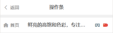
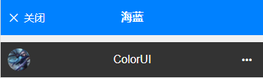
<view class="box">
	<view class="cu-bar bg-white">
		<view class="action">
			<text class="cuIcon-back text-gray"></text> 返回
		</view>
		<view class="content text-bold">操作条	</view>
	</view>
	<view class="cu-bar bg-white">
		<view class="action">
			<text class="cuIcon-homefill text-gray"></text> 首页
		</view>
		<view class="content text-bold">鲜亮的高饱和色彩,专注视觉的小程序组件库</view>
		<view class="action">
			<text class="cuIcon-cardboardfill text-grey"></text>
			<text class="cuIcon-recordfill text-red"></text>
		</view>
	</view>
	<view class="cu-bar bg-blue">
		<view class="action">
			<text class="cuIcon-close"></text>关闭
		</view>
		<view class="content text-bold">海蓝</view>
	</view>
	<view class="cu-bar bg-black search">
		<view class="cu-avatar round" style="background-image:url(https://ossweb-img.qq.com/images/lol/web201310/skin/big91012.jpg);"></view>
		<view class="content">ColorUI</view>
		<view class="action">
			<text class="cuIcon-more"></text>
		</view>
	</view>
</view>
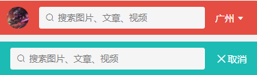
search action bar
The search operation bar is mainly search-form , which sets the style of the input box with round and radius (the more I write, the more I find that there are not many new things, and they are all made up of basic elements. Simple)
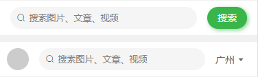
<view class="box">
	<view class="cu-bar search bg-white">
		<view class="search-form round">
			<text class="cuIcon-search"></text>
			<input @focus="InputFocus" @blur="InputBlur" :adjust-position="false" type="text" placeholder="搜索图片、文章、视频"
			 confirm-type="search"></input>
		</view>
		<view class="action">
			<button class="cu-btn bg-green shadow-blur round">搜索</button>
		</view>
	</view>
	<view class="cu-bar search bg-white">
		<view class="cu-avatar round" style="background-image:url(https://ossweb-img.qq.com/images/lol/web201310/skin/big11010.jpg"></view>
		<view class="search-form round">
			<text class="cuIcon-search"></text>
			<input @focus="InputFocus" @blur="InputBlur" :adjust-position="false" type="text" placeholder="搜索图片、文章、视频"
			 confirm-type="search"></input>
		</view>
		<view class="action">
			<text>广州</text>
			<text class="cuIcon-triangledownfill"></text>
		</view>
	</view>
	<view class="cu-bar bg-red search">
		<view class="cu-avatar round" style="background-image:url(https://ossweb-img.qq.com/images/lol/web201310/skin/big114004.jpg);"></view>
		<view class="search-form radius">
			<text class="cuIcon-search"></text>
			<input @focus="InputFocus" @blur="InputBlur" :adjust-position="false" type="text" placeholder="搜索图片、文章、视频"
			 confirm-type="search"></input>
		</view>
		<view class="action">
			<text>广州</text>
			<text class="cuIcon-triangledownfill"></text>
		</view>
	</view>
	<view class="cu-bar bg-cyan search">
		<view class="search-form radius">
			<text class="cuIcon-search"></text>
			<input @focus="InputFocus" @blur="InputBlur" :adjust-position="false" type="text" placeholder="搜索图片、文章、视频"
			 confirm-type="search"></input>
		</view>
		<view class="action">
			<text class="cuIcon-close"></text>
			<text>取消</text>
		</view>
	</view>
</view>
button group action bar
These are a few buttons. The class name of the cu-bar operation bar sets the tiled style for this button group. Look at the second group of buttons. I deleted the class name of cu-bar, and the effect comparison is obvious.
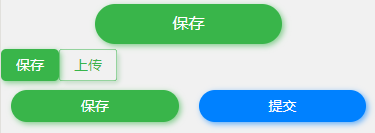
<view class="box">
	<view class="cu-bar btn-group">
		<button class="cu-btn bg-green shadow-blur round lg">保存</button>
	</view>
	<view class="btn-group">
		<button class="cu-btn bg-green shadow-blur">保存</button>
		<button class="cu-btn text-green line-green shadow">上传</button>
	</view>
	<view class="cu-bar btn-group">
		<button class="cu-btn bg-green shadow-blur round">保存</button>
		<button class="cu-btn bg-blue shadow-blur round">提交</button>
	</view>
</view>
Input operation bar
The general style is mainly set by cu-bar and input , and the internal filling is customized. The following styles are for reference
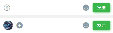
<view class="box">
	<view class="cu-bar input">
		<view class="action">
			<text class="cuIcon-sound text-grey"></text>
		</view>
		<input @focus="InputFocus" @blur="InputBlur" :adjust-position="false" class="solid-bottom" :focus="false" maxlength="300"
		 cursor-spacing="10"></input>
		<view class="action">
			<text class="cuIcon-emojifill text-grey"></text>
		</view>
		<button class="cu-btn bg-green shadow-blur">发送</button>
	</view>

	<view class="cu-bar input">
		<view class="cu-avatar round" style="background-image:url(https://ossweb-img.qq.com/images/lol/web201310/skin/big91012.jpg);"></view>
		<view class="action">
			<text class="cuIcon-roundaddfill text-grey"></text>
		</view>
		<input @focus="InputFocus" @blur="InputBlur" :adjust-position="false" class="solid-bottom" maxlength="300"
		 cursor-spacing="10"></input>
		<view class="action">
			<text class="cuIcon-emojifill text-grey"></text>
		</view>
		<button class="cu-btn bg-green shadow-blur">发送</button>
	</view>
</view>
Operation bar related class
| class | illustrate | optional value |
|---|---|---|
| with bar | Mandatory value for the bottom operation bar | —— |
| sure | Mandatory value for the bottom operation bar | —— |
| foot | Fixed positioning at the bottom of the page | —— |
| add-action | The midButton of the applet tabBar | —— |
| shop | Required value for shopping action bar | —— |
| submit | submit button | —— |
| border-title | Title with Bottom Border Style | —— |
| sub-title | Title with subtitle style | —— |
| self-end | css属性align-self: flex-end; | —— |
| search-form | search bar | —— |
| input | input box style | —— |
Nav navigation bar
The nav navigation bar is designed in combination with the scroll-view tag of uni-app. When using it, you can refer to the document of uni-app https://uniapp.dcloud.io/component/scroll-view for some attributes , the class name nav and cu-item is a required value
default
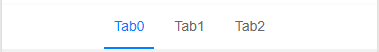
I don’t know how to explain it. It’s very simple to look at the code. It is to switch each tab and its font border style through the index value. I won’t go into details.
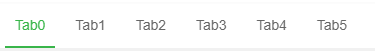
<scroll-view scroll-x class="bg-white nav" scroll-with-animation :scroll-left="scrollLeft">
	<view class="cu-item" :class="index==TabCur?'text-green cur':''" v-for="(item,index) in 10" :key="index" @tap="tabSelect" :data-id="index">
		Tab{

   {index}}
	</view>
</scroll-view>

<script>
	export default {
		data() {
			return {
				TabCur: 0,
				scrollLeft: 0
			};
		},
		methods: {
			tabSelect(e) {
				this.TabCur = e.currentTarget.dataset.id;
				this.scrollLeft = (e.currentTarget.dataset.id - 1) * 60
			}
		}
	}
</script>
in the center
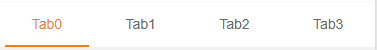
Centered by text-center
<scroll-view scroll-x class="bg-white nav text-center">
	<view class="cu-item" :class="index==TabCur?'text-blue cur':''" v-for="(item,index) in 3" :key="index" @tap="tabSelect" :data-id="index">
		Tab{

   {index}}
	</view>
</scroll-view>
split equally
Set flex and flex-sub to achieve elastic layout, flex-sub is the css attribute flex:1, and allocate space for the child elements in the elastic box according to 1:1:1:1
<scroll-view scroll-x class="bg-white nav">
	<view class="flex text-center">
		<view class="cu-item flex-sub" :class="index==TabCur?'text-orange cur':''" v-for="(item,index) in 4" :key="index" @tap="tabSelect" :data-id="index">
			Tab{

   {index}}
		</view>
	</view>
</scroll-view>
background
bg-{ {color}} , reference background color
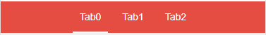
<scroll-view scroll-x class="bg-red nav text-center">
	<view class="cu-item" :class="index==TabCur?'text-white cur':''" v-for="(item,index) in 3" :key="index" @tap="tabSelect" :data-id="index">
		Tab{

   {index}}
	</view>
</scroll-view>
icon
cuIcon-{ {icon}} , reference icon
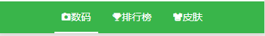
<scroll-view scroll-x class="bg-green nav text-center">
	<view class="cu-item" :class="0==TabCur?'text-white cur':''" @tap="tabSelect" data-id="0">
		<text class="cuIcon-camerafill"></text> 数码
	</view>
	<view class="cu-item" :class="1==TabCur?'text-white cur':''" @tap="tabSelect" data-id="1">
		<text class="cuIcon-upstagefill"></text> 排行榜
	</view>
	<view class="cu-item" :class="2==TabCur?'text-white cur':''" @tap="tabSelect" data-id="2">
		<text class="cuIcon-clothesfill"></text> 皮肤
	</view>
</scroll-view>
Navigation bar related class
| class | illustrate | optional value |
|---|---|---|
| nav | Navigation bar required value | —— |
| with-item | Navigation bar child element | —— |
| flex | flex layout | —— |
| flex-sub | flex: 1, split equally | —— |
| text-center | in the center | —— |
List list
Use cu-list and cu-item together
grid list
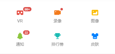
The grid list is a style designed by combining the list with the grid layout. Set the number of each line through col-{ {number}} , and the value of number is 1~5. There is a border by default. You can add the class name no-border to remove the border

<view class="cu-list grid" :class="['col-' + gridCol,gridBorder?'':'no-border']">
	<view class="cu-item" v-for="(item,index) in cuIconList" :key="index" v-if="index<gridCol*2">
		<view :class="['cuIcon-' + item.cuIcon,'text-' + item.color]">
			<view class="cu-tag badge" v-if="item.badge!=0">
				<block v-if="item.badge!=1">{

   {item.badge>99?'99+':item.badge}}</block>
			</view>
		</view>
		<text>{

   {item.name}}</text>
	</view>
</view>

data() {
	return {
		cuIconList: [{cuIcon: 'cardboardfill',color: 'red',badge: 120,name: 'VR'},
		{cuIcon: 'recordfill',color: 'orange',badge: 1,name: '录像'},
		{cuIcon: 'picfill',color: 'yellow',badge: 0,name: '图像'},
		{cuIcon: 'noticefill',color: 'olive',badge: 22,name: '通知'},
		{cuIcon: 'upstagefill',color: 'cyan',badge: 0,name: '排行榜'	},
		{cuIcon: 'clothesfill',color: 'blue',badge: 0,name: '皮肤'},
		{cuIcon: 'discoverfill',color: 'purple',badge: 0,name: '发现'},
		{cuIcon: 'questionfill',color: 'mauve',badge: 0,name: '帮助'},
		{cuIcon: 'commandfill',color: 'purple',badge: 0,name: '问答'},
		{cuIcon: 'brandfill',color: 'mauve',badge: 0,name: '版权'}],
        gridCol: 3,
		gridBorder: false
	};
},
menu list
The menu list is the style designed by combining the list with the class name menu . You can set the short border of each line through sm-border r, set the list into a card style through card-menu , and change the style by adding arrow to the list child element to set the arrow The effect can be compared by the following two figures


<view class="cu-list menu" :class="[menuBorder?'sm-border':'',menuCard?'card-menu margin-top':'']">
	<view class="cu-item" :class="menuArrow?'arrow':''">
		<view class="content">
			<text class="cuIcon-circlefill text-grey"></text>
			<text class="text-grey">图标 + 标题</text>
		</view>
	</view>
	<view class="cu-item" :class="menuArrow?'arrow':''">
		<view class="content">
			<image src="/static/logo.png" class="png" mode="aspectFit"></image>
			<text class="text-grey">图片 + 标题</text>
		</view>
	</view>
	<view class="cu-item" :class="menuArrow?'arrow':''">
		<button class="cu-btn content" open-type="contact">
			<text class="cuIcon-btn text-olive"></text>
			<text class="text-grey">Open-type 按钮</text>
		</button>
	</view>
	<view class="cu-item" :class="menuArrow?'arrow':''">
		<navigator class="content" hover-class="none" url="../list/list" open-type="redirect">
			<text class="cuIcon-discoverfill text-orange"></text>
			<text class="text-grey">Navigator 跳转</text>
		</navigator>
	</view>
	<view class="cu-item" :class="menuArrow?'arrow':''">
		<view class="content">
			<text class="cuIcon-emojiflashfill text-pink"></text>
			<text class="text-grey">头像组</text>
		</view>
		<view class="action">
			<view class="cu-avatar-group">
				<view class="cu-avatar round sm" style="background-image:url(https://ossweb-img.qq.com/images/lol/web201310/skin/big10001.jpg);"></view>
				<view class="cu-avatar round sm" style="background-image:url(https://ossweb-img.qq.com/images/lol/web201310/skin/big81005.jpg);"></view>
				<view class="cu-avatar round sm" style="background-image:url(https://ossweb-img.qq.com/images/lol/web201310/skin/big25002.jpg);"></view>
				<view class="cu-avatar round sm" style="background-image:url(https://ossweb-img.qq.com/images/lol/web201310/skin/big91012.jpg);"></view>
			</view>
			<text class="text-grey text-sm">4 人</text>
		</view>
	</view>
	<view class="cu-item" :class="menuArrow?'arrow':''">
		<view class="content">
			<text class="cuIcon-btn text-green"></text>
			<text class="text-grey">按钮</text>
		</view>
		<view class="action">
			<button class="cu-btn round bg-green shadow">
				<text class="cuIcon-upload"></text> 上传</button>
		</view>
	</view>
	<view class="cu-item" :class="menuArrow?'arrow':''">
		<view class="content">
			<text class="cuIcon-tagfill text-red  margin-right-xs"></text>
			<text class="text-grey">标签</text>
		</view>
		<view class="action">
			<view class="cu-tag round bg-orange light">音乐</view>
			<view class="cu-tag round bg-olive light">电影</view>
			<view class="cu-tag round bg-blue light">旅行</view>
		</view>
	</view>
	<view class="cu-item" :class="menuArrow?'arrow':''">
		<view class="content">
			<text class="cuIcon-warn text-green"></text>
			<text class="text-grey">文本</text>
		</view>
		<view class="action">
			<text class="text-grey text-sm">小目标还没有实现!</text>
		</view>
	</view>
	<view class="cu-item">
		<view class="content padding-tb-sm">
			<view>
				<text class="cuIcon-clothesfill text-blue margin-right-xs"></text> 多行Item</view>
			<view class="text-gray text-sm">
				<text class="cuIcon-infofill margin-right-xs"></text> 小目标还没有实现!</view>
		</view>
		<view class="action">
			<switch class="switch-sex" @change="SwitchSex" :class="skin?'checked':''" :checked="skin?true:false"></switch>
		</view>
	</view>
</view>

<script>
	export default {
		data() {
			return {
				menuBorder: false,
				menuArrow: false,
				menuCard: false,
				skin: false
			};
		}
	}
</script>
message list
The message list is similar to the list of QQ messages and WeChat messages. It is basically composed of avatars and content, which is a bit like a menu list with avatars. The basic format is as follows:
<view class="cu-list menu-avatar">
	<view class="cu-item">
		<view class="cu-avatar">头像</view>
		<view class="content">消息内容</view>
	</view>
</view>
For a specific example, please see the following code:

<view class="cu-list menu-avatar">
	<view class="cu-item">
		<view class="cu-avatar round lg" style="background-image:url(https://ossweb-img.qq.com/images/lol/web201310/skin/big10001.jpg);"></view>
		<view class="content">
			<view class="text-grey">凯尔</view>
			<view class="text-gray text-sm flex">
				<view class="text-cut">
					<text class="cuIcon-infofill text-red  margin-right-xs"></text>
					我已天理为凭,踏入这片荒芜,不再受凡人的枷锁遏制。我已天理为凭,踏入这片荒芜,不再受凡人的枷锁遏制。
				</view> </view>
		</view>
		<view class="action">
			<view class="text-grey text-xs">22:20</view>
			<view class="cu-tag round bg-grey sm">5</view>
		</view>
	</view>
	<view class="cu-item">
		<view class="cu-avatar round lg" style="background-image:url(https://ossweb-img.qq.com/images/lol/img/champion/Taric.png);">
			<view class="cu-tag badge">99+</view>
		</view>
		<view class="content">
			<view class="text-grey">
				<view class="text-cut">瓦洛兰之盾-塔里克</view>
				<view class="cu-tag round bg-orange sm">战士</view>
			</view>
			<view class="text-gray text-sm flex">
				<view class="text-cut">
					塔里克是保护者星灵,用超乎寻常的力量守护着符文之地的生命、仁爱以及万物之美。塔里克由于渎职而被放逐,离开了祖国德玛西亚,前去攀登巨神峰寻找救赎,但他找到的却是来自星界的更高层的召唤。现在的塔里克与古代巨神族的神力相融合,以瓦洛兰之盾的身份,永不疲倦地警惕着阴险狡诈的虚空腐化之力。
				</view>
			</view>
		</view>
		<view class="action">
			<view class="text-grey text-xs">22:20</view>
			<view class="cuIcon-notice_forbid_fill text-gray"></view>
		</view>
	</view>
	<view class="cu-item ">
		<view class="cu-avatar radius lg" style="background-image:url(https://ossweb-img.qq.com/images/lol/img/champion/Morgana.png);"></view>
		<view class="content">
			<view class="text-pink"><view class="text-cut">莫甘娜</view></view>
			<view class="text-gray text-sm flex"> <view class="text-cut">凯尔,你被自己的光芒变的盲目!</view></view>
		</view>
		<view class="action">
			<view class="text-grey text-xs">22:20</view>
			<view class="cu-tag round bg-red sm">5</view>
		</view>
	</view>
	<view class="cu-item grayscale">
		<view class="cu-avatar radius lg" style="background-image:url(https://ossweb-img.qq.com/images/lol/web201310/skin/big81007.jpg);"></view>
		<view class="content">
			<view><view class="text-cut">伊泽瑞尔</view>
				<view class="cu-tag round bg-orange sm">断开连接...</view>
			</view>
			<view class="text-gray text-sm flex"> <view class="text-cut"> 等我回来一个打十个</view></view>
		</view>
		<view class="action">
			<view class="text-grey text-xs">22:20</view>
			<view class="cu-tag round bg-red sm">5</view>
		</view>
	</view>
	<view class="cu-item cur">
		<view class="cu-avatar radius lg" style="background-image:url(https://ossweb-img.qq.com/images/lol/web201310/skin/big81020.jpg);">
			<view class="cu-tag badge"></view>
		</view>
		<view class="content">
			<view>
				<view class="text-cut">瓦罗兰大陆-睡衣守护者-新手保护营</view>
				<view class="cu-tag round bg-orange sm">6人</view>
			</view>
			<view class="text-gray text-sm flex">
				<view class="text-cut"> 伊泽瑞尔:<text class="cuIcon-locationfill text-orange margin-right-xs"></text> 传送中...</view></view>
		</view>
		<view class="action">
			<view class="text-grey text-xs">22:20</view>
			<view class="cuIcon-notice_forbid_fill text-gray"></view>
		</view>
	</view>
</view>
list slide left
When the user starts to touch, get the distance from the touch point to the left side of the box, compare the distance at the end of the touch with the start distance, and determine the direction of the user's slide. If it is a left slide, add the class name move-cur, which is the The item moves to the left by 260upx, and slides to the right to return to the original position unchanged.

<view class="cu-list menu-avatar">
	<view class="cu-item" :class="modalName=='move-box-'+ index?'move-cur':''" v-for="(item,index) in 4" :key="index"
	 @touchstart="ListTouchStart" @touchmove="ListTouchMove" @touchend="ListTouchEnd" :data-target="'move-box-' + index">
		<view class="cu-avatar round lg" :style="[{backgroundImage:'url(https://ossweb-img.qq.com/images/lol/web201310/skin/big2100'+ (index+2) +'.jpg)'}]"></view>
		<view class="content">
			<view class="text-grey">文晓港</view>
			<view class="text-gray text-sm">
				<text class="cuIcon-infofill text-red  margin-right-xs"></text> 消息未送达</view>
		</view>
		<view class="action">
			<view class="text-grey text-xs">22:20</view>
			<view class="cu-tag round bg-grey sm">5</view>
		</view>
		<view class="move">
			<view class="bg-grey">置顶</view>
			<view class="bg-red">删除</view>
		</view>
	</view>
</view>

<script>
	export default {
		data() {
			return {
				modalName: null,
				listTouchStart: 0,
				listTouchDirection: null,
			};
		},
		methods: {
			// ListTouch触摸开始,获取触摸点距盒子左侧的距离
			ListTouchStart(e) {
				this.listTouchStart = e.touches[0].pageX
			},
			// ListTouch计算方向,
			ListTouchMove(e) {
				this.listTouchDirection = e.touches[0].pageX - this.listTouchStart > 0 ? 'right' : 'left'
			},
			// ListTouch计算滚动
			ListTouchEnd(e) {
				if (this.listTouchDirection == 'left') {
					this.modalName = e.currentTarget.dataset.target
				} else {
					this.modalName = null
				}
				this.listTouchDirection = null
			}
		}
	}
</script>
List related classes
| class | illustrate | optional value |
|---|---|---|
| with-list | list required value | —— |
| with-item | list child element | —— |
| no-border | Rimless | —— |
| menu | menu list | —— |
| sm-border | short border | —— |
| card-menu | Card style menu list | —— |
| arrow | right arrow | —— |
| menu-avatar | Message list (with avatar) | —— |
| with-avatar | avatar | —— |
| content | content | —— |
| grayscale | grayscale (background-color: #f5f5f5) | —— |
| cur | background-color: #fcf7e9 | |
| move-cur | shift left (transform: translateX(-260upx)) |
Card
cu-card卡片必选值
案例类卡片
cu-card和case结合,在配合子元素的cu-item类名,写出案例类的样式,内部其他样式可以根据其他类名自行设置,cu-item自带margin:30px;可以通过类名no-card去除

<view class="cu-card case" :class="isCard?'no-card':''">
	<view class="cu-item shadow">
		<view class="image">
			<image src="https://ossweb-img.qq.com/images/lol/web201310/skin/big10006.jpg"
			 mode="widthFix"></image>
			<view class="cu-tag bg-blue">史诗</view>
			<view class="cu-bar bg-shadeBottom"> <text class="text-cut">我已天理为凭,踏入这片荒芜,不再受凡人的枷锁遏制。我已天理为凭,踏入这片荒芜,不再受凡人的枷锁遏制。</text></view>
		</view>
		<view class="cu-list menu-avatar">
			<view class="cu-item">
				<view class="cu-avatar round lg" style="background-image:url(https://ossweb-img.qq.com/images/lol/web201310/skin/big10006.jpg);"></view>
				<view class="content flex-sub">
					<view class="text-grey">正义天使 凯尔</view>
					<view class="text-gray text-sm flex justify-between">
						十天前
						<view class="text-gray text-sm">
							<text class="cuIcon-attentionfill margin-lr-xs"></text> 10
							<text class="cuIcon-appreciatefill margin-lr-xs"></text> 20
							<text class="cuIcon-messagefill margin-lr-xs"></text> 30
						</view>
					</view>
				</view>
			</view>
		</view>
	</view>
</view>
动态类卡片
该样式类似于QQ动态,由cu-card和dynamic结合,再配合子元素cu-item编写而成,动态下方的评论需要添加类名comment

<view class="cu-card dynamic" :class="isCard?'no-card':''">
	<view class="cu-item shadow">
		<view class="cu-list menu-avatar">
			<view class="cu-item">
				<view class="cu-avatar round lg" style="background-image:url(https://ossweb-img.qq.com/images/lol/web201310/skin/big10006.jpg);"></view>
				<view class="content flex-sub">
					<view>凯尔</view>
					<view class="text-gray text-sm flex justify-between">
						2019年12月3日
					</view>
				</view>
			</view>
		</view>
		<view class="text-content">
			折磨生出苦难,苦难又会加剧折磨,凡间这无穷的循环,将有我来终结!
		</view>
		<view class="grid flex-sub padding-lr" :class="isCard?'col-3 grid-square':'col-1'">
			<view class="bg-img " :class="isCard?'':'only-img'" style="background-image:url(https://ossweb-img.qq.com/images/lol/web201310/skin/big10006.jpg);"
			 v-for="(item,index) in isCard?9:1" :key="index">
			</view>
		</view>
		<view class="text-gray text-sm text-right padding">
			<text class="cuIcon-attentionfill margin-lr-xs"></text> 10
			<text class="cuIcon-appreciatefill margin-lr-xs"></text> 20
			<text class="cuIcon-messagefill margin-lr-xs"></text> 30
		</view>

		<view class="cu-list menu-avatar comment solids-top">
			<view class="cu-item">
				<view class="cu-avatar round" style="background-image:url(https://ossweb-img.qq.com/images/lol/img/champion/Morgana.png);"></view>
				<view class="content">
					<view class="text-grey">莫甘娜</view>
					<view class="text-gray text-content text-df">
						凯尔,你被自己的光芒变的盲目。
					</view>
					<view class="bg-grey padding-sm radius margin-top-sm  text-sm">
						<view class="flex">
							<view>凯尔:</view>
							<view class="flex-sub">妹妹,你在帮他们给黑暗找借口吗?</view>
						</view>
					</view>
					<view class="margin-top-sm flex justify-between">
						<view class="text-gray text-df">2018年12月4日</view>
						<view>
							<text class="cuIcon-appreciatefill text-red"></text>
							<text class="cuIcon-messagefill text-gray margin-left-sm"></text>
						</view>
					</view>
				</view>
			</view>
        </view>
    </view>
</view>
文章类卡片
该卡片由cu-card和article结合,再配合子元素cu-item
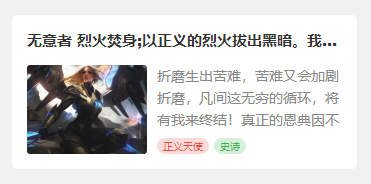
<view class="cu-card article" :class="isCard?'no-card':''">
	<view class="cu-item shadow">
		<view class="title"><view class="text-cut">无意者 烈火焚身;以正义的烈火拔出黑暗。我有自己的正义,见证至高的烈火吧。</view></view>
		<view class="content">
			<image src="https://ossweb-img.qq.com/images/lol/web201310/skin/big10006.jpg"
			 mode="aspectFill"></image>
			<view class="desc">
				<view class="text-content"> 折磨生出苦难,苦难又会加剧折磨,凡间这无穷的循环,将有我来终结!真正的恩典因不完整而美丽,因情感而真诚,因脆弱而自由!</view>
				<view>
					<view class="cu-tag bg-red light sm round">正义天使</view>
					<view class="cu-tag bg-green light sm round">史诗</view>
				</view>
			</view>
		</view>
	</view>
</view>
卡片相关class
| class | 说明 | 可选值 |
|---|---|---|
| cu-card | 卡片必选值 | —— |
| case | 案例类卡片 | —— |
| dynamic | 动态类卡片 | —— |
| article | 文章类卡片 | —— |
| comment | 评论 | —— |
| no-card | 配合cu-card,去除子元素cu-item的margin和border | —— |
| desc | 纵向的flex布局 | —— |
Form表单
input输入框
form表单是用form标签包裹,每一个子元素添加类名cu-form-group,行内自定义,title类名用于设置每行的文字说明,如果想统一宽度,像示例一样,需要自定义宽度

<form>
    <view class="cu-form-group margin-top">
		<view class="title">邮件</view>
		<input placeholder="两字短标题" name="input"></input>
	</view>
	<view class="cu-form-group">
		<view class="title">输入框</view>
		<input placeholder="三字标题" name="input"></input>
	</view>
	<view class="cu-form-group">
		<view class="title">收货地址</view>
		<input placeholder="统一标题的宽度" name="input"></input>
	</view>
	<view class="cu-form-group">
		<view class="title">收货地址</view>
		<input placeholder="输入框带个图标" name="input"></input>
		<text class='cuIcon-locationfill text-orange'></text>
	</view>
	<view class="cu-form-group">
		<view class="title">验证码</view>
		<input placeholder="输入框带个按钮" name="input"></input>
		<button class='cu-btn bg-green shadow'>验证码</button>
	</view>
	<view class="cu-form-group">
		<view class="title">手机号码</view>
		<input placeholder="输入框带标签" name="input"></input>
		<view class="cu-capsule radius">
			<view class='cu-tag bg-blue '>+86</view>
			<view class="cu-tag line-blue">中国大陆</view>
		</view>
	</view>
</form>

<style>
	.cu-form-group .title {
		min-width: calc(4em + 15px);
	}
</style>
picker选择器
对于表单中从底部谈起的选择器,写法与上述简单的input相同,而选择器picker的使用,建议查看官方文档

<form>
	<view class="cu-form-group margin-top">
		<view class="title">普通选择</view>
		<picker @change="PickerChange" :value="index" :range="picker">
			<view class="picker">
				{

   {index>-1?picker[index]:'禁止换行,超出容器部分会以 ... 方式截断'}}
			</view>
		</picker>
	</view>
	<!-- #ifndef MP-ALIPAY -->
	<view class="cu-form-group">
		<view class="title">多列选择</view>
		<picker mode="multiSelector" @change="MultiChange" @columnchange="MultiColumnChange" :value="multiIndex" :range="multiArray">
			<view class="picker">
				{

   {multiArray[0][multiIndex[0]]}},{

   {multiArray[1][multiIndex[1]]}},{

   {multiArray[2][multiIndex[2]]}}
			</view>
		</picker>
	</view>
	<!-- #endif -->
	<view class="cu-form-group">
		<view class="title">时间选择</view>
		<picker mode="time" :value="time" start="09:01" end="21:01" @change="TimeChange">
			<view class="picker">
				{

   {time}}
			</view>
		</picker>
	</view>
	<view class="cu-form-group">
		<view class="title">日期选择</view>
		<picker mode="date" :value="date" start="2015-09-01" end="2020-09-01" @change="DateChange">
			<view class="picker">
				{

   {date}}
			</view>
		</picker>
	</view>
	<!-- #ifndef H5 || APP-PLUS || MP-ALIPAY -->
	<view class="cu-form-group">
		<view class="title">地址选择</view>
		<picker mode="region" @change="RegionChange" :value="region">
			<view class="picker">
				{

   {region[0]}},{

   {region[1]}},{

   {region[2]}}
			</view>
		</picker>
	</view>
	<!-- #endif -->
</form>
switch开关
对于开关的样式,参考switch官方文档,需要注意的阿里小程序的不同,我没有用阿里测试,我测的是微信小程序,在微信小程序上,switch的color属性不生效,想要更改开关颜色,可以用颜色类名,直接写颜色就可以,颜色的取值可以参考上一章背景色

<form>
	<view class="cu-form-group margin-top">
		<view class="title">开关选择</view>
		<switch @change="SwitchA" :class="switchA?'checked':''" :checked="switchA?true:false"></switch>
	</view>
	<view class="cu-form-group">
		<view class="title">定义颜色</view>
		<!-- #ifdef MP-ALIPAY -->
		<switch class='red' @change="SwitchB" :class="switchB?'checked':''" :checked="switchB?true:false" color="#e54d42"></switch>
		<!-- #endif -->

		<!-- #ifndef MP-ALIPAY -->
		<switch class='red' @change="SwitchB" :class="switchB?'checked':''" :checked="switchB?true:false"></switch>
		<!-- #endif -->
	</view>
	<view class="cu-form-group">
		<view class="title">定义图标</view>
		<switch class='switch-sex' @change="SwitchC" :class="switchC?'checked':''" :checked="switchC?true:false"></switch>
	</view>
	<!-- #ifndef MP-ALIPAY -->
	<view class="cu-form-group">
		<view class="title">方形开关</view>
		<switch class='orange radius' @change="SwitchD" :class="switchD?'checked':''" :checked="switchD?true:false"></switch>
	</view>
	<!-- #endif -->
</form>
radio单选框
radio官方文档先奉上,更改颜色同上,使用提供的颜色类名即可,其默认样式是圆形全色中间有个√,可以通过类名radio更改形状为镂空中间一个点
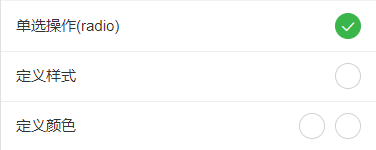
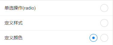
<form>
<radio-group class="block" @change="RadioChange">
<view class="cu-form-group margin-top">
<view class="title">单选操作(radio)</view>
<radio :class="radio=='A'?'checked':''" :checked="radio=='A'?true:false" value="A"></radio>
</view>
<!-- #ifndef MP-ALIPAY -->
<view class="cu-form-group">
<view class="title">定义样式</view>
<radio class='radio' :class="radio=='B'?'checked':''" :checked="radio=='B'?true:false" value="B"></radio>
</view>
<view class="cu-form-group">
<view class="title">定义颜色</view>
<view>
<radio class='blue radio' :class="radio=='C'?'checked':''" :checked="radio=='C'?true:false" value="C"></radio>
<radio class='red margin-left-sm' :class="radio=='D'?'checked':''" :checked="radio=='D'?true:false" value="D"></radio>
</view>
</view>
<!-- #endif -->
</radio-group>
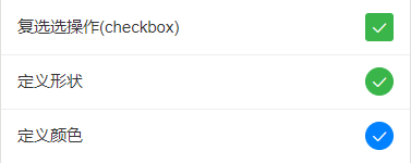
</form>checkbox复选框
CheckBox官方文档 ,更改颜色同上,使用提供的颜色类名即可,其默认样式是方形,可以通过类名round更改形状为圆形
<form>
<checkbox-group class="block" @change="CheckboxChange">
<view class="cu-form-group margin-top">
<view class="title">复选选操作(checkbox)</view>
<checkbox :class="checkbox[0].checked?'checked':''" :checked="checkbox[0].checked?true:false" value="A"></checkbox>
</view>
<!-- #ifndef MP-ALIPAY -->
<view class="cu-form-group">
<view class="title">定义形状</view>
<checkbox class='round' :class="checkbox[1].checked?'checked':''" :checked="checkbox[1].checked?true:false" value="B"></checkbox>
</view>
<view class="cu-form-group">
<view class="title">定义颜色</view>
<checkbox class='round blue' :class="checkbox[2].checked?'checked':''" :checked="checkbox[2].checked?true:false"
value="C"></checkbox>
</view>
<!-- #endif -->
</checkbox-group>
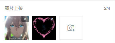
</form>图片上传
图片相关操作的API,自己看一下哈,我没什么好说的
<form>
<view class="cu-form-group">
<view class="grid col-4 grid-square flex-sub">
<view class="bg-img" v-for="(item,index) in imgList" :key="index" @tap="ViewImage" :data-url="imgList[index]">
<image :src="imgList[index]" mode="aspectFill"></image>
<view class="cu-tag bg-red" @tap.stop="DelImg" :data-index="index">
<text class='cuIcon-close'></text>
</view>
</view>
<view class="solids" @tap="ChooseImage" v-if="imgList.length<4">
<text class='cuIcon-cameraadd'></text>
</view>
</view>
</view>
</form>
<script>
export default {
data() {
return {
index: -1,
imgList: []
};
},
methods: {
ChooseImage() {
uni.chooseImage({
count: 4, //默认9
sizeType: ['original', 'compressed'], //可以指定是原图还是压缩图,默认二者都有
sourceType: ['album'], //从相册选择
success: (res) => {
if (this.imgList.length != 0) {
this.imgList = this.imgList.concat(res.tempFilePaths)
} else {
this.imgList = res.tempFilePaths
}
}
});
},
ViewImage(e) {
uni.previewImage({
urls: this.imgList,
current: e.currentTarget.dataset.url
});
},
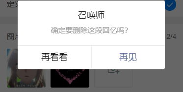
DelImg(e) {
uni.showModal({
title: '召唤师',
content: '确定要删除这段回忆吗?',
cancelText: '再看看',
confirmText: '再见',
success: res => {
if (res.confirm) {
this.imgList.splice(e.currentTarget.dataset.index, 1)
}
}
})
}
}
}
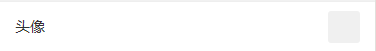
</script>头像
这个样式可以用于用户修改个人资料中,修改头像
<form>
	<view class="cu-form-group margin-top">
		<view class="title">头像</view>
		<view class="cu-avatar radius bg-gray"></view>
	</view>
</form>
多行文本
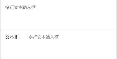
<form>
	<!-- !!!!! placeholder 在ios表现有偏移 建议使用 第一种样式 -->
	<view class="cu-form-group margin-top">
		<textarea maxlength="-1" :disabled="modalName!=null" @input="textareaAInput" placeholder="多行文本输入框"></textarea>
	</view>
	<view class="cu-form-group align-start">
		<view class="title">文本框</view>
		<textarea maxlength="-1" :disabled="modalName!=null" @input="textareaBInput" placeholder="多行文本输入框"></textarea>
	</view>
</form>
表单相关class
| class | 说明 | 可选值 |
|---|---|---|
| cu-form-group | 表单子元素 | —— |
| title | 标题(自定义宽度) | —— |
TimeLine时间轴
默认
时间轴默认结构如下代码,由cu-timeline包裹cu-time和cu-item,在item内编写内容,由content包裹
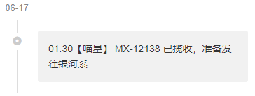
<view class="cu-timeline">
	<view class="cu-time">06-17</view>
	<view class="cu-item">
		<view class="content">
			<text>01:30</text> 【喵星】 MX-12138 已揽收,准备发往银河系
		</view>
	</view>
</view>
多彩时间轴
这个与默认的基本格式相同,只是自定义了内容框颜色和图标,结合基础元素的样式,你可以写个彩虹

<view class="cu-timeline">
	<view class="cu-time">昨天</view>
	<view class="cu-item cur cuIcon-noticefill">
		<view class="content bg-green shadow-blur">
			<text>22:22</text> 【广州市】快件已到达地球
		</view>
	</view>
	<view class="cu-item text-red cuIcon-attentionforbidfill">
		<view class="content bg-red shadow-blur">
			这是第一次,我家的铲屎官走了这么久。久到足足有三天!!
		</view>
	</view>
	<view class="cu-item text-grey cuIcon-evaluate_fill">
		<view class="content bg-grey shadow-blur">
			这是第一次,我家的铲屎官走了这么久。
		</view>
	</view>
	<view class="cu-item text-blue">
		<view class="bg-blue content">
			<text>20:00</text> 【月球】快件已到达月球,准备发往地球
		</view>
		<view class="bg-cyan content">
			<text>10:00</text> 【银河系】快件已到达银河系,准备发往月球
		</view>
	</view>
</view>
自定义
上一个是简单的修改了颜色图标,这一个则是稍微复杂一点,结合之前的标签、列表等,丰富了内容

<view class="cu-timeline">
	<view class="cu-time">06-17</view>
	<view class="cu-item">
		<view class="content">
			<view class="cu-capsule radius">
				<view class="cu-tag bg-cyan">上午</view>
				<view class="cu-tag line-cyan">10:00</view>
			</view>
			<view class="margin-top">这是第一次,我家的铲屎官走了这么久。久到足足有三天!! 在听到他的脚步声响在楼梯间的那一刻,我简直想要破门而出,对着他狠狠地吼上10分钟,然后再看心情要不要他进门。</view>
		</view>
	</view>
	<view class="cu-item text-blue">
		<view class="bg-blue shadow-blur content">
			<view class="cu-list menu-avatar radius">
				<view class="cu-item">
					<view class="cu-avatar round lg" style="background-image:url(https://ossweb-img.qq.com/images/lol/web201310/skin/big10006.jpg);"></view>
					<view class="content">
						<view class="text-grey">文晓港</view>
						<view class="text-gray text-sm">
							<text class="cuIcon-infofill text-red"></text> 消息未送达</view>
					</view>
					<view class="action">
						<view class="text-grey text-xs">22:20</view>
						<view class="cu-tag round bg-grey sm">5</view>
					</view>
				</view>
				<view class="cu-item">
					<view class="cu-avatar round lg" style="background-image:url(https://ossweb-img.qq.com/images/lol/web201310/skin/big10006.jpg);">
						<view class="cu-tag badge">99+</view>
					</view>
					<view class="content">
						<view class="text-grey">文晓港
							<view class="cu-tag round orange sm">SVIP</view>
						</view>
						<view class="text-gray text-sm">
							<text class="cuIcon-redpacket_fill text-red"></text> 收到红包</view>
					</view>
					<view class="action">
						<view class="text-grey text-xs">22:20</view>
						<text class="cuIcon-notice_forbid_fill text-gray"></text>
					</view>
				</view>
			</view>
		</view>
	</view>
</view>
时间轴相关class
| class | 说明 | 可选值 |
|---|---|---|
| cu-timeline | 时间轴必选值 | —— |
| cu-time | 时间 | —— |
| cu-item | 子元素 | —— |
| content | 内容信息 | —— |
Chat聊天
cu-chat聊天必选值
基本样式
聊天的外部大框架是cu-chat,cu-item包裹某人的聊天信息,self表示右侧自己的聊天样式,main包含聊天内容,date表示消息时间,cu-info表示提示词

<view class="cu-chat">
	<view class="cu-item self">
		<view class="main">
			<view class="content bg-green shadow">
				<text>喵喵喵!喵喵喵!喵喵喵!喵喵!喵喵!!喵!喵喵喵!</text>
			</view>
		</view>
		<view class="cu-avatar radius" style="background-image:url(https://ossweb-img.qq.com/images/lol/web201310/skin/big107000.jpg);"></view>
		<view class="date">2018年3月23日 13:23</view>
	</view>
	<view class="cu-info round">对方撤回一条消息!</view>
	<view class="cu-item">
		<view class="cu-avatar radius" style="background-image:url(https://ossweb-img.qq.com/images/lol/web201310/skin/big143004.jpg);"></view>
		<view class="main">
			<view class="content shadow">
				<text>喵喵喵!喵喵喵!</text>
			</view>
		</view>
		<view class="date "> 13:23</view>
	</view>
	<view class="cu-info">
		<text class="cuIcon-roundclosefill text-red "></text> 对方拒绝了你的消息
	</view>
	<view class="cu-info">
		对方开启了好友验证,你还不是他(她)的好友。请先发送好友验证请求,对方验证通过后,才能聊天。
		<text class="text-blue">发送好友验证</text>
	</view>
</view>
其他聊天内容
聊天内容除了语句,还有图片,语音消息,地理位置消息等 ,main包含的聊天内容不止是消息框里的,还有消息框旁边的提示图标文字等,消息框里的内容由content包裹

<view class="cu-chat">
	<view class="cu-item self">
		<view class="main">
			<image src="https://ossweb-img.qq.com/images/lol/web201310/skin/big10006.jpg" class="radius" mode="widthFix"></image>
		</view>
		<view class="cu-avatar radius" style="background-image:url(https://ossweb-img.qq.com/images/lol/web201310/skin/big107000.jpg);"></view>
		<view class="date"> 13:23</view>
	</view>
	<view class="cu-item self">
		<view class="main">
			<view class="action text-bold text-grey">
				3"
			</view>
			<view class="content shadow">
				<text class="cuIcon-sound text-xxl padding-right-xl"> </text>
			</view>
		</view>
		<view class="cu-avatar radius" style="background-image:url(https://ossweb-img.qq.com/images/lol/web201310/skin/big107000.jpg);"></view>
		<view class="date">13:23</view>
	</view>
	<view class="cu-item self">
		<view class="main">
			<view class="action">
				<text class="cuIcon-locationfill text-orange text-xxl"></text>
			</view>
			<view class="content shadow">
				喵星球,喵喵市
			</view>
		</view>
		<view class="cu-avatar radius" style="background-image:url(https://ossweb-img.qq.com/images/lol/web201310/skin/big107000.jpg);"></view>
		<view class="date">13:23</view>
	</view>
	<view class="cu-item">
		<view class="cu-avatar radius" style="background-image:url(https://ossweb-img.qq.com/images/lol/web201310/skin/big143004.jpg);"></view>
		<view class="main">
			<view class="content shadow">
				@#$^&**
			</view>
			<view class="action text-grey">
				<text class="cuIcon-warnfill text-red text-xxl"></text> <text class="text-sm margin-left-sm">翻译错误</text>
			</view>
		</view>
		<view class="date">13:23</view>
	</view>
</view>
发送框
发送框就是之前的操作条,相关内容看最上面操作条的讲解
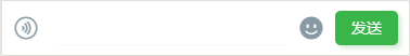
<view class="cu-bar foot input" :style="[{bottom:InputBottom+'px'}]">
	<view class="action">
		<text class="cuIcon-sound text-grey"></text>
	</view>
	<input class="solid-bottom" :adjust-position="false" :focus="false" maxlength="300" cursor-spacing="10"
	 @focus="InputFocus" @blur="InputBlur"></input>
	<view class="action">
		<text class="cuIcon-emojifill text-grey"></text>
	</view>
	<button class="cu-btn bg-green shadow">发送</button>
</view>
聊天相关class
| class | 说明 | 可选值 |
|---|---|---|
| cu-chat | 聊天必选值 | —— |
| cu-item | 子元素 | —— |
| self | 右侧本人的聊天样式 | —— |
| main | 聊天内容 | —— |
| content | 消息框内容 | —— |
| date | 消息日期 | —— |
| cu-info | 提示词 | —— |
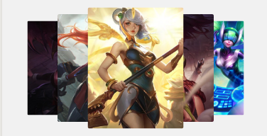
Swiper轮播图
全屏限高轮播
这是最常见的轮播图,添加类名screen-swiper,宽度为全屏,高度自定义,请直接参考swiper官方文档,可以通过类名square-dot和round-dot定义小圆点样式
<template>
	<view>
		<swiper class="screen-swiper" :class="dotStyle?'square-dot':'round-dot'" :indicator-dots="true" :circular="true"
		 :autoplay="true" interval="5000" duration="500">
			<swiper-item v-for="(item,index) in swiperList" :key="index">
				<image :src="item.url" mode="aspectFill" v-if="item.type=='image'"></image>
				<video :src="item.url" autoplay loop muted :show-play-btn="false" :controls="false" objectFit="cover" v-if="item.type=='video'"></video>
			</swiper-item>
		</swiper>
	</view>
</template>

<script>
	export default {
		data() {
			return {
				swiperList: [{
					id: 0,
					type: 'image',
					url: 'https://ossweb-img.qq.com/images/lol/web201310/skin/big84000.jpg'
				}, {
					id: 1,
					type: 'image',
					url: 'https://ossweb-img.qq.com/images/lol/web201310/skin/big37006.jpg',
				}, {
					id: 2,
					type: 'image',
					url: 'https://ossweb-img.qq.com/images/lol/web201310/skin/big39000.jpg'
				}, {
					id: 3,
					type: 'image',
					url: 'https://ossweb-img.qq.com/images/lol/web201310/skin/big10001.jpg'
				}],
				dotStyle: true
			};
		}
	}
</script>
卡片式轮播
在swiper标签上添加类名card-swiper,在swiper-item标签内的子元素上添加类名swiper-item,示例中cardSwiper函数的主要作用是切换类名cur,cur的作用是实现轮播图片中间大,两边小的效果,就是transform的scale()

<swiper class="card-swiper" :class="dotStyle?'square-dot':'round-dot'" :indicator-dots="true" :circular="true"
 :autoplay="true" interval="5000" duration="500" @change="cardSwiper" indicator-color="#8799a3"
 indicator-active-color="#0081ff">
	<swiper-item v-for="(item,index) in swiperList" :key="index" :class="cardCur==index?'cur':''">
		<view class="swiper-item">
			<image :src="item.url" mode="aspectFill" v-if="item.type=='image'"></image>
			<video :src="item.url" autoplay loop muted :show-play-btn="false" :controls="false" objectFit="cover" v-if="item.type=='video'"></video>
		</view>
	</swiper-item>
</swiper>

cardSwiper(e) {
    this.cardCur = e.detail.current
},
堆叠式轮播
堆叠轮播是原生写的,注意类名tower-swiper、tower-item以及swiper-item的配合使用,这主要是通过层级的高低来显示图片的,使用时需要配合js和css。(这种轮播图初始化展示效果如图二,需要触动一下才会展示如图一的效果,可以通过在onload()函数中给变量direction赋值解决)

<template>
	<view>
		<view class="tower-swiper" @touchmove="TowerMove" @touchstart="TowerStart" @touchend="TowerEnd">
			<view class="tower-item" :class="item.zIndex==1?'none':''" v-for="(item,index) in swiperList" :key="index" :style="[{'--index': item.zIndex,'--left':item.mLeft}]" :data-direction="direction">
				<view class="swiper-item">
					<image :src="item.url" mode="aspectFill" v-if="item.type=='image'"></image>
					<video :src="item.url" autoplay loop muted :show-play-btn="false" :controls="false" objectFit="cover" v-if="item.type=='video'"></video>
				</view>
			</view>
		</view>
	</view>
</template>

<script>
	export default {
		data() {
			return {
				swiperList: [{
					id: 0,
					type: 'image',
					url: 'https://ossweb-img.qq.com/images/lol/web201310/skin/big84000.jpg'
				}, {
					id: 1,
					type: 'image',
					url: 'https://ossweb-img.qq.com/images/lol/web201310/skin/big37006.jpg',
				}, {
					id: 2,
					type: 'image',
					url: 'https://ossweb-img.qq.com/images/lol/web201310/skin/big39000.jpg'
				}, {
					id: 3,
					type: 'image',
					url: 'https://ossweb-img.qq.com/images/lol/web201310/skin/big10001.jpg'
				}, {
					id: 4,
					type: 'image',
					url: 'https://ossweb-img.qq.com/images/lol/web201310/skin/big25011.jpg'
				}, {
					id: 5,
					type: 'image',
					url: 'https://ossweb-img.qq.com/images/lol/web201310/skin/big21016.jpg'
				}, {
					id: 6,
					type: 'image',
					url: 'https://ossweb-img.qq.com/images/lol/web201310/skin/big99008.jpg'
				}],
				towerStart: 0,
				direction: ''
			};
		},
		onLoad() {
			this.TowerSwiper('swiperList');
                        this.direction = 'left';
			// 初始化towerSwiper 传已有的数组名即可
		},
		methods: {
			// 初始化towerSwiper
			TowerSwiper(name) {
				let list = this[name];
				console.log(list)
				for (let i = 0; i < list.length; i++) {
					list[i].zIndex = parseInt(list.length / 2) + 1 - Math.abs(i - parseInt(list.length / 2))
					list[i].mLeft = i - parseInt(list.length / 2)
				}
				this.swiperList = list
			},
			// towerSwiper触摸开始
			TowerStart(e) {
				console.log(e)
				this.towerStart = e.touches[0].pageX
			},
			// towerSwiper计算方向
			TowerMove(e) {
				this.direction = e.touches[0].pageX - this.towerStart > 0 ? 'right' : 'left'
			},
			// towerSwiper计算滚动
			TowerEnd(e) {
				let direction = this.direction;
				let list = this.swiperList;
				if (direction == 'right') {
					let mLeft = list[0].mLeft;
					console.log(list[0])
					let zIndex = list[0].zIndex;
					for (let i = 1; i < this.swiperList.length; i++) {
						this.swiperList[i - 1].mLeft = this.swiperList[i].mLeft
						this.swiperList[i - 1].zIndex = this.swiperList[i].zIndex
					}
					this.swiperList[list.length - 1].mLeft = mLeft;
					this.swiperList[list.length - 1].zIndex = zIndex;
				} else {
					let mLeft = list[list.length - 1].mLeft;
					let zIndex = list[list.length - 1].zIndex;
					for (let i = this.swiperList.length - 1; i > 0; i--) {
						this.swiperList[i].mLeft = this.swiperList[i - 1].mLeft
						this.swiperList[i].zIndex = this.swiperList[i - 1].zIndex
					}
					this.swiperList[0].mLeft = mLeft;
					this.swiperList[0].zIndex = zIndex;
				}
				this.direction = ""
				this.swiperList = this.swiperList
			},
		}
	}
</script>

<style>
	.tower-swiper .tower-item {
		transform: scale(calc(0.5 + var(--index) / 10));
		margin-left: calc(var(--left) * 100upx - 150upx);
		z-index: var(--index);
	}
</style>
轮播图相关class
| class | 说明 | 可选值 |
|---|---|---|
| screen-swiper | 全屏限高轮播 | —— |
| square-dot | 方形指示点 | —— |
| round-dot | 圆形指示点 | —— |
| card-swiper | 卡片式轮播 | —— |
| swiper-item | 滑动切换区域(具体看示例) | —— |
| tower-swiper | 堆叠式轮播 | —— |
| tower-item | 堆叠式轮播子元素 | —— |
Modal模态框
cu-modal和cu-dialog为模态框必选值,所有模态框的大体框架都是cu-modal包裹cu-dialog,cu-dialog内部填充操作部分和信息展示部分,操作部分可以用cu-bar操作条来布局,信息展示就直接写。弹框的显示隐藏是通过添加或移除类名show来实现的,示例中隐藏弹框是绑定tap调用hideModal事件,hideModal函数内执行的语句就是将变量modalName赋值为null,从而移除类名show,你想让用户点击哪里隐藏弹框,就可以把hideModal事件绑定在哪里(比如设置点击遮罩层隐藏弹框,就把hideModal事件绑定在有类名cu-modal的标签上)
普通窗口
普通窗口就是cu-modal包裹cu-dialog,只做信息的展示,没有交互效果
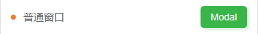
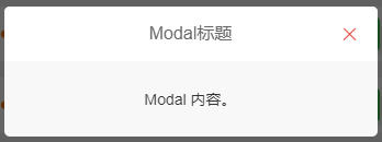
<view class="cu-modal" :class="modalName=='Modal'?'show':''">
	<view class="cu-dialog">
		<view class="cu-bar bg-white justify-end">
			<view class="content">Modal标题</view>
			<view class="action" @tap="hideModal">
				<text class="cuIcon-close text-red"></text>
			</view>
		</view>
		<view class="padding-xl">
			Modal 内容。
		</view>
	</view>
</view>
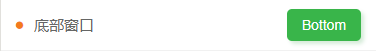
底部窗口
cu-modal结合bottom-modal实现底部弹窗
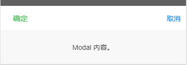
<view class="cu-modal bottom-modal" :class="modalName=='bottomModal'?'show':''">
	<view class="cu-dialog">
		<view class="cu-bar bg-white">
			<view class="action text-green">确定</view>
			<view class="action text-blue" @tap="hideModal">取消</view>
		</view>
		<view class="padding-xl">
			Modal 内容。
		</view>
	</view>
</view>
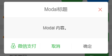
对话窗口
对话窗口相较于普通窗口底部多了一些用户交互的操作
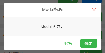
//示例一
<view class="cu-modal" :class="modalName=='DialogModal1'?'show':''">
	<view class="cu-dialog">
		<view class="cu-bar bg-white justify-end">
			<view class="content">Modal标题</view>
			<view class="action" @tap="hideModal">
				<text class="cuIcon-close text-red"></text>
			</view>
		</view>
		<view class="padding-xl">
			Modal 内容。
		</view>
		<view class="cu-bar bg-white justify-end">
			<view class="action">
				<button class="cu-btn line-green text-green" @tap="hideModal">取消</button>
				<button class="cu-btn bg-green margin-left" @tap="hideModal">确定</button>
			</view>
		</view>
	</view>
</view>
//示例二
<view class="cu-modal" :class="modalName=='DialogModal2'?'show':''">
	<view class="cu-dialog">
		<view class="cu-bar bg-white justify-end">
			<view class="content">Modal标题</view>
			<view class="action" @tap="hideModal">
				<text class="cuIcon-close text-red"></text>
			</view>
		</view>
		<view class="padding-xl">
			Modal 内容。
		</view>
		<view class="cu-bar bg-white">
			<view class="action margin-0 flex-sub text-green " @tap="hideModal">
				<text class="cuIcon-moneybag"></text>微信支付</view>
			<view class="action margin-0 flex-sub text-green solid-left" @tap="hideModal">取消</view>
			<view class="action margin-0 flex-sub  solid-left" @tap="hideModal">确定</view>
		</view>
	</view>
</view>
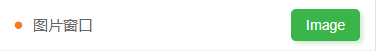
图片窗口
图片窗口用于图片的展示,也可自定义操作

<view class="cu-modal" :class="modalName=='Image'?'show':''">
	<view class="cu-dialog">
		<view class="bg-img" style="background-image: url('https://ossweb-img.qq.com/images/lol/web201310/skin/big91012.jpg');height:200px;">
			<view class="cu-bar justify-end text-white">
				<view class="action" @tap="hideModal">
					<text class="cuIcon-close "></text>
				</view>
			</view>
		</view>
		<view class="cu-bar bg-white">
			<view class="action margin-0 flex-sub  solid-left" @tap="hideModal">我知道了</view>
		</view>
	</view>
</view>
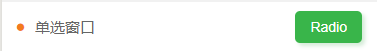
单选窗口
单选窗口是普通窗口内部结合radio标签编写的

<view class="cu-modal" :class="modalName=='RadioModal'?'show':''" @tap="hideModal">
	<view class="cu-dialog" @tap.stop="">
		<radio-group class="block" @change="RadioChange">
			<view class="cu-list menu text-left">
				<view class="cu-item" v-for="(item,index) in 5" :key="index">
					<label class="flex justify-between align-center flex-sub">
						<view class="flex-sub">Item {

   {index +1}}</view>
						<radio class="round" :class="radio=='radio' + index?'checked':''" :checked="radio=='radio' + index?true:false"
						 :value="'radio' + index"></radio>
					</label>
				</view>
			</view>
		</radio-group>
	</view>
</view>
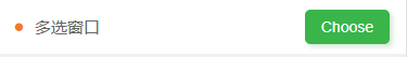
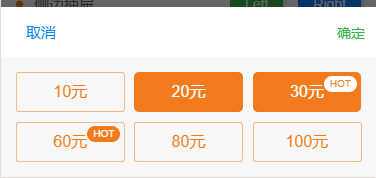
多选窗口
多选窗口的内容是配合grid布局自定义的
<view class="cu-modal bottom-modal" :class="modalName=='ChooseModal'?'show':''" @tap="hideModal">
	<view class="cu-dialog" @tap.stop="">
		<view class="cu-bar bg-white">
			<view class="action text-blue" @tap="hideModal">取消</view>
			<view class="action text-green" @tap="hideModal">确定</view>
		</view>
		<view class="grid col-3 padding-sm">
			<view v-for="(item,index) in checkbox" class="padding-xs" :key="index">
				<button class="cu-btn orange lg block" :class="item.checked?'bg-orange':'line-orange'" @tap="ChooseCheckbox"
				 :data-value="item.value"> {

   {item.name}}
					<view class="cu-tag sm round" :class="item.checked?'bg-white text-orange':'bg-orange'" v-if="item.hot">HOT</view>
				</button>
			</view>
		</view>
	</view>
</view>
<script>
	export default {
		data() {
			return {
				modalName: null,
				checkbox: [{value: 0,name: '10元',checked: false,hot: false,},
                           {value: 1,name: '20元',checked: true,hot: false,},
                           {value: 2,name: '30元',checked: true,hot: true,},
                           {value: 3,name: '60元',checked: false,hot: true,},
                           {value: 4,name: '80元',checked: false,hot: false,},
                           {value: 5,name: '100元',checked: false,hot: false,}
                          ]
			};
		},
		methods: {
			showModal(e) {
				this.modalName = e.currentTarget.dataset.target
			},
			hideModal(e) {
				this.modalName = null
			},
			ChooseCheckbox(e) {
				let items = this.checkbox;
				let values = e.currentTarget.dataset.value;
				for (let i = 0, lenI = items.length; i < lenI; ++i) {
					if (items[i].value == values) {
						items[i].checked = !items[i].checked;
						break
					}
				}
			}
		}
	}
</script>
侧边抽屉
cu-modal结合drawer-modal,由justify-start和justify-end决定抽屉方向
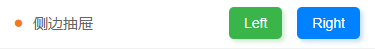


//左侧抽屉
<view class="cu-modal drawer-modal justify-start" :class="modalName=='DrawerModalL'?'show':''" @tap="hideModal">
	<view class="cu-dialog basis-lg" @tap.stop="">
		<view class="cu-list menu text-left">
			<view class="cu-item arrow" v-for="(item,index) in 5" :key="index">
				<view class="content">
					<view>Item {

   {index +1}}</view>
				</view>
			</view>
		</view>
	</view>
</view>
//右侧抽屉
<view class="cu-modal drawer-modal justify-end" :class="modalName=='DrawerModalR'?'show':''" @tap="hideModal">
	<view class="cu-dialog basis-lg" @tap.stop="" >
		<view class="cu-list menu text-left">
			<view class="cu-item arrow" v-for="(item,index) in 5" :key="index">
				<view class="content">
					<view>Item {

   {index +1}}</view>
				</view>
			</view>
		</view>
	</view>
</view>
Modal box related class
| class | illustrate | optional value |
|---|---|---|
| with-modal | Required value for modal box | —— |
| with-dialog | modal child element | —— |
| bottom-modal | Bottom popup | —— |
| drawer-modal | side popup | —— |
| show | Show popup | —— |
Steps step bar
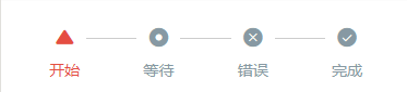
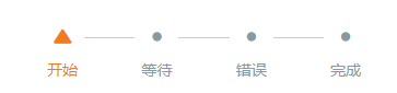
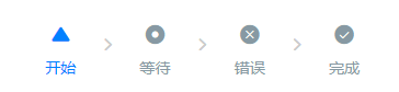
Required value of cu-steps step bar
default
Use cu-steps and cu-item together
<view class="bg-white padding">
	<view class="cu-steps">
		<view class="cu-item" :class="index>basics?'':'text-red'" v-for="(item,index) in basicsList" :key="index">
			<text :class="'cuIcon-' + item.cuIcon"></text> {

   {item.name}}
		</view>
	</view>
</view>

<script>
	export default {
		data() {
			return {
				basicsList: [{cuIcon: 'usefullfill',name: '开始'},
                                    {cuIcon: 'radioboxfill',name: '等待'},
                                    {cuIcon: 'roundclosefill',name: '错误'},
                                    {cuIcon: 'roundcheckfill',name: '完成'
				}],
				basics: 0
			};
		},
		methods: {
			BasicsSteps() {
				this.basics= this.basics == this.basicsList.length - 1 ? 0 : this.basics + 1
			}
		}
	}
</script>
The color and icon of the step bar can be customized
<view class="bg-white padding margin-top-xs">
	<view class="cu-steps">
		<view class="cu-item" :class="index>basics?'':'text-orange'" v-for="(item,index) in basicsList" :key="index">
			<text :class="index>basics?'cuIcon-title':'cuIcon-' + item.cuIcon"></text> {

   {item.name}}
		</view>
	</view>
</view>
The connection between steps is a horizontal line by default, and it can also be replaced by an arrow through the class name steps-arrow
<view class="bg-white padding  margin-top-xs">
	<view class="cu-steps steps-arrow">
		<view class="cu-item" :class="index>basics?'':'text-blue'" v-for="(item,index) in basicsList" :key="index">
			<text :class="'cuIcon-' + item.cuIcon"></text> {

   {item.name}}
		</view>
	</view>
</view>
digital completion
The default icon can be set to a number through the class name num , the completed and correct icon is a tick, and the completed but wrong icon is defined by the class name er r
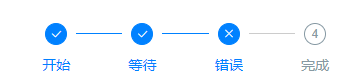
<view class="bg-white padding">
	<view class="cu-steps">
		<view class="cu-item" :class="index>num?'':'text-blue'" v-for="(item,index) in numList" :key="index">
			<text class="num" :class="index==2?'err':''" :data-index="index + 1"></text> {

   {item.name}}
		</view>
	</view>
</view>
multi-level display
Multi-level display needs to be used with the scroll-view tag , and the class name steps-bottom should be added
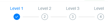
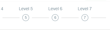
<scroll-view scroll-x class="bg-white padding response cu-steps steps-bottom" :scroll-into-view="'scroll-' + scroll"
 scroll-with-animation>
	<view class="cu-item padding-lr-xl" :class="index>scroll?'':'text-blue'" v-for="(item,index) in 10" :key="index" :id="'scroll-' + index">
		Level {

   {index + 1}} <text class="num" :data-index="index + 1"></text>
	</view>
</scroll-view>

<script>
	export default {
		data() {
			return {
				scroll: 0
			};
		},
		methods: {
			ScrollSteps() {
				this.scroll= this.scroll == 9 ? 0 : this.scroll + 1
			}
		}
	}
</script>
Step bar related class
| class | illustrate | optional value |
|---|---|---|
| with-steps | Step bar required value | —— |
| with-item | step sliver element | —— |
| num | Number steps bar incomplete icon | —— |
| err | error icon | —— |
| steps-arrow | Step Bar Connecting Arrows | —— |
| steps-bottom | Use with multi-level step bars (the icon is on the bottom, the text is on the top, and the style of other step bars will be messed up) | —— |
extension
This is the end of the interactive components. Please give me more advice on the deficiencies so that I can correct them in time. Following the previous blog on basic elements, we will write another article on the extension plug-in part, ColorUI Component Library Simple Tutorial Extension Plug- in