Table of contents
This article is the fourth part of the practical development tutorial for kindergarten small programs. We use three articles to explain the development of the first page and second-level pages. In this section, we continue to develop the subsequent pages.
News Announcement List Page
On the home page, we have realized clicking on the title of the announcement to enter the details page of the article. We also have a function of viewing more that has not been realized. First of all, we will create a list page of the announcement and
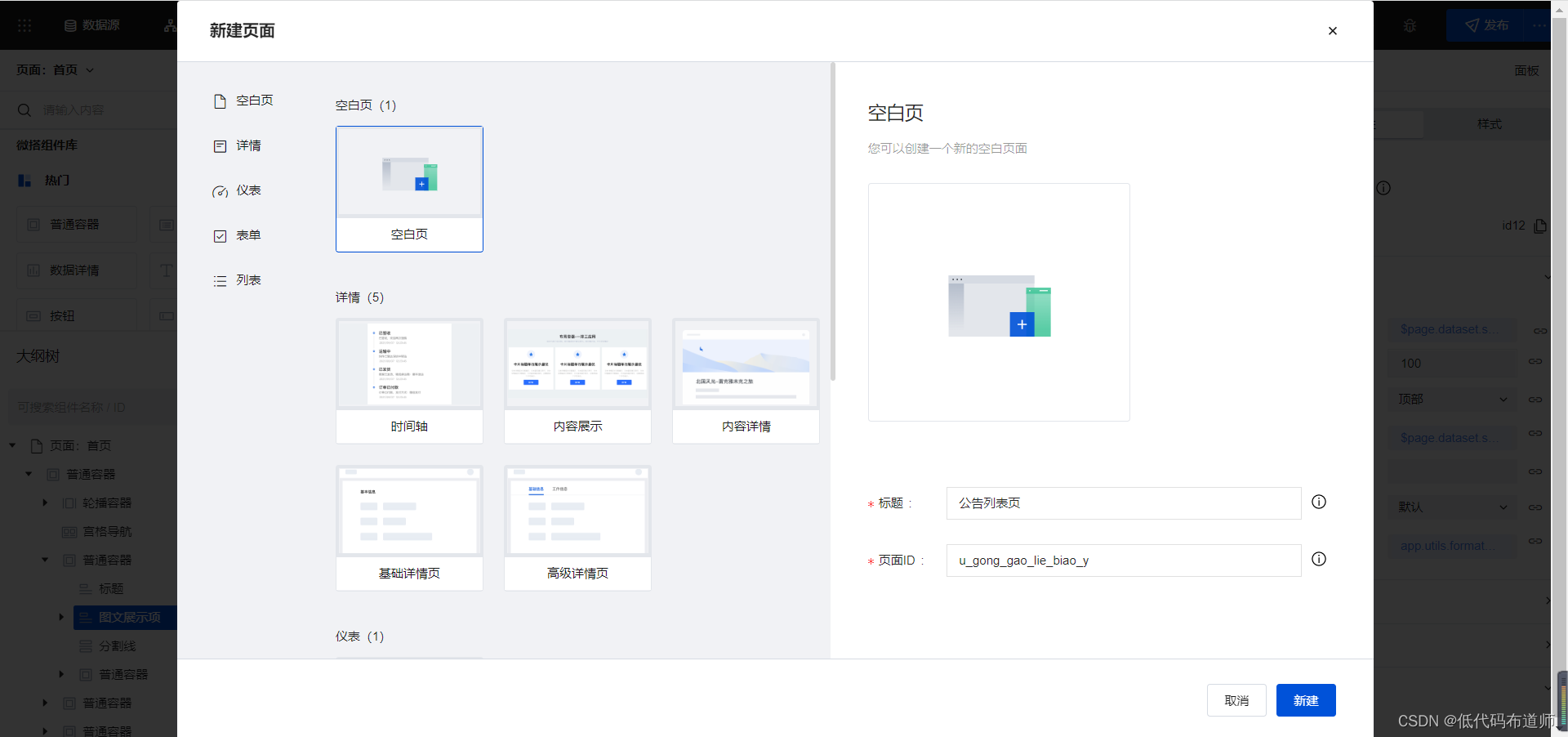
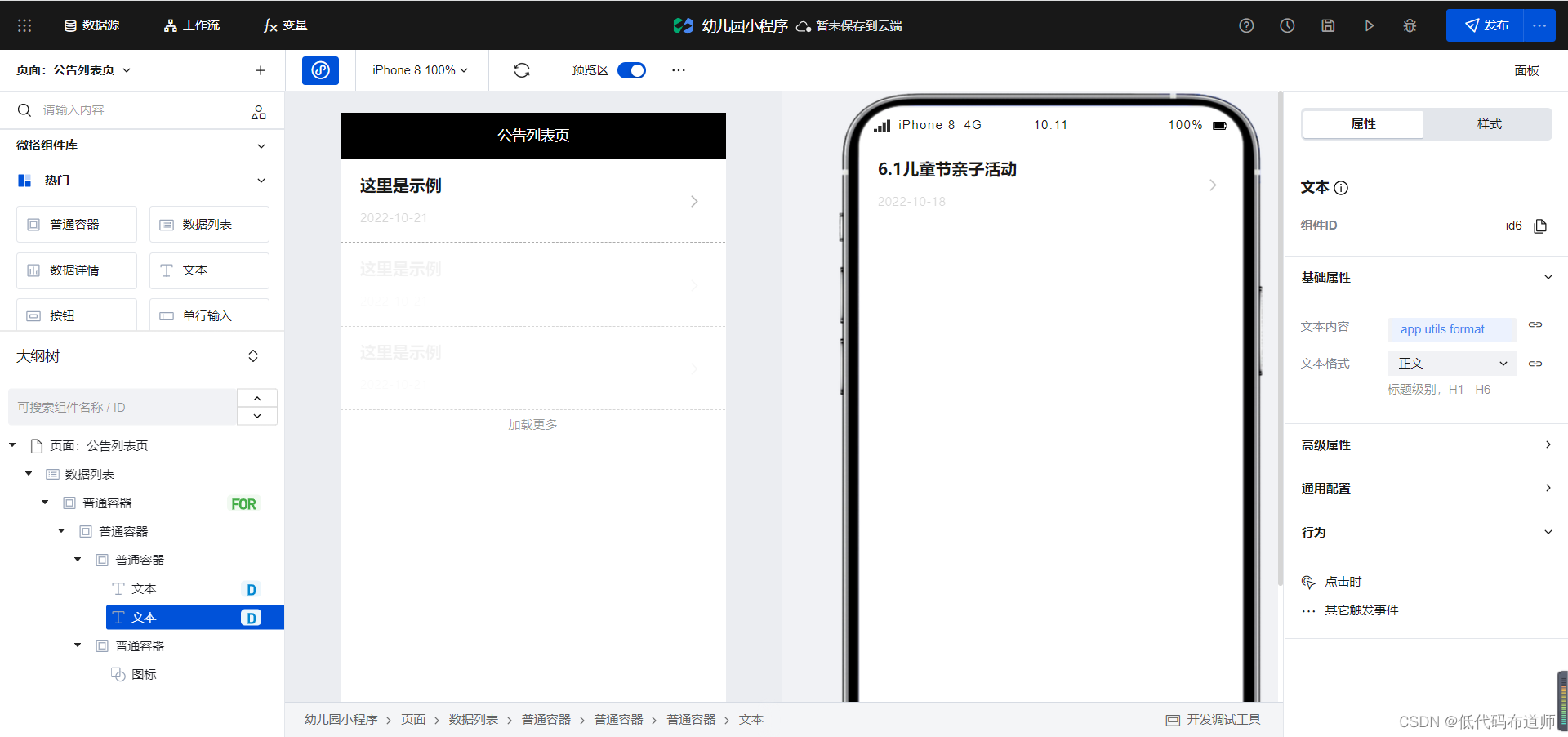
open the list page. Our article list can use the data list. Component implementation, add a data list component to the page,
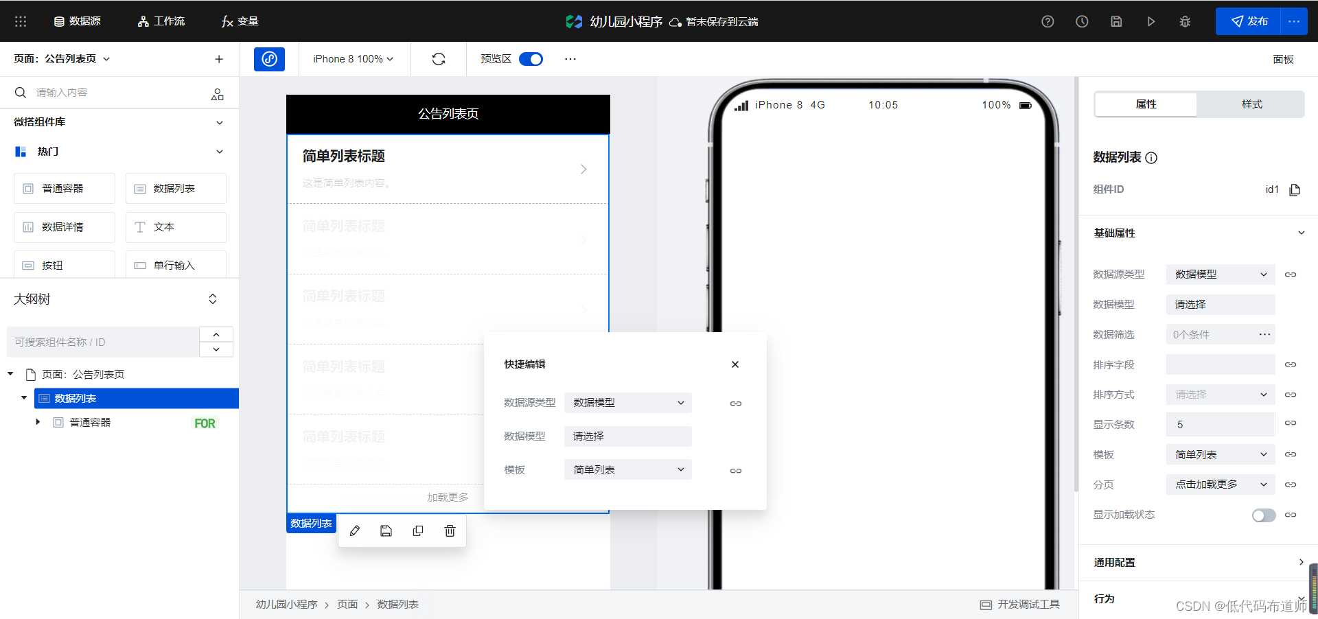
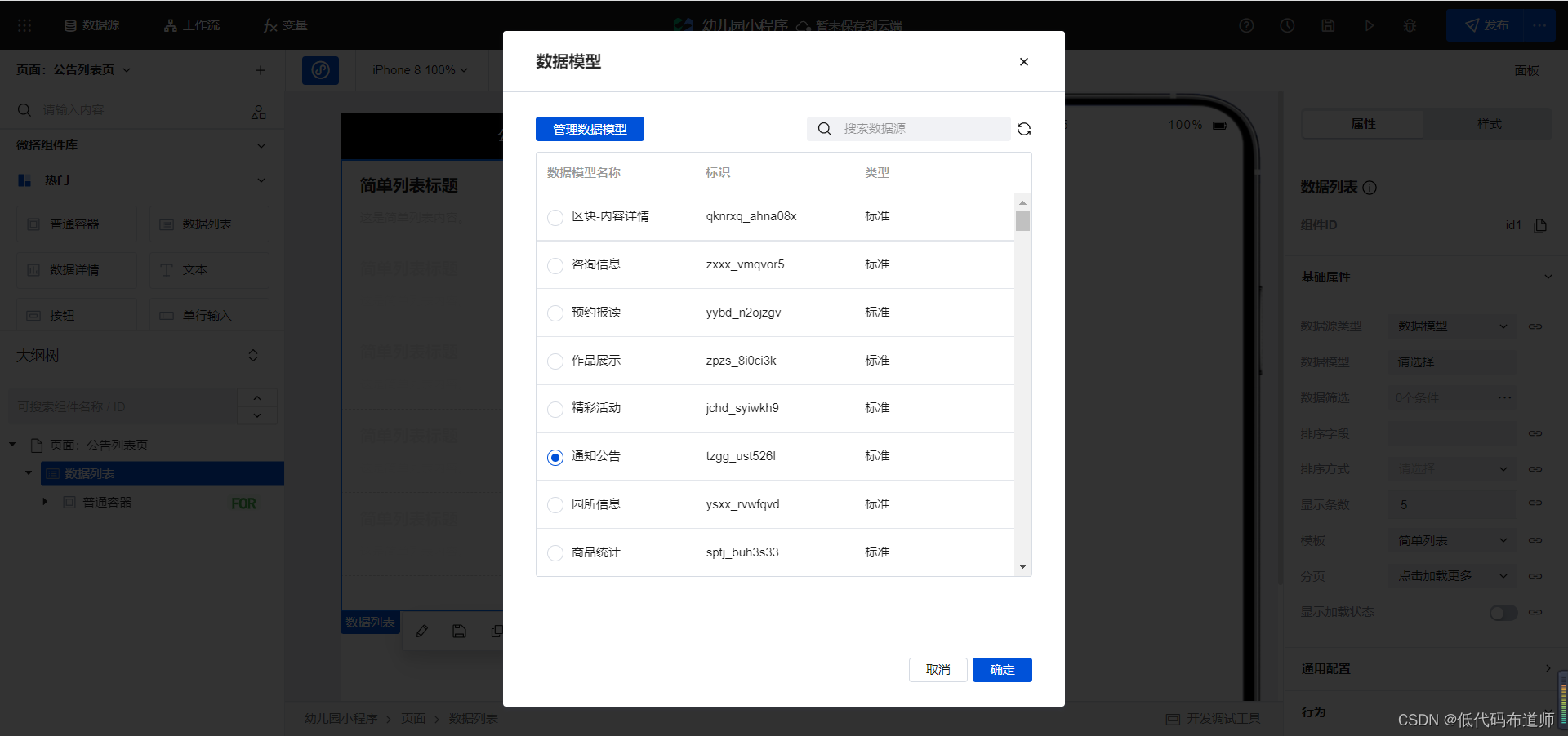
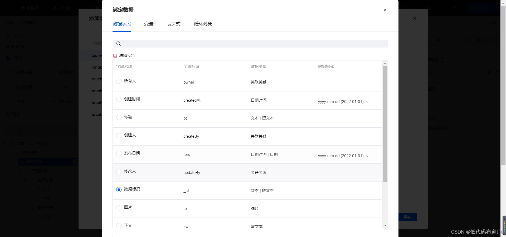
select our notification announcement data source , bind the text content of the first text component to the
title, and bind
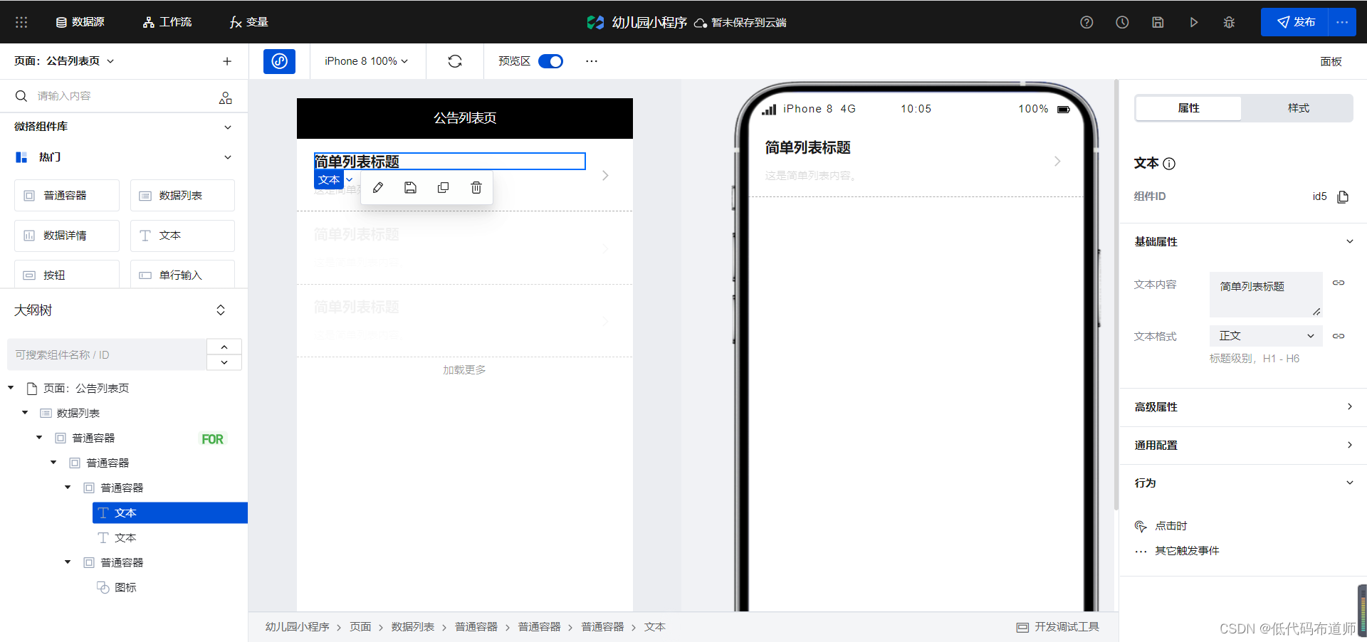
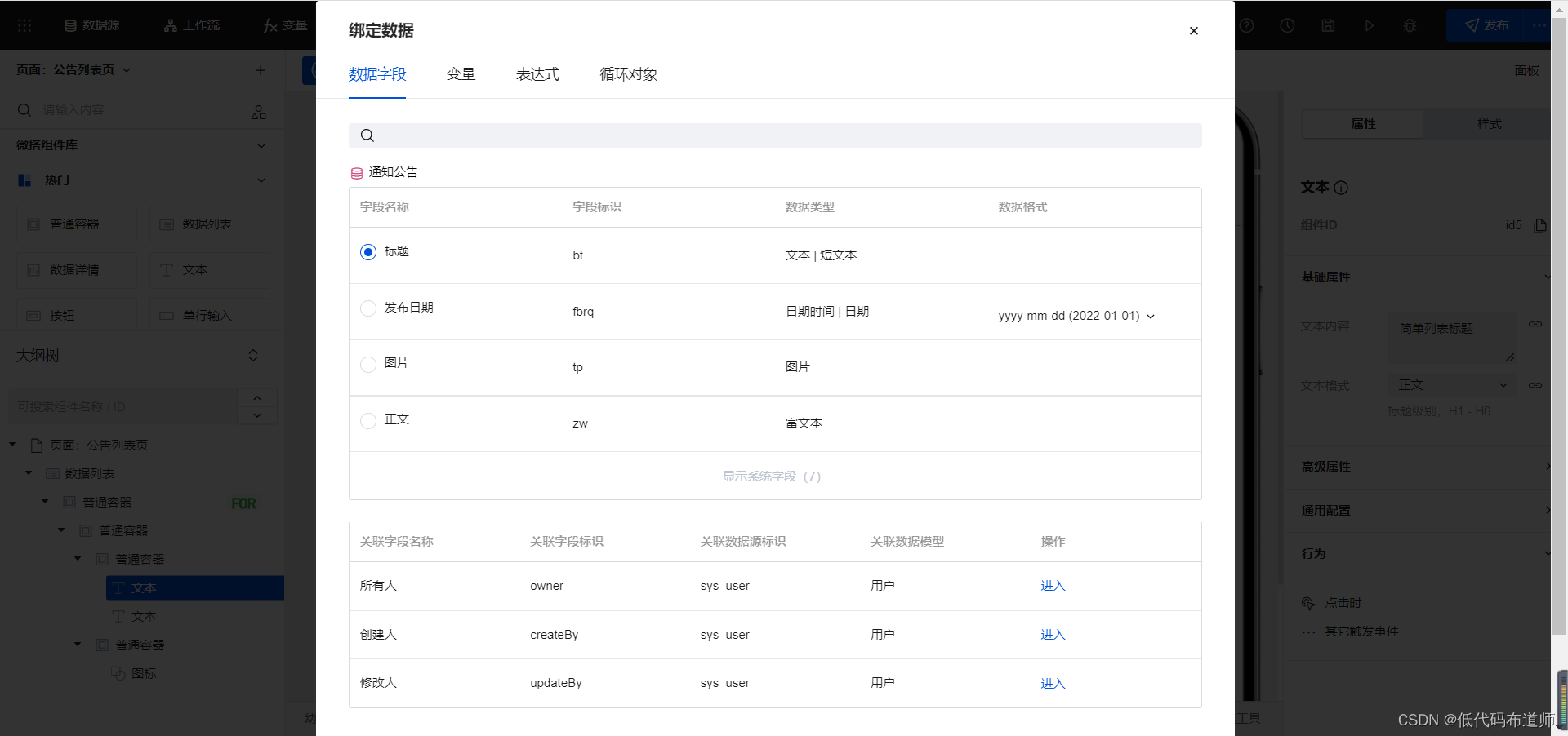
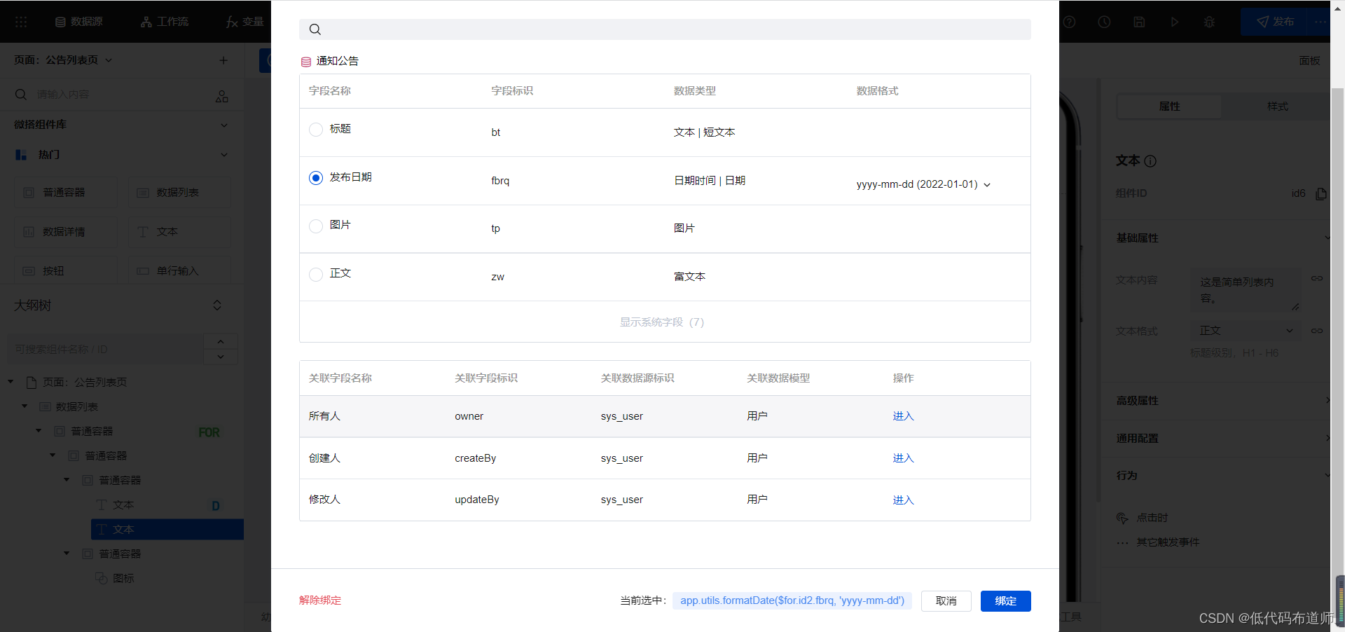
the text content of the second text component to the release date
content. After binding, we give Add behavior to common containers and jump to the details page.
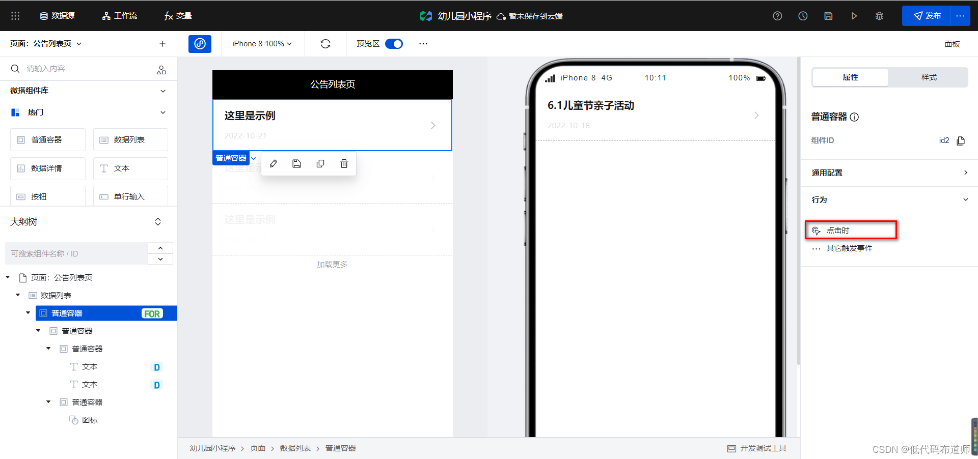
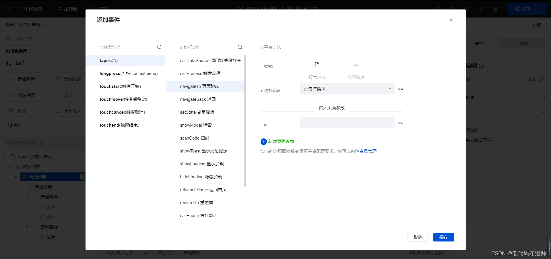
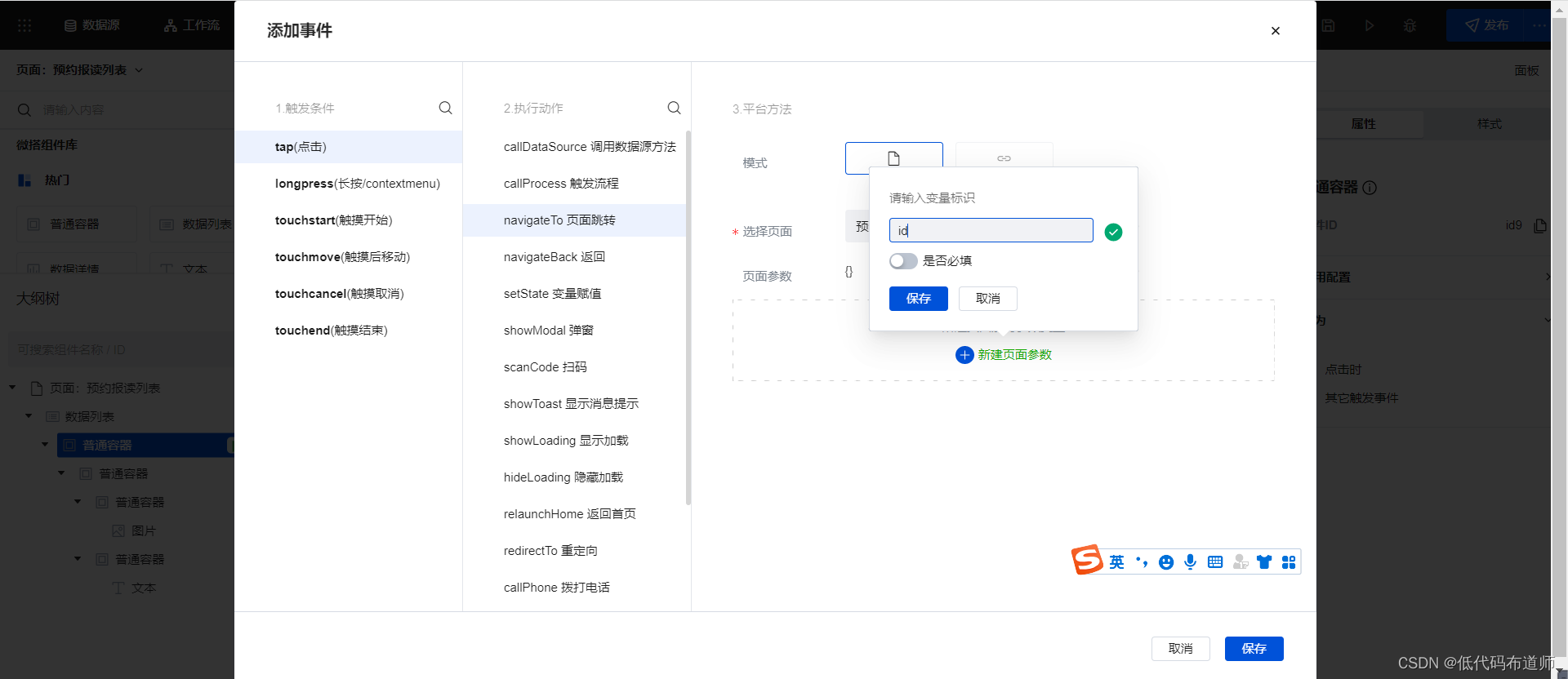
When jumping to the details page, we need to pass in the data identifier of the current data and
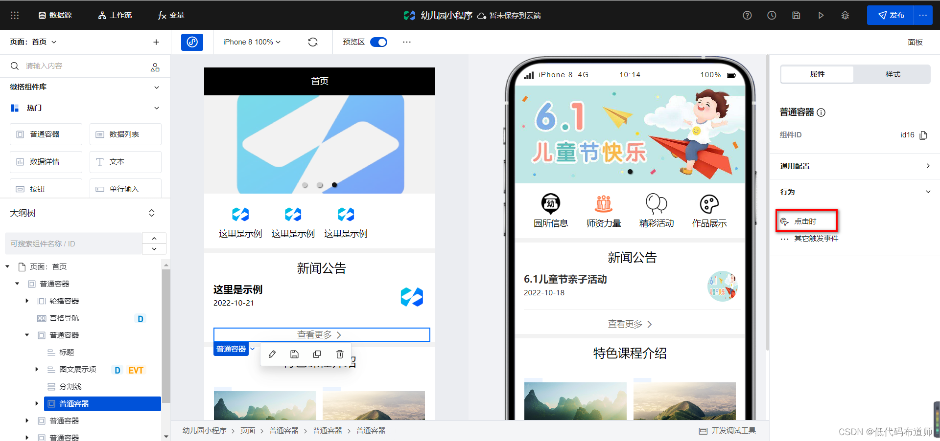
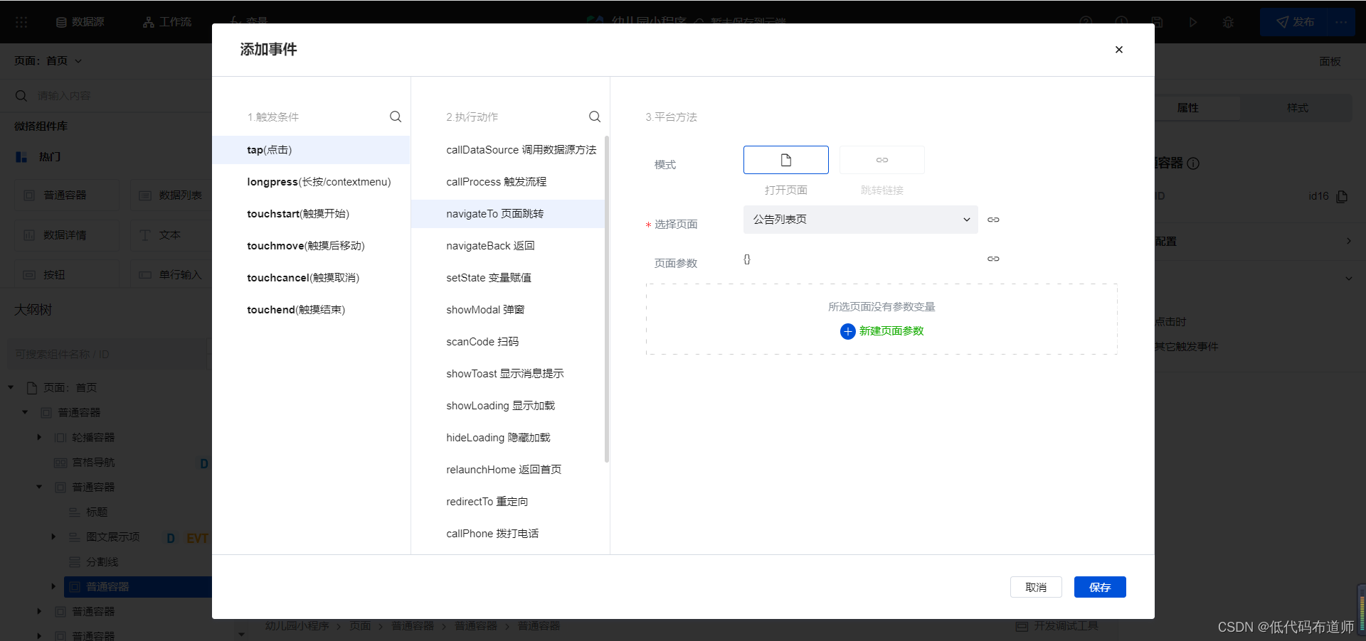
set it up. After that, we go back to the home page and set behaviors for viewing more common container components, jump to Go to the announcement list page
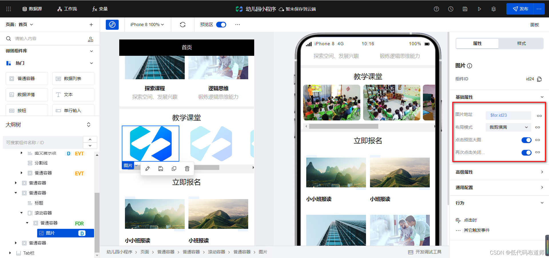
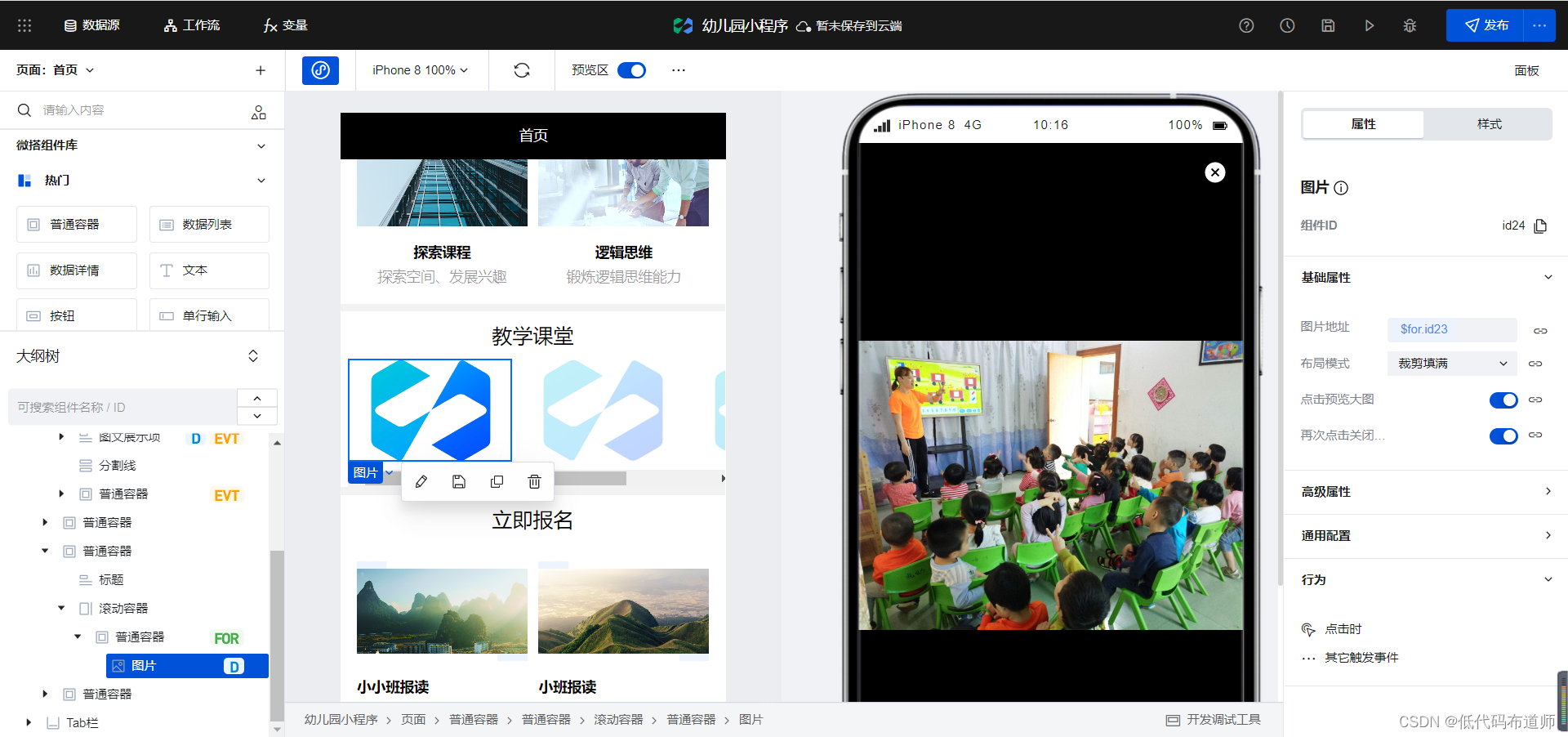
teaching classroom
In the teaching class, we add a function to click to preview the large image, just open the configuration
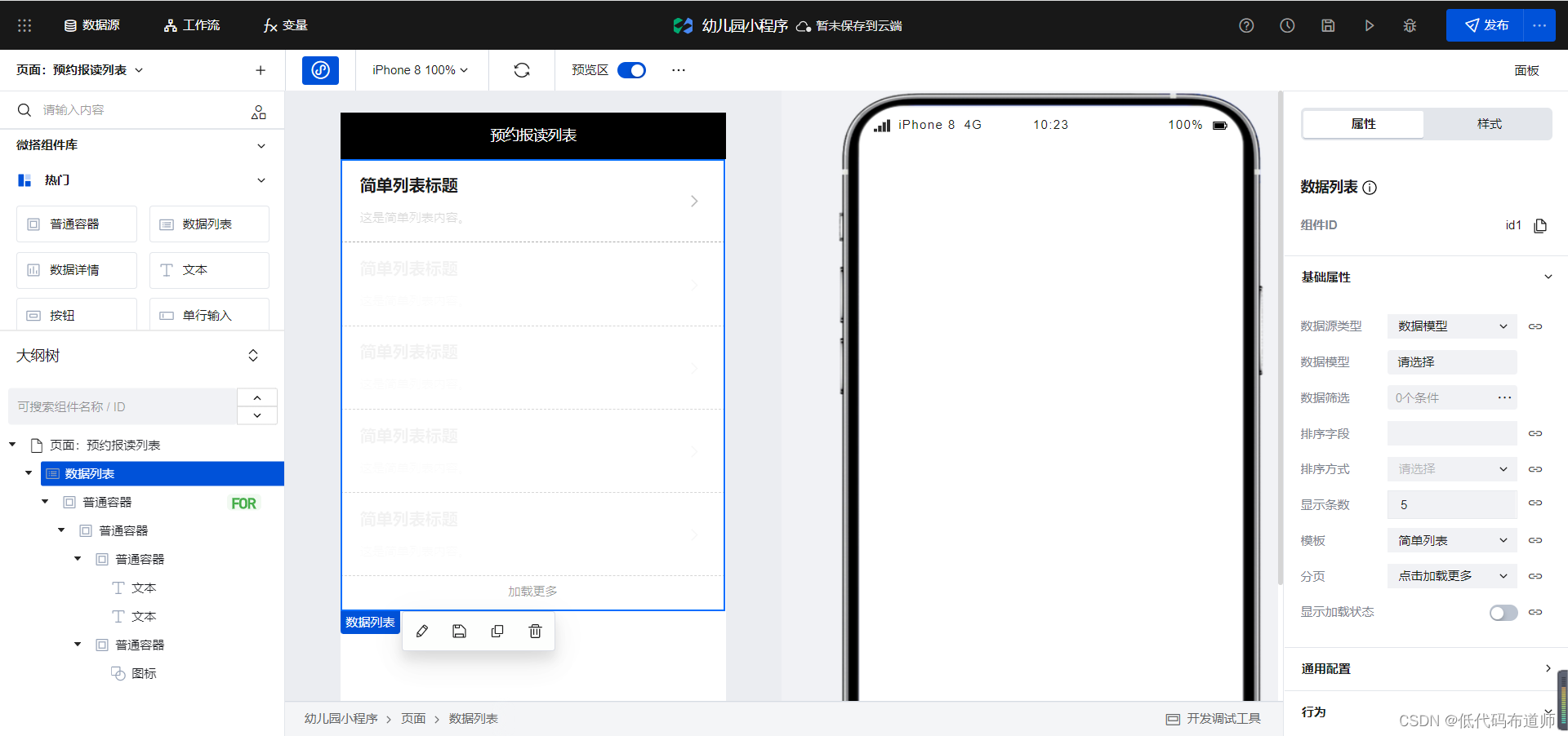
Appointment Enrollment List
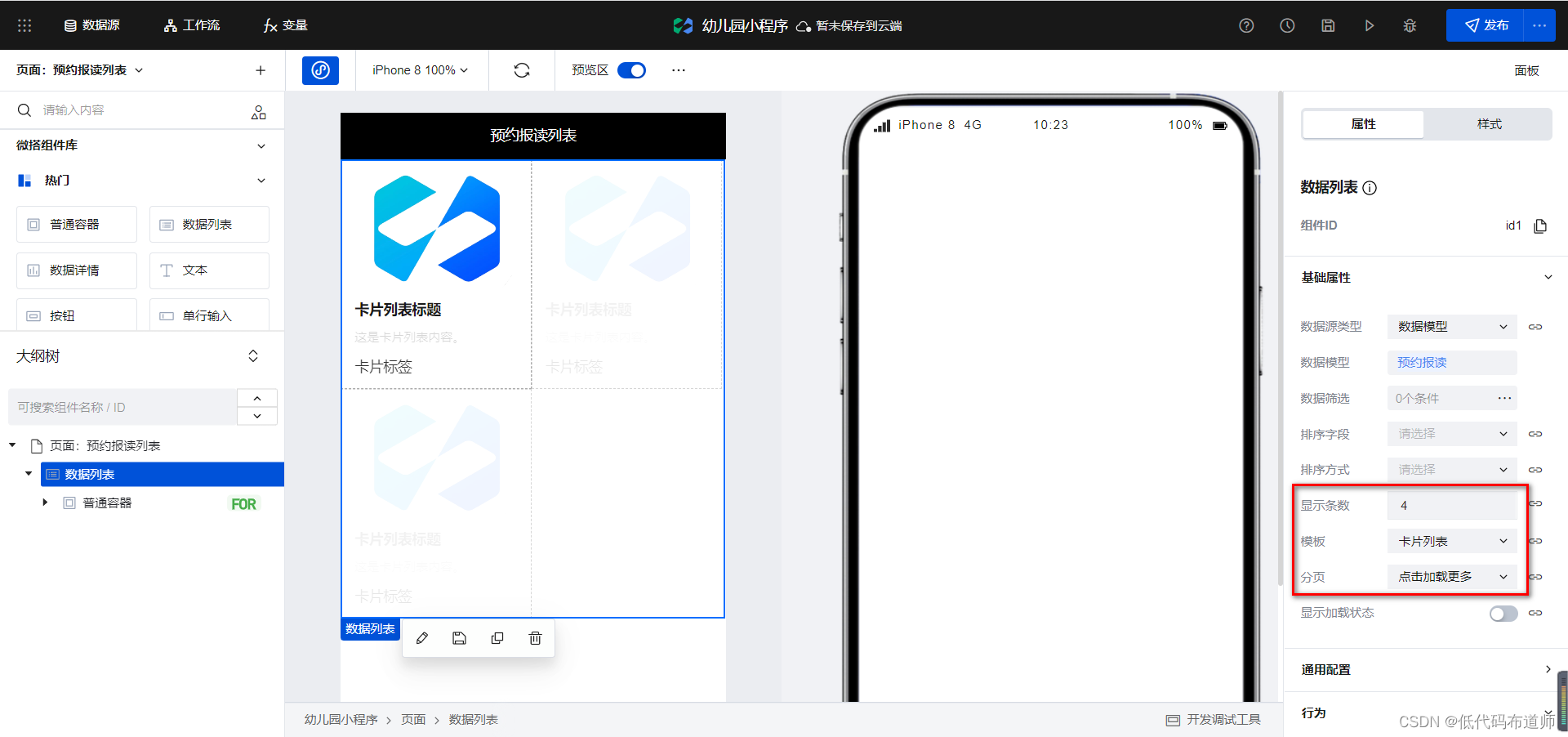
For the application list page, we also use the data list component for development, first add the data list component to the page,
select the data model to book an appointment,

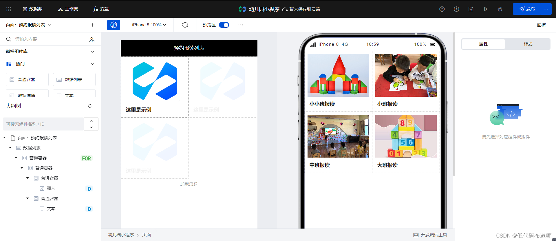
select the card list for the template, set the number of displayed items to 4
, and then select the picture component to bind the address as a list Image
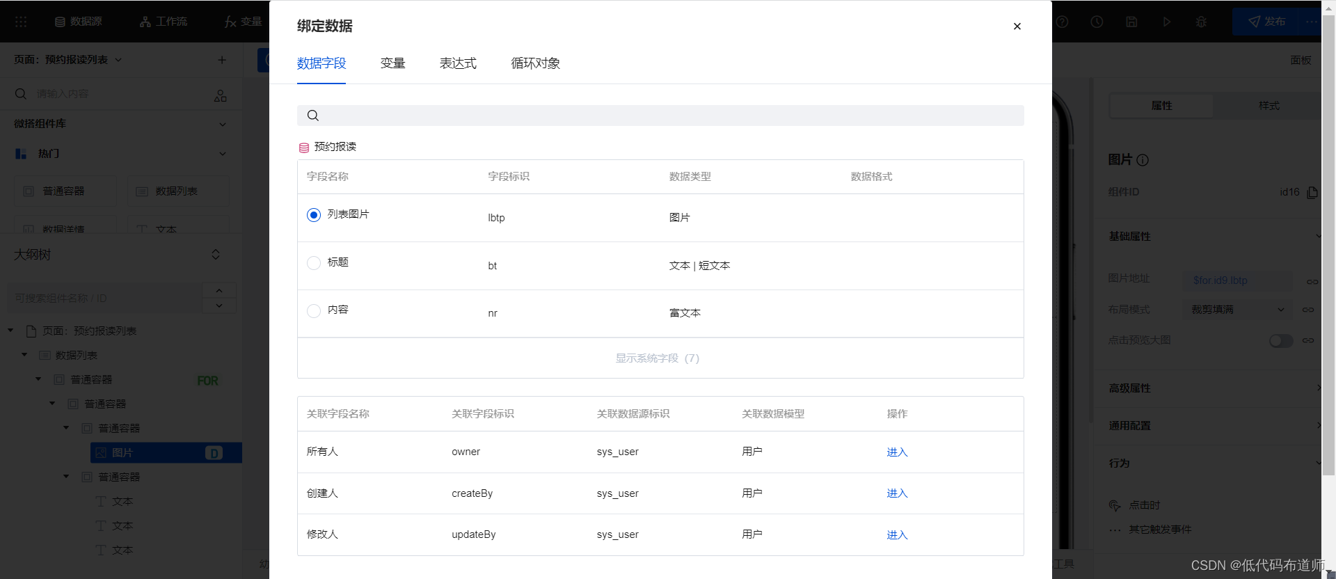
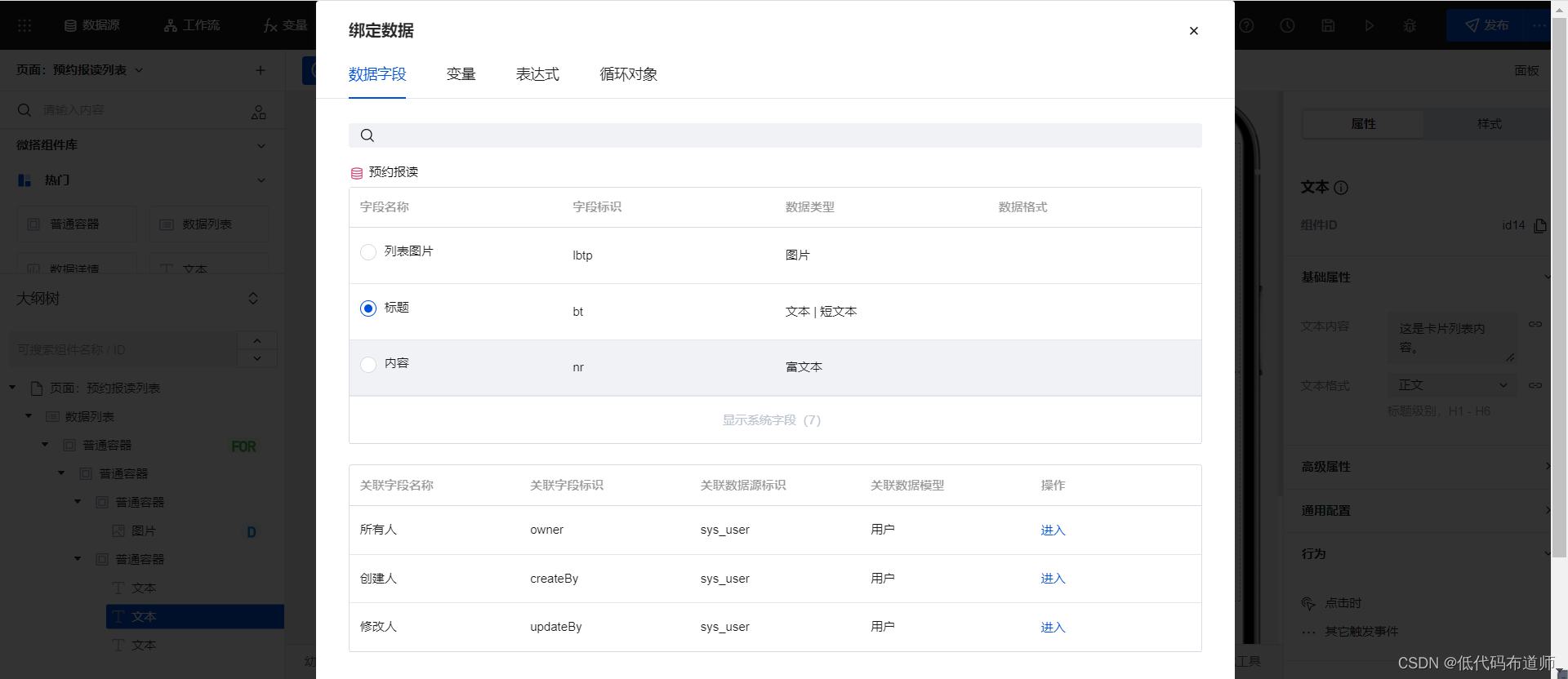
Keep only one text component, and bind the text content as the title
. Bind the behavior to the outer ordinary container. When jumping to the reservation report details page
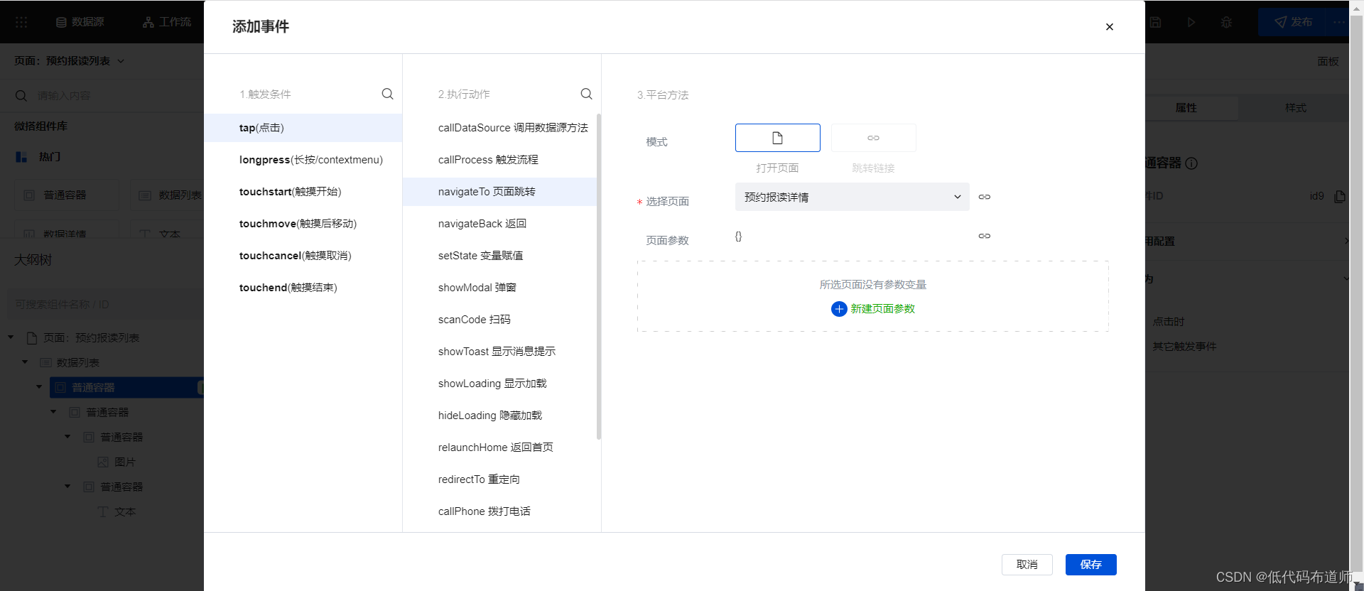
, we need to pass in the data identifier. You can create a new page parameter and set The parameter name is id, and the data ID is passed in
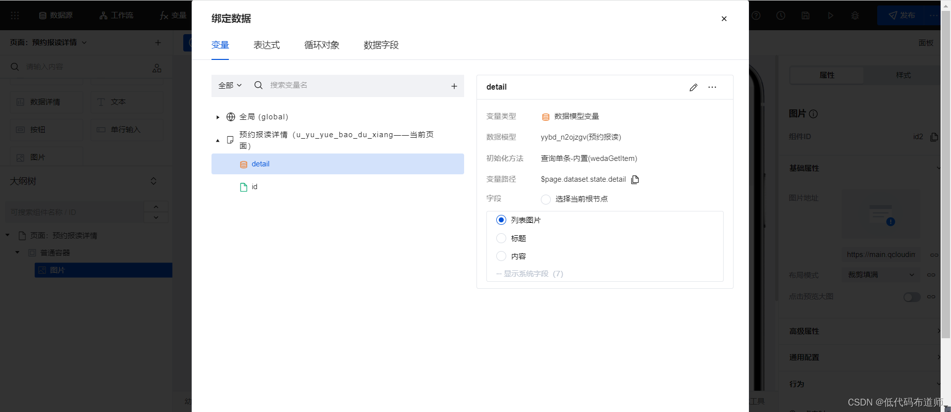
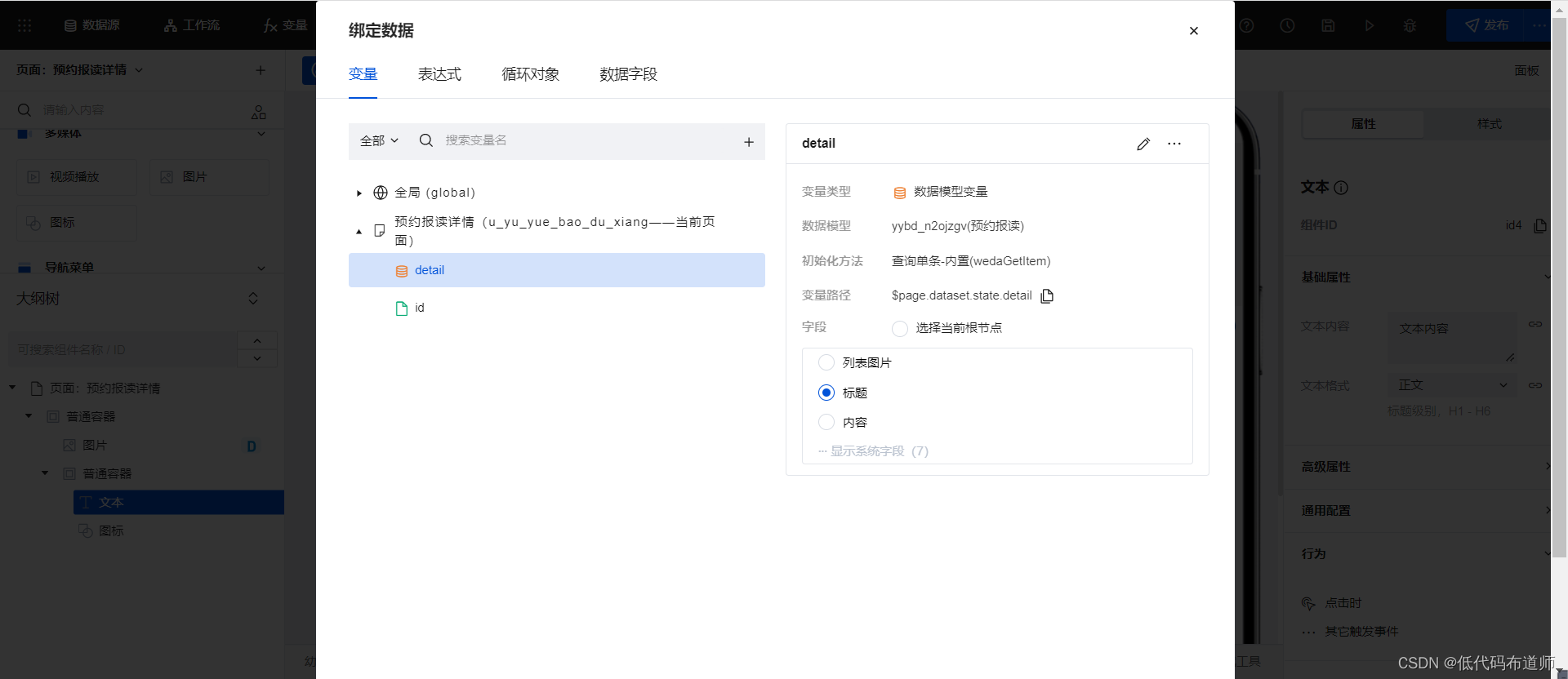
Appointment registration details page
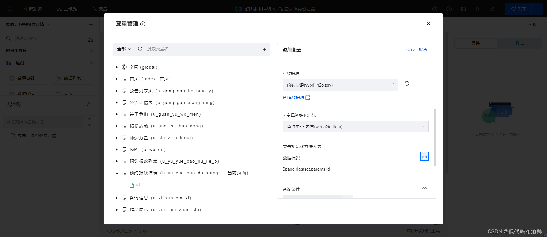
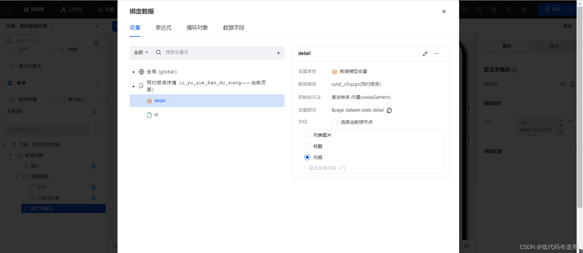
When we display data on the details page, we need to define variables first, select model variables for variable types, select query singles for methods, and bind our parameter variables
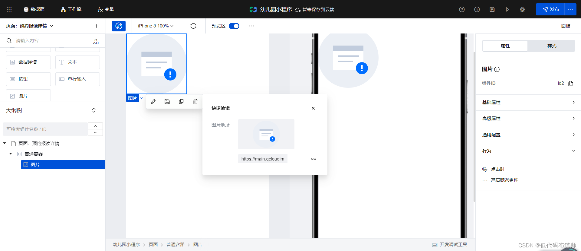
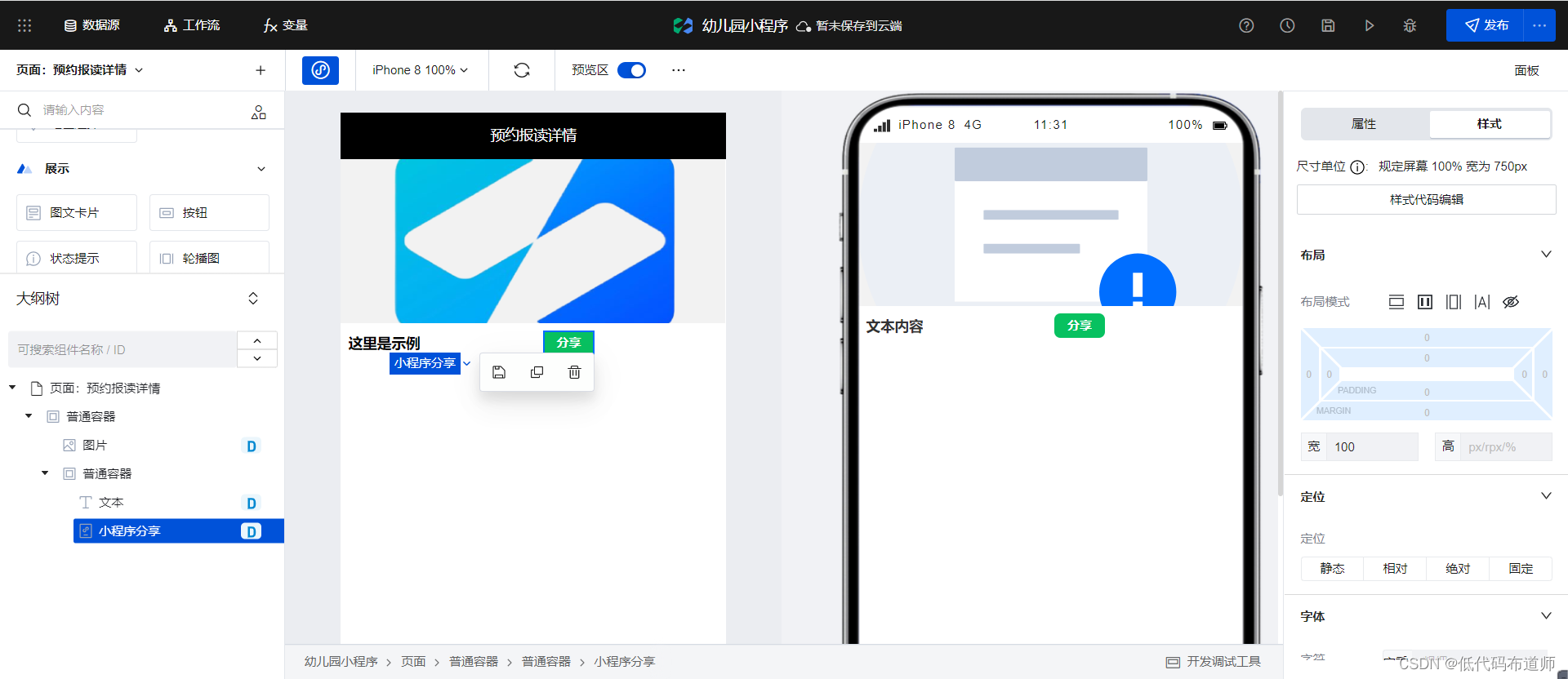
. First, add a common container to the page, and add a picture component inside
to add a gray color to the common container. Background
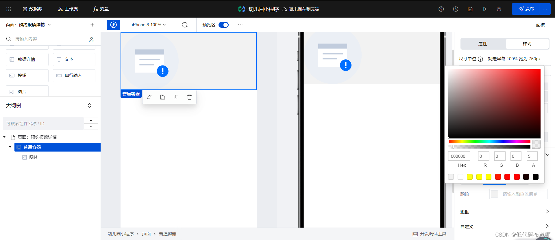
Set the width of the image to 100% and the height to 320.
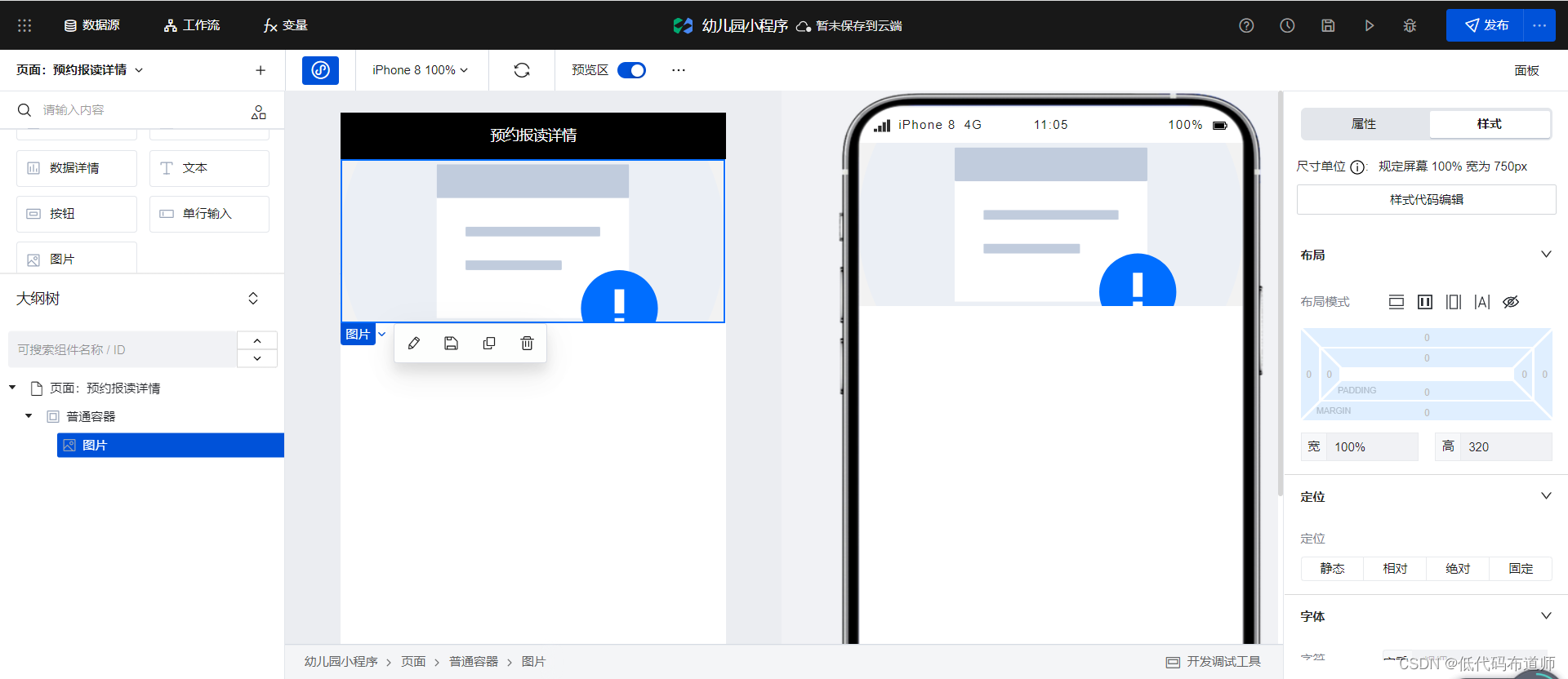
Bind the image address to the list image
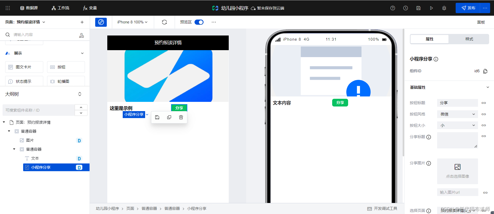
in the variable. Add a common container under the image component, and add text and applet sharing components inside.
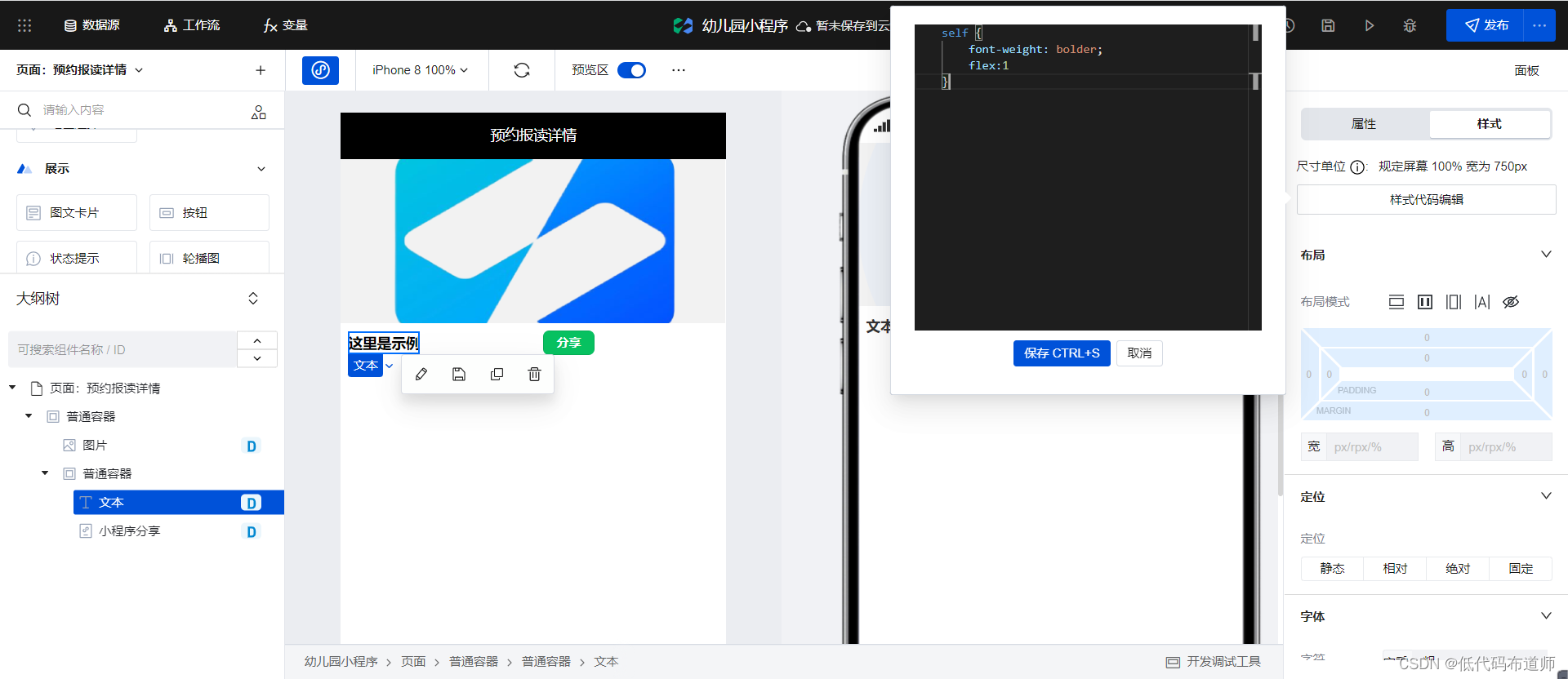
Set the background color of the normal container to white, a certain padding, and set the layout to flex layout
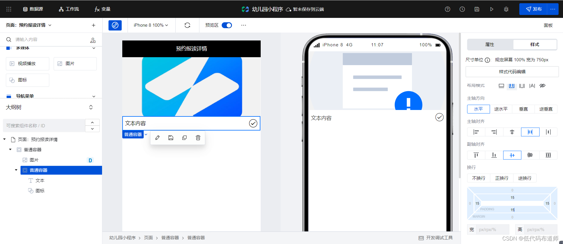
self {


    padding: 15px;
    display: flex;
    justify-content: space-between;
    align-items: center;
    flex-direction: row;
    background: rgb(255, 255, 255)
}
Bind the text content as the title in the variable
Set the width of the applet sharing component to 100.
At present, the two ends are not aligned. We need to add a style flex: 1 to the text component.
After the applet is shared, we need to pass in parameters. Binding with expressions
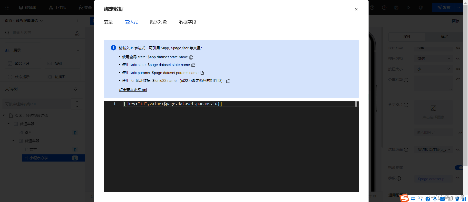
[{

    key:"id",value:$page.dataset.params.id}]
Then add a rich text display component and
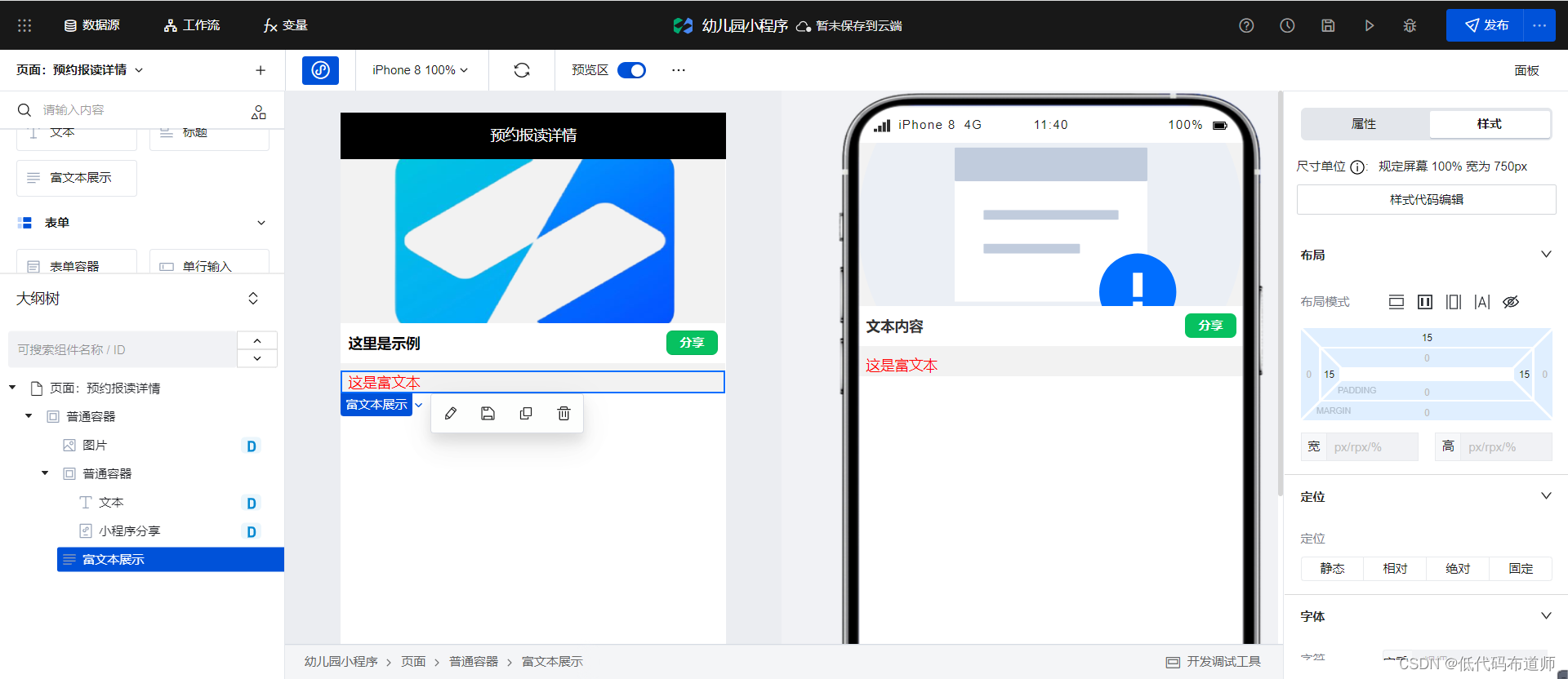
bind the content field.
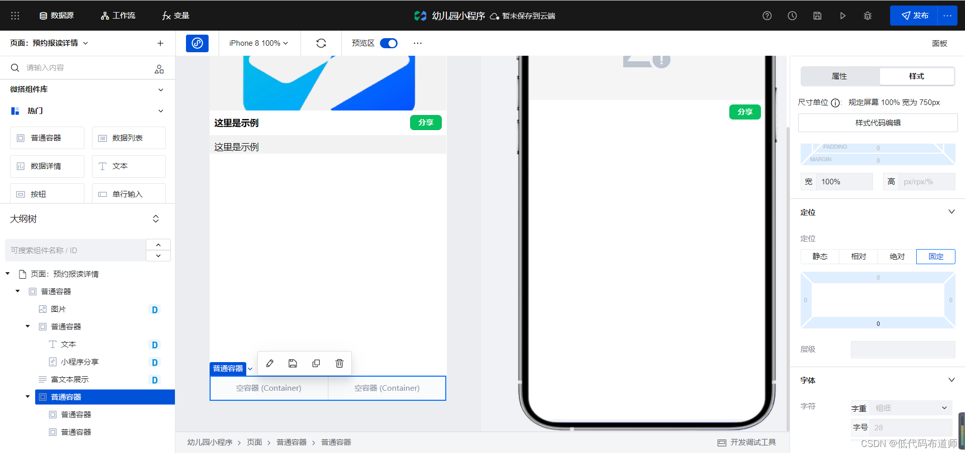
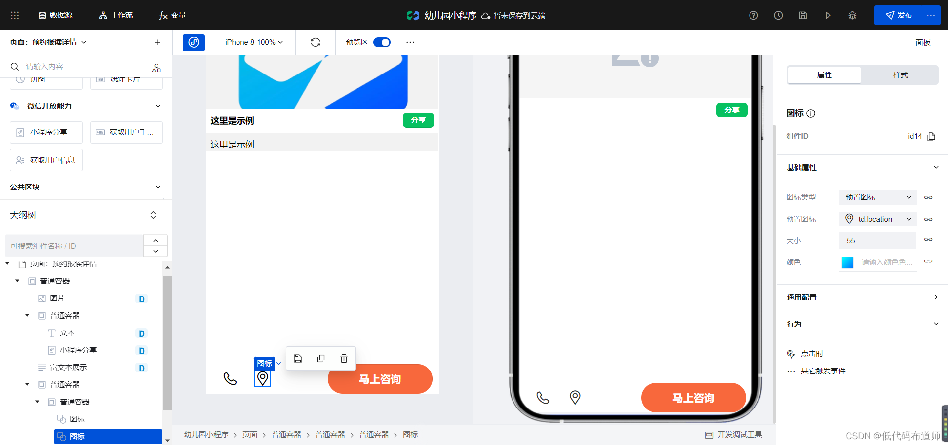
Then we implement the button at the bottom, first add a normal container, add two normal containers inside, and set the layout of the parent container to 50% of the width,
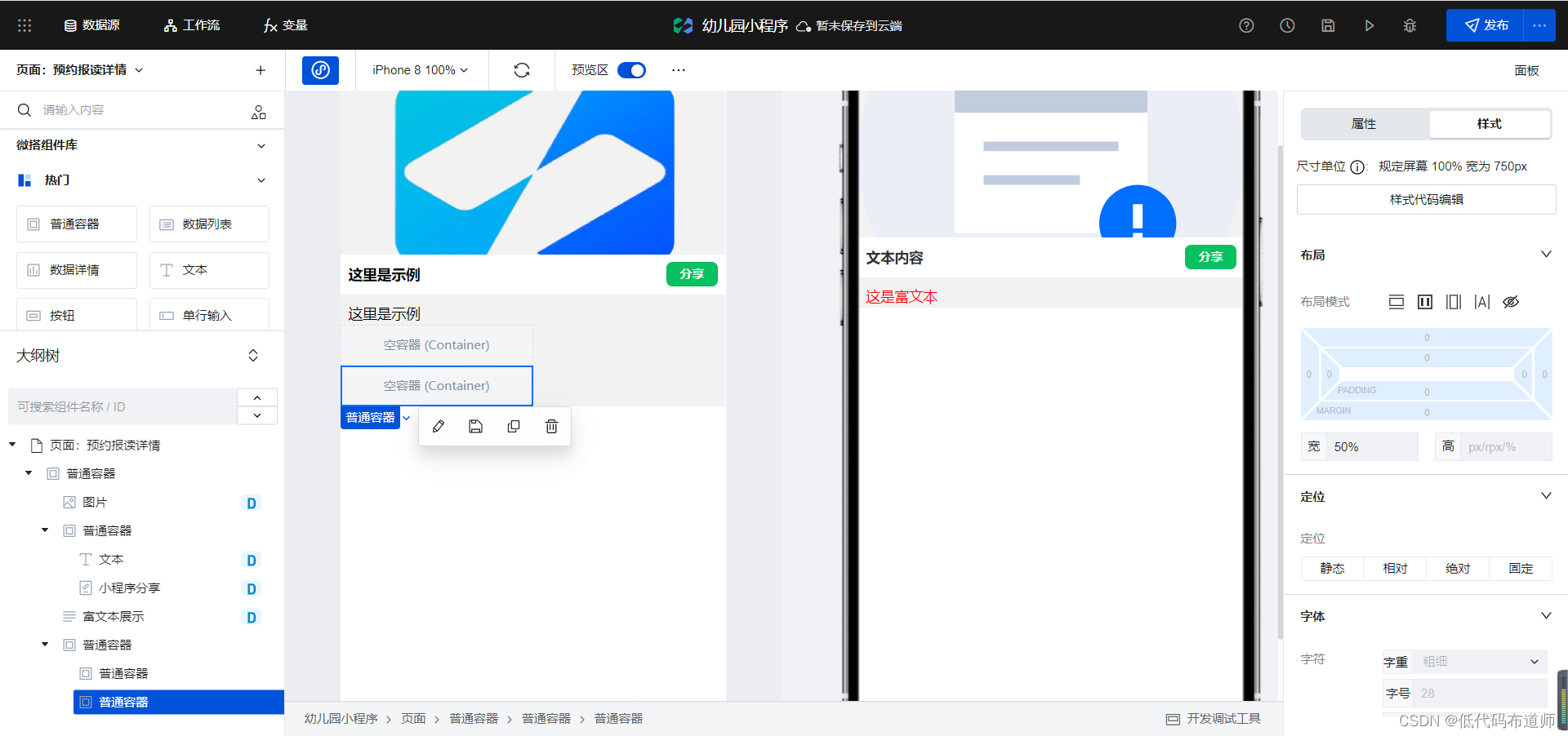
set the layout of the parent container to flex layout, and set the positioning to fixed positioning
. Add two icon components to one common container, add button components to the second common container, and set the style
Summarize
In this article, we continue to improve the applet and realize the effect of the page. In the next article, we will explain the functions of making calls, map navigation and submitting information, so stay tuned.