Table of contents
foreword
I have learned HTML, CSS, and JS for a month, and I haven't finished learning JS yet. I was lazy to write a small project and spent an afternoon to consolidate the knowledge I learned. (The content is relatively simple, suitable for novices)
Source code: https://github.com/yeziyuhai/QQ-login-interface
Introduction
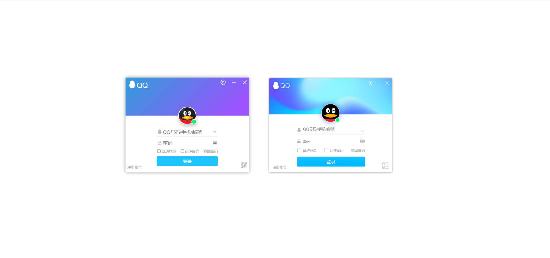
The one on the left is mine, the one on the right is the official one. Without design drafts and materials, I can only find them by myself, so it is impossible to make them exactly the same, and it is not enough.
layout ideas
Obviously, the simple way is to have two boxes at the top and bottom. The middle avatar can locate the upper parent or the lower parent. Here I choose the upper one, and the middle content is wrapped in a form. The registered account and the QR code use positioning, and the parent is the big box.
.html
<!-- 登录界面 -->
<div>
<div class="login">
<!-- 顶部 -->
<div class="top">
<div class="left">
<span class="iconfont icon-QQ"></span>QQ
</div>
<div class="right">
<span class="iconfont icon-shezhi"></span>
<span class="iconfont icon-jianhao"></span>
<span class="iconfont icon-chenghao"></span>
</div>
<div class="head">
<div class="green"></div>
</div>
</div>
<!-- 底部 -->
<div class="bottom">
<!-- 表单 -->
<form action="javascript:;">
<div class="input">
<div class="text">
<label for=""><span class="iconfont icon-QQ"></span></label>
<label for=""><span class="iconfont icon-xiala"></span></label>
<input type="text" placeholder="QQ号码/手机/邮箱" name="uname">
</div>
<div class="password">
<label for=""><span class="iconfont icon-suoding_huaban"></span></label>
<label for=""><span class="iconfont icon-jianpan_o"></span></label>
<input type="password" placeholder="密码">
</div>
</div>
<div class="check">
<!-- 点击文字也可以选中 -->
<label><input type="checkbox" >自动登录</label>
<label><input type="checkbox">记住密码</label>
<a href="https://accounts.qq.com/find?aquin" target="_blank">找回密码</a>
</div>
<input type="submit" value="登录" class="loginBtn">
</form>
<!-- 其他 -->
<a href="https://ssl.zc.qq.com/v3/index-chs.html?from=client®key=1720F6EE975B2AFF081EC88BCAE91F145C04012178E039924F1CC17DB69AC184&ADUIN=0&ADSESSION=0&ADTAG=CLIENT.QQ.5929_NewAccount_Btn.0&ADPUBNO=27255" class="signup" target="_blank">注册账号</a>
<span class="iconfont icon-ico"></span>
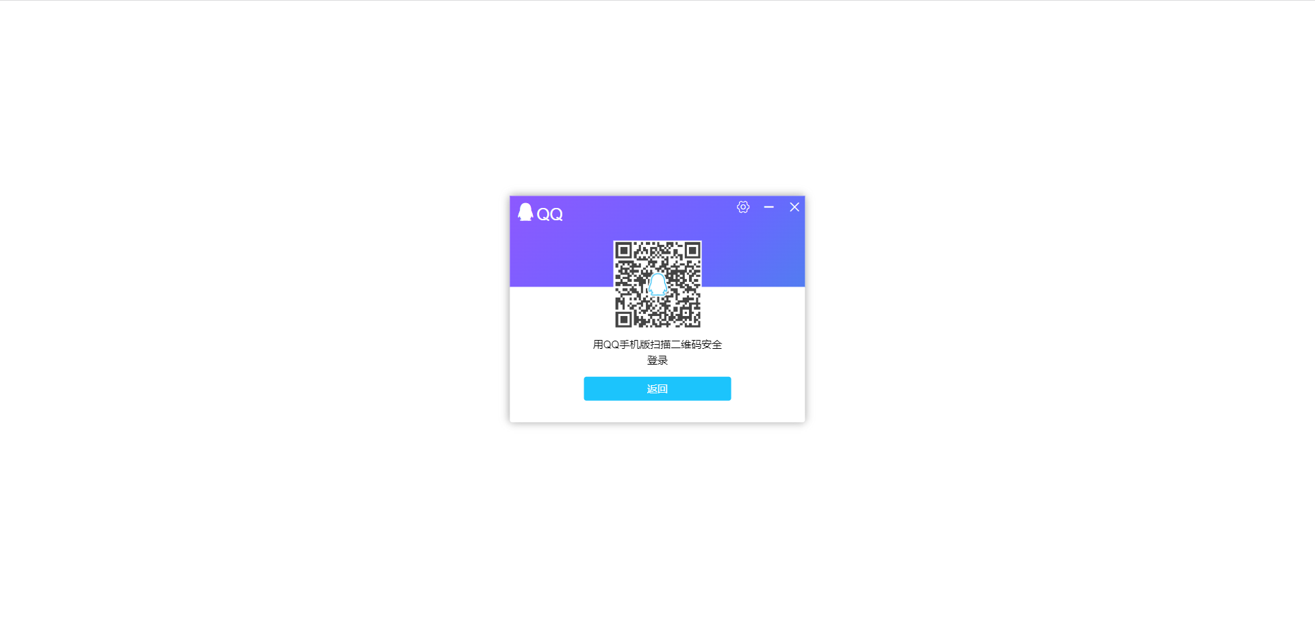
<!-- 手机登录二维码 -->
</div>
<div class="mobile">
<img src="./images/erweima.png" alt="">
<p>用QQ手机版扫描二维码安全登录</p>
<button class="back">返回</button>
</div>
<!-- 设置 -->
<div class="setup">
<p>懒得弄了</p>
<button class="back">返回</button>
</div>
</div>
</div>
related code
color gradient animation
The idea is that the gradient is inclined at an angle of 45 degrees, and then the animation changes its position. Of course, it is different from the official one, and it is enough to make a similar effect.
.css
.login .top {


  position: relative;
  width: 100%;
  height: 40%;
  background: linear-gradient(-45deg, #23A6D5, rgba(106, 103, 255), rgba(158, 81, 255), #23A6D5, #23D5AB);
  background-size: 400% 400%;
  animation: bg 4s infinite linear forwards;
  color: #fff;
}

@keyframes bg {


  0% {


    background-position: 0 50%;
  }
  50% {


    background-position: 100% 50%;
  }
  100% {


    background-position: 0 50%;
  }
}
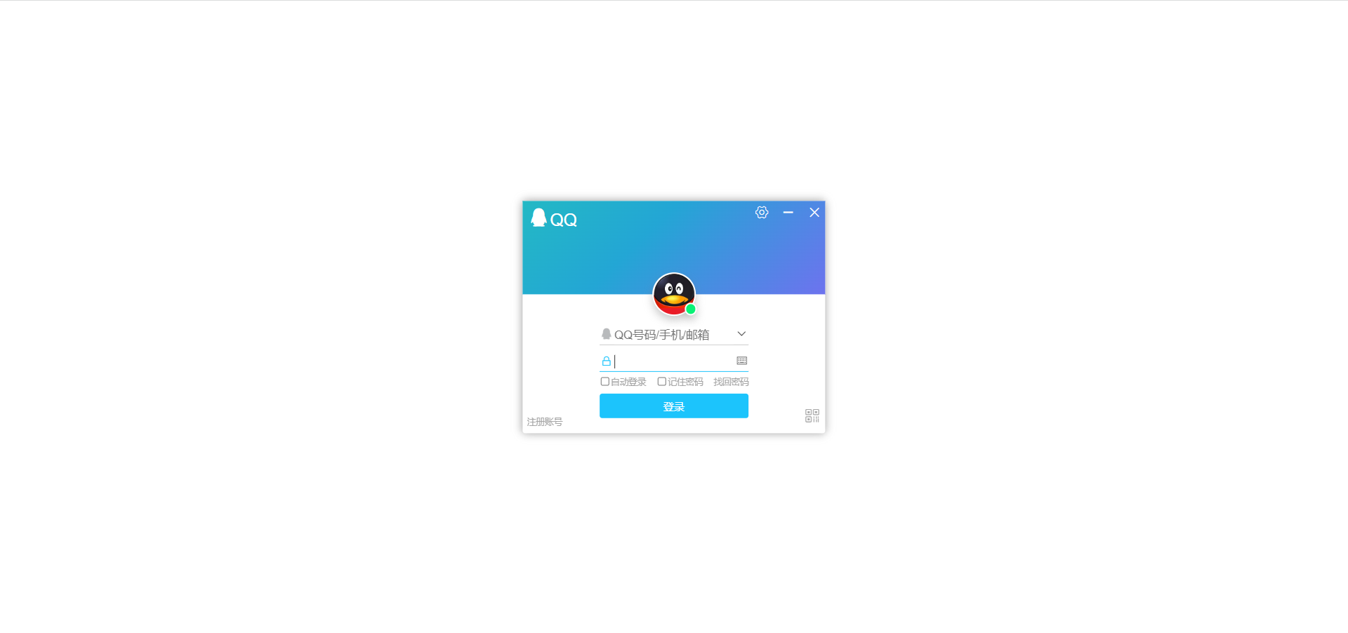
avatar
The avatar is positioned absolutely, the top is positioned relatively, and the small green dot is positioned absolutely.
.login .top .head {


  position: absolute;
  left: 50%;
  top: 100%;
  width: 50px;
  height: 50px;
  border-radius: 50%;
  border: 2px solid #fff;
  transform: translate(-50%, -50%);
  box-shadow: 0px 5px 10px 0px rgba(118, 118, 118, 0.4);
  background-image: url(/images/head.png);
  background-size: contain;
  background-repeat: no-repeat;
  background-color: rgba(234, 28, 39);
}
.login .top .head .green {


  position: absolute;
  right: -10px;
  bottom: -8px;
  width: 14px;
  height: 14px;
  border-radius: 50%;
  border: 2px solid #fff;
  transform: translate(-50%, -50%);
  box-shadow: 0px 5px 10px 0px rgba(118, 118, 118, 0.4);
  background-color: rgba(9, 241, 117);
}
form area
Just move .less over and clear some. There are quite a lot of details here. First, let’s talk about the font size. The minimum font size of the browser can only be 12px. Unless you adjust the minimum font size of your browser to 10px, which looks better visually, otherwise the words in the check boxes below will wrap.
The textChange class is added because the style needs to change after the input box is clicked.
It takes me a lot of time and a lot of details here. After all, I am a person who pursues perfection.
.less
form {


            position: absolute;
            left: 50%;
            top: 50%;
            transform: translate(-50%, -50%);

            text-align: center;
            margin-top: 8px;
            .input {


                .text {


                    position: relative;
                    width: 100%;
                    border-bottom: 1px solid #ccc;
                    margin-bottom: 5px;

                    .icon-QQ {


                        position: absolute;
                        left: 0;
                        top: 0;
                        color: rgba(184, 186, 188);
                    }

                    .icon-xiala {


                        position: absolute;
                        right: 0;
                        top: 0;
                    }
                }

                .password {


                    position: relative;
                    width: 100%;
                    border-bottom: 1px solid #ccc;

                    .icon-suoding_huaban {


                        position: absolute;
                        left: 2px;
                        top: 4px;
                        font-size: 12px;
                        color: rgba(184, 186, 188);
                    }

                    .icon-jianpan_o {


                        position: absolute;
                        right: 0;
                        top: 0;
                    }
                }

                // 要放在后面,不然层叠
                .textChange {


                    border-bottom: 1px solid rgba(28, 196, 252);
                    .icon-QQ {


                        color: rgba(28, 196, 252);
                    }
                }
                .passWordChange {


                    border-bottom: 1px solid rgba(28, 196, 252);
                    .icon-suoding_huaban {


                        color: rgba(28, 196, 252);
                    }
                }

                input {


                    width: 80%;
                    height: 20px;
                    /* 去掉默认边框样式 */
                    border: 0;
                    outline: none;
                }
            }

            .check {


                display: flex;
                justify-content: space-between;
                width: 100%;
                margin: 5px 0;
                font-size: 10px;
                color: rgba(166, 166, 166);

                // 多选框大小
                input {


                    // ohhhhhhhhhhh
                    float: left;
                    transform: scale(.8);
                }

                label {


                    position: relative;
                    margin-right: 12px;
                }

                a {


                    color: rgba(166, 166, 166);
                }

                a:hover {


                    color: rgba(166, 190, 177);
                }
            }

            // 点击登录
            .loginBtn {


                width: 100%;
                height: 28px;
                border-radius: 3px;
                background-color: rgba(28, 196, 252);
                color: #fff;
                font-size: 12px;
            }

            .loginBtn:active {


                background-color: rgba(34, 174, 250);
            }
        }

        .signup {


            position: absolute;
            left: 0;
            bottom: 0;
            margin: 5px;
            font-size: 10px;
            color: rgba(166, 166, 166);
        }
        .signup:hover {


            color: rgba(166, 190, 177)
        }
JS-related
Drag and drop the interface, close the interface, display the input box, click the QR code to log in with your mobile phone
.js
// window.onload是窗口(页面)加载事件,当文档内容完全加载完成会触发该事件(包括图像,脚本文件,CSS文件等),就调用的处理函数。
window.addEventListener('load', function() {


    // 1.登录界面
    // 关闭
    var jianhao = this.document.querySelector('.icon-jianhao');
    var chenghao = this.document.querySelector('.icon-chenghao');
    var login = this.document.querySelector('.login');
    jianhao.addEventListener('click', function() {


        login.style.display = 'none';
    })
    chenghao.addEventListener('click', function() {


        login.style.display = 'none';
    })

    // 输入框
    var text = this.document.querySelector('.text');
    var password = this.document.querySelector('.password');
    var textInput = text.querySelector('input');
    var passwordInput = password.querySelector('input');

    textInput.addEventListener('focus', function() {


        this.placeholder = '';
        text.className = 'text textChange';
    })
    textInput.addEventListener('blur', function() {


        this.placeholder = 'QQ号码/手机/邮箱';
        text.className = 'text';
    })
    passwordInput.addEventListener('focus', function() {


        this.placeholder = '';
        password.className = 'password passWordChange';
    })
    passwordInput.addEventListener('blur', function() {


        this.placeholder = '密码';
        password.className = 'password';
    })

    // 拖拽界面
    // 新的坐标 = 鼠标离盒子内距离 - 鼠标距离在网页距离
    var top = this.document.querySelector('.top');
    top.addEventListener('mousedown', function(e) {


        var x = e.pageX - login.offsetLeft;
        var y = e.pageY - login.offsetTop;
        document.addEventListener('mousemove', move);
        function move(e) {


            login.style.left = e.pageX - x + 'px';
            login.style.top = e.pageY - y + 'px';
        }
        document.addEventListener('mouseup', function() {


            document.removeEventListener('mousemove', move);
        })
    })

    // 手机登录
    var ico = this.document.querySelector('.icon-ico');
    var mobile = this.document.querySelector('.mobile');
    var bottom = this.document.querySelector('.bottom');
    var head = this.document.querySelector('.head');
    var back = this.document.querySelector('.back');
    ico.addEventListener('click', function() {


        mobile.style.display = 'block';
        bottom.style.display = 'none';
        head.style.display = 'none';
    })
    back.addEventListener('click', function() {


        bottom.style.display = 'block';
        head.style.display = 'block';
        mobile.style.display = 'none';
    })
})
Summarize
More hands-on skills will improve, and writing code will be proficient. This series of articles will be updated later.