Continuous Supervised Learning

Continuous Classifier vs Discrete Classifier
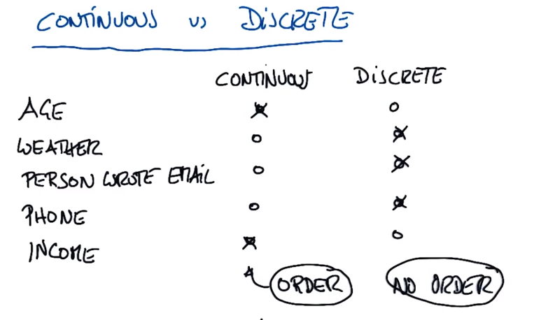
Continuous is usually ordered (eg age, income (10000 and 9999 are no difference))
Discrete is usually unordered (like onboarding id (no relationship exists between two people), weather (sunny or rainy), phone number lookup by name (sequential numbers have no relationship))
PS: Most things considered discrete are continuous to some extent (such as expressing weather as the amount of sunlight projected on a certain area on the ground during a certain period of time, i.e. continuous measurement))
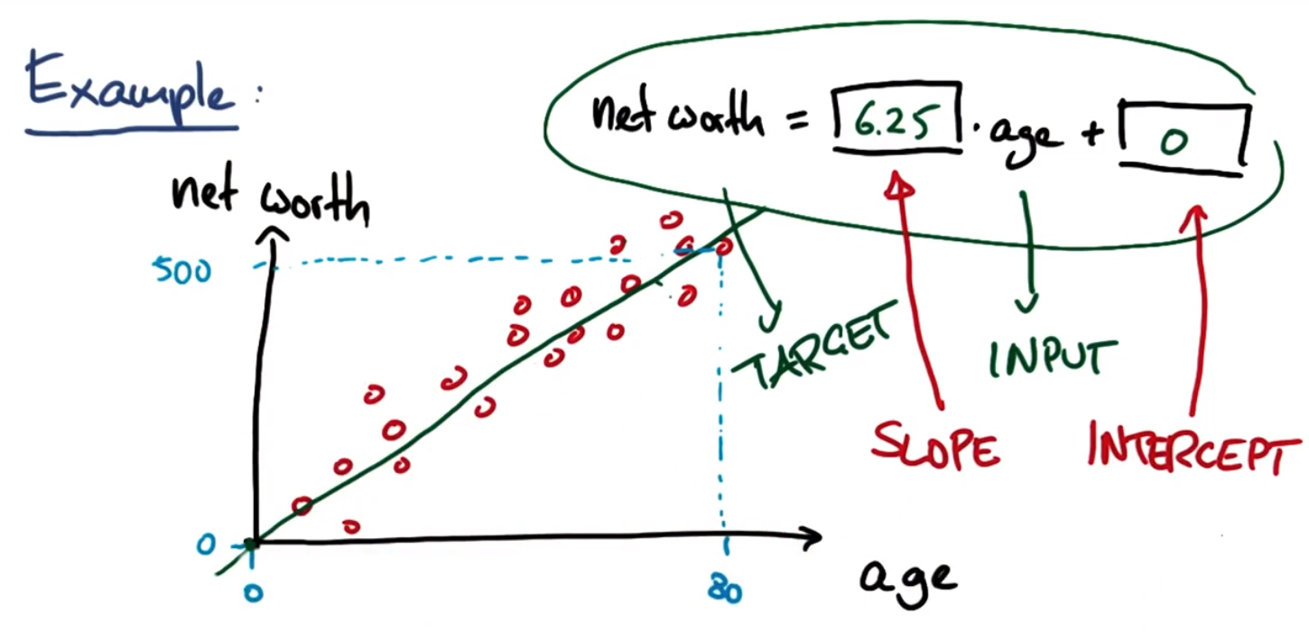
Linear regression equation:
Target target variable: the variable to try to predict, ie output
Input: input
Slope: slope
Intercept: Intercept
Reference URL: http://scikit-learn.org/stable/modules/linear_model.html
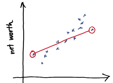
Age/Equity Regression
studentMain.py
import numpy
import matplotlib
matplotlib.use('agg')
import matplotlib.pyplot as plt
from studentRegression import studentReg
from class_vis import prettyPicture, output_image
from ages_net_worths import ageNetWorthData
ages_train, ages_test, net_worths_train, net_worths_test = ageNetWorthData ()
reg = studentReg(ages_train, net_worths_train)
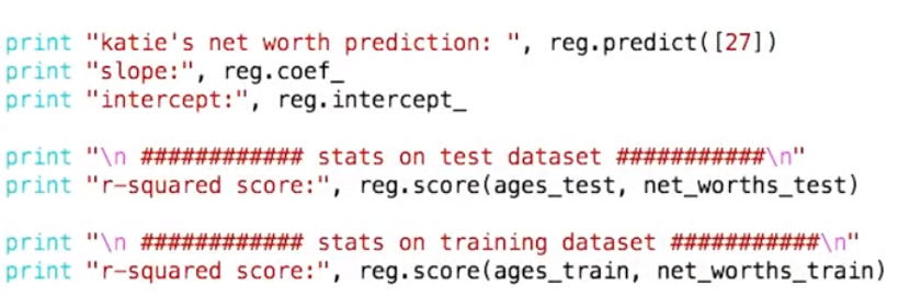
print "zwb's new worth prediction:",reg.predict([[27]])
print "slope:", reg.coef_
print "intercept:", reg.intercept_
print "r-square score:",reg.score(ages_test, net_worths_test)
print "r-square score:",reg.score(ages_train, net_worths_train)
plt.clf()
plt.scatter(ages_train, net_worths_train, color="b", label="train data")
plt.scatter(ages_test, net_worths_test, color="r", label="test data")
plt.plot(ages_test, reg.predict(ages_test), color="black")
plt.legend(loc=2)
plt.xlabel("ages")
plt.ylabel("net worths")
plt.savefig("test.png")
output_image("test.png", "png", open("test.png", "r").read())
studentRegression.py
def studentReg(ages_train, net_worths_train):
	### import the sklearn regression module, create, and train your regression
	### name your regression reg

	### your code goes here!
	from sklearn import linear_model
	reg = linear_model.LinearRegression()
	reg.fit(ages_train, net_worths_train)

	return reg
ages_net_worths.py
import numpy
import random

def ageNetWorthData ():
	random.seed(42)
	numpy.random.seed(42)

	ages = []
	for ii in range(100):
		ages.append( random.randint(20,65) )
	net_worths = [ii * 6.25 + numpy.random.normal(scale=40.) for ii in ages]
### need massage list into a 2d numpy array to get it to work in LinearRegression
	ages = numpy.reshape( numpy.array(ages), (len(ages), 1))
	net_worths = numpy.reshape( numpy.array(net_worths), (len(net_worths), 1))

	from sklearn.cross_validation import train_test_split
	ages_train, ages_test, net_worths_train, net_worths_test = train_test_split(ages, net_worths)

	return ages_train, ages_test, net_worths_train, net_worths_test
class_vis.py unchanged
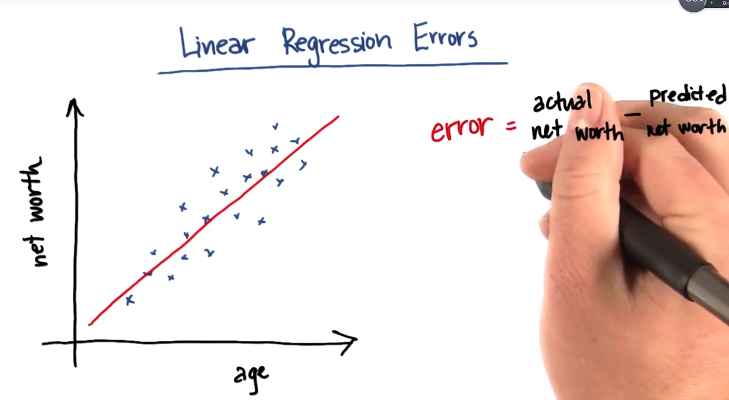
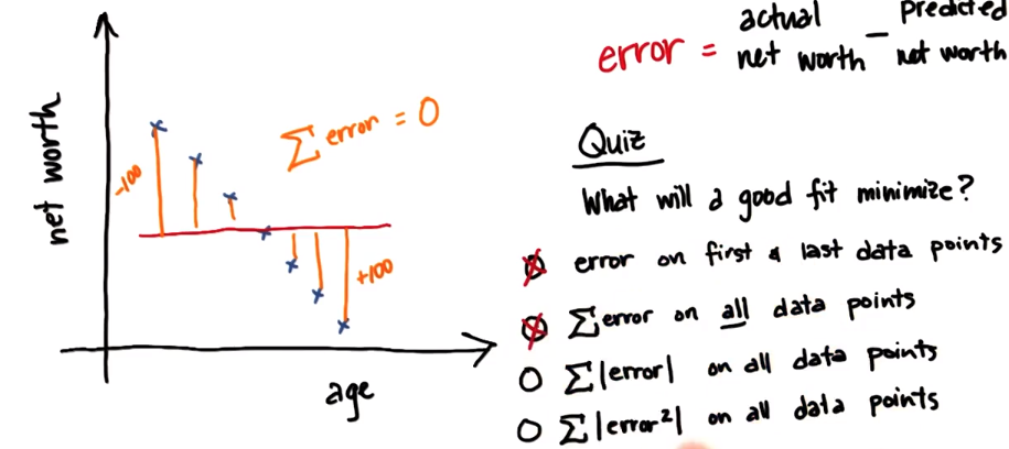
Linear Regression Errors
In this example error is the difference between a person's actual net worth and the predicted net worth predicted by the regression line
QUIZ: What kind of error does the fit minimize?
- □ Error of first and last data point ×
- □ Error sum of all data points ×
- □ Sum of absolute values of all errors √
- □ Sum of squares of all errors √
Option 1:
Option 2:
Option 3: Sum of Absolute Errors - Multiple lines can be found that minimize absolute error, so there is ambiguity in the exact range
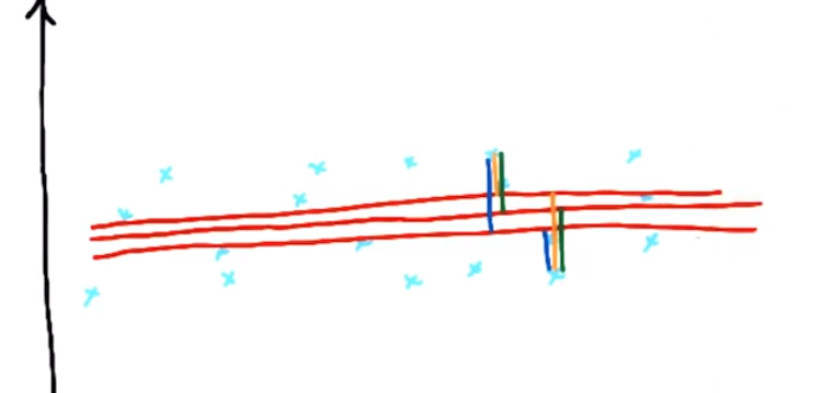
Option 4: There is only one line that minimizes the squared error, the method of using the sum of squared error to find the regression can also make the regression simpler
Sum of square errors (SSE)
The best regression is the one that minimizes the sum of squared errors: find m and b that minimize the sum of squared errors
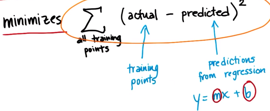
Two of the most popular solutions for computing the sum of squared errors:
1. Ordinary least squares (ordinary least squares—OLS)
2. Gradient descent
R square
SSE will be biased (increased) due to the increase in the number of data points used, so there is another evaluation metric - R-squared, which can describe the goodness of fit of linear regression, with a value of 0~1 (but may be is negative), the larger the value, the better the fit, and the R-squared performs better than SSE in situations where the dataset will change.
R-squared function
score(X, y[,]sample_weight) , returns the predicted coefficient of determination R^2. Defined as (1-u/v), where u = ((y_true - y_pred)**2).sum(), and v=((y_true-y_true.mean())**2).mean(), The best score is 1.0, the general score is lower than 1.0, the lower the score, the worse the result. It may be negative, because the model may be worse. When a model always outputs the expected y regardless of the input eigenvalue, it returns 0.
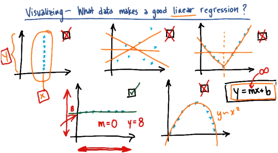
what data is suitable for linear regression
Compare classification and regression:
Output type: supervised classification (class labels are discrete), regression (continuous, predicted numbers, etc.)
What you're really looking for: classification (decision boundary - assigning a class label to a point based on its position relative to the decision boundary), regression (line of best fit - a line that fits the data, not a boundary that describes the data)
How to evaluate: supervised classification (precision as a metric - is the class label correctly assigned on the test set), regression (sum of squared errors - R-squared)
Back Mini Project
1. Import LinearRegression from sklearn and create/fit regression. Name it reg so that the plotting code can overlay the regression on the scatterplot.
Extract the slope (stored in the reg.coef_ attribute) and intercept. Slope 5.44814029 and intercept -102360.543294
2. Suppose that the test is not performed on the test set, but on the training data, and the method used is to compare the regression prediction value with the target value (eg: bonus) in the training data. (I always think the regression prediction value here is predict(feature_test), but it doesn't seem to be....) The score is 0.0455091926995, which is not very good (but very bad)
3. Calculate the regression score on the test data. -1.48499241737
4. Suppose you think about the data and speculate that the "long_term_incentive" feature (employees who contribute to the long-term health of the company should be rewarded) may be more closely related to bonuses than wages. One way to justify your assumptions is to regress bonuses based on long-term incentives, and see if the regression is significantly higher than regressing bonuses based on salary. Regression bonuses based on long-term rewards - what is the score on test data? -0.59271289995
5.
About the identification and removal of outliers. Go back to a previous setup where you used salary forecast bonuses and rerun the code to review the data. You may have noticed that a small number of data points fell outside the main trend of someone earning a high salary (over $1M!) with a relatively small bonus. This is an example of an outlier,
A point like this can have a big impact on regression: if it falls within the training set, it can significantly affect the slope/intercept. If it falls in the test set, it may result in a much lower score than if it falls outside the test set. As it stands, this point falls within the test set (and will likely end up lowering the score). Let's do some processing and see what happens when it falls within the training set. Add these two lines of code near the bottom of finance_regression.py and before plt.xlabel ( features_list[1]) :
reg.fit(feature_test, target_test)
plt.plot(feature_train, reg.predict(feature_train), color="b")
We will now draw two regression lines, one fitted on the test data (with outliers) and one fitted on the training data (without outliers). Looking at the graphics now, there's a big difference, right? A single outlier can make a big difference.
What is the slope of the new regression line? 2.27410114
#!/usr/bin/python
# -*- coding: utf-8 -*-
"""
    Starter code for the regression mini-project.

    Loads up/formats a modified version of the dataset
    (why modified?  we've removed some trouble points
    that you'll find yourself in the outliers mini-project).

    Draws a little scatterplot of the training/testing data

    You fill in the regression code where indicated:
"""


import sys
import pickle
sys.path.append("../tools/")
from feature_format import featureFormat, targetFeatureSplit
dictionary = pickle.load( open("../final_project/final_project_dataset_modified.pkl", "r") )

### list the features you want to look at--first item in the
### list will be the "target" feature
The relationship between #salary and bonus
features_list = ["bonus", "salary"]
The relationship between #long_term_incentive and bonus
#features_list = ["bonus", "long_term_incentive"]

data = featureFormat( dictionary, features_list, remove_any_zeroes=True,sort_keys = '../tools/python2_lesson06_keys.pkl')
target, features = targetFeatureSplit( data )

### training-testing split needed in regression, just like classification
from sklearn.cross_validation import train_test_split
feature_train, feature_test, target_train, target_test = train_test_split(features, target, test_size=0.5, random_state=42)
train_color = "b"
test_color = "r"


### Your regression goes here!
### Please name it reg, so that the plotting code below picks it up and
### plots it correctly. Don't forget to change the test_color above from "b" to
### "r" to differentiate training points from test points.
#train model
from sklearn import linear_model
reg = linear_model.LinearRegression()
reg.fit(feature_train,target_train)

# extract slope and intercept
print "slope:", reg.coef_
print "intercept:", reg.intercept_
#Calculate the regression score on the training data
print "r-square score:",reg.score(feature_train,target_train)
# Calculate the regression score on the test data
print "r-square score:",reg.score(feature_test,target_test)


### draw the scatterplot, with color-coded training and testing points
import matplotlib.pyplot as plt
for feature, target in zip(feature_test, target_test):
    plt.scatter( feature, target, color=test_color )
for feature, target in zip(feature_train, target_train):
    plt.scatter( feature, target, color=train_color )

### labels for the legend
plt.scatter(feature_test[0], target_test[0], color=test_color, label="test")
plt.scatter(feature_test[0], target_test[0], color=train_color, label="train")


### draw the regression line, once it's coded
try:
    plt.plot( feature_test, reg.predict(feature_test) )
except NameError:
    pass
#Slope and regression line after removing outliers
reg.fit(feature_test, target_test)
print "slope:", reg.coef_
plt.plot(feature_train, reg.predict(feature_train), color="g")

plt.xlabel(features_list[1])
plt.ylabel(features_list[0])
plt.legend()
plt.show()