Getting Started with EChart.js
Recently, there is a statistical project to be done, and the front-end data needs to be displayed in the form of charts. I searched online and found that there are several statistical galleries.
MSChart
This is a built-in control in Visual Studio, which is relatively simple to use, but the data needs to be bound in the background.
ichartjs
It is a graphics library based on HTML5. Use pure javascript language to draw various graphics using HTML5 canvas tag. Supports pie charts, ring charts, line charts, area charts, column charts, bar charts, etc.
Chart.js
It is also an HTML5-based graphics library similar to ichartjs as a whole. However, the tutorial documentation of Chart.js does not have the details of ichartjs. However, it feels a little better than ichartjs in terms of adapting to mobile.
ECharts.js
This is the graphics library I am going to use in this project, which is also an HTML5 based graphics library. The creation of graphics is also relatively simple, and you can directly refer to Javascript. There are three main reasons for using this library. One is that this library is a Baidu project and has been updated all the time. The latest one is EChart 3; It is clear, and in Chinese, it is easier to understand; the third point is that the graphics supported by this library are very rich, and the graphics can be switched directly, which is very convenient to use.
Official website: ECharts.js
Let's briefly explain the use of EChart.js.
The first step is to reference the Js file
<script type="text/javascript" src="js/echarts.js"></script>
There are several versions of js files, and the required version can be referenced according to actual needs. download link
The second step is to prepare a container for the chart
<div id="chartmain" style="width:600px; height: 400px;"></div>
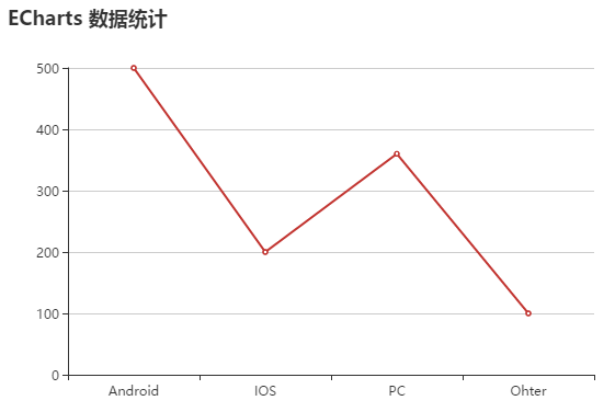
The third step, set parameters, initialize the chart

<script type="text/javascript">
        //Specify the configuration and data of the icon
        var option = {
            title:{
                text:'ECharts data statistics'
            },
            tooltip:{},
            legend:{
                data:['User Source']
            },
            xAxis: A
                data:["Android","IOS","PC","Ohter"]
            },
            yAxis:{

            },
            series:[{
                name:'Visit',
                type:'line',
                data:[500,200,360,100]
            }]
        };
        //Initialize the echarts instance
        var myChart = echarts.init(document.getElementById('chartmain'));

        //Display the chart using the specified configuration items and data
        myChart.setOption(option);
    </script>
Such a simple statistical chart came out. The column chart used on the official website, I switched to a line chart here.
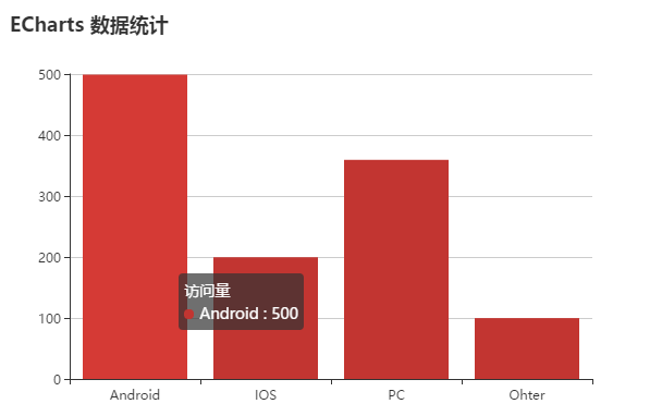
The histogram is actually very simple, just modify one parameter. Change the type value in the series to "bar"
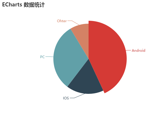
Pie charts are slightly different from line and column charts. Mainly on parameters and data binding. The pie chart does not have X-axis and Y-axis coordinates, and the data binding also uses the corresponding form of value and name.
        var option = {
            title:{
                text:'ECharts data statistics'
            },
            series:[{
                name:'Visit',
                type:'pie',
                radius:'60%',
                data:[
                    {value:500,name:'Android'},
                    {value:200,name:'IOS'},
                    {value:360,name:'PC'},
                    {value:100,name:'Ohter'}
                ]
            }]
        };