Reason for the problem: When making an article details page, the font is enlarged with a little more text, which is really strange.
Problem reproduces
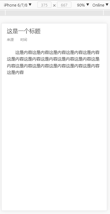
when a text
When two paragraphs of text
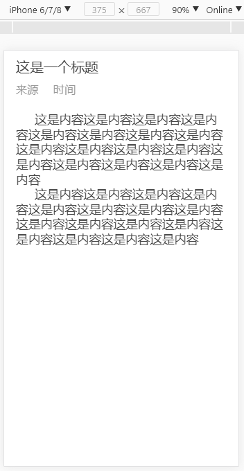
Obviously, the font is enlarged a lot.
Doubt
Meta tag scaling problem
Recently, I just encountered the problem of dealing with the retain screen 1px, and then I used the automatic modification of the meta tag.
/**
 * Created by jarjune on 2017/7/26.
 */
(function (doc, win) {
  var scale = 1.0;
  var ratio = 1;
  if (window.devicePixelRatio == 2) {
    scale *= 0.5;
    ratio *= 2;
  }
  if (window.devicePixelRatio == 3) {
    scale *= (1/3);
    ratio *= 3;
  }
  var text = '<meta name="viewport" content="initial-scale=' + scale + ', maximum-scale=' + scale + ',' + ' minimum-scale=' + scale + ', width=device-width,' + ' user-scalable=no" />';
  document.write(text);

  var docEl = doc.documentElement
  var resizeEvt = 'orientationchange' in window ? 'orientationchange' : 'resize'
  var recalc = function () {
    var clientWidth = docEl.clientWidth
    if (!clientWidth) return
      docEl.style.fontSize = 100 * (clientWidth / 750)  + 'px'
  }

  if (!doc.addEventListener) return
  win.addEventListener(resizeEvt, recalc, false)
  doc.addEventListener('DOMContentLoaded', recalc, false)
})(document, window);
At that timewindow.devicePixelRatio == 1 , there was no problem with auto-enlargement of fonts.
When window.devicePixelRatio == 2or window.devicePixelRatio == 3when, the problem arises.
Scientific explanation [Font Boosting]
This feature is called "Text Autosizer", also known as "Font Boosting" and "Font Inflation". It is a feature provided by Webkit to mobile browsers: when we browse the web on a mobile phone, it is likely that the original page width is relatively large. It's too big, and it's hard to see the text when it's zoomed out on the phone screen. The Font Boosting feature will automatically increase the font size of the text at this time, ensuring that people can easily read the text on the page without sliding the screen left or right or double-clicking to enlarge the screen content.
solution
<meta name="viewport" content="initial-scale=1, maximum-scale=1, minimum-scale=1, width=device-width, user-scalable=no">The zoom ratio is set to 1. As for problems such as 1px, other solutions can be adopted.- Specify a height for the element (unrealistic to think about it), but the setting
max-height:99999pxworks too. - settings
text-size-adjust:none, but most browsers are not compatible.