After the article "Teach you to draw a nomogram after the COX regression in R language" was released, many people sent me messages saying that my calibration curve was ugly, and my old face blushed slightly.

Let’s revise it again today, and review the original code. See the original article for the specific meaning.
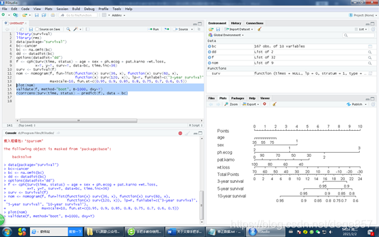
library(survival)
library(rms)
data(package="survival")
bc<-cancer
bc <- na.omit(bc)
dd <- datadist(bc)
options(datadist="dd")
f <- cph(Surv(time, status) ~ age + sex + ph.ecog + pat.karno +wt.loss,
         x=T, y=T, surv=T, data=bc, time.inc=36)
surv <- Survival(f)
nom <- nomogram(f, fun=list(function(x) surv(36, x), function(x) surv(60, x),
                            function(x) surv(120, x)), lp=F, funlabel=c("3-year survival", "5-year survival", "10-year survival"),
                maxscale=10, fun.at=c(0.95, 0.9, 0.85, 0.8, 0.75, 0.7, 0.6, 0.5))
plot(nom)
validate(f, method="boot", B=1000, dxy=T)
rcorrcens(Surv(time, status) ~ predict(f), data = bc)
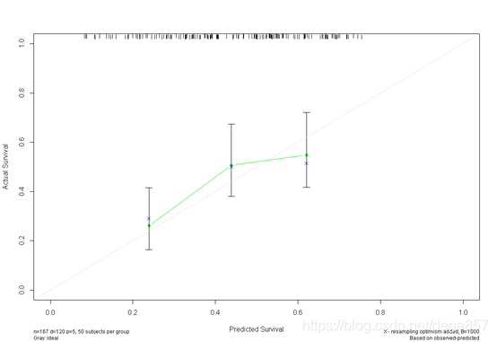
In this step, the internal verification has been completed and the discrimination has been completed, and the calibration is ready. The original code is like this. In fact, it is easy to correct the picture. We need to adjust the two parameters of u and m according to the original data. u represents how long you want to see the survival time, note that the time.inc of f3 should also be modified simultaneously, and m represents the sample size of the sample. The
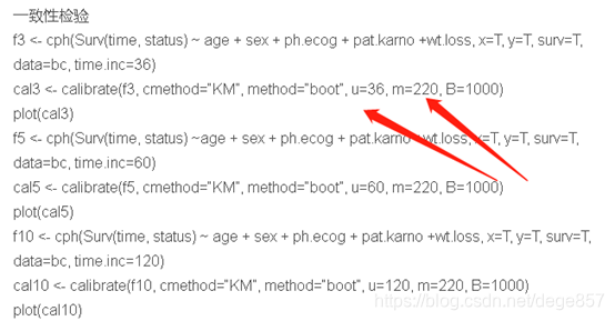
new code is as follows
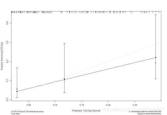
f3 <- cph(Surv(time, status) ~ age + sex + ph.ecog + pat.karno +wt.loss, x=T, y=T, surv=T,
data=bc, time.inc=720)
cal3 <- calibrate(f3, cmethod="KM", method="boot", u=720, m=50, B=1000)
plot(cal3)
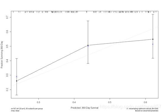
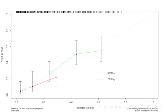
f5<- cph(Surv(time, status) ~ age + sex + ph.ecog + pat.karno +wt.loss, x=T, y=T, surv=T,
data=bc, time.inc=360)
cal5 <- calibrate(f5, cmethod="KM", method="boot", u=360, m=50, B=1000)
You can also beautify it and add some color.

You can also put the two pictures together. For
more exciting articles, please pay attention to the public account: zero-based scientific research