Python-Tkinter graphical interface design (detailed tutorial)
1. Basic understanding of graphical interface design
Most of the current popular computer desktop applications are Graphic User Interface (GUI), that is, commands are triggered by the mouse on graphical elements such as menus and buttons, and obtained from graphical display containers such as labels and dialog boxes. Man-machine dialogue information.
Python comes with the tkinter module, which is essentially a Python programming interface of the popular object-oriented GUI toolkit TK, which provides a quick and convenient way to create GUI applications. The basic steps of graphical programming usually include:
- Import the tkinter module
- Create the GUI root form
- Add human-computer interaction controls and write corresponding functions.
- Wait for the user to trigger an event response in the main event loop.
Second, the form control layout
2.1 Root form rendering example
The root form is the root controller of the graphical application and an instance of tkinter's underlying controls. After importing the tkinter module, call the Tk() method to initialize a root window instance root, use the title() method to set its title text, and use the geometry() method to set the size of the window (in pixels). Put it in the main loop, unless the user closes it, the program is always running. After executing the program, a form is displayed. In the root form of this main loop, other visual control instances can be continuously presented, monitoring the occurrence of events and executing corresponding processing procedures. The following is an example of the rendering of the root form:
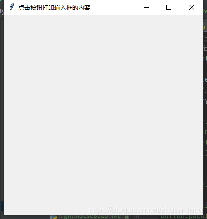
#coding=utf-8
import tkinter

Win = tkinter.Tk()
Win.title("点击按钮打印输入框的内容")
Win.geometry("400x400+20+20") # 这里的400x400是指窗口大小,+20+20是指窗口运行后距离屏幕左上角的位置
Win.mainloop()
2.2 Tkinter common controls
2.2.1 Common controls
| Control | name | effect |
|---|---|---|
| Button | Button | Click to trigger event |
| Canvas | canvas | Draw graphics or draw special controls |
| Checkbutton | Checkbox | Multiple choice |
| Entry | Input box | Receive single-line text input |
| Frame | frame | Used to group controls |
| Label | label | Single line text display |
| Listbox | List box | Show text list |
| Menu | menu | Create menu commands |
| Message | news | Multi-line text label, similar to Label usage |
| Radiobutton | single button | Make a single choice from mutually exclusive options |
| Scale | Slider | The default vertical direction, drag the mouse to change the value to form a visual interaction |
| Scrollbar | Slider | The default vertical direction, the mouse drag to change the value, can be combined with Text, Listbox, Canvas and other controls to move the visualization space |
| Text | Text box | Receive or output multiple lines of text |
| Toplevel | New form container | Create a new form at the top level |
2.2.2 Common attributes of controls
The visual controls presented on the form usually include common attributes such as size, color, font, relative position, relief style, icon style, and hover cursor shape. Different controls have their own characteristic attributes due to their different shapes and functions. Between the initialization of the root form and the main loop of the root form, form controls can be instantiated and their properties can be set. The parent container can be the root form or other container control instances. The common attributes of common controls are as follows:
| Attributes | Description | Value |
|---|---|---|
| anchor | Text start position | CENTER (default), E, S, W, N, NE, SE, SW, NW |
| bg | Background color | no |
| bd | Bold (default 2 pixels) | no |
| bitmap | Black and white binary icon | Find online |
| cursor | Mouse over cursor | Find online |
| font | Font | no |
| fg | font color | no |
| height | High (the unit of the text control is line) | no |
| image | Display image | no |
| justify | Alignment of multi-line text | CENTER (default), LEFT, RIGHT, TOP, BOTTOM |
| padx | Scale pixels horizontally | no |
| pads | Vertically expand pixels | no |
| relief | 3D relief style | FLAT,RAISED,SUNKEN,GROOVE,RIDGE |
| state | Whether the control instance status is available | NORMAL (default), DISABLED |
| width | Width (the unit of text control is line) | no |
#coding=utf-8
import tkinter
Win = tkinter.Tk()
Win.title("这是标题")
Win.geometry("400x400+200+200")
label = tkinter.Label(Win,text='这是文本标签',
        bg='#d3fbfb',
        fg='red',
        font=('宋体',32),
        width=20,
        height=2,
        relief="sunken")
label.pack()
Win.mainloop()
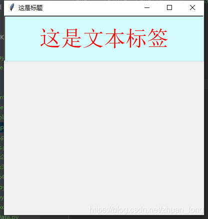
其中,标签实例label 在父容器Win中实例化,具有代码中所示的text(文本)、bg(背景色)、fg(前景色)、font(字体)、width(宽,默认以字符为单位)、height(高,默认以字符为单位)和 relief(浮雕样式)等一系列属性。
在实例化控件时,实例的属性可以“属性=属性值”的形式枚举列出,不区分先后次序。例如:“ text=‘这是文本标签’ ”显示标签的文本内容,“bg=’#d3fbfb’”设置背景色为十六进制数RGB色 #d3fbfb等等。属性值通常用文本形式表示。
当然如果这个控件实例只需要一次性呈现,也可以不必命名,直接实例化并布局呈现出来,例如:
tkinter.Label(Win,text='这是文本标签',bg='#d3fbfb',fg='red',font=('宋体',32),width=20,height=2,relief="sunken").pack()
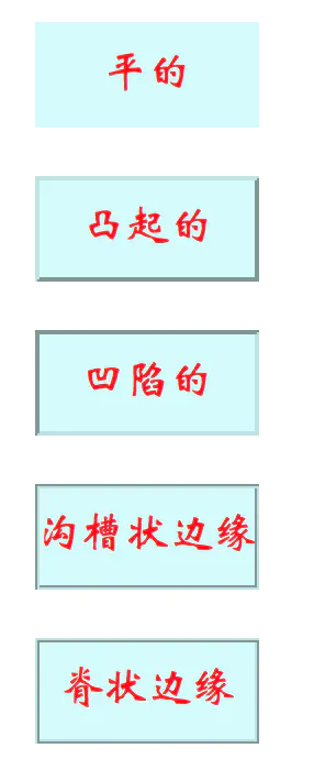
属性 relief 为控件呈现出来的3D浮雕样式,有 FLAT(平的)、RAISED(凸起的)、SUNKEN(凹陷的)、GROOVE(沟槽状边缘)和 RIDGE(脊状边缘) 5种。
2.3 控件布局
2.3.1 place() 使用方法
- place()方法:根据控件实例在父容器中的绝对或相对位置参数进行布局。其常用布局参数如下:
- x,y:控件实例在根窗体中水平和垂直方向上的其实位置(单位为像素)。注意,根窗体左上角为0,0,水平向右,垂直向下为正方向。
- relx,rely:控件实例在根窗体中水平和垂直方向上起始布局的相对位置。即相对于根窗体宽和高的比例位置,取值在0.0~1.0之间。
- height,width:控件实例本身的高度和宽度(单位为像素)。
- relheight,relwidth:控件实例相对于根窗体的高度和宽度比例,取值在0.0~1.0之间。
利用place()方法配合relx,rely和relheight,relwidth参数所得的到的界面可自适应根窗体尺寸的大小。place()方法与grid()方法可以混合使用。如下例子:利用place()方法排列消息(多行标签)。
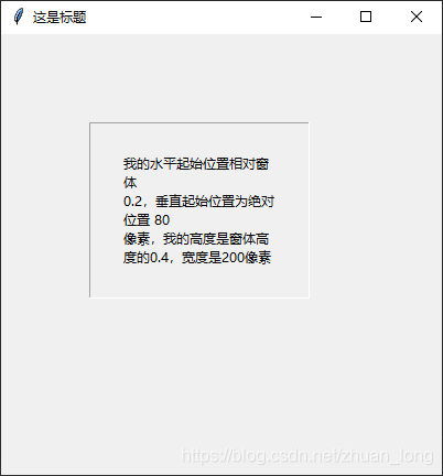
#coding=utf-8
import tkinter
Win = tkinter.Tk()
Win.title("这是标题")
Win.geometry('400x400+200+200')

Str = '''我的水平起始位置相对窗体 0.2,垂直起始位置为绝对位置 80 像素,我的高度是窗体高度的0.4,宽度是200像素'''
Msg = tkinter.Message(Win,text = Str,relief = 'groove')
Msg.place(relx = 0.2,y = 80,relheight = 0.4,width = 200)
Win.mainloop()
2.3.2 pack() 使用方法
- pack()方法:是一种简单的布局方法,如果不加-
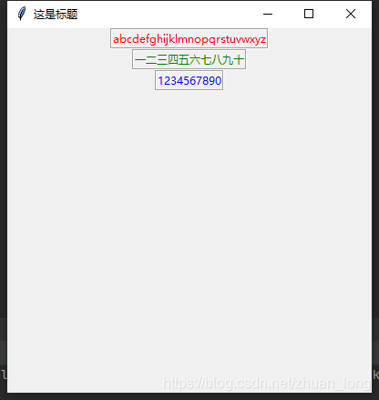
参数的默认方式,将按布局语句的先后,以最小占用空间的方式自上而下地排列控件实例,并且保持控件本身的最小尺寸。 - 用pack() 方法不加参数排列标签。为看清楚各控件所占用的空间大小,文本用了不同长度的中英文,并设置relief="groove"的凹陷边缘属性。如下所示:
#coding=utf-8
import tkinter
Win = tkinter.Tk()
Win.title("这是标题")
Win.geometry("400x400+200+200")
LabelRed = tkinter.Label(Win,text="abcdefghijklmnopqrstuvwxyz",fg="Red",relief = "groove")
LabelRed.pack()
LabelGreen = tkinter.Label(Win,text="一二三四五六七八九十",fg="green",relief = "groove")
LabelGreen.pack()
LabelBlue = tkinter.Label(Win,text="1234567890",fg="blue",relief = "groove")
LabelBlue.pack()
Win.mainloop()
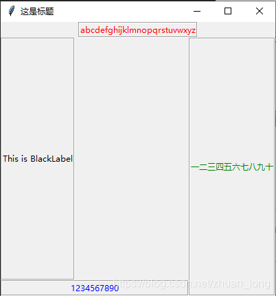
- 使用pack()方法可设置 fill、side 等属性参数。其中,参数fill 可取值:fill=X,fill=Y或fill=BOTH,分别表示允许控件向水平方向、垂直方向或二维伸展填充未被占用控件。参数 side 可取值:side=TOP(默认),side=LEFT,side=RIGHT,side=BOTTOM,分别表示本控件实例的布局相对于下一个控件实例的方位。如下例子:
#coding=utf-8
import tkinter
Win = tkinter.Tk()
Win.title("这是标题")
Win.geometry("400x400+200+200")
LabelRed = tkinter.Label(Win,text="abcdefghijklmnopqrstuvwxyz",fg="Red",relief = "groove")
LabelRed.pack()
LabelGreen = tkinter.Label(Win,text="一二三四五六七八九十",fg="green",relief = "groove")
LabelGreen.pack(fill = "y",side = "right")
LabelBlue = tkinter.Label(Win,text="1234567890",fg="blue",relief = "groove")
LabelBlue.pack(fill = "x",side = "bottom")
LabelBlack = tkinter.Label(Win,text = "This is BlackLabel",fg = "black",relief = "groove")
LabelBlack.pack(fill = "both",side = "left")
Win.mainloop()
2.3.3 grid() 使用方法
- grid()方法:是基于网格的布局。先虚拟一个二维表格,再在该表格中布局控件实例。由于在虚拟表格的单元中所布局的控件实例大小不一,单元格也没有固定或均一的大小,因此其仅用于布局的定位。pack()方法与grid()方法不能混合使用。
grid()方法常用布局参数如下:
- column: 控件实例的起始列,最左边为第0列。
- columnspan: 控件实例所跨越的列数,默认为1列。
- ipadx,ipady: 控件实例所呈现区域内部的像素数,用来设置控件实例的大小。
- padx,pady: 控件实例所占据空间像素数,用来设置实例所在单元格的大小。
- row: 控件实例的起始行,最上面为第0行。
- rowspan: 控件实例的起始行数,默认为1行。
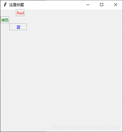
看下面的例子:用grid()方法排列标签,设想有一个3x4的表格,起始行、列序号均为0.将标签lbred 至于第2列第0行;将标签lbgreen置于第0列第1行;将标签lbblue置于第1列起跨2列第2行,占20像素宽。
#coding=utf-8
import tkinter
Win = tkinter.Tk()
Win.title("这是标题")
Win.geometry("400x400+200+200")
LabelRed = tkinter.Label(Win,text="Red",fg="Red",relief='groove')
LabelRed.grid(column=2,row=0)
LabelGreen = tkinter.Label(Win,text="绿色",fg="green",relief='groove')
LabelGreen.grid(column=0,row=1)
LabelBlue = tkinter.Label(Win,text="蓝",fg="blue",relief="groove")
LabelBlue.grid(column=1,columnspan=2,ipadx=20,row=2)
Win.mainloop()
Three, the characteristic attributes of tkinter common controls
The third part of the content, see the feature attributes of tkinter common controls in this post
Fourth, incident response
Five, background picture
6. Turn on the camera and display
1. Basic understanding of graphical interface design