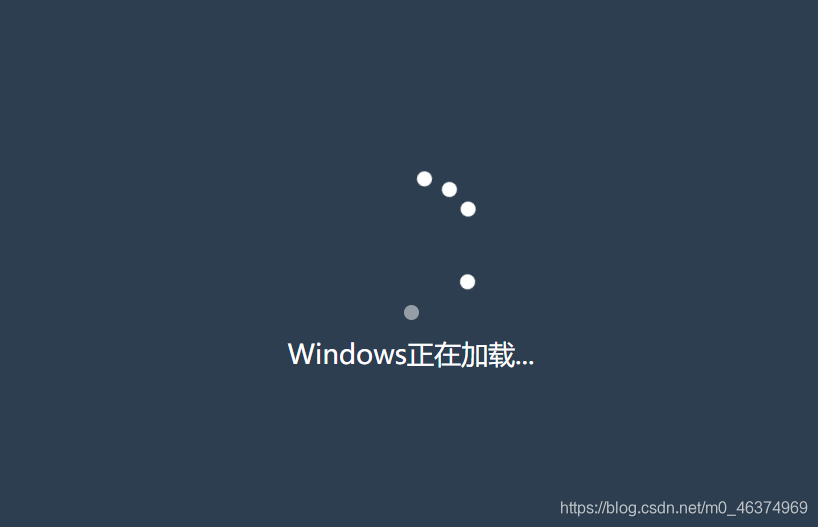
HTML+CSS to make Windows boot loading animation The
renderings are as follows:

HTML part of the source code is as follows:
<!DOCTYPE html>
<html lang="en">

<head>
    <meta charset="UTF-8">
    <meta name="viewport" content="width=device-width, initial-scale=1.0">
    <title>Windows加载动画</title>
    <link rel="stylesheet" href="style.css">
</head>

<body>
    <div class="container">
        <div class="loader">
            <span></span>
            <span></span>
            <span></span>
            <span></span>
            <span></span>
        </div>
        <p>Windows正在加载...</p>
    </div>
</body>

</html>
The source code of CSS is as follows:
:root {


    --background-color: #2c3e50;
    --border-color: #7591AD;
    --text-color: #34495e;
    --color1: #EC3E27;
    --color2: #fd79a8;
    --color3: #0984e3;
    --color4: #00b894;
    --color5: #fdcb6e;
    --color6: #e056fd;
    --color7: #F97F51;
    --color8: #BDC581;
}

* {


    margin: 0;
    padding: 0;
}

html {


    font-size: 14px;
}

body {


    width: 100vw;
    height: 100vh;
    background-color: var(--background-color);
    display: flex;
    justify-content: center;
    align-items: center;
    font-family: 'Montserrat', sans-serif, Arial, 'Microsoft Yahei';
}

.container {


    width: 400px;
    height: 400px;
    /* background-color: turquoise; */
    display: flex;
    justify-content: center;
    align-items: center;
    flex-direction: column;
    color: #fff;
    font-size: 18px;
}

.loader {


    position: relative;
    width: 100px;
    height: 100px;
    margin: 10px;
    /* background-color: violet; */
}

.loader span {


    position: absolute;
    width: 100px;
    height: 100px;
    animation: animate 3.5s linear infinite;
}

.loader span::before {


    position: absolute;
    content: "";
    background-color: #FFF;
    width: 10px;
    height: 10px;
    bottom: 0;
    left: calc(50% - 5px);
    border-radius: 50%;
}

.loader span:nth-child(1) {


    animation-delay: 0.1s;
}

.loader span:nth-child(2) {


    animation-delay: 0.2s;
}

.loader span:nth-child(3) {


    animation-delay: 0.3s;
}

.loader span:nth-child(4) {


    animation-delay: 0.4s;
}

.loader span:nth-child(5) {


    animation-delay: 0.5s;
}

@keyframes animate {


    74%{


        transform: rotate(600deg);
    }
    79% {


        transform: rotate(720deg);
        opacity: 1;
    }
    80% {


        transform: rotate(720deg);
        opacity: 0;
    }
    100% {


        transform: rotate(810deg);
        opacity: 0;
    }
}