
推荐学习专栏:
Article directory
foreword
When we browse the web, we can always see some cool special effects, such as the blinds effect. In this article, we will use HTML+CSS to make a small blinds project, which is suitable for small partners who are just learning the front end. The code is simple and easy to understand, and it is easy to learn. After finishing this article, I believe you can also knock out your own blinds effect, change the size of the picture and the corresponding box, if you have a girlfriend, you can try to put a few photos together, it is also a very romantic thing, not much to say Say, start explaining the code.
1. The shutter effect
This project realizes the dynamic switching of several pictures, and the complete picture can be displayed when the mouse reaches the corresponding picture position
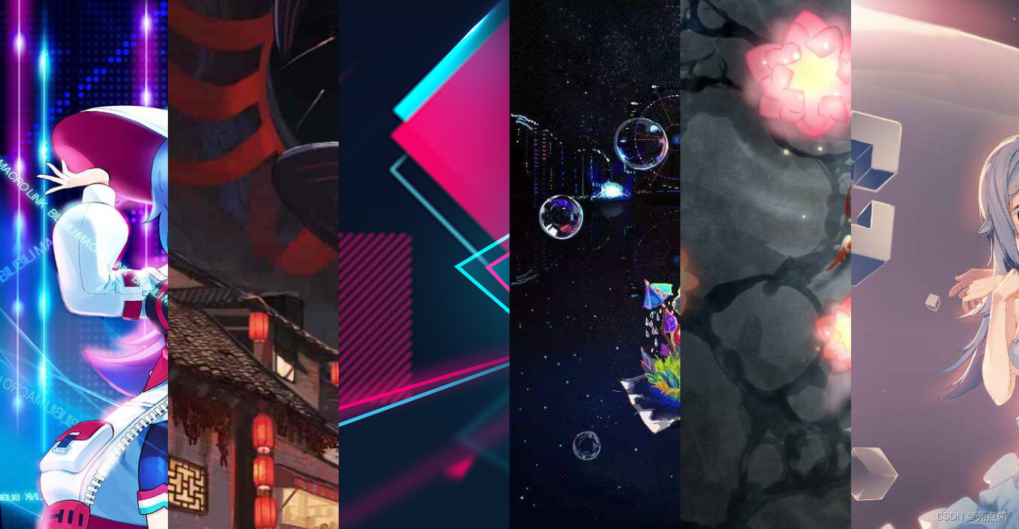
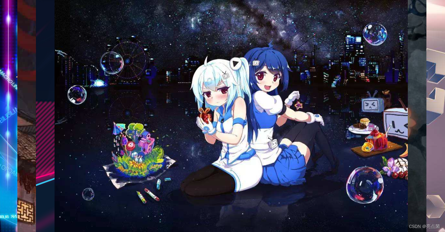
dynamic effect

2. Principle explanation
Use the same few boxes to organize the "blinds", each box is used to put a photo, put all the small boxes for photos in a big box, and operate each box to achieve the desired effect , please see below for specific operations.
set style
- Set the width and height of the box to border overflow (overflow hidden)
overflow : If overflow:hidden is set in an element, if the content of the element exceeds the given width and height attributes, the excess part will be hidden without occupying space. (You can also use overflow: hidden to clear the float)
-
Use wildcards to clear the original border style
*{ margin=0; padding=0; } -
Use selectors to style each section individually
Notice:
- Because ul is a block-level element, you can set ul as a flexible layout for convenience
- Because ul li is a label with its own inner and outer margins, it can be more flexible and convenient to control the label of the web page
- Use transition to set the shutter transition time
transition is css3 animation content, an important style to realize the shutter effect, and the transition time setting unit is s/ms.
- Set img as a block-level element, set width and height
- Set the hover effect (hover is a pseudo class selector)
- hover : mouse pseudo-class, the hover after the colon (:) is a fixed way of writing, before the colon (:) is the target to add the hover pseudo-class (the target should not be written as a label selector), the specified target: preferably a single .
- Function : Trigger the specified style when the mouse moves in and out
- When the mouse moves in : the style that triggers hover
- When the mouse is out : Return to the initial style.
- The code in the entire hover will not be loaded. When using the hover pseudo-class, the child (descendant) selector
- Written after hover, it means: : the front is the triggerer and the one after hover is the displayer
3. Making shutters
-
First create an empty folder on the desktop, drag the folder directly into VSCode (development tool)
-
After entering, right-click the new folder in the icon position, name it
img, and store the displayed photos, then right-click the newly created.htmlfile (that is, the web page file), and then you can write code in this file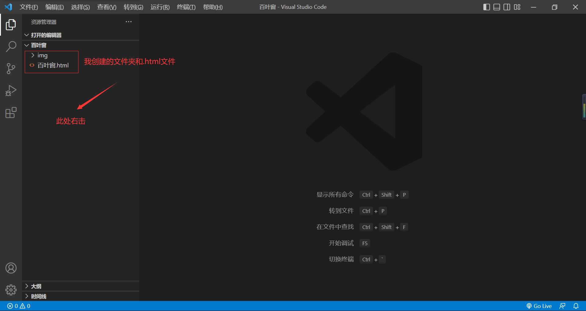
-
Write html template, just
!+enter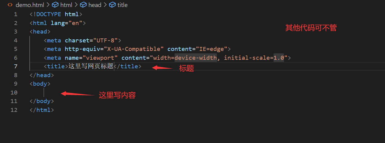
-
Fix the structure first, write
<body> </body>the box below , and after the src is the path that needs to insert the picture<ul> </ul><li> </li><body> <ul> <li><img src="img/p1.jpeg" alt="" /></li> <li><img src="img/p2.jpeg" alt="" /></li> <li><img src="img/p3.jpeg" alt="" /></li> <li><img src="img/p4.jpeg" alt="" /></li> <li><img src="img/p5.jpeg" alt="" /></li> <li><img src="img/p6.jpeg" alt="" /></li> </ul> </body> -
CSS decorates the html structure, that is, the CSS style, which can set the size of the box and the background color. This part is written
<head>under<style> </style>
The width in the above code needs to be set accurately. You can adjust the size of the corresponding box according to the size of your picture. It is best to put the photo in the same size. It is the
transitionoperation of the box action. Set the transformation time to 1s.
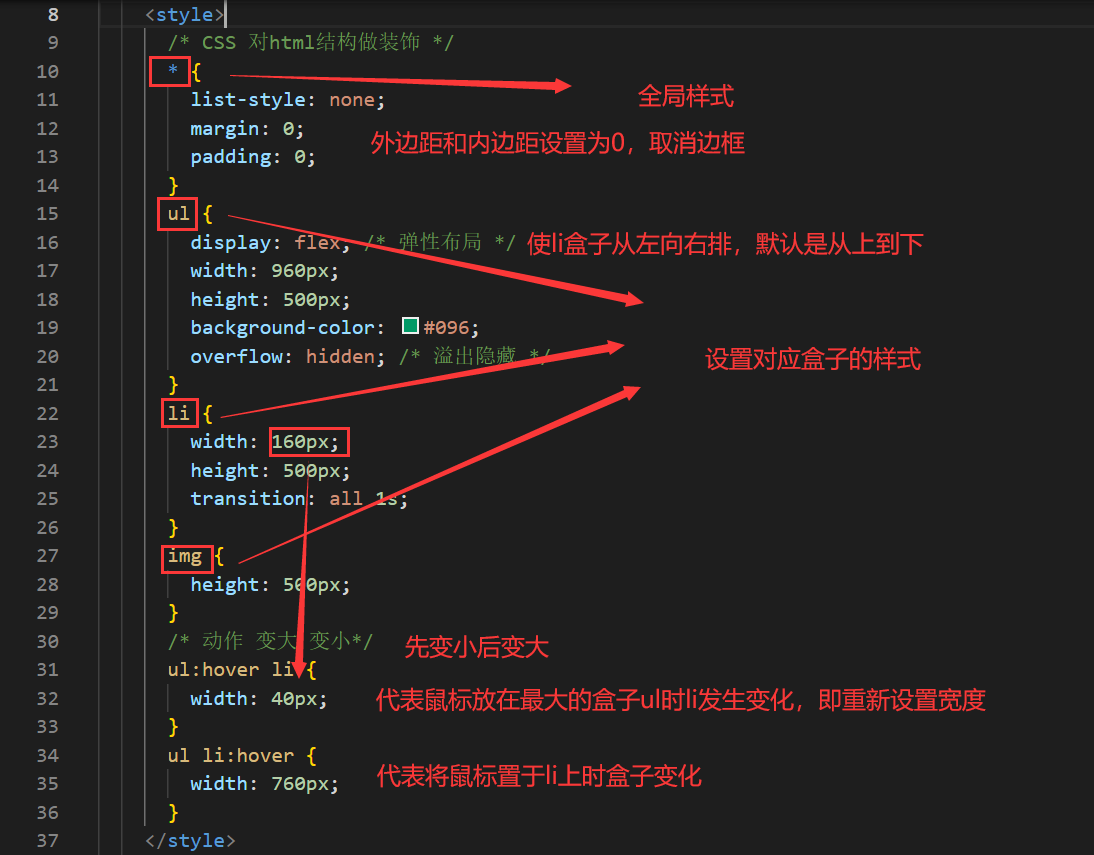
The CSS source code is as follows:<style> /* CSS 对html结构做装饰 */ * { list-style: none; margin: 0; padding: 0; } ul { display: flex; /* 弹性布局 */ width: 960px; height: 500px; background-color: #096; overflow: hidden; /* 溢出隐藏 */ } li { width: 160px; height: 500px; transition: all 1s; } img { height: 500px; } /* 动作 变大 变小*/ ul:hover li { width: 40px; } ul li:hover { width: 760px; } </style>
4. Resource download
Case effect pictures and other resources are as follows, you can pick up what you need
-
Baidu Netdisk : Link:
https://pan.baidu.com/s/19cmCorgWelAFRQhOSW2M8Q?pwd=o5un
Extraction code: o5un -
CSDN download :
https://download.csdn.net/download/CSDN_anhl/87050707
5. Complete code
<!DOCTYPE html>
<html lang="en">
<head>
<meta charset="UTF-8" />
<meta http-equiv="X-UA-Compatible" content="IE=edge" />
<meta name="viewport" content="width=device-width, initial-scale=1.0" />
<title>百叶窗</title>
<style>
/* CSS 对html结构做装饰 */
* {
list-style: none;
margin: 0;
padding: 0;
}
ul {
display: flex;
/* 弹性布局 */
width: 960px;
height: 500px;
background-color: #096;
overflow: hidden;
/* 溢出隐藏 */
}
li {
width: 160px;
height: 500px;
transition: all 1s;
}
img {
height: 500px;
}
/* 动作 变大 变小*/
ul:hover li {
width: 40px;
}
ul li:hover {
width: 760px;
}
</style>
</head>
<body>
    <ul>
      <li><img src="img/p1.jpeg" alt="" /></li>
      <li><img src="img/p2.jpeg" alt="" /></li>
      <li><img src="img/p3.jpeg" alt="" /></li>
      <li><img src="img/p4.jpeg" alt="" /></li>
      <li><img src="img/p5.jpeg" alt="" /></li>
      <li><img src="img/p6.jpeg" alt="" /></li>
    </ul>
</body>
</html>
Summarize
By learning these interesting small projects, we can not only deepen our understanding of knowledge, but also enhance our interest in learning the front-end. Interested friends can subscribe to the blogger’s column, learn the basic knowledge of the front-end, and create the special effects you want!