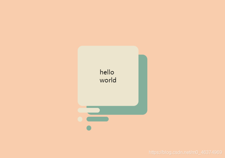
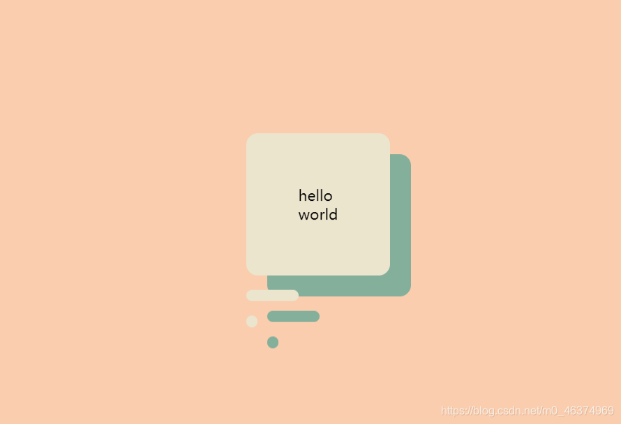
HTML+CSS to make a floating dialog box The
renderings are as follows:
HTML part of the source code is as follows:
<!DOCTYPE html>
<html lang="en">

<head>
    <meta charset="UTF-8">
    <meta name="viewport" content="width=device-width, initial-scale=1.0">
    <title>对话框</title>
    <link rel="stylesheet" href="style.css">
</head>

<body>
    <p>hello <br> world</p>
</body>

</html>
The source code of CSS is as follows:
:root {


    --background-color: #f9cdad;
    --border-color: #7591AD;
    --text-color: #34495e;
    --color1: #ECE5CE;
    --color2: #83af9b;
}

* {


    margin: 0;
    padding: 0;
}

html {


    font-size: 14px;
}

body {


    width: 100vw;
    height: 100vh;
    background-color: var(--background-color);
    display: flex;
    justify-content: center;
    align-items: center;
    font-family: 'Montserrat', sans-serif, Arial, 'Microsoft Yahei';
}

p {


    position: relative;
    padding: 50px;
    background-color: var(--color1);
    border-radius: 11px;
    /* 投影 */
    box-shadow: 20px 20px var(--color2);
    /* 动画效果 50%的时候向上移动20px */
    animation: animate1 4s ease-in-out infinite;
}

/* 实现底部横线与圆点 */

p::after, p::before {


    position: absolute;
    content: '';
    height: 11px;
    left: 0px;
    background-color: var(--color1);
    border-radius: 11px;
    /* 投影 */
    box-shadow: 20px 20px var(--color2);
}

/* 单独定义底部横线的样式,宽度为50px */

p::after {


    width: 50px;
    bottom: -25px;
    /* 动画效果 50%的时候向上移动10px 加上P元素向上移动20,真实移动像素为20+10px */
    animation: animate2 4s ease-in-out infinite;
}

/* 单独定义底部圆点的样式,宽度为11px */

p::before {


    width: 11px;
    bottom: -50px;
    /* 动画效果 50%的时候向上移动15px 加上P元素向上移动20,真实移动像素为20+15px */
    animation: animate3 4s ease-in-out infinite;
}

@keyframes animate1 {


    /* 初始化和结束状态为默认 */
    50% {


        transform: translateY(-20px);
    }
}

@keyframes animate2 {


    /* 初始化和结束状态为默认 */
    50% {


        transform: translateY(-10px);
    }
}

@keyframes animate3 {


    /* 初始化和结束状态为默认 */
    50% {


        transform: translateY(-15px);
    }
}