Video lesson: https://edu.csdn.net/course/play/7621
Contents of this chapter
Section 1 Linear layout
Section 2 Relative layout
Section 3 Frame layout
Section 4 Table layout
Section 5 Grid layout
Linear layout
The linear layout is configured using the <LinearLayout> tag, and the class in the corresponding code is android.widget.LinearLayout. The linear layout is divided into two directions, horizontal and vertical .
Common attributes of linear layout are as follows:
android:orientation represents the layout direction, the value vertical represents the vertical layout, and the value horizontal represents the horizontal layout.
android:gravity indicates the alignment of the view. The
content includes: top, bottom, left, right, center_vertical, center_horizontal, center, you can use | to separate and fill in multiple values
. The views in the layout can use the following attributes
android:layout_gravity represents the alignment of a single view, android:layout_weight represents the proportion of the size of a single view, when the layout_weight is 0, the view size is determined by itself, when the layout_weight is greater than 0, the view stretches according to the proportion in the linear layout direction
Relative layout
Relative layout is a layout by setting the relative position. The relative layout is configured using the <RelativeLayout> tag. The class in the corresponding code is android.widget.RelativeLayout. The views in the layout are arranged by setting the relative position of each other. Arrangement position, relative alignment; relative layout is more convenient to use drag-and-drop.
The common attributes available for the view in the relative layout are as follows:
Location-related attributes
android:layout_above means above the target component
android:layout_below means below the target component
android:layout_toLeftOf means on the left side of the target component
android:layout_toRightOf means on the right side of the target component
Properties related to alignment
android:alignBaseLine means aligned with the baseline of the target component
android:alignBottom means aligned with the bottom edge of the target component
android:alignTop means aligned with the top edge of the target component
android:alignLeft means aligned with the left side of the target component
android:alignRight means aligned with the target component Align on the right
android:layout_centerHorizontal means center horizontally in the relative layout container
android:layout_centerVertical means vertical centering in the relative layout container
Frame layout
Frame layout is a layout in which views are stacked and displayed
Use the <FrameLayout> tag to configure, the corresponding class is android.widget.FrameLayout, the views in the layout are arranged in the order of writing, the first added is displayed at the bottom, and the last added is displayed at the top. Each view can be specific to the layout. Set the position of the container
Common attributes of frame layout

android:foreground is used to represent the topmost overlay of the frame layout
android:foregroundGravity is used to indicate the location of the overlay content
The common attributes available for views in the frame layout are as follows:
android:layout_gravity represents the position of the view, the content includes: top, bottom, left, right, center_vertical, center_horizontal, center, you can use | to separate multiple values
Layout file:
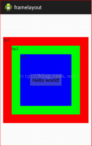
<FrameLayout xmlns:android="http://schemas.android.com/apk/res/android"android:layout_width="match_parent"android:layout_height="match_parent" ><TextViewandroid:layout_gravity="center"android:layout_width="300dp"android:layout_height="300dp"android:background="#FF0000"android:text="@string/tip1" />……</FrameLayout></pre><pre code_snippet_id="1741515" snippet_file_name="blog_20160702_4_51180" name="code" class="html">
Table layout
Table layout is a layout in which views are arranged in rows and columns. It is configured using <TableLayout> and <TableRow> tags. The corresponding class is android.widget.TableLayout. A pair of <TableRow> tags contain the views displayed in a row.
Common attributes of table layout
android:stretchColumns is used to specify the columns that can be stretched. The columns that can be stretched are stretched and filled when there is a blank area on the screen. The columns are indicated by index values starting from 0, and multiple columns are separated by commas.
android:shrinkColumns is used to specify the columns that can be compressed. When the screen is not enough, the columns are compressed until fully displayed
android:collapseColumns is used to indicate columns that can be completely collapsed
The common attributes available for views in the table layout are as follows:
android:layout_column specifies the index number of the column, because some rows may not have the full number of columns, you need to specify the index number for the column at this time
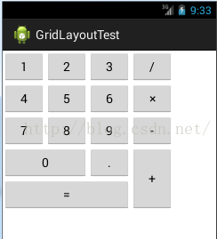
Grid layout
The grid layout is represented by GridLayout, which is a new layout manager for Android 4.0. Use the <GridLayout> tag for configuration, and the corresponding class is android.widget.GridLayout
Common attributes of grid layout are as follows:
android:columnCount sets the number of columns in the grid
android:rowCount sets the number of rows in the grid
The common properties of subviews in the grid layout are as follows:XML Attribute Description
android: layout_column disposed in the first sub-assembly of columns GridLayout
android: layout_columnSpan disposed across the subassembly transverse columns on GridLayout
android: layout_gravity disposed subassembly manner in which the space occupied by the mesh
android: layout_row Set the subcomponent in the first few rows of the GridLayout
android:layout_rowSpan Set the subcomponent to span several rows in the GridLayout longitudinal directionRealize the view interface as shown below through grid layout