Hello everyone, have you all eaten? I’m Kaiqisan, a shameless boy. When we use div+css layout, because div is a block-level element, it will always wrap automatically when arranged. Now there is a requirement to be able to wrap automatically.
<div class="main">
	<div class="block"></div>
	<div class="block"></div>
	<div class="block"></div>
	<div class="block"></div>
	<div class="block"></div>
	<div class="block"></div>
</div>
	.main {


		width: 800px;
		height: 600px;
		border: 1px solid #000000;
	}

	.block {


		width: 100px;
		height: 80px;
		margin: 15px;
		border: 1px solid #8470FF;
	}
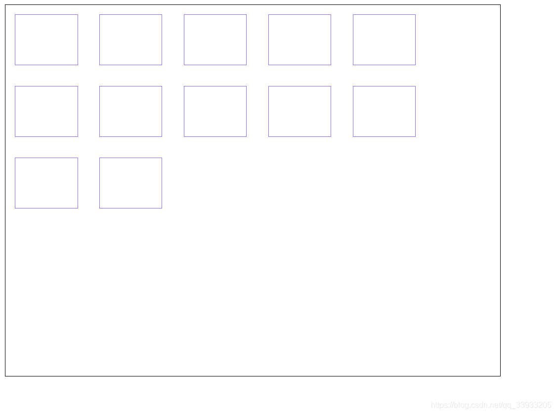
display effect

Sometimes, we want to arrange them horizontally, and then automatically wrap them when they reach the right end of the parent block. This type of responsive page is of great significance.
So we can do
method 1
- Add for the inner member div
display: inline-block
	.block {


		width: 100px;
		height: 80px;
		margin: 15px;
		border: 1px solid #8470FF;
        display: inline-block;
        /* div的默认的display为block,块级元素,这也是导致div默认竖向排列的原因 */
	}
Then we increase the div block to more blocks
<div class="main">
	<div class="block"></div>
	<div class="block"></div>
	<div class="block"></div>
	<div class="block"></div>
	<div class="block"></div>
	<div class="block"></div>
	<div class="block"></div>
	<div class="block"></div>
	<div class="block"></div>
	<div class="block"></div>
	<div class="block"></div>
	<div class="block"></div>
</div>
display effect
Method 2
- Modify the arrangement, use flex layout
	.main {


		width: 800px;
		height: auto;	/* 不要使用定高度,后果自负 */
		border: 1px solid #000000;
		display: flex;
		flex-wrap: wrap;
	}

	.block {


		width: 100px;
		height: 80px;
		margin: 15px;
		border: 1px solid #8470FF;
	}
Method 3
- Use grid layout
	.main {


		width: 800px;
		height: 600px;
		border: 1px solid #000000;
		display: grid;
		grid-template-columns: 1fr 1fr 1fr;
        /* 横向排列规则,把宽度分为三等分 */
	}

	.block {


		width: 100px;
		height: 80px;
		margin: 15px;
		border: 1px solid #8470FF;
	}
Display of results
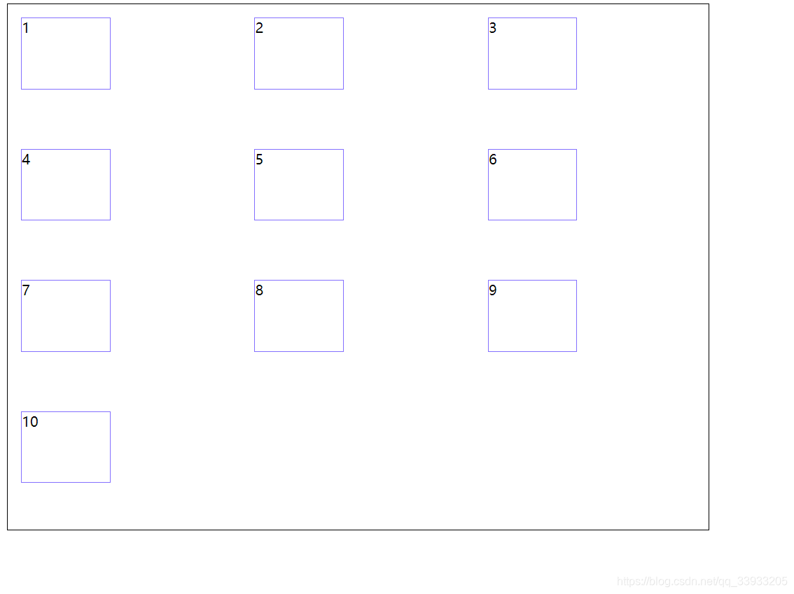
This method can more accurately typeset your div block, and the detailed content will be published in a column in the future. Grad layout is also a piece of knowledge that companies often produce in the knowledge of css interviews.
to sum up
There is no summary, just use it directly.