Not long ago, Apple held a press conference to announce the launch of iOS 14 and macOS Big Sur. Among them, the new UI change is definitely the future trend.
Today, we will analyze the material broadcast, what are the changes this time, and prepare the relevant components, let’s watch it together~
From plane to three-dimensional
In the past, most product designs were flat designs.
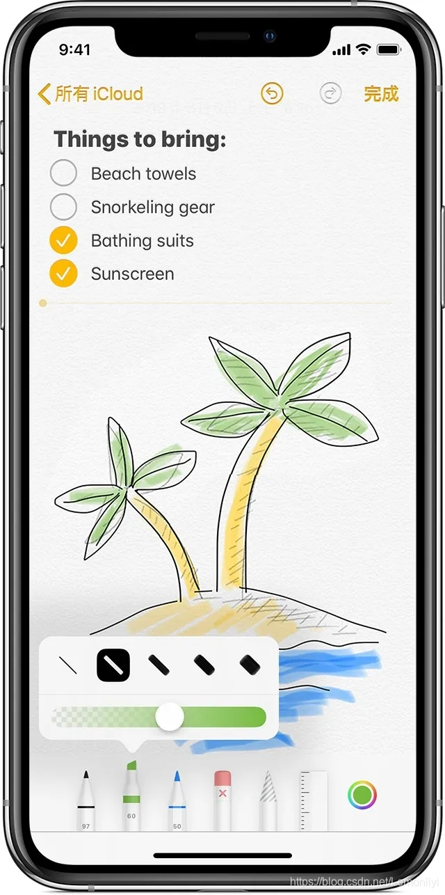
But since iOS13 last year, Apple has been trying to change, wanting to present more images in UI design, such as drawing tools for memos.
This year, iOS14 has further strengthened this style. In the new Apple operating system, you can see more shadows, textures and 3D shapes in many places.
Alan Dye, vice president of Apple’s human-machine interface, put it this way: “Depth, shadows and translucency are used to create hierarchies. The new materials are rich and vibrant...”
Summary: Designers can keep the simple style in design, but add some simple effects (shadows, translucency) to establish visual hierarchy.
Visual reminder of changes
The human brain needs prompts to recognize objects, so in order to enhance the sense of prompts, many people will increase the shadow of the button to form a 3D effect.
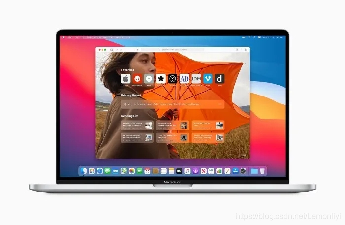
In addition, exercise is also an additional clue. Just like the macOS toolbar, when you move the mouse cursor to the corresponding icon, they will become larger and the background highlighted, just to encourage users to click further.
Another way is to use color. Apple wants designers to use tones to make the elements more conspicuous.

The biggest change to macOS is that the design style is more and more similar to iOS, which also laid the foundation for Apple's future platform integration strategy. This convergence is not only reflected in the visual level, but also in the interactive level.
Summary: Don't be afraid of not highlighting all the options. Not every button needs to have a shape. It reappears when the user mouses over it. Try color where possible to eliminate visual complexity.
Transparency and background blur
In iOS7, Apple started to make some frosted glass effect UI styles, like this:

In iOS13, a large number of cards with a frosted glass texture are used, and four different background blurs are also set.
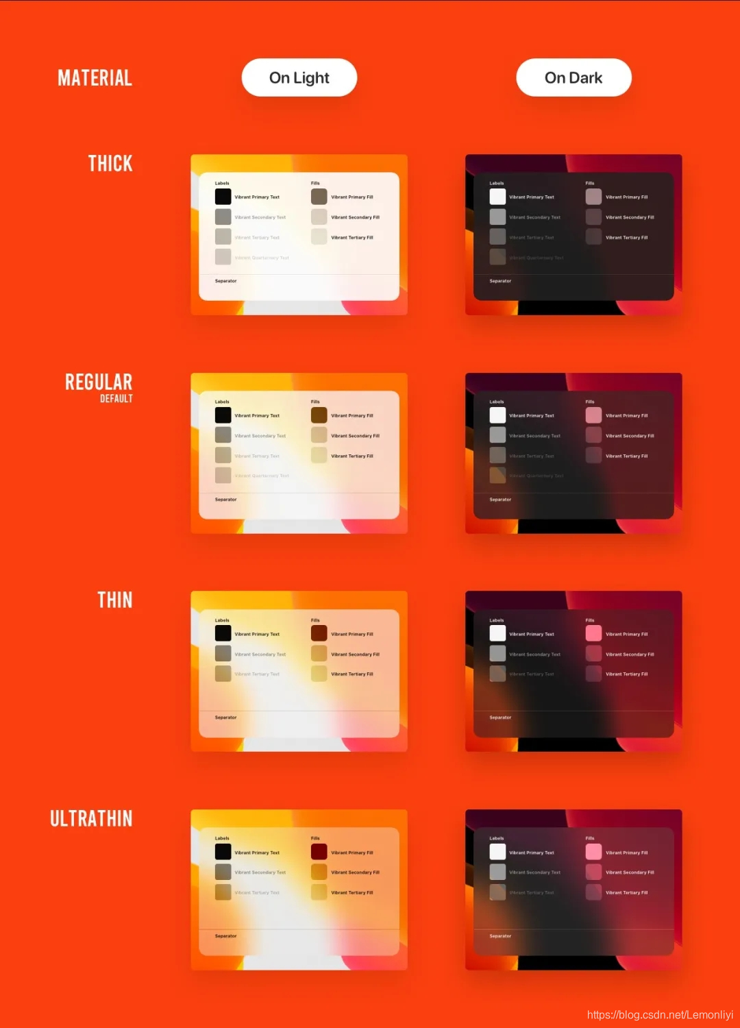
In iOS14, transparency and background blur are strengthened, and the concept of layering is proposed.
Summary: Try to use shadows and translucency to create visual hierarchy.
Icon new mimicry
Apple's icon design has been at the forefront of the industry, silently influencing other colleagues.
However, this year they stepped out of their comfort zone and ushered in a new change-mimicry, which changed the flatness, enhanced the three-dimensionality, and had a new style.

Summary: You can change the flat iOS icons through shadows and gradients.
In addition to the above, there are rounded corner changes, small components, and so on.
Intimate like us, according to the characteristics of iOS14, a batch of new components have been launched, a total of 15 components, which are convenient for the knife friends to reuse quickly.

Hurry up to experience the material square~ the method is as follows:
The first step is to find the desired target page in the material square and click save.
In the second step, click the material to find the material you just saved, and place it on the current page, or, in the right component, drag it directly to the workspace.

If you have other material needs, please leave a message to tell us~