Compose は、マテリアル デザイン スタイルのホームページ コンポーネント ( Scaffold) を提供します。これを直接適用して、APP のホームページ インターフェイスを完成させることができます。
Scaffold には他のコンポーネントも含まれているため、いくつかのフロント コンポーネントを説明するために、最初に Scaffold について説明します。
トップアプリバー
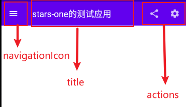
まず、これは TopAppBar ですが、これは本質的には Android にネイティブな一般的なツールバーですが、より適切にパッケージ化されており、迅速に構築できます。
TopAppBar(
    title: @Composable () -> Unit,
    modifier: Modifier = Modifier,
    navigationIcon: @Composable (() -> Unit)? = null,
    actions: @Composable RowScope.() -> Unit = {},
    backgroundColor: Color = MaterialTheme.colors.primarySurface,
    contentColor: Color = contentColorFor(backgroundColor),
    elevation: Dp = AppBarDefaults.TopAppBarElevation
)
titleタイトル、Compose コンポーネントを受け取り、そこに Text テキストを渡すことができますmodifier修飾子、詳細については前の章を参照してくださいnavigationIconナビゲーションアイコンactionsアクションコンポーネントbackgroundColor背景色contentColorコンテンツの色elevation影
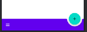
それは非常に明確かもしれません。コードとレンダリングを直接アップロードしましょう。そうすれば、誰もが明確になるでしょう。
TopAppBar(
    navigationIcon = {
        IconButton(
            onClick = {}
        ) {
            Icon(Icons.Filled.Menu, null)
        }
    },
    title = {
        Text("stars-one的测试应用")
    },actions = {
        IconButton(
            onClick = {}
        ) {
            Icon(Icons.Filled.Share, null)
        }
        IconButton(
            onClick = {}
        ) {
            Icon(Icons.Filled.Settings, null)
        }
    }
)
レンダリングは次のとおりです
フローティングアクションボタン
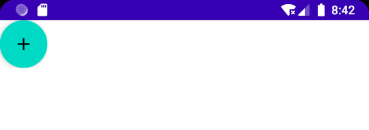
より一般的なフローティング ボタンは通常、内部に単純なボタンがあり、パラメータは前のボタンと同じです。
FloatingActionButton(
    onClick: () -> Unit,
    modifier: Modifier = Modifier,
    interactionSource: MutableInteractionSource = remember { MutableInteractionSource() },
    shape: Shape = MaterialTheme.shapes.small.copy(CornerSize(percent = 50)),
    backgroundColor: Color = MaterialTheme.colors.secondary,
    contentColor: Color = contentColorFor(backgroundColor),
    elevation: FloatingActionButtonElevation = FloatingActionButtonDefaults.elevation(),
    content: @Composable () -> Unit
)
使用:
FloatingActionButton(onClick = { /*TODO*/ }) {
    Icon(imageVector = Icons.Default.Add, contentDescription = null)
}
PS: 通常、これは
ScaffoldFloatingActionButton の位置を制御するために Scaffold と組み合わせて使用されます。
さらに、ExtendedFloatingActionButton以下に示すように、アイコンとテキストを含めることができる別のものがあります。
ExtendedFloatingActionButton(
    icon = { Icon(Icons.Filled.Favorite, contentDescription = null) },
    text = { Text("ADD TO BASKET") },
    onClick = { /*do something*/ }
)
ExtendedFloatingActionButton違いFloatingActionButtonは、ExtendedFloatingActionButton主にテキストであり、アイコンはオプションであり、FloatingActionButtonアイコンのみが表示されることです。
ボトムアプリバー
これは、以前の TopAppBar パラメータとは異なります。名前から、実際には下部に配置されるツールバーであることがわかりますが、位置制御がなく、Scaffold と組み合わせて使用する必要があります。単独で使用する場合、ページ上部の TopAppBar と同じ効果になります。
BottomAppBar(
    modifier: Modifier = Modifier,
    backgroundColor: Color = MaterialTheme.colors.primarySurface,
    contentColor: Color = contentColorFor(backgroundColor),
    cutoutShape: Shape? = null,
    elevation: Dp = AppBarDefaults.BottomAppBarElevation,
    contentPadding: PaddingValues = AppBarDefaults.ContentPadding,
    content: @Composable RowScope.() -> Unit
)
このレイアウトは Row レイアウトと考えることができます。その中のパラメータは、背景色の設定やパディングマージンの設定など、名前から確認できるため、ここでは詳しく説明しません。
注目すべきはcutoutShape属性で、Scaffold途中にBottomAppBar和があるとFloatingActionButton以下のような効果が得られます。
ボトムナビゲーション
BottomNavigationそこには N が入りますBottomNavigationItem。定義するメニュー項目の数によって異なります。
BottomNavigation(
    modifier: Modifier = Modifier,
    backgroundColor: Color = MaterialTheme.colors.primarySurface,
    contentColor: Color = contentColorFor(backgroundColor),
    elevation: Dp = BottomNavigationDefaults.Elevation,
    content: @Composable RowScope.() -> Unit
)
BottomNavigation提供されているパラメータの一部は色や影を変更するものですが、焦点は次のとおりです。BottomNavigationItem
BottomNavigationItem(
    selected: Boolean,
    onClick: () -> Unit,
    icon: @Composable () -> Unit,
    modifier: Modifier = Modifier,
    enabled: Boolean = true,
    label: @Composable (() -> Unit)? = null,
    alwaysShowLabel: Boolean = true,
    interactionSource: MutableInteractionSource = remember { MutableInteractionSource() },
    selectedContentColor: Color = LocalContentColor.current,
    unselectedContentColor: Color = selectedContentColor.copy(alpha = ContentAlpha.medium)
)
BottomNavigationItemselected選択するかどうかを示すパラメータがあります
iconそれはアイコンの設定labelとテキストであり、両方ともコンポーネントを受け取る必要があります
selectedContentColor選択した色unselectedContentColor未チェックの色
直接説明するための例を次に示します
var selectIndex by remember {
    mutableStateOf(0)
}
val navList = listOf("首页","发现","我的")
BottomNavigation() {
    navList.forEachIndexed { index, str ->
        BottomNavigationItem(
            selected = index == selectIndex, onClick = { selectIndex = index },
            icon = {
                Icon(imageVector = Icons.Default.Favorite, contentDescription =null )
            },label = {Text(str)}
        )
    }
}

Text(text = "这是${navList[selectIndex]}")
効果は以下の通りです

PS:appbarやbootomBarを使用するとコンテンツ内のコンテンツがブロックされてしまうので、この時
PaddingValue内側のマージンを設定する必要があります。
Scaffold(){
     Surface(modifier = Modifier.padding(bottom = it.calculateBottomPadding())) {

     }
}
足場
Scaffold(
    modifier: Modifier = Modifier,
    scaffoldState: ScaffoldState = rememberScaffoldState(),
    topBar: @Composable () -> Unit = {},
    bottomBar: @Composable () -> Unit = {},
    snackbarHost: @Composable (SnackbarHostState) -> Unit = { SnackbarHost(it) },
    floatingActionButton: @Composable () -> Unit = {},
    floatingActionButtonPosition: FabPosition = FabPosition.End,
    isFloatingActionButtonDocked: Boolean = false,
    drawerContent: @Composable (ColumnScope.() -> Unit)? = null,
    drawerGesturesEnabled: Boolean = true,
    drawerShape: Shape = MaterialTheme.shapes.large,
    drawerElevation: Dp = DrawerDefaults.Elevation,
    drawerBackgroundColor: Color = MaterialTheme.colors.surface,
    drawerContentColor: Color = contentColorFor(drawerBackgroundColor),
    drawerScrimColor: Color = DrawerDefaults.scrimColor,
    backgroundColor: Color = MaterialTheme.colors.background,
    contentColor: Color = contentColorFor(backgroundColor),
    content: @Composable (PaddingValues) -> Unit
)
プロパティの説明
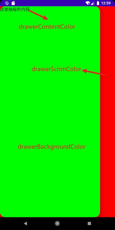
topBarトップレイアウトbottomBar下部レイアウトfloatingActionButtonフローティングボタンレイアウトfloatingActionButtonPositionフローティング ボタン位置、はいFabPosition.End(デフォルト) およびFabPosition.CenterオプションisFloatingActionButtonDockedBottomAppBar と組み合わせて使用すると、下部ナビゲーション バーのトリミング効果を実現できます。その効果は次の図で確認できます。drawerGesturesEnabledサイドドロワージェスチャを有効にするかどうか(ドロワーを開いた後、横にスライドすることで開くことができます)drawerShape引き出しの形状drawerContentサイド引き出しの中身は自分でアレンジできるコラムレイアウトですdrawerElevationサイド引き出しの影drawerBackgroundColorサイドドロワーの背景色drawerContentColorサイドドロワーのコンテンツの色 (フォントの色をオーバーライドするようです)drawerScrimColorサイド引出しカバー底面カラー
基本的な使い方
5 つの属性を使用してtopBar bottomBar floatingActionButton floatingActionButtonPosition isFloatingActionButtonDockedシンプルなアーキテクチャ効果を実現します
Scaffold(
    topBar = {
        TopAppBar(
            navigationIcon = {
                IconButton(
                    onClick = {}
                ) {
                    Icon(Icons.Filled.Menu, null)
                }
            },
            title = {
                Text("stars-one的测试应用")
            },actions = {
                IconButton(
                    onClick = {}
                ) {
                    Icon(Icons.Filled.Share, null)
                }
                IconButton(
                    onClick = {}
                ) {
                    Icon(Icons.Filled.Settings, null)
                }
            }
        )
    },
    floatingActionButton = {
        FloatingActionButton(onClick = { /*TODO*/ }) {
            Icon(imageVector = Icons.Default.Favorite, contentDescription = null)
        }
    },
    bottomBar = {

        BottomAppBar(cutoutShape = CircleShape) {

        }
    },
    //注意此参数,可以实现图中那种被裁剪的效果,前提是上面的cutoutShape也有设置
    isFloatingActionButtonDocked = true,
    floatingActionButtonPosition = FabPosition.End

) {
    //这里是主界面
    Text("我是要展示的内容")
}
結果は以下の通り

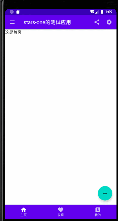
下部のナビゲーションバー
上記のベース(主にbottomAppBarパラメータ)を変更できます。コードは次のとおりです。
//当前选择的NavItem
var selectIndex by remember { mutableStateOf(0) }
val navTextList = listOf("主页", "发现", "我的")
//图标
val iconList = listOf(Icons.Default.Home,Icons.Default.Favorite,Icons.Default.AccountBox)
Scaffold(
    topBar = {
        TopAppBar(
            navigationIcon = {
                IconButton(
                    onClick = {}
                ) {
                    Icon(Icons.Filled.Menu, null)
                }
            },
            title = {
                Text("stars-one的测试应用")
            },actions = {
                IconButton(
                    onClick = {}
                ) {
                    Icon(Icons.Filled.Share, null)
                }
                IconButton(
                    onClick = {}
                ) {
                    Icon(Icons.Filled.Settings, null)
                }
            }
        )
    },
    floatingActionButton = {
        FloatingActionButton(onClick = { /*TODO*/ }) {
            Icon(imageVector = Icons.Default.Add, contentDescription = null)
        }
    },
    bottomBar = {

        BottomNavigation() {
            navTextList.forEachIndexed { index, str ->
                BottomNavigationItem(label = {Text(str)},selected = index==selectIndex , onClick = {selectIndex = index },icon = {
                    Icon(imageVector = iconList[index], contentDescription = null)
                })
            }
        }
    },
    //注意此参数,可以实现图中那种被裁剪的效果,前提是上面的cutoutShape也有设置
    floatingActionButtonPosition = FabPosition.End

) {
    //这里是主界面
    //根据底部导航选中的下标改变展示的页面
    when(selectIndex){
        0 -> Text("这是首页")
        1 -> Text("这是发现")
        2 -> Text("这是我的")
    }

}
結果は以下の通り

サイド引き出し付き
ここで、サイドドロワーのポップアップはサスペンド操作 (サスペンド) であることに注意してください。そのため、Kotlin でコルーチンを使用する必要がありますが、それほど深くはありません。最初に使用方法を知っているだけです。後で時間があるときにコルーチンを使用する
これは主にドロワーから始まるパラメータをテストするためであり、左上隅のメニュー ボタンをクリックしてサイド ドロワー機能 (つまり、対応するクリック イベント) をポップアップします。
//状态
val scaffoldState = rememberScaffoldState()
//协程的作用域
val scope = rememberCoroutineScope()
//当前选择的NavItem
var selectIndex by remember { mutableStateOf(0) }
val navTextList = listOf("主页", "发现", "我的")
//图标
val iconList =
    listOf(Icons.Default.Home, Icons.Default.Favorite, Icons.Default.AccountBox)
Scaffold(
    scaffoldState = scaffoldState,
    topBar = {
        TopAppBar(
            navigationIcon = {
                IconButton(
                    onClick = {
                        //使用协程
                        scope.launch {
                            //改变状态,显示drawer抽屉
                            scaffoldState.drawerState.open()
                        }
                    }
                ) {
                    Icon(Icons.Filled.Menu, null)
                }
            },
            title = {
                Text("stars-one的测试应用")
            }, actions = {
                IconButton(
                    onClick = {}
                ) {
                    Icon(Icons.Filled.Share, null)
                }
                IconButton(
                    onClick = {}
                ) {
                    Icon(Icons.Filled.Settings, null)
                }
            }
        )
    },
    floatingActionButton = {
        FloatingActionButton(onClick = { /*TODO*/ }) {
            Icon(imageVector = Icons.Default.Add, contentDescription = null)
        }
    },
    bottomBar = {

        BottomNavigation() {
            navTextList.forEachIndexed { index, str ->
                BottomNavigationItem(
                    label = { Text(str) },
                    selected = index == selectIndex,
                    onClick = { selectIndex = index },
                    icon = {
                        Icon(
                            imageVector = iconList[index],
                            contentDescription = null
                        )
                    })
            }
        }
    },
    //注意此参数,可以实现图中那种被裁剪的效果,前提是上面的cutoutShape也有设置
    floatingActionButtonPosition = FabPosition.End,
    drawerContent = {
        Text("这是抽屉的内容")
    },

    drawerContentColor = Color.Black,
    drawerBackgroundColor = Color.Green,
    drawerGesturesEnabled = true,
    drawerScrimColor = Color.Red,
    drawerShape = RoundedCornerShape(20.dp)

) {
    //这里是主界面
    //根据底部导航选中的下标改变展示的页面
    when (selectIndex) {
        0 -> Text("这是首页")
        1 -> Text("这是发现")
        2 -> Text("这是我的")
    }

}