Android開発ログパンチAPP(2)
序文
前回の記事で準備が整いましたので、本番生産を開始します。今日のページの制作プロセスをここに示します。
開発プロセス
1.背景とタイトル
ファイルディレクトリの一般的な状況は、前の章で紹介されています。今日のページのレイアウトはfragment_home.xmlファイルに書き込まれます。
ここでは、RelativeLayoutレイアウトを使用します
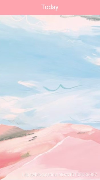
まず、今日のページに適したトップタブバーを追加します。
後で他のページで使用されるため、ここではカスタムコンポーネントメソッドを使用してfragment_home.xmlで呼び出します。
    <include
        android:id="@+id/ic_main"
        layout="@layout/custom_control_home_title"/>
custom_control_home_title.xmlファイルを次のように表示します。
<?xml version="1.0" encoding="utf-8"?>
<RelativeLayout xmlns:android="http://schemas.android.com/apk/res/android"
    android:layout_width="match_parent"
    android:layout_height="60dp"
    android:background="@color/pink_02">

    <TextView
        android:id="@+id/home_title_main"
        android:layout_width="wrap_content"
        android:layout_height="wrap_content"
        android:text="Today"
        android:textSize="26dp"
        android:textColor="@color/white"
        android:layout_centerHorizontal="true"
        android:layout_marginTop="10dp"/>
</RelativeLayout>
このように、[今日]ページでは、タイトルバーがすでに上部に存在していることがわかります。
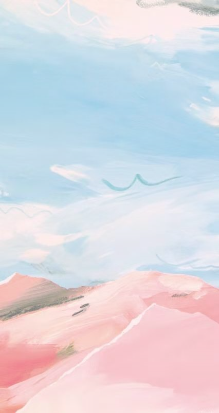
次に、見栄えの良い背景を[今日]ページに追加します。便宜上、背景として高解像度の写真を直接使用します。
    //背景
    <ImageView
        android:layout_below="@+id/ic_main"
        android:layout_marginLeft="-25dp"
        android:layout_width="500dp"
        android:layout_height="match_parent"
        android:scaleType="fitXY"
        android:src="@drawable/back_icon"/>
参考までに、背景画像を画像ベッドにアップロードしました:
背景画像の接続
この時点でのページは次のとおりです。
ログアイコン
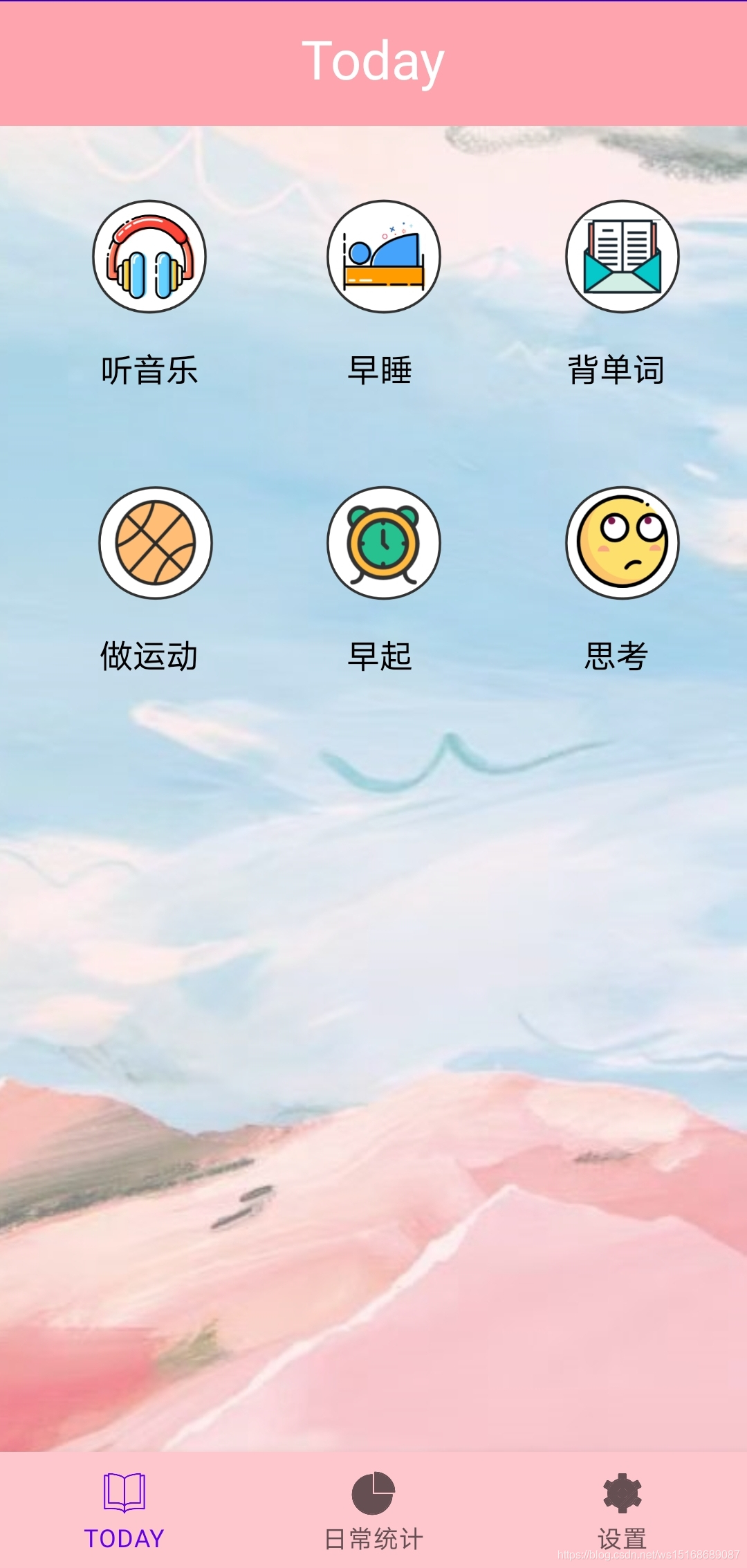
次に、今日のページにログアイコンを追加します。
ここでは、ImageButtonとTextViewの2つのコンポーネントを使用して、ログアイコンの生成を実現します。
    //听音乐

    <ImageButton
        android:id="@+id/btn_listen_music"
        style="?android:attr/borderlessButtonStyle"
        android:layout_width="90dp"
        android:layout_height="86dp"
        android:layout_alignParentStart="true"
        android:layout_alignParentTop="true"
        android:layout_marginStart="27dp"
        android:layout_marginTop="80dp"
        android:scaleType="fitXY"
        android:src="@mipmap/music6" />

    <TextView
        android:id="@+id/text_listen_music"
        android:layout_width="wrap_content"
        android:layout_height="wrap_content"
        android:layout_below="@id/btn_listen_music"
        android:layout_alignParentStart="true"
        android:layout_centerVertical="true"
        android:layout_marginStart="48dp"
        android:text="听音乐"
        android:textColor="#000000"
        android:textSize="16sp" />
ここにあなたが説明するためのいくつかのコードがあります:
1.  style="?android:attr/borderlessButtonStyle"       用于消除按钮的默认背景色
2.  android:scaleType="fitXY"        用于调整图片的比例
そこに導入されている音楽アイコンを図に示します。
 残りのコードは、ページ上のアイコンとテキストの位置を維持するためのものです。
これに基づいて、早起き、単語の記憶、運動、早起き、思考の5種類を追加しました。ここでは、それらを1つずつ紹介しません。この時点で、今日のページの基本ページが完成しました。
3.ログボックス
次に、ログアイコンのポップオーバーを作成します。
ここでファイルを作成します:最初にレンダリングでdialog_tips_custom_style.xml :
 ここでは、LinearLayoutレイアウトを大きなRelativeLayoutレイアウトにネストします。
最初は箇条書きのタイトルです。
        <TextView
            android:id="@+id/dialog_custom_title"
            android:layout_width="match_parent"
            android:layout_height="wrap_content"
            android:gravity="center"
            android:padding="10dp"
            android:text="提示"
            android:textColor="#000"
            android:textSize="14dp"/>
ここのテキストは一時的に「ヒント」に設定され、テキストは水平方向と中央に表示されます。
次に、分離実線を導入します。
        <View
            android:layout_marginBottom="6dp"
            android:layout_marginLeft="20dp"
            android:layout_marginRight="20dp"
            android:layout_width="match_parent"
            android:layout_height="1dp"
            android:background="#ECEAEA"
            android:layout_above="@+id/ll_btn" />
ここでは、実線はプロンプトテキストの下に配置されています。
次に、ログアイコンを導入します。
        <ImageView
            android:id="@+id/dialog_custom_image"
            style="?android:attr/borderlessButtonStyle"
            android:layout_width="match_parent"
            android:layout_height="66dp"
            android:layout_gravity="center"
            android:src="@mipmap/music4"
            />
次に、入力可能なテキストボックスを紹介します。
        //文本框,最长可输入200字
        <EditText
            android:id="@+id/dialog_custom_edittext"
            android:layout_width="match_parent"
            android:layout_height="180dp"
            android:layout_marginLeft="20dp"
            android:layout_marginRight="20dp"
            android:background="@drawable/dialog_edittext_shape"
            android:hint="写点什么吧..."
            android:gravity="top|left"
            android:padding="10dp"
            android:inputType="textMultiLine"
            android:textSize="13sp"
            android:maxLines="8" />
その中で:
maxLines-最大8行の入力を入力するようにテキストボックスを
設定しますヒント-プロンプトテキストを設定します
textMultiLine-複数行の入力を設定します
インポートされたスタイルdialog_edittext_shapeは次のとおりです。
<?xml version="1.0" encoding="utf-8"?>
<shape xmlns:android="http://schemas.android.com/apk/res/android">
    <corners android:radius="16dp"/>
    <stroke android:width="2dp" android:color="#F2F2F2"/>
    <solid android:color="#ffffff"/>
    <padding android:top="2dp" android:bottom="2dp" android:left="2dp"/>
</shape>
最後に、ポップアップのクリックボタンを設定します。
        <RelativeLayout
            android:id="@+id/ll_btn"
            android:layout_width="match_parent"
            android:layout_height="wrap_content"
            android:layout_alignParentBottom="true"
            android:orientation="vertical">

            <Button
                android:id="@+id/dialog_button_save"
                android:layout_width="80dp"
                android:layout_height="33dp"
                android:layout_marginTop="20dp"
                android:layout_marginBottom="30dp"
                android:layout_centerHorizontal="true"
                android:background="@drawable/dialog_button_shape"
                android:text="保存"
                android:textSize="10sp"
                android:textColor="#ffffff"/>

        </RelativeLayout>
この時点で、ポップアップボックスのスタイルは完成です。
新しいCustomTipDialog.ktファイルを作成しましょう
:Dialogクラスを継承させます:
class CustomTipDialog(context: Context) : Dialog(context, R.style.DialogTheme){}
ポップアップスタイルをインポートします。
    private val mTvTitle:TextView
    init {
        val view=LayoutInflater.from(context).inflate(R.layout.dialog_tips_custom_style,null)
        mTvTitle=view.findViewById(R.id.dialog_custom_title)
        setContentView(view)
    }

    fun setTitle(title:String){
        mTvTitle.text=title
    }
HomeFragment.ktファイルのクリックイベントをバインドします。
    binding = FragmentHomeBinding.inflate(inflater, container, false)
        val dialog_fragment: View = inflater!!.inflate(R.layout.dialog_tips_custom_style,container,false)
              //听音乐按钮
    binding.btnListenMusic.setOnClickListener{
        val customTipDialog=CustomTipDialog(activity as Context)
        customTipDialog.setTitle("打卡日志")
        customTipDialog.show()
    }
これまで、ホームページのスタイルの基本的な制作プロセスを紹介してきましたが、ポップアップボックスの内容を読み、保存する方法を次の章で紹介します。