mission details
The task of this level: learn to master matplotlibthe first graphic line graph, and be able to use common configurations of lines.
related information
In order to complete this task, you need to master: 1. How to draw a line graph, 2. How to set the color style and coordinate axis for the line graph.
- Applicable scenarios: Line charts are suitable for large two-dimensional data sets, especially those where the trend is more important than a single data point. It is also suitable for comparison of multiple 2D data sets.
Draw line graph
Of all graphs, the simplest is probably y = f (x)the visualization of a linear equation. Let's see how to create this simple line graph. When you want to draw Matplotliba graph, you need to first create a graph figand a coordinate axis ax. The simplest way to create a graph and axes is:
import matplotlib.pyplot as plt#导入模块plt.style.use('seaborn-whitegrid')#设置matplotlib画图样式fig = plt.figure()ax = plt.axes()

In Matplotlib, figure( plt.Figurean instance of the class) can be seen as a container that can hold various coordinate axes, graphics, text and labels. As you can see in the picture, axes( plt.Axesan instance of the class) is a rectangle with ticks and labels that will ultimately contain all the visual graphical elements.
Here we generally use variables figto represent a graph instance and variables axto represent an axis instance. Next use ax.plotPaint, starting with a simple sine curve:
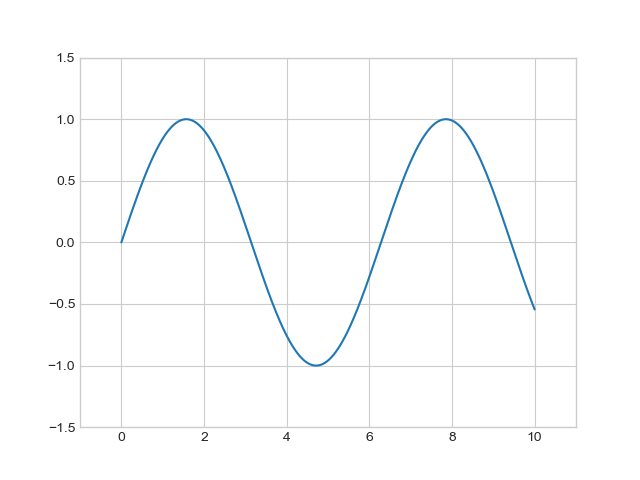
fig = plt.figure()ax = plt.axes()x = np.linspace(0, 10, 1000)ax.plot(x, np.sin(x))

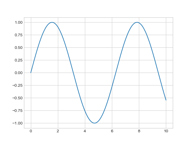
You can also use pylabthe interface to draw a graph. At this time, the graph and coordinate axes are executed at the bottom layer, and the execution result is the same as the above figure:plt.plot(x, np.sin(x))
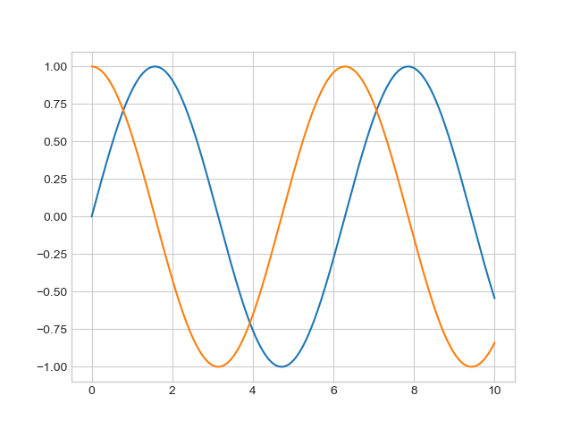
Just imagine plotwhat happens if we call the command repeatedly, it creates multiple lines in a graph:
plt.plot(x, np.sin(x))plt.plot(x, np.cos(x))
Set color and style
In the process of drawing, the first adjustment to a graphic is usually to adjust the color and style of its lines.
plt.plot()The function can set the color and style through the corresponding parameters, and modify the color usage colorparameters. It supports strings with various color values. The specific usage is as follows:
plt.plot(x, np.sin(x - 0), color='blue') # 标准颜色名称plt.plot(x, np.sin(x - 1), color='g') # 缩写颜色代码(rgbcmyk)plt.plot(x, np.sin(x - 2), color='0.75') # 范围在0~1的灰度值plt.plot(x, np.sin(x - 3), color='#FFDD44') # 十六进制(RRGGBB,00~FF)plt.plot(x, np.sin(x - 4), color=(1.0,0.2,0.3)) # RGB元组,范围在0~1plt.plot(x, np.sin(x - 5), color='chartreuse') # HTML颜色名称

Commonly used color corresponding values:
| value | color |
|---|---|
b |
blue |
g |
green |
r |
red |
c |
cyan |
m |
magenta |
y |
yellow |
k |
black |
w |
white |
If you do not specify a color, matplotliba default set of colors will automatically cycle through multiple lines. Set style using linestyleparameters:
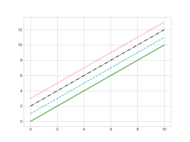
plt.plot(x, x + 0, linestyle='solid')plt.plot(x, x + 1, linestyle='dashed')plt.plot(x, x + 2, linestyle='dashdot')plt.plot(x, x + 3, linestyle='dotted')#也可以用下面的简写形式plt.plot(x, x + 4, linestyle='-') # 实线plt.plot(x, x + 5, linestyle='--') # 虚线plt.plot(x, x + 6, linestyle='-.') # 点划线plt.plot(x, x + 7, linestyle=':') # 实点线

You can also combine linestyleand colorencoding and plt.plot()use it as a non-keyword parameter of the function:
plt.plot(x, x + 0, '-g') # 绿色实线plt.plot(x, x + 1, '--c') # 青色虚线plt.plot(x, x + 2, '-.k') # 黑色点划线plt.plot(x, x + 3, ':r'); # 红色实点线
Set the upper and lower limits of the coordinate axis
Although matplotlibthe most appropriate axis limits are automatically selected for your graph, sometimes it may be better to customize the axis limits. The most basic way to adjust the upper and lower limits of the coordinate axis is plt.xlim()and plt.ylim():
plt.plot(x, np.sin(x))plt.xlim(-1, 11)plt.ylim(-1.5, 1.5)

If you want the coordinate axes to be displayed in reverse order, then you only need to set the axis scale values in reverse order. matplotlibThere is another way plt.axis(). By passing in the values corresponding to [ xmin, xmax, ymin, ymax], you can set the limit of the sum with one line of xcode y:
plt.plot(x, np.sin(x))plt.axis([-1, 11, -1.5, 1.5])
It also supports automatically tightening the coordinate axes according to the content of the graph without leaving any blank space:
plt.plot(x, np.sin(x))plt.axis('tight')
Set graphic labels
Graph labels and axis titles are the simplest labels. The settings are as follows:
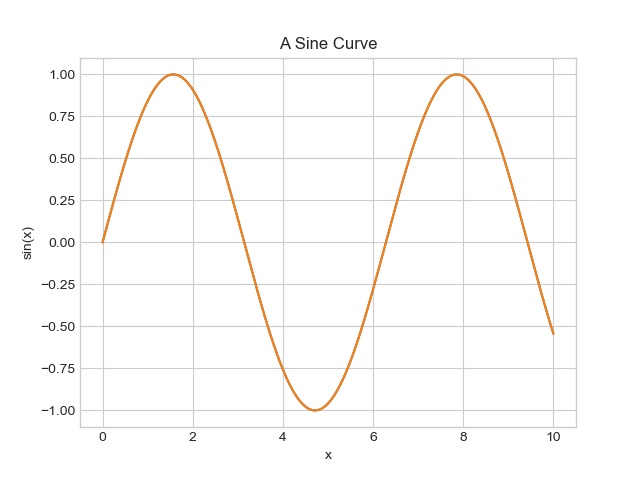
plt.plot(x, np.sin(x))plt.title("A Sine Curve")plt.xlabel("x")plt.ylabel("sin(x)");
Programming requirements
Begin-EndAdd code in the editor on the right and draw two line charts based on the input input_datadata input_data1. Set the color style for the two sets of data in turn --g, :rand set the legend to L1, L2. The specific requirements are as follows:
-
The line chart
figsizeis(10, 10); -
Save the graph to
Task2/img/T1.png.
Test instruction
The platform will test the code you write:
Expected output:你的答案与正确答案一致
import matplotlib
matplotlib.use("Agg")
import matplotlib.pyplot as plt


def student(input_data,input_data1):

    # ********* Begin *********#
    plt.figure(figsize=(10, 10))

    # 绘制第一条折线图
    plt.plot(input_data, '--g', label='L1')

    # 绘制第二条折线图
    plt.plot(input_data1, ':r', label='L2')

    # 设置图例
    plt.legend()

    # 保存图形
    save_dir = 'Task2/img/'
    plt.savefig(f'{save_dir}T1.png')
    plt.close()
    # ********* End *********#