01 Introduction to echarts
echarts is a JavaScript-based chart plug-in developed by Baidu and later donated to the Apache Foundation for open source.
echarts website address:
https://echarts.apache.org/examples/zh/index.html
Commonly used charts can be found.
Go to the homepage of the website to find which chart
you need The effect you want)
Complete code (if you need to quote, you need to download the complete code)
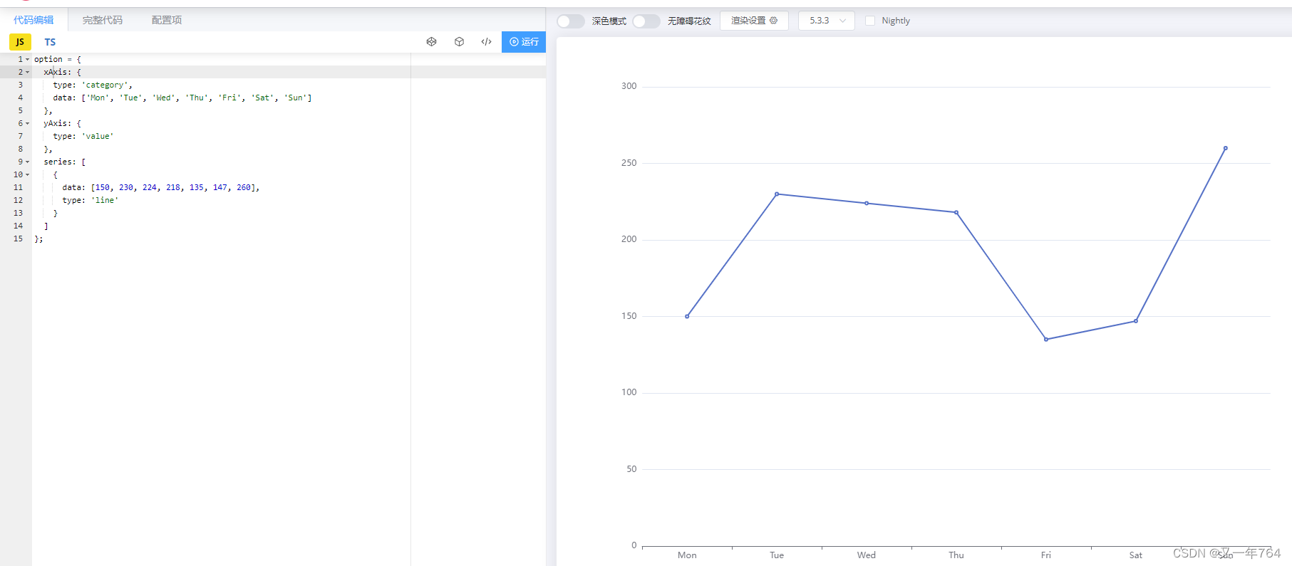
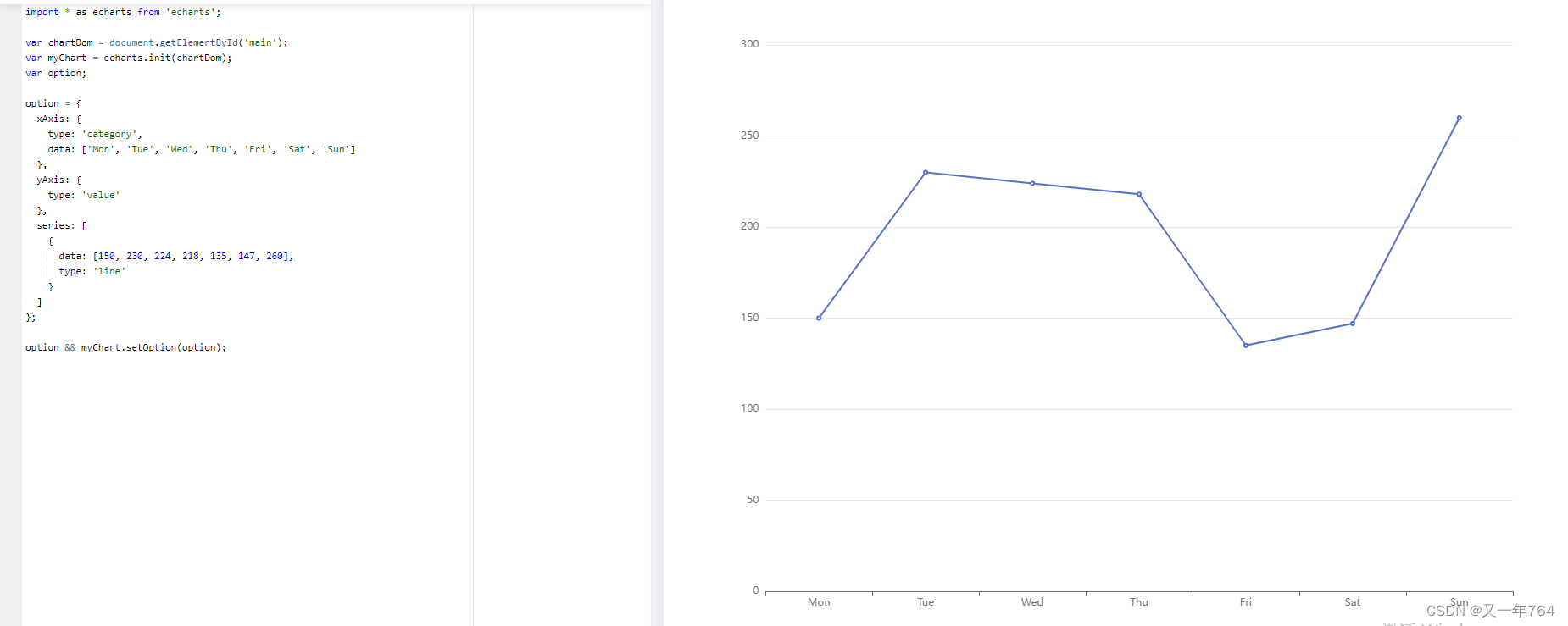
var chartDom = document.getElementById('main'); //main is the created container id name
If the operation fails,
import * as echarts from ' echarts';
to delete
the following is the introduction of the case
Getting started with echarts-hello world
1. To use echarts, you must first import the js file of echarts
<script src="./js/echarts.min.js"></script>
2. Initialization
var echart = echarts.init(dom节点,主题)
3. Define options
var option={

    }
option mainly includes
title-title
legend-legend
tooltip-mouse passing prompt
xAxis-x axis
yAxis-y axis
series-series data
4. Update options
echart.setOption(option)
complete case
<!DOCTYPE html>
<html>
<head>
<meta charset="utf-8">
<title></title>
<!-- 01 引入 -->
<script src="./js/echarts.min.js"></script>
<style>
#app{
width: 800px; height: 600px;}
</style>
</head>
<body>
<!-- 02 设置容器 宽高 -->
<div id="app"></div>
<script>
// 03 初始化
var echart = echarts.init(document.getElementById("app"));
// 04 定义选项
var option = {
title:{
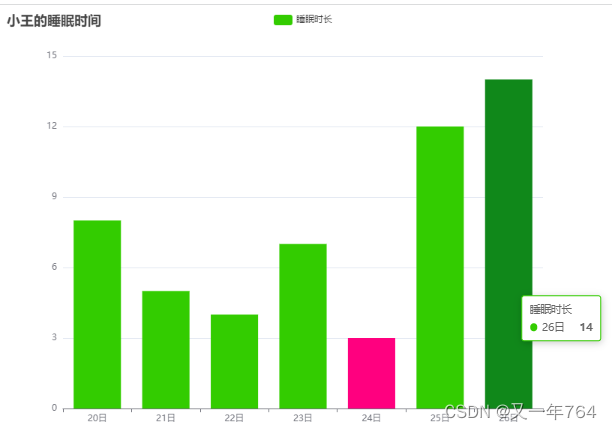
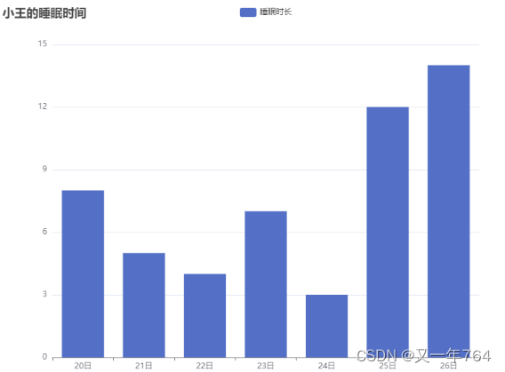
text:"小王的睡眠时间"},//标题文本
legend:{
data:["睡眠时长","作业耗时"]} ,//图例
tooltip:{
},//鼠标提示
yAxis:{
},//x轴线
xAxis:{
data:["20日","21日","22日","23日","24日","25日","26日"]}, //y轴线
series:[ //系列数据
// 数据
{
name:"睡眠时长",type:"bar",data:[8,5,4,7,3,12,14]},
]
}
// 05 设置选项
echart.setOption(option);
</script>
</body>
</html>
result
Color width property changed
Through itemStyle: {}, you can customize the color of the shadow part (you can set it globally or separately)
normal is the color in the normal state, emphasis is the color in the emphasized state, that is, the effect of the mouse passing
itemStyle can also set the histogram The radian of each corner
itemStyle: { borderRadius: [upper left, upper right, lower right, lower left] color color can be translucent or gradient } barWidth can be customized to set the width of the column every day
<!DOCTYPE html>
<html>
	<head>
		<meta charset="utf-8">
		<title></title>
		<!-- 01 引入 -->
		<script src="./js/echarts.min.js"></script>
		<script src="js/theme.js"></script>
	</head>
	<body>
		<!-- 02 设置容器 宽高 -->
		<div id="app" style=" width: 800px; height: 600px;"></div>
		<script>
		// 03 初始化
		// 主题 默认,dark,light,自定义
		var echart = echarts.init(document.getElementById("app"));
		// 04 定义选项
		var option = {


			// color:["#aa00ff","#aa007f","#55ff00","#aaff00"],
			title:{

    text:"小王的睡眠时间"},//标题文本
			legend:{

    data:["睡眠时长","作业耗时"]} ,//图例
			tooltip:{

    },//鼠标提示
			yAxis:{

    },//x轴线
			xAxis:{

    data:["20日","21日","22日","23日","24日","25日","26日"]}, //y轴线
			series:[ //系列数据
				// 数据
				{

    name:"睡眠时长",type:"bar",barWidth:36,data:[8,5,4,7,{

    value:3,itemStyle:{

    color:"#ff007f"}},12,14],
				// barWidth可以自定义设置每天柱体的宽度

				itemStyle:{

      //条目样式
					normal:{

    color:"#3c0"}, //正常
					emphasis:{

    color:"#10881a"} ,//强调状态
				}},
			]

		}
		// 05 设置选项
		echart.setOption(option);
		// chart图表,Option选项 Series系列,Axis刻度轴线,tooltip提示,legend图例 ,mooth平滑
		// bar 柱状图,line 折线图,pie饼形图
		</script>
result