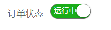
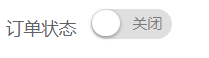
Sobre el divisor está el interruptor de interruptor en la forma
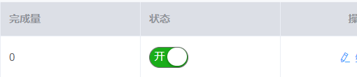
Debajo de la línea divisoria está el interruptor interruptor en la tabla
Pasos de implementación: 1: primero cree una página vue, llamada switch
<template>
    <div>
        <span class="weui-switch" :class="{'weui-switch-on' : isChecked}" :value="value" @click="toggle" style="position:relative">
            <div v-if="isChecked && direction.length > 0" style="width:100%;height:100%;position:absolute;padding:0 5px;line-height:20px;color:#FFF;user-select:none">
                {

   {direction[0]}}
            </div>
            <div v-if="!isChecked && direction.length > 0" style="width:100%;height:100%;position:absolute;padding:0 5px;right:2px;line-height:22px;color:#7A7A7A;text-align:right;user-select:none">
                {

   {direction[1]}}
            </div>
        </span>
    </div>
</template>

<script>
    export default {
        name: 'switchComponent',
        props: {
            value: {
                type: Boolean,
                default: true
            },
            text: {
                type: String,
                default: ''
            }
        },
        data () {
            return {
                isChecked: this.value
            }
        },
        computed: {
            direction () {
                if (this.text) {
                    return this.text.split('|')
                } else {
                    return []
                }
            }
        },
        watch: {
            value (val) {
                this.isChecked = val
            },
            isChecked(val) {
                this.$emit('change', val);
            }
        },
        methods: {
            toggle() {
                this.isChecked = !this.isChecked;
            }
        }
    }
</script>
<style>
    .weui-switch {
        font-size: 12px;
        display: block;
        position: relative;
        width: 65px;
        height: 24px;
        border: 1px solid #DFDFDF;
        outline: 0;
        border-radius: 16px;
        box-sizing: border-box;
        background-color: #DFDFDF;
        transition: background-color 0.1s, border 0.1s;
        cursor: pointer;
    }
    .weui-switch:before {
        content: " ";
        position: absolute;
        top: 0;
        left: 0;
      /*  width: 70px;*/
        height: 22px;
        border-radius: 15px;
        background-color: #FDFDFD;
        transition: transform 0.35s cubic-bezier(0.45, 1, 0.4, 1);
    }
    .weui-switch:after {
        content: " ";
        position: absolute;
        top: 0;
        left: 0;
        width: 22px;
        height: 21px;
        border-radius: 15px;
        background-color: #FFFFFF;
        box-shadow: 0 1px 3px rgba(0, 0, 0, 0.4);
        transition: transform 0.35s cubic-bezier(0.4, 0.4, 0.25, 1.35);
    }
    .weui-switch-on {
        border-color: #6F6F6F;
        background-color: #1AAD19;
    }
    .weui-switch-on:before {
        border-color: #1AAD19;
        background-color: #409eff;
    }
    .weui-switch-on:after {
        transform: translateX(41px);
    }
    /*以上是表单里的开关样式,以下是表格里的开关样式,主要是长度不一样*/
    .cell .weui-switch{
        width: 45px;
    }
    .cell .weui-switch-on:after {
        transform: translateX(20px);
    }
</style>
Dos: referencia
1. Definido en componentes
import switchc from '../common/switch'

export default{
   data(){},
   methods:{},
   components: {
            switchc
   }
}
2. Utilice
<el-form-item label="订单状态">
      <switchc v-model="requirementEditForm.status=='RUNNING'" text="运行中|关闭"></switchc>
</el-form-item>
Algunos de los estilos en el artículo son de un bloguero en Jianshu, y olvidé quién era específico.