First, the basic controls
In the building there are many Android interface controls for our use, have TextView, EditText, Button, ImageView and so on, it is with these controls, we can build a nice interface framework, this chapter show explain the properties of the basic controls, Some Android and comes with controls commonly used in the project.
All controls must have attributes: Set the length and width controls
android:layout_width
android:layout_height
1.TextView
This is a text control, it is mainly to display some text information.
   <TextView
       android:id="@+id/textView"
       android:layout_width="match_parent"
       android:layout_height="wrap_content"
       android:gravity="center"
       android:textSize="25sp"
       android:textColor="#ff0000"
       android:text="这是helloworld"
       android:textStyle="blod"
       />
1.android:id TextView property represents the Id, which is a unique identifier TextView, java code we can get control by findViewById () method by Id. A unique id of the widget above is textView.
2.android:layout_width property represents the width of the control, the value of this attribute is match_parent, showing the same width as the control of the parent view.
3.android:layout_height property represents the height of the control, the value of the property is wrap_content, represents the height of the control changes according to the height of the content.
4.android:gravity property represents TextView text alignment, there are a variety of ways, we in this election is the center, centered.
5.android:textSize property represents the text in TextView model, which is the size of the text.
6.android:textColor property is the color of the text in TextView, the attribute value is a hexadecimal color value.
7.android:text TextView property is used to set the value displayed.
8 androidtextStyle font style: blod (bold), italic (italic), normal (routine)
Of course, TextView there are many other attributes, is not presented here, which you need after-school interest in learning on their own time to explore the.
2.EditText
EditText is an important program for the control and user interaction,It allows users to enter and edit content controls in. Similarly, it can be configured and TextView properties are similar, there are a few other common attributes:
● android: hint This attribute specifies the period of suggestive text, when the user enters any content, this text will disappear automatically.
● android: Specifies the maximum number of lines maxLine EditText, so that when the content of the input exceeds the maximum number of lines of text will scroll up, and does not continue EditText stretch.
   <EditText
        android:id="@+id/name"
        android:layout_width="match_parent"
        android:layout_height="wrap_content"
        android:hint="请输入内容"
        android:maxLines="2"
        />
3.Button
Button is a button that the user clickedIn Android development, Button is one of the most commonly used controls.
    <Button
    android:id="@+id/button"
    android:layout_width="match_parent"
    android:layout_height="wrap_content"
    android:text="我是button"
    android:textAllCaps="false"
    />
All letters will automatically convert uppercase Button, we need android: textAllCaps property to false to cancel
▲
We've added a button in the interface, then click on it did not respond, so we need to register a listener for the button, and write the click logic in it.
public class MainActivity extends AppCompatActivity {

     Button button;
    @Override
    protected void onCreate(Bundle savedInstanceState) {
        super.onCreate(savedInstanceState);
        setContentView(R.layout.activity_main);
        button = findViewById(R.id.button);

        button.setOnClickListener(new View.OnClickListener() {
            @Override
            public void onClick(View v) {
                Toast.makeText(MainActivity.this,"你点击了button",Toast.LENGTH_SHORT).show();
            }
        });
    }
First we create a button object Button, and then we need to onCreate method (which is returned when the event was created to perform, they need to initialize controls and other things written in this method) is that binding of a button, use findViewById () is found, the name is layout file Button's id. button call setOnClickListener, write and rewrite the corresponding logic in onClick. Here is a text display with Toast.
4.ImageView
This is a picture of the display control, which can make our program more colorful. Learning this space need money to prepare in advance some pictures, pictures usually need our own place in the drawable res directory. Here I put a copy into the drawable smile.jpg picture inside, and then write in the layout:
<ImageView
        android:layout_width="wrap_content"
        android:layout_height="wrap_content"
        android:src="@drawable/smile"
   />
5. Other controls
I will not start talking so much, after-school students themselves to expand
1.CheckBox box: https://blog.csdn.net/kotlp1/article/details/78886736
2.ProgressBar progress bar: HTTPS: // www.jianshu.com/p/f613571addb5
too much, according to the future needs of the students to expand on their own
Second, the basic layout
1.LinearLayout (linear layout)
Layout, what is linear, linear, linear with the same properties as wire, ha.
LinearLayout has two modes of control to control its arrangement inside a vertical mold (android: orientation = "vertical" ), one is the horizontal mode (android: orientation = "horizontal" ), when we set the mode to when the vertical mode, on the phone screen, the controls are arranged vertically inside down, and each row has only one control, when we set the horizontal mode, the phone screen, this layout is only one row, but may have a number of controls in a row.
android: orientation attribute specifies the arrangement direction is vertical, if the specified horizontal, the control will be arranged in the horizontal direction.
android: gravity is used to specify the text alignment in the control
android: layout_gravity is used to specify the alignment control in the layout
android: layout_weight = "1" (weight distribution), the weight in vertical layout, on behalf spacing; when the level of the representative column width;
Android: visibility = Invisible control layout is displayed: 1, a display visible 2, are not displayed, but the space invisible 3, hidden gone
Vertical arrangement of the buttons
Renderings

<LinearLayout xmlns:android="http://schemas.android.com/apk/res/android"
    xmlns:app="http://schemas.android.com/apk/res-auto"
    xmlns:tools="http://schemas.android.com/tools"
    android:layout_width="match_parent"
    android:layout_height="match_parent"
    android:orientation="vertical"
    tools:context=".MainActivity">
    <Button
      android:layout_width="wrap_content"
      android:layout_height="wrap_content"
      android:text="button1"
      android:textAllCaps="false"/>
    <Button
        android:layout_width="wrap_content"
        android:layout_height="wrap_content"
        android:text="button2"
        android:textAllCaps="false"/>
    <Button
        android:layout_width="wrap_content"
        android:layout_height="wrap_content"
        android:text="button3"
        android:textAllCaps="false"/>
    <Button
        android:layout_width="wrap_content"
        android:layout_height="wrap_content"
        android:text="button4"
        android:textAllCaps="false"/>


</LinearLayout>
Linear layout, controls are next to each other, if we want the screen horizontal, so that two buttons as the ratio of 1: 3, full screen width, which is how to achieve it, which need to use android: layout_weight
<LinearLayout xmlns:android="http://schemas.android.com/apk/res/android"
    xmlns:app="http://schemas.android.com/apk/res-auto"
    xmlns:tools="http://schemas.android.com/tools"
    android:layout_width="match_parent"
    android:layout_height="match_parent"
    android:orientation="horizontal"
    tools:context=".MainActivity">
    <Button
      android:layout_width="0dp"
      android:layout_height="wrap_content"
        android:layout_weight="1"
      android:text="button1"
      android:textAllCaps="false"/>
    <Button
        android:layout_width="0dp"
        android:layout_height="wrap_content"
        android:layout_weight="3"
        android:text="button2"
        android:textAllCaps="false"/>


</LinearLayout>

2.RelativeLayout (opposite layout)
Is a relative layout position of control is calculated in accordance with the relative position of the latter depends on what position control in a front basic position control, is the most common arrangement, a layout is the most flexible.
1. To achieve the effect of FIG.
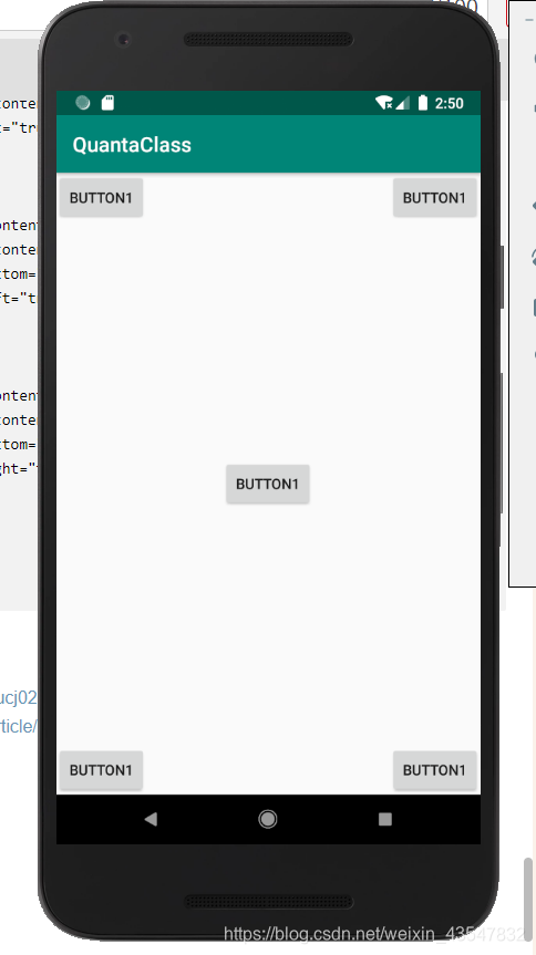
<?xml version="1.0" encoding="utf-8"?>
<RelativeLayout xmlns:android="http://schemas.android.com/apk/res/android"
    xmlns:app="http://schemas.android.com/apk/res-auto"
    xmlns:tools="http://schemas.android.com/tools"
    android:layout_width="match_parent"
    android:layout_height="match_parent"

    tools:context=".MainActivity">
   <Button
       android:layout_width="wrap_content"
       android:layout_height="wrap_content"
       android:layout_alignParentLeft="true"
       android:layout_alignParentTop="true"
       android:text="button1"
       />
    <Button
        android:layout_alignParentTop="true"
        android:layout_width="wrap_content"
        android:layout_height="wrap_content"
        android:layout_alignParentRight="true"
        android:text="button1"
        />
    <Button
        android:layout_width="wrap_content"
        android:layout_height="wrap_content"
        android:layout_centerInParent="true"
        android:text="button1"
        />
    <Button
        android:layout_width="wrap_content"
        android:layout_height="wrap_content"
        android:layout_alignParentBottom="true"
        android:layout_alignParentLeft="true"
        android:text="button1"
        />
    <Button
        android:layout_width="wrap_content"
        android:layout_height="wrap_content"
        android:layout_alignParentBottom="true"
        android:layout_alignParentRight="true"
        android:text="button1"
        />


</RelativeLayout>
2. FIG achieve results:
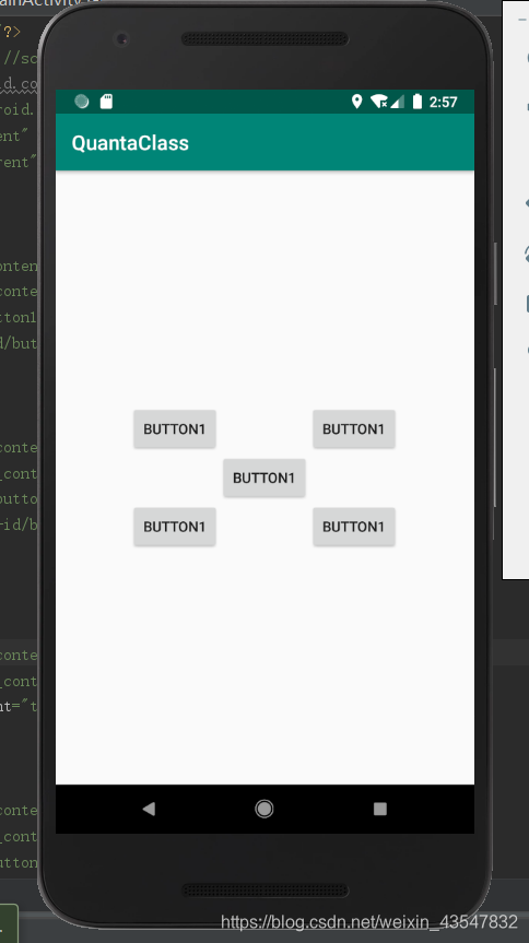
<?xml version="1.0" encoding="utf-8"?>
<RelativeLayout xmlns:android="http://schemas.android.com/apk/res/android"
    xmlns:app="http://schemas.android.com/apk/res-auto"
    xmlns:tools="http://schemas.android.com/tools"
    android:layout_width="match_parent"
    android:layout_height="match_parent"

    tools:context=".MainActivity">
   <Button
       android:layout_width="wrap_content"
       android:layout_height="wrap_content"
      android:layout_above="@+id/button1"
       android:layout_toLeftOf="@+id/button1"
       android:text="button1"
       />
    <Button
        android:layout_width="wrap_content"
        android:layout_height="wrap_content"
        android:layout_above="@+id/button1"
        android:layout_toRightOf="@+id/button1"
        android:text="button1"
        />
    <Button
        android:id="@+id/button1"
        android:layout_width="wrap_content"
        android:layout_height="wrap_content"
        android:layout_centerInParent="true"
        android:text="button1"
        />
    <Button
        android:layout_width="wrap_content"
        android:layout_height="wrap_content"
       android:layout_below="@+id/button1"
        android:layout_toLeftOf="@+id/button1"
        android:text="button1"
        />
    <Button
        android:layout_width="wrap_content"
        android:layout_height="wrap_content"
       android:layout_below="@+id/button1"
        android:layout_toRightOf="@+id/button1"
        android:text="button1"
        />


</RelativeLayout>
In yet another set of opposing 3.RelativeLayout attribute control positioning, android: layout_alignLeft showing a control so that the left edge of the left edge and the other controls the aligned, android: layout_alignRight showing a control so that the right edge and the other controls align the right edge, android: layout_alignBottom and android: layout_alignTop is the same reason, you will own to explore!
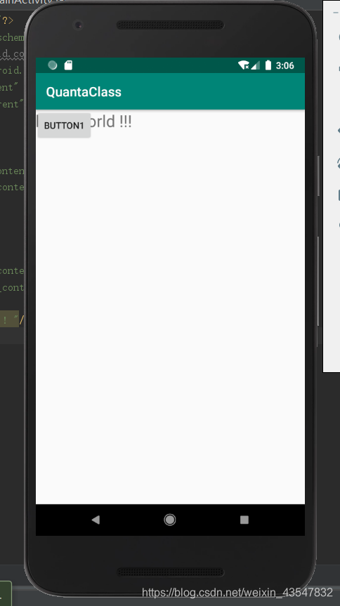
3.FrameLayout (frame layout)
FrameLayout objects on the screen like a good book in advance an empty area, some elements can be filled on the inside, such as pictures. All elements are placed in the upper left most area FrameLayout region, but can not specify an exact position of these elements is made, if a plurality of elements, the elements behind the element will be displayed superimposed on a front.
Renderings:
<?xml version="1.0" encoding="utf-8"?>
<FrameLayout xmlns:android="http://schemas.android.com/apk/res/android"
    xmlns:app="http://schemas.android.com/apk/res-auto"
    xmlns:tools="http://schemas.android.com/tools"
    android:layout_width="match_parent"
    android:layout_height="match_parent"

    tools:context=".MainActivity">
   <Button
       android:layout_width="wrap_content"
       android:layout_height="wrap_content"

       android:text="button1"
       />
    <TextView
        android:layout_width="wrap_content"
        android:layout_height="wrap_content"
        android:textSize="25sp"
        android:text="hello world !!! "/>


</FrameLayout>
4. Other layouts
TableLayout (table layout), AbsoluteLayout (absolute position of the layout), etc. can go to access their own data to find out
III. Jobs
FIG achieve the following effects:
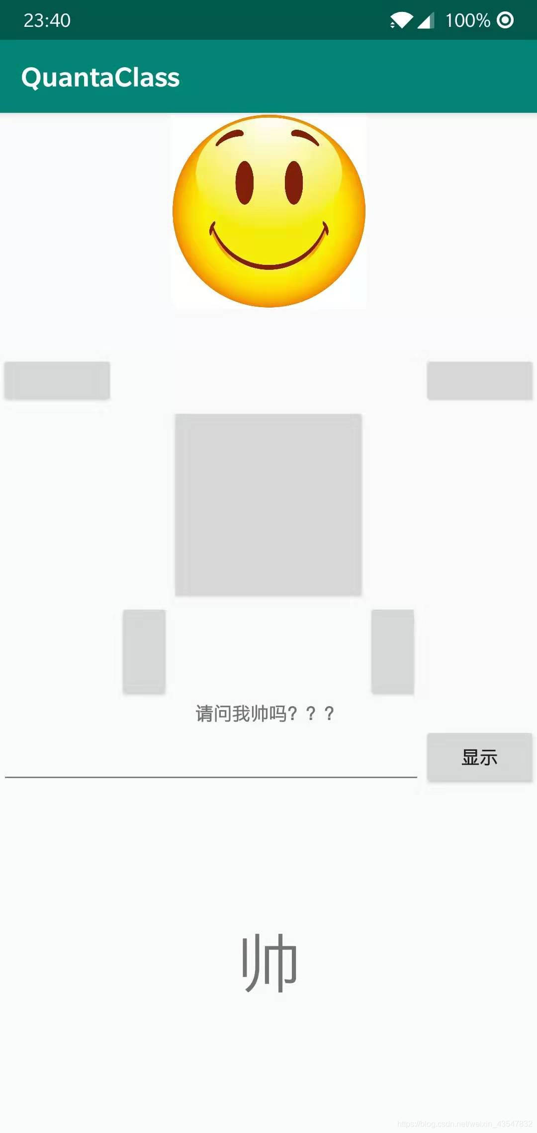
Job Description: The picture may be different, but the controls to the same position. EditText enter the answer, click the Show button, the answer will appear in the following TextView