Introduction to Android basic controls (TextView, ImageView) and layout (linear layout, relative layout)
Table of contents
UI
In software development, we often come into contact with UI, so what is UI? The full name of UI is User Interface , that is, user interface . Simply put, it is the operable interface that can be seen on the mobile phone.
In the software development process, interface design and function development are equally important, and they are the most critical parts of Android applications that directly affect user experience. An application with a beautiful interface can not only greatly increase user stickiness, but also attract more new users. And Android provides us with a large number of UI development tools, as long as they are used reasonably, you can write a variety of beautiful and exquisite layouts!
The user interface is composed of controls and layouts . The layout regulates the position of the controls and holds the controls like a container, and the placement of the controls most directly affects the display of the user interface. Next, let's learn from the most basic controls and layouts.
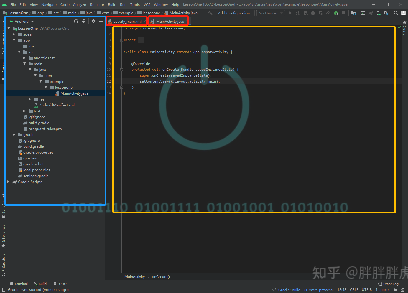
New Project
Wait a minute! Want to enter Android learning, after configuring the Android environment, we have to create a new project before we can start coding! So how to create a new project?
Refer to Sister Bingbing's blog
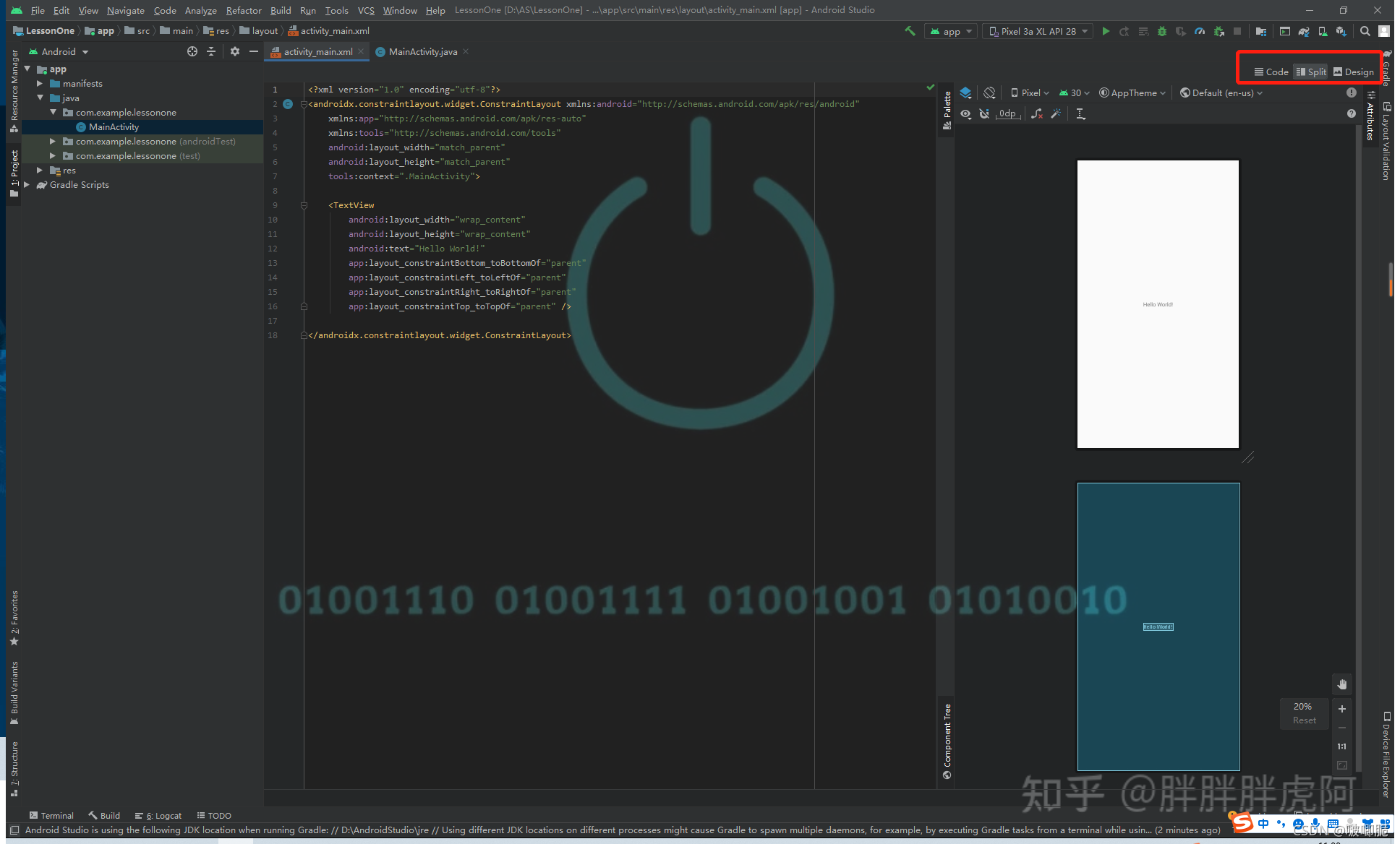
After creating a new project, let's briefly understand the interface of AS
View (control)
Label
Each control is controlled by a tag in the code , which is the xml syntax , and the control and layout are implemented in the .xml file.
The general format of the label is believed to have been seen in the brochure.
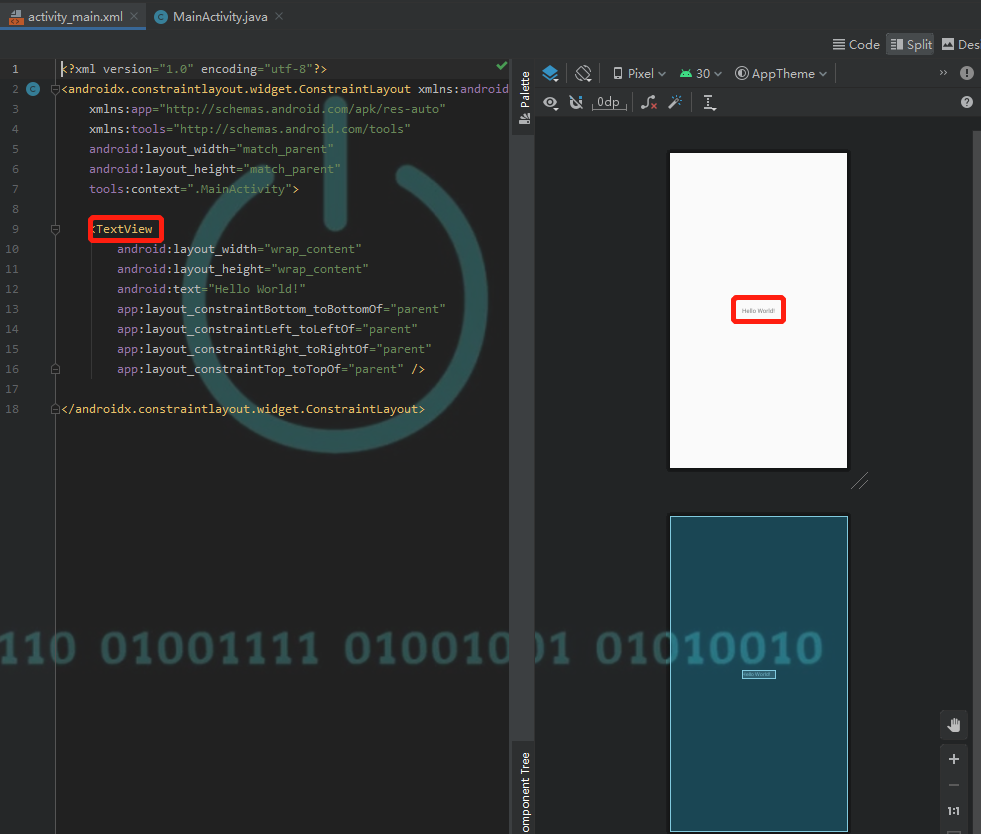
<TextView
        android:layout_width="wrap_content"
        android:layout_height="wrap_content"
        android:text="Hello World!"/>
A pair of angle brackets encloses a control, starting with the control name, followed by the property name and property value of the control , and finally with a slash and right angle bracket as the end symbol
TextView (text box)
Then let's take a look at the text box first. The text box can be said to be the simplest control in Android. It is mainly used to display a piece of text on the interface. It is very common in our usual mobile phone software. It can be said that TextView exists wherever there is text displayed.
For example, WeChat, which is visible every day, also has text boxes everywhere. For another example, every time we create a new project in AndroidStudio, the HelloWorld in the middle of the default interface is also a text box style. How to use the text box? Let's take a closer look.
code display
<TextView
        android:layout_width="wrap_content"
        android:layout_height="wrap_content"
        android:text="Hello World!"/>
This is the simplest TextView, every time we create a new project, there will be an initial control TextView, the text content is "Hello World!"
How do we implement the style of a control? In fact, just like we draw, if we want to draw the simplest button, what elements should we draw? The size of the button, the text content inside the button, etc. First, let's take a look at the basic properties of the control
basic attributes
android:layout_width和android:layout_height
Take this code as an example. The two attributes android:layout_width and android:layout_height specify the width and height of the control. Almost every control has these two attributes to specify the size of the control. The content after the equal sign is the value we give to this property. The wrap_content here represents the default size. That is, the size of this control will be similar to the text inside it.
In addition to wrap_content, we will also use match_parent to indicate that the size of the control will be the same as the parent layout.
Customize the layout, directly use numbers to customize the size, such as 60dp (dp is a commonly used size unit for controls, in addition to dp, there are px, sp, etc., interested students can learn about it on Baidu)
android:text
This is also very simple. The text attribute is used to set the text content. The content after the equal sign can be directly enclosed in double quotation marks.
other attributes
Of course, there are many other properties of the text box, such as using textSize to set the size of the text font, the color of the text font, the background color of the text box, and the position of the text relative to the text box.
<TextView
    android:layout_width="match_parent"
    android:layout_height="wrap_content"
    android:text="Welcome to Quanta"
    android:textSize="30sp"
    android:textColor="#FF9800"
    android:background="#000000"
    android:gravity="center"/>
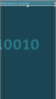
Effect picture as above
ImageView (image view)
As the name suggests! This control is used to display pictures, and ImageView is used in many places where pictures are displayed. For example, the profile picture of WeChat, the picture of Xiaohongshu. (Too lazy to post pictures)
code display
So how to write ImageView? Similar to TextView, we also enclose ImageView with a label.
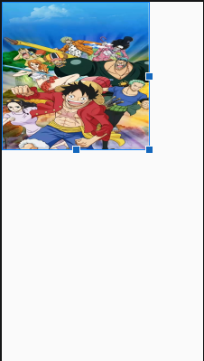
<ImageView
        android:layout_width="300dp"
        android:layout_height="300dp"
        android:src="@drawable/OnePiece"/>
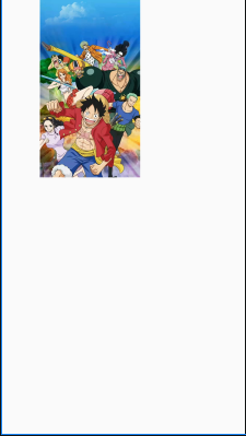
The basic properties of this are also very simple. You can see that the width and height here are 300dp, but why there are blank spaces around, this involves the size of the control and the size of the text in the control.
In fact, there will be a frame around the control. The size of this frame is the size of the control's ImageView. Because of the problem of the proportion of the picture inside, when we use to fill in the picture, it will not be stretched and filled, but It is directly filled, and the width adapted to the ratio is used for display.
basic attributes
android:src
The android :src attribute is used to obtain image resources , where can it be obtained? We find the drawable directory under the res folder in the leftmost project list of AS. We will put pictures and other resources needed for the layout in this res (Resource) folder, and drawable is responsible for placing files.
We find the picture we want on the computer. The first step is to drag the picture to the drawable directory. Note that the name of the picture must start with a letter and cannot contain capital letters.
Then we get the picture through the src attribute in the ImageView control (see the code snippet above for details)
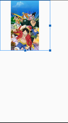
android:scaleType
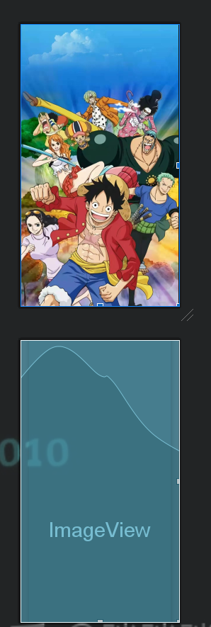
So what if we want to change its display effect? I want him to enlarge and fill the frame. At this time, we can use the scaleType attribute. This attribute is very useful when you are not satisfied with the layout of the picture.
android:scaleType="fitXY"
We choose the fitXY value, this property is equivalent to directly stretching and filling, the effect is as follows
It's still ugly, what should I do if I want him to keep the proportions?
We use the value centerCrop to set, this property maintains the proportion of the image, but when the size of the control is not large enough, it will sacrifice part of the image, the center of the one-piece piece is the center and completely covers the ImageView control, and the rest may be cropped part.
What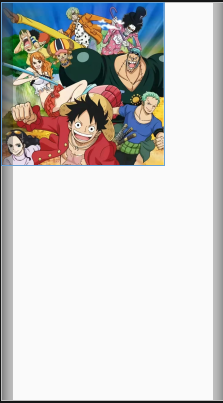
? Are you still not satisfied? Then change the size of the ImageView!
<ImageView
        android:layout_width="match_parent"
        android:layout_height="match_parent"
        android:src="@drawable/OnePiece" />
Isn’t it very shocking hahahaha because this picture is too full! How can I make him not so full? Editing of ImageView (in fact, the same is true for many controls), you can make the length and width of the control a little smaller, or use the margin method, let's introduce it below.
Inner margin padding and outer margin margin
Margin properties are also very commonly used. If there is no margin, two controls will easily stick together, which is neither beautiful nor convenient to click. Let's get to know the margin next.
![[External link picture transfer failed, the source site may have an anti-theft link mechanism, it is recommended to save the picture and upload it directly (img-jGzLon91-1633768768453)(https://z3.ax1x.com/2021/10/09/5FJL24.png )]](https://img-blog.csdnimg.cn/12e1a1c1ecd348dba3fec5ee7f3be176.png?x-oss-process=image/watermark,type_ZHJvaWRzYW5zZmFsbGJhY2s,shadow_50,text_Q1NETiBA5ZW15ZSn6ISG,size_20,color_FFFFFF,t_70,g_se,x_16)
Let’s take our most familiar WeChat as an example. We can see that each control or their control content is not close together, how to use the margin to achieve it? Let’s talk about the margin first. According to the style circled in the picture above, the black frame is the size of the control. The distance between one black frame and other black frames, that is, the distance from one control to another is the margin .
So what is padding? In order to facilitate the demonstration, I changed the drawing method.
![[External link picture transfer failed, the source site may have an anti-leeching mechanism, it is recommended to save the picture and upload it directly (img-OfgkVkOE-1633768768455) (C:\Users\Meng Qiuhua\AppData\Roaming\Typora\typora-user- images\image-20211008163401207.png)]](https://img-blog.csdnimg.cn/a5cf8b3b911d40bc9b6f44460dd761a3.png?x-oss-process=image/watermark,type_ZHJvaWRzYW5zZmFsbGJhY2s,shadow_50,text_Q1NETiBA5ZW15ZSn6ISG,size_20,color_FFFFFF,t_70,g_se,x_16)
If the red frame represents the size of the control, one is ImageView and the other is TextView, we find that the real picture and text content are some distance away from the red frame, this is the inner margin padding, which refers to the content inside the control The distance from the control frame.
AS Demonstration
Layout
We also said before that the layout is like a container that holds all the controls, and it can also be understood as a chessboard. Different layouts have different placement rules, just like different chessboards also stipulate different placement methods, but different What's more, we can see the chessboard, but we can't see the layout. It's more like an invisible containment. It can be said that the layout controls the placement of all controls.
Let's start with the two simplest and most commonly used layouts. When creating a new project, we can see that a layout has been written in the xml file. This layout is a constraint layout. We will not talk about it in this class.

First use it to understand how to write the layout. 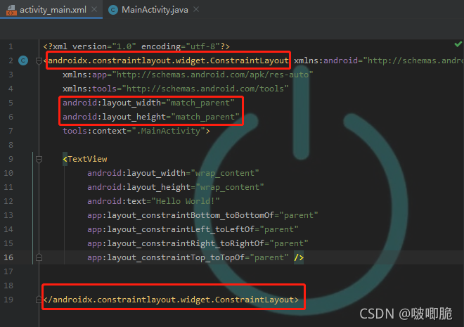
This is the layout code in xml when we just created a new project. The top red box is the name of the layout used, the second box is the length and width of the layout, and finally a pair of angle brackets and a slash , inside the angle brackets is the name of the layout to end. Add the controls that need to be placed between the two pairs of angle brackets in the layout. (Different from the format of ordinary controls)
We write other layouts in this way
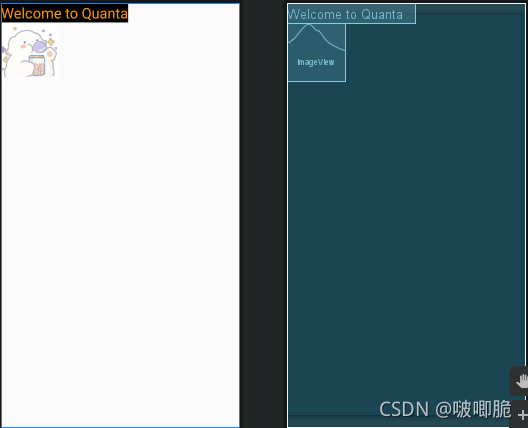
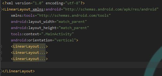
LinearLayout (linear layout)
Linear layout is the most basic layout, which allows the controls inside to be arranged horizontally or vertically. We use the android:orientation attribute to determine the arrangement order. It has only two values, "vertical" means vertical, and "horizontal" means horizontal. When this attribute is not set, it will default to horizontal horizontal arrangement.
Let's take a look at the demonstration
<?xml version="1.0" encoding="utf-8"?>
<LinearLayout xmlns:android="http://schemas.android.com/apk/res/android"
    xmlns:tools="http://schemas.android.com/tools"
    android:layout_width="match_parent"
    android:layout_height="match_parent"
    tools:context=".MainActivity"
    android:orientation="vertical">

    <TextView
        android:layout_width="wrap_content"
        android:layout_height="wrap_content"
        android:text="Welcome to Quanta"
        android:textSize="25sp"
        android:textColor="#FF9800"
        android:background="@android:color/black" />
    <ImageView
        android:layout_width="100dp"
        android:layout_height="100dp"
        android:src="@drawable/icon"/>


</LinearLayout>
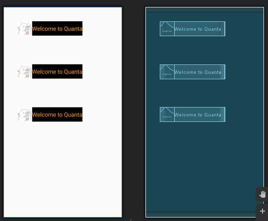
Because the arrangement is set to a vertical layout, the two controls will be arranged vertically up and down (both are on the far left by default)
The renderings are as follows:
If it is changed to a horizontal arrangement, you only need to modify the orientation property directly.
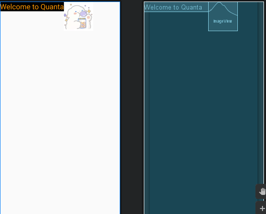
The controls sit next to each other in rows.
RelativeLayout (relative layout)
Relative layout is also a very commonly used layout. Compared with the vertical and horizontal arrangement of LinearLayout, RelativeLayout is more casual. It allows controls to appear anywhere in the layout through relative positioning. Because of this, RelativeLayout has more attributes , but its laws are also easy to touch. Come and see!
We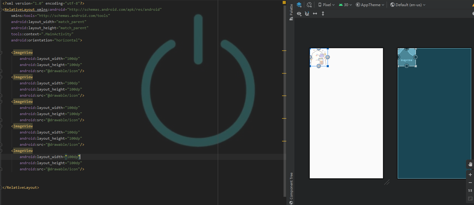
changed the layout to RelativeLayout (you can delete the orientation attribute, which has no effect in RelativeLayout), and you can see that I have created five identical ImageView controls, but only one is displayed, that is because! When they fit, they are placed in the upper left corner by default in RelativeLayout, and these five pictures are all the same size, so they look like a fit.
As mentioned earlier, this layout is arranged through relative positioning, just like when we were in school, the teacher arranged the seating chart, and xxx sat on the left/right/left rear of xxx. We have to set up these controls first. A name, and at this time we will use an attribute called android:id , unlike us humans, the names of controls must be unique.
Then let's see a chestnut!
Code display
<?xml version="1.0" encoding="utf-8"?>
<RelativeLayout xmlns:android="http://schemas.android.com/apk/res/android"
    xmlns:tools="http://schemas.android.com/tools"
    android:layout_width="match_parent"
    android:layout_height="match_parent"
    tools:context=".MainActivity"
    android:orientation="horizontal">

    <ImageView
        android:id="@+id/iv_pic1"
        android:layout_width="100dp"
        android:layout_height="100dp"
        android:src="@drawable/icon"/>
    <ImageView
        android:id="@+id/iv_pic2"
        android:layout_width="100dp"
        android:layout_height="100dp"
        android:src="@drawable/icon"
        android:layout_toRightOf="@id/iv_pic1"/>
    <ImageView
        android:id="@+id/pic3"
        android:layout_width="100dp"
        android:layout_height="100dp"
        android:src="@drawable/icon"
        android:layout_below="@id/iv_pic1"/>
    <ImageView
        android:id="@+id/iv_pic4"
        android:layout_width="100dp"
        android:layout_height="100dp"
        android:src="@drawable/icon"
        android:layout_centerInParent="true"/>
    <ImageView
        android:id="@+id/iv_pic5"
        android:layout_width="100dp"
        android:layout_height="100dp"
        android:src="@drawable/icon"
        android:layout_centerVertical="true"/>


</RelativeLayout>
Although the above code is very long, we only need to pay attention to the last line of each control
In pic2 android:layout_toRightOf="@id/iv_pic1", it is easy to understand, that is, pic2 is on the right of pic1, and android:layout_below="@id/iv_pic1"the representation in pic3 is below pic1, above, below, left, and right of a certain control, and the value assigned to the corresponding attribute is the id name of the target control.
For the position of the sibling layout
在某控件左边:android:layout_toLeftOf="@id/id_name"
在某控件右边:android:layout_toRightOf="@id/id_name"
在某控件上面:android:layout_above="@id/id_name"
在某控件下面:android:layout_below="@id/id_name"
In pic4, android:layout_centerInParent="true"it means that it is in the center of the parent layout. Here it means that both the horizontal and vertical directions are in the center. It can also be set to be centered in the horizontal direction or in the vertical direction separately.
For the position of the parent layout
贴着父布局右边:android:layout_alignParentRight="true"
贴着父布局左边:android:layout_alignParentLeft="true"
贴着父布局上面:android:layout_alignParentTop="true"
贴着父布局下面:android:layout_alignParentBottom="true"
在父布局竖直方向居中:android:layout_centerVertical="true"
在父布局水平方向居中:android:layout_centerHorizontal="true"
在父布局正中间:android:layout_centerInParent="true"
ViewGroup (view group)
Master Chestnut Lifting Online Chestnut Lifting

还是这张图哈哈哈哈
Careful children must have discovered that the controls and layouts we learned above are all in a single layout. In this way), there are both horizontal distribution and vertical distribution, and a relative positioning layout, how to realize it!
This is the concept of view group~ A view group is a layout and several controls it contains.
For example,
This can be regarded as a group of view groups. There are four groups of controls in a horizontally distributed layout, and these four groups of controls can be regarded as a view group respectively. There is an ImageView and TextView in the vertically distributed layout. That is to say, layouts can be nested. ** Four (or even more) LinearLayouts can be nested in a LinearLayout.
Isn’t the actual code difficult to write? Just figure out the relationship between each layout.
paste a piece of code
<LinearLayout
	android:layout_width="wrap_content"
	android:layout_height="wrap_content"
	android:orientation="horizontal"
	android:layout_margin="50dp">
<ImageView
	android:layout_width="50dp"
	android:layout_height="50dp"
	android:src="@drawable/icon"/>
<TextView
	android:layout_width="match_parent"
	android:layout_height="50dp"
	android:text="Welcome to Quanta"
	android:textSize="20sp"
	android:textColor="#FF9800"
	android:background="#000000"
	 android:gravity="center"/>
 </LinearLayout>
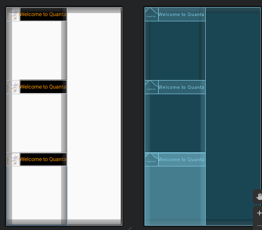
I wrote the same three groups, with a vertical linear layout outside and 3 horizontal linear layouts nested inside. Their relationship and effect are as follows
weight attribute
I have learned the nesting of view groups, but there is still a problem, how do we achieve the equal split effect as shown in the figure below?
It has to be said that such an equal split effect is too common, too easy to use and too beautiful, and it is actually not difficult to realize.
We only need to use the android:layout_weight attribute, and weight represents the weight, so the control with greater weight will have a larger proportion on the screen.
Let's add an android:layout_weight attribute to each view group and set it to 1 to try it out.
Then we found that the 3 view groups split the screen equally
Simple code specification
At the beginning of learning Android, I hope everyone can develop a good code specification. A good code specification can increase the readability of the code, and it is very helpful for code understanding and bug finding!
Note: Since it is Androidmainly Javaimplemented with , the Android specification will cover part of the Java specification.
camel spelling
Interested children should notice that the titles of the brochure and this blog, the names of the controls mentioned TextView, ImageView, EditView, Button, their names are similar in purpose. Hey, take a closer look and find that the first letter of each word in their names is capitalized . Such a naming method, we call it the big camel spelling ( UpperCamelCase), and this naming method is often used for the naming of ordinary java classes. (In our first class, it is mainly understood as the naming of a type of control)
control id naming
The naming method of the id specification of the control is control abbreviation_module (module)_function name (function), because the above example is not used in a specific scenario, so let’s name it iv_xxx first.
For more code specifications, please refer to