This is the ultimate effect is achieved, similar to the style micro-channel dialog.
Analyze the structure of this dialog box, constituted by a small triangle and a rectangle. Rectangle can be achieved easily, focusing on how to make a small triangle with CSS3.
First, how to generate a triangle
Summary: triangle height width is set to 0, a square frame composed of four sides of the border styles are provided to obtain the effect of four triangular pieced together, and then set the border color in other directions as transparent.
1, first of all do a square, the square is not an ordinary elements plus the background color to achieve, but one element of its length and width are set to 0px, this is equivalent to the contents of the box area disappeared. content: "";
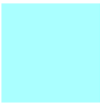
.box{
        border:50px solid #aff;
        width: 0px;height:0px;
        margin:50px auto;
    }
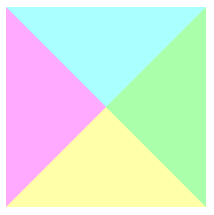
2, and then set each individual style border, you can see how the effect of four triangular pieced together.
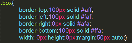
.box{
        border-top:100px solid #aff;
        border-left:100px solid #faf;
        border-right:100px solid #afa;
        border-bottom:100px solid #ffa;
        width: 0px;height:0px;margin:50px auto;
    }
3, a single triangle is obtained, taking half of the border, the border color setting other transparent transparent

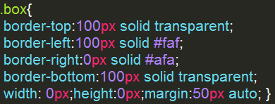

This will get a triangle.
Second, make a box
Settings dialog rounded border-radiu S ; text frame from a certain distance is provided so that the padding for padding ; text vertical center Line-height ;
:: before pseudo-element before the element adding content;
<!DOCTYPE html>
<html lang="en">
<head>
    <meta charset="UTF-8">
    <title></title>
    <style>
    .main{
        background-color: #6a6;
        margin:50px auto;padding:16px;
        width:200px;height:25px;
        border-radius: 10px;line-height: 25px;
        position: relative;
    }
    .main::before{
        content:" ";
        border-left: 0px solid #6a6;
        border-top:10px solid transparent;
        border-right:10px solid #6a6;
        border-bottom:10px solid transparent;
        position: absolute;left:-10px;top:18px;
    }
    /*::before伪元素在元素前面添加内容;*/
    </style>
</head>
<body>
    <div class="main">Hello World ! </div>
</body>
</html>