FIG Effect:

left a div, right 3- The basic layout of the architecture:
<!DOCTYPE html>
<html>

<head lang="en">
    <meta charset="UTF-8">
    <title>cell</title>
</head>

<body>

    <style type="text/css" rel="stylesheet">
        .content {
            color: white;
        }

        .row {
            height: 200px;
            background-color: red;
        }

        .left {
            background-color: blue;
            display: inline-block;
            width: 100px;
            height: 150px;
        }

        .right {
            width: 100px;
            height: 150px;
            background-color: green;
            display: inline-block;
        }
    </style>
    <div class="content">
        <div class="row">
            <div class="left">left</div>
            <div class="right">
                <div class="right1">right1</div>
                <div class="right2">right1</div>
                <div class="right3">right3</div>
            </div>

        </div>
    </div>
</body>

</html>
.left and .right in a row, can be achieved by inline-block does not wrap
that when the effect is as follows:
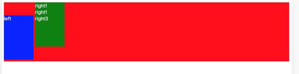
since the inner row of elements aligned with the baseline default, so there will be such an effect
.Row set of text-align: center; let element is centered horizontally
Set row height so that the contents of the elements vertically centered
Provided vertical-align: middle; elements within a row so that the rows aligned with the center line
<!DOCTYPE html>
<html>

<head lang="en">
    <meta charset="UTF-8">
    <title>cell</title>
</head>

<body>

    <style type="text/css" rel="stylesheet">
        .content {
            color: white;
        }

        .row {
            height: 200px;
            background-color: red;
            text-align: center;
            line-height: 200px;
        }

        .left {
            background-color: blue;
            display: inline-block;
            width: 100px;
            height: 150px;
            line-height: 150px;
            vertical-align: middle;
        }

        .right {
            background-color: green;
            display: inline-block;
            width: 100px;
            height: 150px;
            vertical-align: middle;
        }

        .right1 {
            width: 100px;
            height: 50px;
            line-height: 50px;
        }

        .right2 {
            width: 100px;
            height: 50px;
            line-height: 50px;
        }

        .right3 {
            width: 100px;
            height: 50px;
            line-height: 50px;
        }
    </style>
    <div class="content">
        <div class="row">

            <div class="left">left</div>
            <div class="right">
                <div class="right1">right1</div>
                <div class="right2">right1</div>
                <div class="right3">right3</div>
            </div>

        </div>
    </div>
</body>

</html>