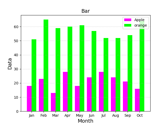
1, bar chart (histogram)
A histogram related API:
. 1 plt.figure ( ' Bar ' , facecolor = ' LightGray ' )
 2  plt.bar (
 . 3      X,                 # horizontal coordinate array
. 4      Y,                 # histogram array height
. 5      width,             # width of the column
. 6      bottom,            # bottom of the column reference position
. 7      color = '' ,          # fill color
. 8      label = '' ,          # label
 . 9      Alpha = 0.2          # transparency
Example:
 1 import numpy as np
 2 import matplotlib.pyplot as plt
 3
 4 apples = np.random.randint(10, 30, size=10)
 5 oranges = np.random.randint(50, 70, size=10)
 6
 7 plt.figure('Bar', facecolor='lightgray')
 8 plt.title('Bar', fontsize=14)
 9 plt.xlabel('Month', fontsize=14)
10 plt.ylabel('Data', fontsize=14)
11 plt.grid(linestyle=':', axis='y')
12 x = np.arange(apples.size)
13 plt.bar(x - 0.2, apples, 0.4, color='fuchsia', label='Apple', align='center')
14 y = np.arange(oranges.size)
15 plt.bar(y + 0.2, oranges, 0.4, color='lime', label='orange', align='center')
16 plt.xticks(x, ['Jan', 'Feb', 'Mar', 'Apr', 'May', 'Jun', 'Jul', 'Aug', 'Sep', 'Oct'])
17 plt.legend(loc='best')
18 plt.savefig('images/bar.png ')
19 plt.show()
operation result:
2, pie
Drawing basic API pie chart:
. 1  plt.pie (
 2      values,              # list of values
. 3      Spaces,              # spacing between the sector list
. 4      Labels,              # tag list
. 5      Colors,              # color list
. 6      ' % D %% ' ,            # label format proportion
. 7      Shadow = true,       # whether shadows
. 8      startAngle = 90       # starting angle of a pie chart drawn counterclockwise
. 9      rADIUS. 1 =           # radius
Example:
 1 import numpy as np
 2 import matplotlib.pyplot as plt
 3
 4 values = [25, 71, 38, 29, 16]
 5 spaces = [0.1, 0.1, 0.1, 0.1, 0.1]
 6 labels = ['Java', 'Javascript', 'Python', 'PHP', 'C++']
 7 colors = ['dodgerblue', 'orangered', 'limegreen', 'cyan', 'gold']
 8
 9 plt.figure('Pie', facecolor='lightgray')
10 plt.axis('equal')
11 plt.pie(values, spaces, labels, colors, '%.2f%%', shadow=True, radius=1, startangle=90)
12 plt.legend(loc='best')
13 plt.savefig('images/pie.png')
14 plt.show()
运行结果:

3、等高线图
绘制等高线图的基本API:
 1 cntr = plt.contour(
 2     x,         # 网格坐标矩阵的x坐标 (2维数组)
 3     y,         # 网格坐标矩阵的y坐标 (2维数组)
 4     z,         # 网格坐标矩阵的z坐标 (2维数组)
 5     8,                     # 把等高线绘制成8部分
 6     colors='black',        # 等高线的颜色
 7     linewidths=0.5        # 线宽
 8 )
 9
10 # 为等高线图添加高度标签
11 plt.clabel(cntr, inline_spacing=1, fmt='%.1f',fontsize=10)
12 plt.contourf(x, y, z, 8, cmap='jet')
示例:
import numpy as np
import matplotlib.pyplot as plt

n = 500
x, y = np.meshgrid(np.linspace(-3, 3, n), np.linspace(-3, 3, n))
# print(x)
# print(y)
z = (1 - x / 2 + x ** 5 + y ** 3) * np.exp(-x ** 2 - y ** 2)

plt.figure('Contour', facecolor='lightgray')
plt.title('Contour', fontsize=16)
cont = plt.contour(x, y, z, 8, colors='black', linewidths=0.75)
plt.clabel(cont, inline_spacing=5, fmt='%.1f', fontsize=10)
plt.contourf(x, y, z, 8, cmap='Pastel1')
plt.savefig('images/contour.png')
plt.show()
运行结果:

4、热成像图
绘制热成像图的基本API:
1 #   origin: 坐标轴方向
2 #    upper: 缺省值,原点在左上角
3 #    lower: 原点在左下角
4 plt.imshow(z, cmap='jet', origin='low')
示例:
 1 import numpy as np
 2 import matplotlib.pyplot as plt
 3
 4 n = 500
 5 x, y = np.meshgrid(np.linspace(-3, 3, n), np.linspace(-3, 3, n))
 6 # print(x)
 7 # print(y)
 8 z = (1 - x / 2 + x ** 5 + y ** 3) * np.exp(-x ** 2 - y ** 2)
 9
10 # 绘制热成像图
11 plt.figure('Contour', facecolor='lightgray')
12 plt.title('Contour', fontsize=16)
13 cont = plt.contour(x, y, z, 8, colors='black', linewidths=0.75)
14 plt.imshow(z, cmap='jet', origin='lower')
15 plt.colorbar()
16 plt.savefig('images/imshow.png')
17 plt.show()
运行结果:

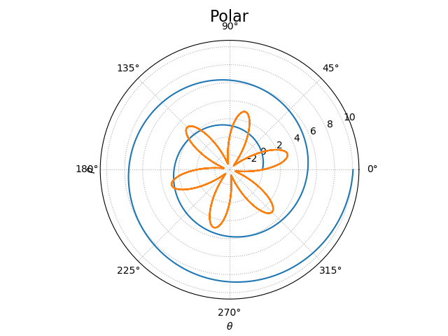
5、极坐标图
绘制极坐标图的基本API:
plt.gca(projection='polar')
示例:
 1 import numpy as np
 2 import matplotlib.pyplot as plt
 3
 4 theta = np.linspace(0, 4 * np.pi, 1000)
 5 r = 0.8 * theta
 6 plt.figure("Polar", facecolor='lightgray')
 7 plt.gca(projection='polar')
 8 plt.title('Polar', fontsize=16)
 9 plt.xlabel(r'$\theta$')
10 plt.ylabel(r'$\rho$')
11 plt.grid(linestyle=':')
12 plt.plot(theta, r)
13 x = np.linspace(0, 6 * np.pi, 1000)
14 y = 3 * np.sin(6 * x)
15 plt.plot(x, y)
16 plt.savefig('images/polar.png')
17 plt.show()
运行结果:
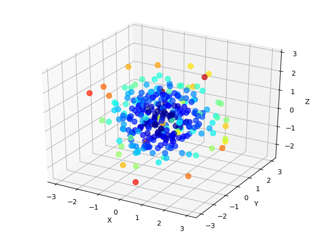
6、3D图形
(1)、3D散点图
3D散点图绘制基本API:
 1 from mpl_toolkits.mplot3d import axes3d
 2 ax3d = plt.gca(projection='3d')   # class axes3d
 3
 4 ax3d.scatter(..)        # 绘制三维点阵
 5 ax3d.scatter(
 6     x,                 # x轴坐标数组
 7     y,                # y轴坐标数组
 8     z,                # z轴坐标数组
 9     marker='',         # 点型
10     s=10,            # 大小
11     zorder='',        # 图层序号
12     color='',        # 颜色
13     edgecolor='',     # 边缘颜色
14     facecolor='',    # 填充色
15     c=v,            # 颜色值 根据cmap映射应用相应颜色
16     cmap=''            #
17 )
示例:
 1 import numpy as np
 2 import matplotlib.pyplot as plt
 3 from mpl_toolkits.mplot3d import axes3d
 4
 5 n = 300
 6 x = np.random.normal(0, 1, n)
 7 y = np.random.normal(0, 1, n)
 8 z = np.random.normal(0, 1, n)
 9
10 plt.figure('3D Points', facecolor='lightgray')
11 ax3d = plt.gca(projection='3d')
12 ax3d.set_xlabel('X')
13 ax3d.set_ylabel('Y')
14 ax3d.set_zlabel('Z')
15 d = x**2 + y**2 + z**2
16 ax3d.scatter(x, y, z, s=60, alpha=0.7, c=d,cmap='jet')
17 plt.tight_layout()
18 plt.savefig('images/3dscatter.png')
19 plt.show()
运行结果:
(2)、3D平面图
绘制3D平面图的API:
1 ax3d.plot_surface(
2     x,         # 网格坐标矩阵的x坐标 (2维数组)
3     y,         # 网格坐标矩阵的y坐标 (2维数组)
4     z,         # 网格坐标矩阵的z坐标 (2维数组)
5     rstride=30,            # 行跨距
6     cstride=30,           # 列跨距
7     cmap='jet'             # 颜色映射
8 )
示例:
import numpy as np
import matplotlib.pyplot as mp
from mpl_toolkits.mplot3d import axes3d
n = 1000
x, y = np.meshgrid(np.linspace(-3, 3, n), np.linspace(-3, 3, n))
z = (1 - x / 2 + x ** 5 + y ** 3) * np.exp(-x ** 2 - y ** 2)
mp.figure('3D Surface', facecolor='lightgray')
ax3d = mp.gca(projection='3d')
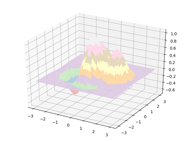
ax3d.plot_surface(x, y, z, cstride=20,rstride=20, cmap='Pastel1')
mp.tight_layout()
mp.savefig('images/3dsurface.png')
mp.show()
运行结果:
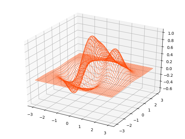
(3)、3D线框图
绘制3D线框图的API:
1 # rstride: 行跨距
2 # cstride: 列跨距
3 ax3d.plot_wireframe(x,y,z,rstride=30,cstride=30, linewidth=1, color='dodgerblue')
示例:
 1 import numpy as np
 2 import matplotlib.pyplot as plt
 3 from mpl_toolkits.mplot3d import axes3d
 4
 5 n = 1000
 6 x, y = np.meshgrid(np.linspace(-3, 3, n), np.linspace(-3, 3, n))
 7 z = (1 - x / 2 + x ** 5 + y ** 3) * np.exp(-x ** 2 - y ** 2)
 8
 9 plt.figure('3D Wireframe', facecolor='lightgray')
10 ax3d = plt.gca(projection='3d')
11 ax3d.plot_wireframe(x, y, z, cstride=20,rstride=20, linewidth=0.5,color='orangered')
12 plt.tight_layout()
13 plt.savefig('images/3dwireframe.png')
14 plt.show()
运行结果: