Box model, float and CSS positioning is the most important of the three concepts. Together, they decided on a elements arranged and displayed on the page in what form.
First, the box model
1. Definitions
The box model is the core concept of CSS. A page, all elements (whether he eventually shown to be circular, rectangular or triangular) are seen as a rectangular box, the box contains the content area, padding, borders and margins.
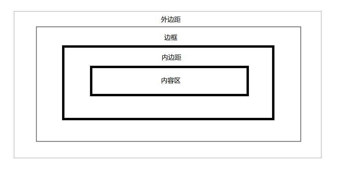
FIG. 1. CSS box model
We can imagine it as express delivery box online shopping in the real world, outside the distance is the distance the box from another box, the border is this box of material, padding is the inner layer of cushioning foam, and content area nature is your online shopping items. But it is difficult to understand the CSS box model with real-life delivery of boxes of different width and height definition. Human high definition wide delivery box comprises a box material itself, while in the CSS box model width and height attributes described it is a wide-area content is high, not included in the margins and borders. Once you understand the links and differences between the box model and reality of the box, then the box model will soon be able to work for us.
2. Properties
More than we can raise this issue be resolved by defining a box of box-sizing property. box-sizing default content-box, border-box may be modified to ensure that the width and height CSS box model are also within the margins and borders included. This calculation wide high way more intuitive than the original, because it is closer to real life.
Another problem is defined as a percentage of the size of the property. Since the time of writing CSS code, property is generally not highly defined, and by how much content adaptation from a predetermined height (to ensure that the content will not disappear for no reason). Thus, in addition to the percentage of the height to the height comprises the box related to other lengths are calculated (including padding-top in the vertical direction, padding-bottom, margin-top and margin-bottom) according to the width comprises a box using a percentage.
3. Including box
More than supplement the concept of what is contained box? When defining the image position: absolute This makes the box from the document flow properties later, becomes a box containing < HTML > </ HTML > , the other state, the box containing all the direct parent element.
Second, the visible formatting model
Understanding of the box model in the future, we can observe how to format a box model and positioning of. We often referred to "block elements" "row-level elements" , these elements are actually " block box " and " in-row box " model exists, can be switched by adjusting a display attribute or element is a row-level block level. Block boxes stacked in the vertical direction; row boxes stacked in the horizontal direction, not only change the position of the line. We all know that the box can be freely set the block width and height, inline box width and height settings are invalid. At the same time, such as our actual text contents written in HTML will be composed of a DOM node (like < strong > , < EM > such labels as well), they are " OK box ", only through the line-height attribute to adjust the height. All in all, we only need to focus ① block box width and height can be freely defined; ② the line width and height of the box is invalid; ③ row box can only be defined "line-height" to adjust the height, these three basic enough.
Three, margin collapse (margin fold)
One conventional mechanism box folded margin, this gives us the layout of the page is often distressing: in the vertical direction, when the two margins meet, will be folded into a larger of the two margins (the outer box and the inner from outside the box will also fold). In such cases how to solve it, the answer is to use some hackers writing: the definition of a small transparent border, its property border: 1px Solid transparent; , so that the naked eye can not see, margins will not be folded together. Or directly substituted padding margin, no folding.
Fourth, the float
Box will float out of the normal flow of the document, but it was originally designed purpose is to allow text can be surrounded by pictures, so with position: absolute they have a little difference.
Fifth, the principle of clear float closed
Since the floating elements do not occupy a position in the document, so it will not load its height (not floating box) box parent distraction. Sometimes we need to stop the line box around the outside of the floating box, CSS provides a clear property for us. Its values are left, right, both and none, to specify which side of the line next to the box can not float box. Therefore, in order to clear the floating closed, we can use a hacker wording, use an empty div, setting it clear to both, so this empty div on the left and right sides will not close the floating box. Meanwhile, this div to set the display: Block , div width of this empty cassette is the default parent as wide, so that it will close the box below the float. Since this is a div occupy space in the document, so the father of the box will be stretched. Specific code as follows:
 1 .outer {
 2     border: 1px solid black;
 3 }
 4
 5 .inner1 {
 6     float: left;
 7     background: greenyellow;
 8     width: 50px;
 9     height: 30px;
10 }
11
12 .outer::after {
13     content: '';
14     display: block;
15     clear: both;
16 }
1 <div class="outer">
2     <div class="inner1">
3         Hello world
4     </div>
5 </div>
Six other new CSS layout module
1. Flexible box layout module (Flexible Box Layout Module)
Flexbox it is short, it supports the horizontal and vertical layouts subelements, subelements can set the size, spacing, and alignment, may be adjusted in addition to the order of the sub-elements rendered HTML pages with different order.
2. The grid layout module (Grid Layout)
Grid layout achieve complete separation of the source code sequence, structure and performance of the content from the individual modules of the grid system in the abstract. Target grid system is substituted backward floating element layout and positioning.
3. multi-column layout (Multi-column Layout Module)
Multi-column layout can have a "waterfall" we often mentioned, the browser will automatically be adjusted according to the available width.
Summary: We introduce the box model, both inside and outside the margins, width and height would affect the size of the box, to understand the block box, the difference between the line a box, line box, floating boxes and so on. We also learned how to solve problems margin collapse, to understand the principles of clear float closed.