Tailwind CSS v1 release, this is the first major project version, first released have been grinding away for 2 years. Tailwind is a utility for rapid UI development framework set CSS, practical design concept for the first, it provides a high degree of utility classes can be combined, can help developers easily build complex user interface. It also provides a tool to extract components from a practical model, developed in response style to meet on different devices.
And Bootstrap, Foundation and other frameworks and Bulma different, Tailwind CSS is not a UI kit, because it does not have a built-in UI components, and no default theme, requires developers to fully customize the design according to their own circumstances.
Currently Tailwind has been adopted by companies such as Mozilla and Algolia.
This version brings the following main elements:
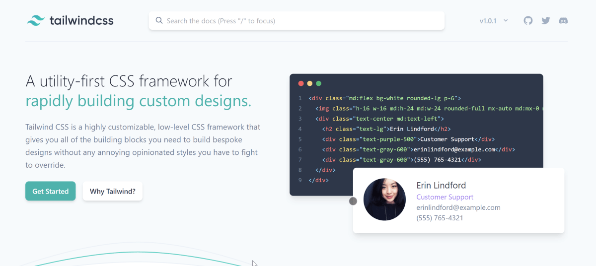
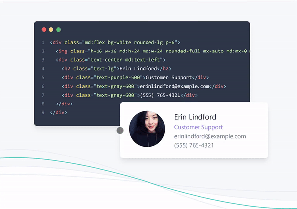
The new home page with a cool animation
New home better describes the Tailwind and tutorials. Because different Tailwind CSS and common Bootstrap, Foundation and Bulma and other frameworks, it is not UI suites, there is no built-in UI components, and no default theme, requires developers to fully customize the design according to their own circumstances, so the biggest obstacle to the entry Tailwind one of them is turned to utility classes from pre-defined components. New navigation and home page animation done a good job on the interpretation.
You do not need to create a profile
Before version of the profile has a lot of configuration options, the default definition, it might actually be a little annoying. The new configuration becomes optional, and now just need some customization options. Now tracking custom configuration applies only to the scope of the project easier. Also like the bottom of the configuration, see extend property, which allows developers to extend the default Tailwind property and not directly covered by them.
// Example `tailwind.config.js` file

module.exports = {
  important: true,
  theme: {
    fontFamily: {
      display: ['Gilroy', 'sans-serif'],
      body: ['Graphik', 'sans-serif'],
    },
    extend: {
      colors: {
        cyan: '#9cdbff',
      },
      margin: {
        '96': '24rem',
        '128': '32rem',
      },
    }
  },
  variants: {
    opacity: ['responsive', 'hover']
  }
}
The new color palette: shades of each color from seven kinds of changes to nine kinds
Tailwind now equipped with digital palette, so it can handle several variations of color and it's correct. In addition, developers can modify the color of their own to meet demand.
// tailwind.config.js
module.exports = {
  theme: {
    colors: {
      indigo: {
        lighter: '#b3bcf5',
        default: '#5c6ac4',
        dark: '#202e78',
      }
    }
  }
}
Note: Tailwind will remain the default attributes as special attributes.
To access the CSS file configuration, you can use the theme and help function using dot notation to get the value:
.btn-blue {
  background-color: theme('colors.indigo.dark');
}
新的排序实用程序
排序实用程序对于以与 DOM 中显示的顺序不同的顺序呈现 Flex 项目非常有用。
<div class="flex">
  <div class="order-last">1</div>
  <div>2</div>
  <div>3</div>
</div>
在上面的示例中,class 属性为 order-last 的 div 将出现在列表的末尾,这与 flexbox 的 order CSS 属性行为相同。默认情况下,有 first、last 和 none 几种排序后缀,分别将对象移动到第一个、最后一个和正常位置。此外排序实用程序还支持 12 列网格,可以扩展它以满足项目的要求。
新的 Position Top/Right/Bottom/Left 实用程序
以往只能粗暴地操控对象位置,直接把对象固定到边上:
<div class="pin-t"><!-- ... --></div>现在通过新的位置实用程序,可以更加灵活地控制具体位置:
<div class="top-16"><!-- ... --></div>更新公告: