1 Introduction to CSS
CSS is the abbreviation of Cascading Style Sheets.
CSS is also a markup language, mainly used to set the text content (font, size, alignment, etc.), image shape (width and height, border style,
margins, etc.) in HTML pages, as well as the layout and appearance display style of the page. .
For more CSS content, please see MDN: Click to send
1.1 CSS syntax specifications
All styles are included in
<head>
 <style>
 h4 {


 color: blue;
 font-size: 100px;
 }
 </style>
</head>
1.2 Three major features of CSS
CSS has three very important characteristics: cascading, inheritance, and priority.
1.2.1 Stackability
If the same selector sets the same style, one style will overwrite (cascade) the other conflicting style. Cascading mainly solves
the problem of style conflict
. Principle of cascading:
- Style conflicts follow the principle of proximity. Whichever style is closer to the structure will be executed.
- Styles do not conflict or overlap
1.2.2 Inheritance
Inheritance in CSS: Child tags will inherit some styles of the parent tag, such as text color and font size.
Proper use of inheritance can simplify code and reduce the complexity of CSS styles.
Child elements can inherit the styles of parent elements (text-, font-, line- elements at the beginning of these elements can be inherited, as well as the color attribute)
- row height inheritance
body {
 font:12px/1.5 Microsoft YaHei;
}
- The row height may or may not follow the unit.
- If the child element does not set a row height, it will inherit the row height of the parent element, which is 1.5.
- At this time, the line height of the child element is: text size of the current child element * 1.5
- body line height 1.5 The biggest advantage of this way of writing is that the sub-elements inside can automatically adjust the line height according to their own text size.
1.2.3 Priority
When multiple selectors are specified for the same element, priority will be generated.
If the selectors are the same, cascading will be performed. If the selectors are different, then the selectors will be executed based on the weight of the selector.
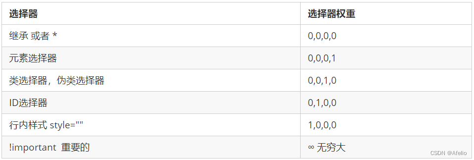
- The weight is composed of 4 groups of numbers, but there will be no carry.
- It can be understood that the class selector is always greater than the element selector, the id selector is always greater than the class selector, and so on...
- The level judgment is from left to right. If the value of a certain digit is the same, the next digit value is judged.
- A simple mnemonic: wildcard and inheritance weight is 0, tag selector is 1, class (pseudo-class) selector is 10, id selector is 100, inline style sheet is
1000, !important is infinity. - The inherited weight is 0. If the element is not directly selected, no matter how high the weight of the parent element is, the child element will get a weight of 0.
Weight overlap: If it is a compound selector, the weight will overlap and the weight needs to be calculated.
- div ul li ------> 0,0,0,3
- .nav ul li ------> 0,0,1,2
- a:hover -----—> 0,0,1,1
- .nav a ------> 0,0,1,1
2 CSS selectors
Selectors are divided into two major categories 基础选择器: and复合选择器
2.1 Basic selectors
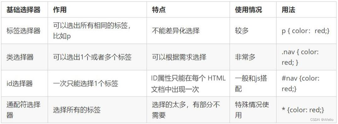
The basic selector is composed of a single selector, including: label selector, class selector, id selector and wildcard selector
2.1.1 Tag Selector
Tag selector (element selector) refers to using HTML tag names as selectors, classifying them according to tag names, and specifying a
unified CSS style for a certain type of tags in the page.
标签名{
 属性1: 属性值1;
 属性2: 属性值2;
 ...
}
The tag selector can select all tags of a certain type, such as all <div>tags and all <span>tags.
Advantages: It can quickly and uniformly set styles for labels of the same type on the page.
Disadvantages: You cannot design differentiated styles, you can only select all current tags.
2.1.2 Class Selector
If you want to differentially select different tags or select one or several tags individually, you can use a class selector. The class selector is represented by the class attribute in HTML. In CSS, the class selector is displayed with a dot "." .
.类名 {
 属性1: 属性值1;
 ...
}
Multiple class names can be written in the label class attribute, and multiple class names must be separated by spaces.
2.1.3 id selector
The id selector can specify a specific style for HTML elements marked with a specific id.
The HTML element uses the id attribute to set the id selector, and the id selector in CSS is defined with "#".
#id名 {
 属性1: 属性值1;
 ...
}
Note: The id attribute can appear only once in each HTML document.
2.1.4 Wildcard Selector
In CSS, the wildcard selector is defined with "*", which means that all elements (tags) in the page are selected.
* {
 属性1: 属性值1;
 ...
}
2.1.5 Summary of basic selectors
2.2 Composite selector
Commonly used compound selectors include: descendant selectors, sub-selectors, union selectors, pseudo-class selectors, etc.
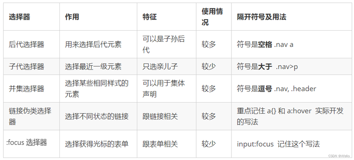
2.2.1 Descendant selectors
The descendant selector, also known as the containing selector, can select child elements within the parent element. The way to write it is to write the outer label at the front and the inner label at
the back, separated by spaces. When tags are nested, the inner tag becomes a descendant of the outer tag.
元素1 元素2 { 样式声明 }
- Element 1 and element 2 are separated by a space.
- Element 1 is the parent, element 2 is the child, and element 2 is ultimately selected.
- Element 2 can be a son, grandson, etc., as long as it is a descendant of element 1
- Element 1 and Element 2 can be any basic selector
2.2.2 Subselector
Child element selectors (child selectors) can only select elements that are the most recent child of an element. The simple understanding is to choose the son element.
元素1 > 元素2 { 样式声明 }
- Element 1 and element 2 are separated by a greater than sign.
- Element 1 is the parent, element 2 is the child, and element 2 is ultimately selected.
- Element 2 must be a biological son, and his grandchildren and great-grandchildren are not under his control. He can also be called a biological son selector.
2.2.3 Union selector
The union selector is composed of selectors connected by English commas (,). Any form of selector can be used as part of the union selector.
元素1,元素2 { 样式声明 }
2.2.4 Pseudo-class selector
Pseudo-class selectors are used to add special effects to certain selectors, such as adding special effects to links, or selecting the 1st or nth element.
The biggest feature of writing pseudo-class selectors is that they are expressed by colons (:), such as :hover and :first-child.
2.2.4.1 Link pseudo-class selector
- To ensure effectiveness, please declare: link-:visited-:hover-:active in the order of LVHA.
- Because a link has a default style in the browser, we need to specify a separate style for the link in actual work.
 /* a 是标签选择器 所有的链接 */
 a {
 color: gray;
 }
 /* :hover 是链接伪类选择器 鼠标经过 */
 a:hover {
 color: red; /* 鼠标经过的时候,由原来的 灰色 变成了红色 */
 }
2.2.4.2 :focus pseudo-class selector
The :focus pseudo-class selector is used to select the focused form element.
The focus is the cursor, which can generally <input>be obtained by form elements, so this selector is mainly targeted at form elements.
input:focus {
 background-color:yellow;
}
2.2.5 Summary of compound selectors
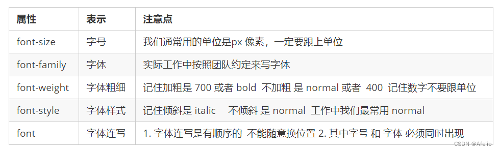
3 CSS font properties
CSS Fonts properties are used to define font family, size, weight, and text style (such as italics).
3.1 Font family
CSS uses the font-family property to define the font family of text.
p { font-family:"微软雅黑";}
div {font-family: Arial,"Microsoft Yahei", "微软雅黑";}
The most common fonts: body {font-family: 'Microsoft YaHei',tahoma,arial,'Hiragino Sans GB'; }
3.2 Font size
CSS uses the font-size property to define font size.
p {
 font-size: 20px;
}
Different browsers may display different font sizes by default. The default text size of Google Chrome is 16px.
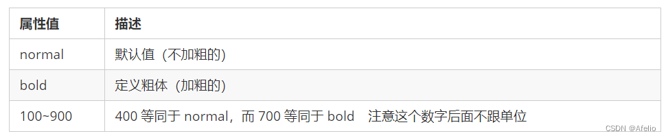
3.3 Font weight
CSS uses the font-weight property to set the weight of text fonts.
p {
 font-weight: bold;
}
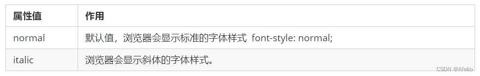
3.4 Text style
CSS uses the font-style property to style text.
p {
 font-style: normal;
}
3.5 Font composite properties
body {
 font: font-style font-weight font-size/line-height font-family;
}
When using the font attribute, it must be written in the order in the above syntax format. The order cannot be changed, and each attribute is separated by a space.
The attributes that do not need to be set can be omitted (take the default value), but font-size and font-family must be retained. attribute, otherwise the font attribute will have no effect
3.6 Summary of font attributes
4 text attributes
The CSS Text property defines the appearance of text, such as text color, text alignment, text decoration, text indentation, line spacing, etc.
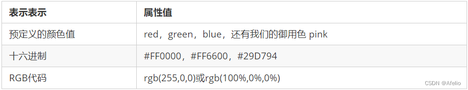
4.1 Text color
The color attribute is used to define the color of the text.
div {
 color: red;
}
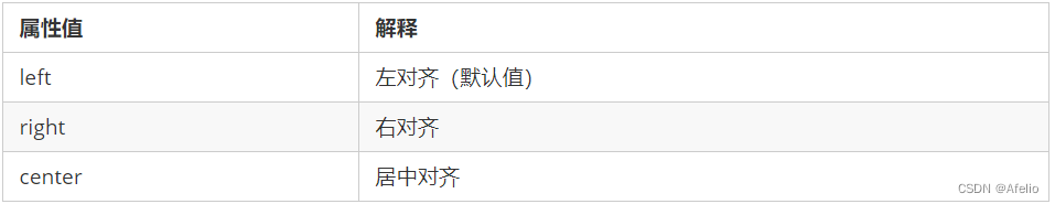
4.2 Align text
The text-align attribute is used to set the horizontal alignment of text content within an element.
div {
 text-align: center;
}
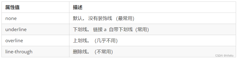
4.3 Decorating text
The text-decoration attribute specifies the decorations added to the text. You can add underline, strikethrough, overline, etc. to text.
div {
 text-decoration:underline;
}
4.4 Text indentation
The text-indent attribute is used to specify the indentation of the first line of text, usually the first line of a paragraph.
div {
 text-indent: 10px;
}
p {
 text-indent: 2em;
}
em is a relative unit, which is the size of one text of the current element (font-size). If the current element does not set a size, it will be
one text size of the parent element.
4.5 Line spacing
The line-height property is used to set the distance between lines (line height). You can control the distance between lines of text.
p {
 line-height: 26px;
}
4.6 Summary of text attributes

5 CSS introduction methods
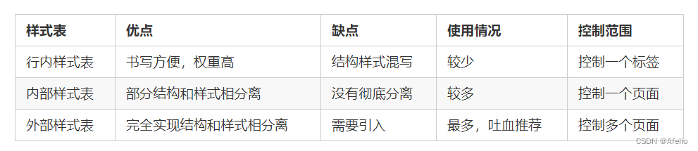
According to the location where CSS styles are written (or how they are introduced), CSS style sheets can be divided into three major categories:
- Inline style sheets (inline)
- Internal style sheet (embedded)
- External style sheet (linked)
引入外部样式表:
<link rel="stylesheet" href="css文件路径">
6 CSS element display modes
It can better layout the web page. The element display mode is the way in which the elements (labels) are displayed. For example, they <div>occupy one line by themselves, and for example, multiple elements can be placed on one line <span>.
HTML elements are generally divided into two types: block elements and inline elements.
6.1 Block elements
Common block elements include <h1>~<h6>, <p>, <div>, <ul>, <ol>, <li>etc., among which <div>the tag is the most typical block element.
Characteristics of block-level elements:
① Occupy one line.
② Height, width, margins and padding can all be controlled.
③ The width defaults to 100% of the container (parent width).
④ It is a container and box, which can contain row or block-level elements.
Notice :
- Block-level elements cannot be used within text-type elements.
<p>Tags are mainly used to store text, so<p>block-level elements cannot be placed inside them, especially<div>- In the same way,
<h1>~<h6>etc. are all text block-level tags, and other block-level elements cannot be placed inside them.
6.2 Inline elements
Common inline elements include <a>, <strong>, <b>, , <em>, <i>, <del>, <s>, <ins>, <u>etc. <span>Among them,
<span>the tag is the most typical inline element. In some places, inline elements are also called inline elements.
Characteristics of inline elements:
① Adjacent inline elements are on one line, and more than one can be displayed on one line.
② Direct setting of height and width is invalid.
③ The default width is the width of its own content.
④ Inline elements can only accommodate text or other inline elements.
Notice:
- No more links can be placed inside the link
- Block-level elements can be placed in special links
<a>, but it<a>is safest to convert them to block-level mode.
6.3 Inline block elements
There are several special tags in inline elements - <img />, <input />, <td>, which have the characteristics of both block elements and inline elements.
Some sources call them inline block elements.
Characteristics of inline block elements:
① On the same line as adjacent inline elements (inline blocks), but there will be a blank gap between them. One line can display multiple elements (characteristics of inline elements).
② The default width is the width of its own content (characteristics of inline elements).
③ Height, line height, margins and padding can all be controlled (block-level element characteristics).
6.4 Summary of element display modes

6.5 Element display mode conversion
In special cases, element mode conversion is required. Simple understanding: elements of one mode need the characteristics of another mode
, such as wanting to increase <a>the trigger range of a link.
- Convert to block element: display:block;
- Convert to inline element: display:inline;
- Convert to inline block: display: inline-block;
7 CSS background
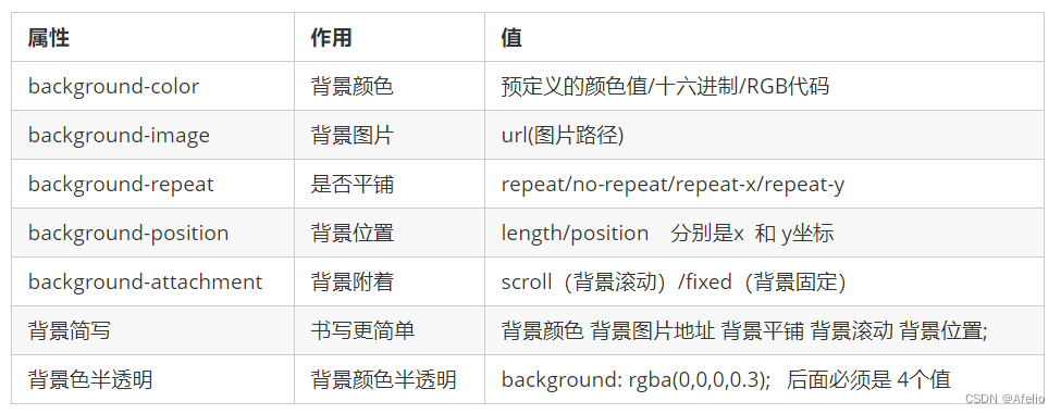
The background properties can set the background color, background image, background tiling, background image position, background image fixation, etc.
7.1 Background color
The background-color property defines the background color of the element.
background-color:颜色值;
Generally, the default value of the background color of an element is transparent. You can also manually specify the background color as transparent.
background-color:transparent;
7.2 Background image
The background-image attribute describes the background image of the element. In actual development, it is common to use logos or some small decorative pictures or oversized
background pictures. The advantage is that it is very easy to control the position. (Sprites are also a use scenario)
background-image : none | url (url)
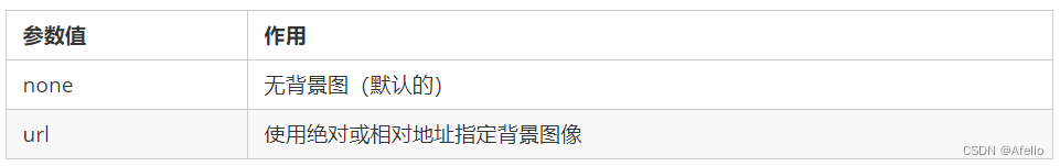
Note : Do not forget to add the url to the address behind the background image, and do not add quotation marks to the path inside.
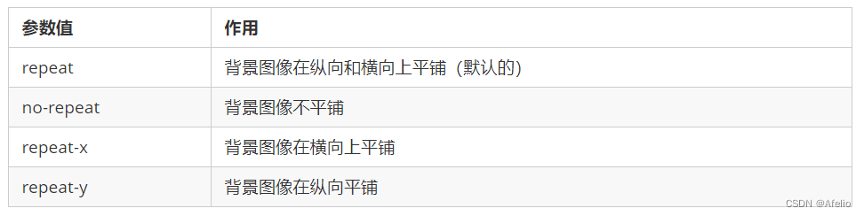
7.3 Background tiling
If you need to tile the background image on the HTML page, you can use the background-repeat attribute.
background-repeat: repeat | no-repeat | repeat-x | repeat-y
7.4 Background image location
Use the background-position property to change the position of the image in the background.
background-position: x y;
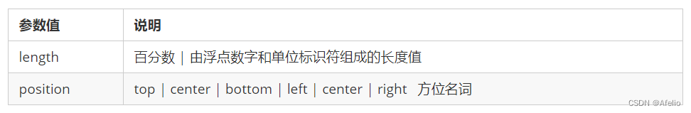
- The parameter is a directional noun.
If the two specified values are both directional nouns, the order of the two values has nothing to do with it. For example, left top and top left have the same effect
. If only one directional noun is specified and the other value is omitted, the second value will default. center alignment - The parameter is an exact unit.
If the parameter value is an exact coordinate, then the first one must be the x coordinate, and the second one must be the y coordinate
. If only one value is specified, then the value must be the x coordinate, and the other one is vertically centered by default. - Parameter is mixed unit
If the two values specified are a mixture of precise units and azimuthal nouns, the first value is the x coordinate and the second value is the y coordinate.
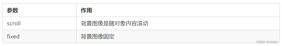
7.5 Background image fixation (background attachment)
The background-attachment property sets whether the background image is fixed or scrolls with the rest of the page.
background-attachment can create parallax scrolling effect later.
background-attachment : scroll | fixed
7.6 Background composite writing method
In order to simplify the code of the background attribute, we can merge these attributes into the same attribute background. This saves the amount of code.
When using abbreviated attributes, there is no specific writing order. The generally agreed order is:
background: background color background image address background tile background image scroll background image position;
background: transparent url(image.jpg) repeat-y fixed top ;
7.7 Background color translucent
CSS3 provides a translucent background color effect.
background: rgba(0, 0, 0, 0.3);
- The last parameter is alpha transparency, the value range is between 0 and 1
- We are used to omitting the 0 in 0.3 and writing it as background: rgba(0, 0, 0, .3);
- Note: Background translucency means the background of the box is translucent, and the content inside the box is not affected.
- CSS3 new attributes are only supported by IE9+ browsers
7.8 Background summary
8 box model
Web page layout process:
- First prepare the relevant web page elements, which are basically boxes.
- Use CSS to set the box style and then place it in the corresponding position.
- Fill the box with contents.
The core essence of web page layout is to use CSS to place boxes.
The so-called box model: The layout element in the HTML page is regarded as a rectangular box, which is a container for holding content.
The CSS box model is essentially a box that encapsulates surrounding HTML elements, including: border, margin, padding and actual content.
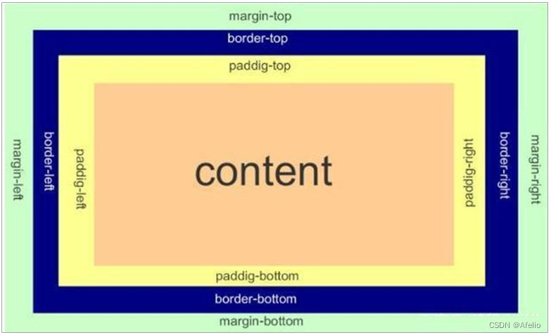
8.1 Border
border can set the border of an element. The border consists of three parts: border width (thickness), border style, and border color.
border : border-width || border-style || border-color
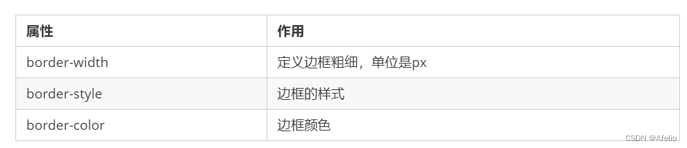
The border style border-style can be set to the following values:
- none: no border, i.e. ignore the width of all borders (default value)
- solid: The border is a single solid line (the most commonly used)
- dashed: The border is dotted
- dotted: The border is a dotted line
Border abbreviation:
border: 1px solid red; 没有顺序
How to write separate borders:
border-top: 1px solid red; /* 只设定上边框, 其余同理 */
8.1.1 Thin line borders for tables
The border-collapse property controls how the browser draws table borders. It controls the borders of adjacent cells.
border-collapse: collapse;
- collapse: The word means to merge
- border-collapse: collapse; means adjacent borders merge together
The border adds extra to the actual size of the box. Therefore there are two solutions:
- When measuring the size of the box, do not measure the border.
- If the measurement includes a border, you need to subtract the width of the border from width/height.
8.1.2 Rounded border
In CSS3, a new rounded border style is added, and the border-radius attribute is used to set the rounded corners of the outer border of an element.
border-radius:length;
- Parameter values can be in the form of numbers or percentages
- If it is a square and you want to set it to a circle, just change the value to half the height or width, or write it directly as 50%
- This attribute is a shorthand attribute that can be followed by four values, representing the upper left corner, upper right corner, lower right corner, and lower left corner respectively.
- Write separately: border-top-left-radius, border-top-right-radius, border-bottom-right-radius and
border-bottom-left-radius - Compatibility IE9+ browser support, but will not affect the page layout, you can use it with confidence.
8.2 Padding
The padding property is used to set the padding, which is the distance between the border and the content.

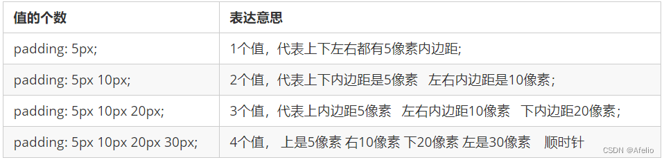
After assigning the padding value to the box, two things happen:
- There is a distance between the content and the border, and padding is added.
- Padding affects the actual size of the box.
In other words, if the box already has a width and height, and then specifying an inner border at this time, the box will be enlarged.
Solution:
If you ensure that the size of the box is consistent with the rendering, just subtract the extra padding from width/height.
8.3 Margins
The margin property is used to set the margin, which controls the distance between the box and the box.
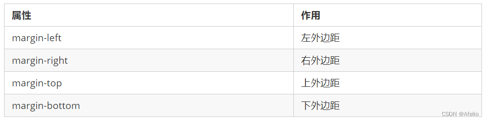
The abbreviation of margin means exactly the same as padding.
Margins can center block-level boxes horizontally, but two conditions must be met:
① The box must specify a width (width).
② Set the left and right margins of the box to auto.
.header{ width:960px; margin:0 auto;}
Common writing methods include the following three methods:
- margin-left: auto; margin-right: auto;
- margin: car;
- margin: 0 auto;
Note: The above method is to center block-level elements horizontally, and add inline elements or inline block elements to their parent elements text-align:center.
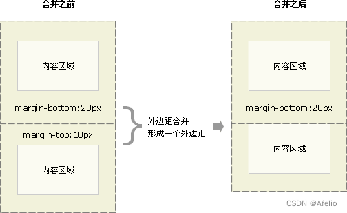
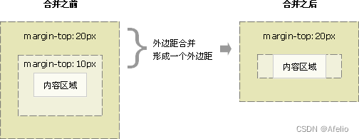
When using margin to define vertical margins for block elements, margin merging may occur.
There are two main situations:
- Merging vertical margins of adjacent block elements
- Collapse of vertical margins on nested block elements
8.3.1 Merging vertical margins of adjacent block elements
When two adjacent block elements (siblings) meet, if the upper element has a lower margin-bottom and the lower element has a
top margin-top, then the vertical spacing between them is not margin-bottom. The sum of margin-top. The phenomenon of taking the larger of the two values
is called the merging of vertical margins of adjacent block elements.
Solution:
Try to add margin value to only one box.
8.3.2 Collapse of vertical margins on nested block elements
For two block elements with a nested relationship (parent-child relationship), the parent element has a top margin and the child element also has a top margin. At this time, the parent element will collapse with a larger margin value.
Solution:
① You can define a top border for the parent element.
② You can define top padding for the parent element.
③ You can add overflow:hidden to the parent element.
④ There are other methods, such as floating, fixed, and absolutely positioned boxes will not have collapse problems.
8.4 Clear internal and external margins
Many web page elements have default internal and external margins, and the defaults are inconsistent across browsers. Therefore, before layout, we must first clear
the inner and outer margins of the web page elements.
* {
 padding:0; /* 清除内边距 */
 margin:0; /* 清除外边距 */
 }
Note: In order to take care of compatibility, inline elements should only set left and right inner and outer margins, and do not set upper and lower inner and outer margins. But converting to block-level and inline
block elements works just fine
9 shadows
9.1 Box shadow
Box shadow is new in CSS3, and you can use the box-shadow property to add a shadow to the box.
box-shadow: h-shadow v-shadow blur spread color inset;
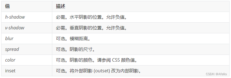
Notice:
- The default is outer shadow (outset), but you cannot write this word, otherwise the shadow will be invalid.
- Box shadows take up no space and will not affect other box arrangements.
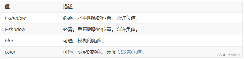
9.2 Text shadow
In CSS3, you can apply a shadow to text using the text-shadow property
text-shadow: h-shadow v-shadow blur color;
10 layout methods
CSS provides three traditional layout methods (simply put, how boxes are arranged): normal flow (standard flow), floating, and positioning.
10.1 Standard stream (ordinary stream/document stream)
The so-called standard flow: labels are arranged in a prescribed default way. Standard flow is the most basic layout method.
- Block-level elements will occupy their own row, arranged in order from top to bottom.
Commonly used elements: div, hr, p, h1~h6, ul, ol, dl, form, table - Inline elements will be arranged in order from left to right, and will automatically wrap when touching the edge of the parent element.
Common elements: span, a, i, em, etc.
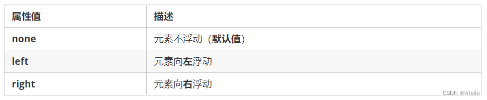
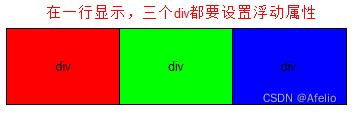
10.2 Float
The float property is used to create a floated box, moving it aside until the left or right edge touches the edge of the containing block or another floated box.
选择器 { float: 属性值; }
Elements after adding floats will have many characteristics:
- Floating elements will break out of the standard flow (out of standard)
- Floated elements will be displayed in one line and the top of the element will be aligned
- Floating elements will have the characteristics of inline block elements.
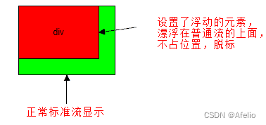
Note : Floating elements are close to each other (there will be no gaps). If the parent width cannot accommodate these floating boxes, the extra boxes
will be aligned on another line. .
Floated elements will have inline block element properties
- Any element can be floated. Regardless of the original mode of the element, adding float will have similar characteristics to inline block elements.
- If the block-level box has no width set, the default width is the same as the parent, but after adding a float, its size is determined based on the content.
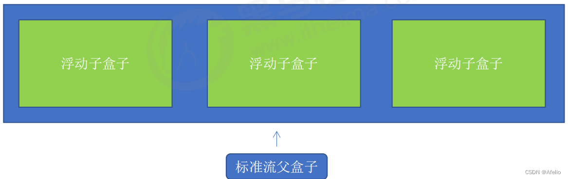
Floating elements are often used in conjunction with the standard flow parent. First, the parent element of the standard flow is used to arrange the upper and lower positions, and then the internal child elements are floated to arrange the left and right positions.
Things to note about floating layout
- Floats are matched with parent boxes of standard streams.
First, use the parent element of the standard flow to arrange the upper and lower positions, and then use the floating arrangement of the internal child elements to the left and right positions. - If one element is floated, theoretically the other sibling elements should also be floated.
There are multiple sub-boxes in a box. If one of the boxes floats, the other brothers should also float to prevent problems.
The floating box will only affect the standard flow behind the floating box, but not the standard flow in front of it.
10.2.1 Clear float
In many cases, it is inconvenient to give height to the parent box, but the child box floats and does not occupy a position. Finally, when the height of the parent box is 0, it will
affect the standard flow box below.
Since the floating element no longer occupies the position of the original document flow, it will affect the layout of subsequent elements.
Clear float essence:
- The essence of clearing floats is the impact of clearing floating elements
- If the parent box itself has height, there is no need to clear the float
- After clearing the float, the parent will automatically detect the height based on the floating child box. If the parent has a height, it will not affect the standard flow below.
选择器{clear:属性值;}
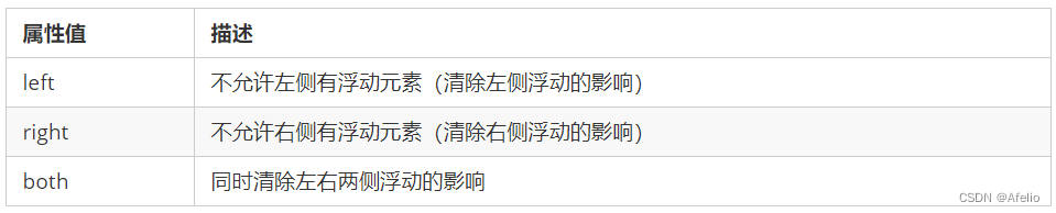
The strategy for clearing floats is: Close the float
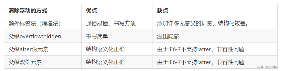
Clear float method:
- The additional labeling method, also known as the partition method, is a practice recommended by the W3C.
- Add overflow attribute to parent
- Add after pseudo-element to parent
- Add double pseudo-element to parent
10.2.1.1 Additional labeling method
The additional labeling method, also known as the partition method, is a practice recommended by the W3C.
The extra tag method adds an empty tag at the end of the floated element. For example <div style=”clear:both”></div>, or other tags
(such as <br />etc.)
Disadvantages: Adding many meaningless tags, poor structure
Note: It is required that this new empty tag must be a block-level element.
10.2.1.2 Add overflow to parent
You can add an overflow attribute to the parent and set its attribute value to hidden, auto or scroll.
Disadvantages: Unable to display overflow parts
10.2.1.3 :after pseudo-element method
The :after method is an upgraded version of the additional tag method. Also added to the parent element
.clearfix:after {
 content: "";
 display: block;
 height: 0;
 clear: both;
 visibility: hidden;
}
.clearfix { /* IE6、7 专有 */
 *zoom: 1;
}
Disadvantages: Taking care of lower version browsers
10.2.1.4 Double pseudo-element clear float
.clearfix:before,.clearfix:after {
 content:"";
 display:table;
}
.clearfix:after {
 clear:both;
}
.clearfix {
 *zoom:1;
}
Disadvantages: Taking care of lower version browsers
10.2.2 Clear floating summary
10.2 Positioning
Positioning allows the box to move freely within a box or fix a certain position on the screen, and it can suppress other boxes.
Positioning: Position the box at a certain position, so positioning is also placing the box and moving the box according to the positioning method.
10.2.1 Positioning components
Positioning = positioning mode + edge offset.
Positioning mode is used to specify how an element is positioned in the document. The edge offset determines the final position of the element.
10.2.1.1 Positioning mode
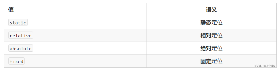
The positioning mode determines the positioning method of the element. It is set through the position attribute of CSS. Its value can be divided into four:
10.2.1.2 Edge offset
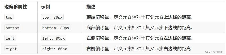
Edge offset is when the positioned box is moved to its final position. There are 4 attributes: top, bottom, left and right.
10.2.2 Static positioning static
Static positioning is the default positioning method of elements and has no meaning of positioning.
选择器 { position: static; }
Static positioning places positions according to standard flow characteristics. It has no edge offset. Static positioning is rarely used in layout.
10.2.3 Relative positioning relative
Relative positioning means that when an element moves, it is relative to its original position.
选择器 { position: relative; }
Characteristics of relative positioning:
- It moves relative to its original position (when moving the position, the reference point is its original position).
- The original position in the standard stream continues to be occupied, and subsequent boxes still treat it as a standard stream.
Therefore, relative positioning is not off-standard. Its most typical application is for absolute positioning. . .
10.2.4 Absolute positioning absolute
Absolute positioning means that when an element moves, it is relative to its ancestor elements.
选择器 { position: absolute; }
Characteristics of absolute positioning:
- If there is no ancestor element or the ancestor element is not positioned, the positioning of the browser will prevail (Document document).
- If the ancestor element has positioning (relative, absolute, fixed positioning), the position will be moved using the nearest positioned ancestor element as the reference point.
- Absolute positioning no longer occupies its original position. (Off-standard)
So absolute positioning is out of standard flow.
If the child is absolutely positioned, the parent must use relative positioning.
① The child is absolutely positioned and will not occupy a position. It can be placed anywhere in the parent box without affecting other sibling boxes.
② The parent box needs to be positioned to restrict the child box from being displayed within the parent box.
③ When the parent box is laid out, it needs to occupy a position, so the parent can only be positioned relatively.
10.2.5 Fixed positioning fixed
Fixed positioning is where an element is fixed in the browser's viewable area. Main usage scenarios: The position of the element will not change when the browser page is scrolled.
选择器 { position: fixed; }
Features of fixed positioning:
- Move elements using the browser's viewport as a reference point. It has nothing to do with the parent element and does not scroll with the scroll bar.
- Fixed positioning no longer occupies the original position.
Fixed positioning is also off-label. In fact, fixed positioning can also be regarded as a special kind of absolute positioning.
10.2.5 Sticky positioning sticky
Sticky positioning can be thought of as a hybrid of relative positioning and fixed positioning.
选择器 { position: sticky; top: 10px; }
Characteristics of sticky positioning:
- Move elements using the browser's visual window as a reference point (fixed positioning feature)
- Sticky positioning occupies the original position (relative positioning characteristics)
- One of top, left, right, and bottom must be added to be valid.
Used in conjunction with page scrolling. Poor compatibility and not supported by IE.
10.2.6 Positioning summary
| Positioning mode | Is it off-standard? | move Place |
|---|---|---|
| static static positioning | no | Edge offset cannot be used |
| relative relative positioning | No (occupy position) | Move relative to own position |
| move | ||
| absolute positioning | Yes (does not occupy a position) | Positioned parent |
| fixed fixed positioning | Yes (does not occupy a position) | Browser viewable area |
| sticky sticky positioning | No (occupy position) | Browser viewable area |
10.2.7 Positioning the stacking order z-index
When using positioning layout, boxes may overlap. At this time, you can use z-index to control the order of the boxes (z-axis)
选择器 { z-index: 1; }
- The value can be a positive integer, a negative integer or 0. The default is auto. The larger the value, the higher the box is.
- If the attribute values are the same, the writing order is followed, with the last one coming first.
- No unit can be added after the number
- Only positioned boxes have the z-index attribute
10.2.8 Expansion of positioning
10.2.8.1 Centering an absolutely positioned box
A box with absolute positioning cannot be horizontally centered through margin:0 auto, but it can be horizontally and vertically centered through the following calculation methods.
① left: 50%;: Move the left side of the box to the horizontal center position of the parent element.
② margin-left: -100px;: Let the box move half of its width to the left.
10.2.8.2 Locating special characteristics
Absolute positioning and fixed positioning are also similar to floating.
- Add absolute or fixed positioning to inline elements, and you can directly set the height and width.
- Block-level elements add absolute or fixed positioning. If no width or height is given, the default size is the size of the content.
10.2.8.3 Off-label boxes will not trigger margin collapse
Floating elements and absolutely positioned (fixed positioned) elements will not trigger the problem of margin merging.
10.2.8.4 Absolute positioning (fixed positioning) will completely press the box
The floating element is different. It will only suppress the standard flow box below it, but it will not suppress the text (picture) in the standard flow box below.
However, absolute positioning (fixed positioning) will suppress all the content of the standard flow below.
The reason why floating does not suppress text is because the purpose of floating is originally to create a text wrapping effect. The text will wrap around the floated element
10.3 Summary of web page layout
A complete web page is laid out using standard flow, floating, and positioning, each of which has its own specialized usage.
- Standard flow
allows boxes to be arranged up and down or left and right. Vertical block-level boxes are displayed using standard flow layout. - Floating
allows multiple block-level elements to be displayed in one line or to align boxes left and right. Use floating layout to display multiple block-level boxes horizontally.
Positioning The biggest feature of positioning is the concept of stacking, which means that multiple boxes can be displayed one after the other .
Use positioning layout if the element is free to move within a box .
11 CSS property writing order
It is recommended to follow the following order:
- Layout positioning attributes: display / position / float / clear / visibility / overflow (it is recommended to write display first, after all, it is related to the mode)
- Self attributes: width / height / margin / padding / border / background
- Text properties: color/font/text-decoration/text-align/vertical-align/white-space/break-word
- Other properties (CSS3): content/cursor/border-radius/box-shadow/text-shadow/background:linear-gradient…
12 Showing and hiding elements
Similar to website advertisements, they disappear when we click to close them, but they will reappear when we refresh the page!
Essence: Let an element be hidden or displayed on the page.
- display shows hidden but does not retain position
- visibility shows hidden but retains original position
- overflow displays and hides overflow but only partially handles overflow.
12.1 display attribute
The display attribute is used to set how an element should be displayed.
- display: none; hide objects
- display: block; in addition to converting to block-level elements, it also means displaying elements.
After display hides the element, it no longer occupies its original position.
12.2 visibility visibility
The visibility attribute is used to specify whether an element should be visible or hidden.
- visibility: visible; element is visible
- visibility:hidden; element hidden
After visibility hides the element, it continues to occupy its original position.
If the hidden element does not want its original position, use visibility: hidden.
If the hidden element does not want its original position, use display: none (more emphasis on usefulness)
12.3 overflow overflow
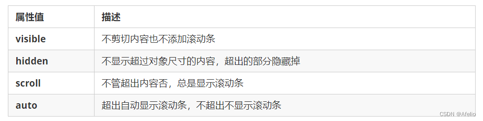
The overflow attribute specifies what happens if content overflows an element's box (beyond its specified height and width).
13 Advanced CSS Tips
13.1 Sprites
Many small background images are often used as decorations in a web page. When there are too many images in the web page, the server will frequently receive and send
request images, causing excessive request pressure on the server, which will greatly reduce the loading speed of the page.
Therefore, in order to effectively reduce the number of times the server receives and sends requests and improve the loading speed of the page, CSS sprite technology (also known as CSS Sprites, CSS Sprite) emerged
.
Core principle: Integrate some small background images in the web page into one large image, so that the server only needs one request.
Using the sprite core:
- Sprite technology is mainly used for background images. It is to integrate multiple small background images into one large image.
- This large picture is also called sprites or sprites.
- To move the background image position, you can use background-position.
- The distance moved is the x and y coordinates of the target image. Note that the coordinates in the web page are different
- Because it usually moves up and to the left, the value is negative.
- When using sprites, you need to accurately measure the size and position of each small background image.
13.2 Font icons
Font icon usage scenarios: Mainly used to display some common and commonly used small icons in web pages.
Sprite charts have many advantages, but their shortcomings are obvious.
- The image file is still relatively large.
- The image itself will be distorted when zoomed in and out.
- It is very complicated to replace the image once it is created.
At this time, there is a technology that has emerged to solve the above problems very well, that is, iconfont.
Font icons can provide front-end engineers with a convenient and efficient way to use icons. They display icons, which are essentially fonts.
13.2.1 Advantages of font icons:
- Lightweight: An icon font is smaller than a series of images. Once the font is loaded, the icon is rendered immediately, reducing server requests.
- Flexibility: The essence is actually text, which can change color, generate shadows, transparency effects, rotation, etc. at will.
- Compatibility: Supports almost all browsers, please feel free to use it
Note: Font icons cannot replace elf technology, but only improve and optimize some of the icon technology at work.
13.2.2 Summary
- If you encounter some small icons with relatively simple structure and style, use font icons.
- If you encounter some small pictures with a more complex structure and style, use sprites.
13.2.3 Font icon download website
Recommended download website:
- icomoon font http://icomoon.io Recommendation index ★★★★★
Founded in 2011, IcoMoon launched the first custom icon font generator, which allows users to select the icons they need and make them into
a single font. The font contains a wide variety of contents and is very comprehensive. The only regret is that the overseas server has a slow network speed. - Alibaba iconfont font library http://www.iconfont.cn/ Recommendation index ★★★★★
This is an iconfont font icon library of Alibaba M2UX, including Taobao icon library and Alimama icon library. You can use AI
to make icons and upload them for generation. The point is, it’s free!
13.2.4 Introduction of font icons
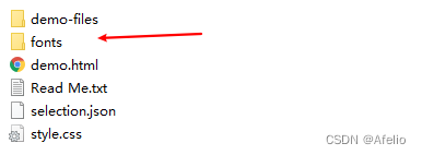
- Put the fonts folder in the download package into the root directory of the page
- Globally declare fonts in CSS styles: Simply understand how to introduce these font files into our page through CSS.
Be sure to pay attention to the font file path.
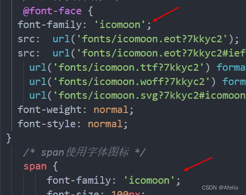
@font-face {
 font-family: 'icomoon';
 src: url('fonts/icomoon.eot?7kkyc2');
 src: url('fonts/icomoon.eot?7kkyc2#iefix') format('embedded-opentype'),
 url('fonts/icomoon.ttf?7kkyc2') format('truetype'),
 url('fonts/icomoon.woff?7kkyc2') format('woff'),
 url('fonts/icomoon.svg?7kkyc2#icomoon') format('svg');
 font-weight: normal;
 font-style: normal;
}
- Add small icons within html tags.
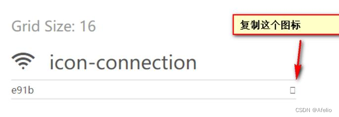
- Define the font for the label.
span {
 font-family: "icomoon";
}
Note: Be sure to ensure that this font is consistent with the font in @font-face above
13.2.4.1 Font file format
The font formats supported by different browsers are different. The reason why font icons are compatible is that they contain font files supported by mainstream browsers.
- TrueType (.ttf) format .ttf font is the most common font for Windows and Mac. Browsers that support this font include IE9+, Firefox3.5+,
Chrome4+, Safari3+, Opera10+, iOS Mobile, Safari4.2+; - Web Open Font Format (.woff) format woff font, browsers that support this font include IE9+, Firefox3.5+, Chrome6+,
Safari3.6+, Opera11.1+; - Embedded Open Type (.eot) format.eot font is a special font for IE. The browsers that support this font are IE4+;
- SVG (.svg) format. svg font is a format based on SVG font rendering. Browsers that support this font include Chrome4+, Safari3.1+,
Opera10.0+, and iOS Mobile Safari3.2+;
13.3 CSS Triangle
Triangles are common in web pages and can be drawn directly using CSS. There is no need to make them into pictures or font icons.
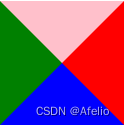
div {
 width: 0;
 height: 0;
 border-top: 10px solid pink;
 border-right: 10px solid red;
 border-bottom: 10px solid blue;
 border-left: 10px solid green;
}
13.4 CSS user interface styles
The so-called interface style is to change some user operation styles in order to improve a better user experience.
- Change the user's mouse style
- form outline
- Prevent form fields from being dragged
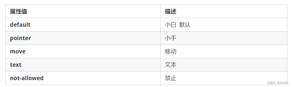
13.4.1 Mouse style cursor
li {cursor: pointer; }
Sets or retrieves the system-defined cursor shape adopted by the mouse pointer moving over the object.
13.4.2 Contour line
After adding outline: 0; or outline: none; style to the form, you can remove the default blue border.
input {outline: none; }
13.4.3 Prevent dragging text fields from being resized
In actual development, the lower right corner of our text field cannot be dragged.
textarea{ resize: none;}
13.5 vertical-align attribute application
Usage scenarios of CSS vertical-align attribute: Often used to set the vertical alignment of images or forms (inline block elements) and text.
Official explanation: Used to set the vertical alignment of an element, but it is only effective for inline elements or inline block elements.
vertical-align : baseline | top | middle | bottom


13.5.1 Alignment of pictures, forms and text
Images and forms are all inline block elements, and the default vertical-align is baseline alignment.
At this time, you can set the vertical-align attribute of inline block elements such as pictures and forms to middle to align the text and pictures vertically and center
.
13.5.2 Solve the problem of default blank gap at the bottom of the picture
Bug: There will be a white space gap at the bottom of the image because the inline block element will be aligned with the baseline of the text.
There are two main solutions:
- Add vertical-align:middle | top| bottom, etc. to the image. (It is recommended to use)
- Convert the image into a block-level element display: block;
13.6 Display of overflowing text ellipses
13.6.1 Single-line text overflow displays ellipses
Three conditions must be met
/*1. 先强制一行内显示文本*/
 white-space: nowrap; ( 默认 normal 自动换行)
 /*2. 超出的部分隐藏*/
 overflow: hidden;
 /*3. 文字用省略号替代超出的部分*/
 text-overflow: ellipsis;
13.6.2 Multi-line text overflow displays ellipses
Multi-line text overflows and displays ellipses, which has major compatibility issues and is suitable for webKit browsers or mobile terminals (most mobile terminals are webkit kernel
)
overflow: hidden;
text-overflow: ellipsis;
/* 弹性伸缩盒子模型显示 */
display: -webkit-box;
/* 限制在一个块元素显示的文本的行数 */
-webkit-line-clamp: 2;
/* 设置或检索伸缩盒对象的子元素的排列方式 */
-webkit-box-orient: vertical;