In fact, this article just wants to share a shortcut for visualization!
There are thousands of ways to create visualizations.
If an Excel master can master VBA with ease and familiarity, he can do all kinds of tricks. Even if he doesn't use chart plug-ins for foreign aid, he can kill many novice players in an instant.
Those who can program, Echarts dozens of lines of code, show off in minutes; R language is good at data mining, visualization is a breeze; Python data crawling expert, holding the matplotlib package to dominate the world.
With so many tools, which one is better to start with? This is something many people have trouble with.
In fact, there is no need to covet tools for data analysis. For most of us, the need is to collect some statistics from thousands of data, or to verify certain business problems by analyzing data.
The more value of analysis tools lies in assisting the processing of data during the analysis process, and being able to visually display conclusions and ultimately solve problems. It would be better if it can avoid writing formulas and codes in terms of function and make it easy to get started and use.
The author has always advocated using BI analysis for data analysts to save time and improve efficiency. For getting started, BI is also the easiest and easiest visual analysis tool to get started with.
Previously, I shared the "Data Analysis Tool Link ," which explained the main functions, features and basic usage of FineBI.
As promised, I will share a practical article.
So today I want to focus on the process of data analysis and teach you step by step how to create a visual report.
PS: In fact, visual reporting is really not difficult, as long as you have some analysis foundation and master 1~2 tools.

1. Operational ideas of data analysis
Data analysis usually starts in this way. For example, if there is a change in the business and the traffic drops by 20%, then we need to analyze the possible reasons and need multiple data to verify the hypothesis. Or get a piece of data and think about patterns that can be analyzed. In either case, a complete data analysis requires the process of data acquisition, data preprocessing, data analysis and modeling, visual analysis and report writing.
The functional modules of FineBI, a BI tool, are also designed based on the analysis process and are divided into data connection, data preparation, visual analysis, dashboard cockpit, sharing dashboard, etc.
2. Get to know this tool-FineBI workspace

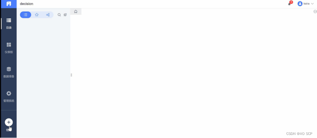
After installing the appropriate version on the official website and successfully activating it, after setting the initial account password, you will be redirected to this web page.
On the left is a navigation bar, similar to a menu bar. The directory is similar to the homepage, showing completed analysis reports. The official built-in demo is displayed here by default.
Data preparation is where data is connected, prepared, and reprocessed. It can manage business packages, data tables, associations, multipaths, data updates, self-service data sets, etc.
Dashboards create visual analytics. The management system is where the entire data decision-making system is managed, including directory settings, appearance settings, data, reports, sharing permissions and other management configurations.
Create is a place where users can quickly create new data connections, add database tables, add SQL data sets, add EXCEL data sets, add self-service data sets, and create new dashboards.
3. Connect/Import data
To make a data report, the first step is to import data. FineBI can import data from many data sources: such as Excel, CSV, XML, and various databases (SQL Server, Oracle, My SQL, etc.), two major open source platforms (Hadoop , Spark) and so on. The most common way is to connect to the database and import excel data. Since these two methods are the most commonly used, they are both demonstrated here.
1. Database connection example: connect to mysql
2. Import excel data
The same data is imported into excel.
Step 1: Data preparation—add business packages. Business packages are used to organize data tables in a unified manner. Create a Typhoon data package here. Click Add Table to create a new excel data set.
You will get the following data details. Here, the field type of the data can be automatically identified and the field type can also be modified. (Example: In some cases, time is recognized as text type and needs to be manually switched to time type, otherwise it will affect subsequent operations)
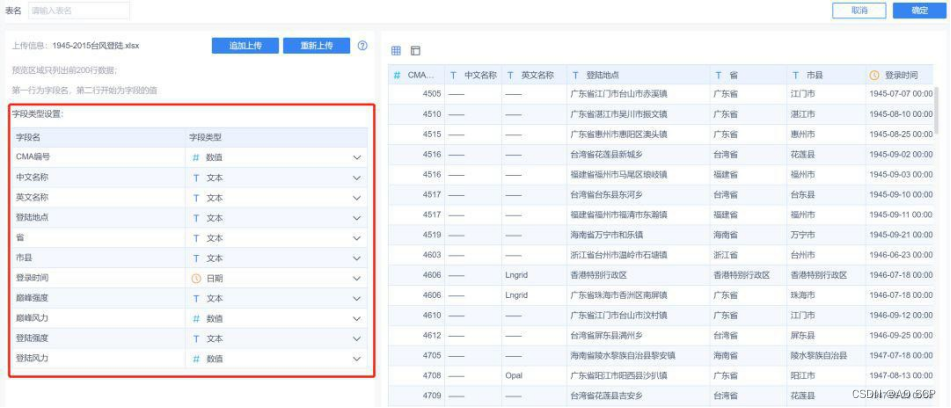
At this point, the data has been imported successfully.
4. Data plasticity—self-service data sets
Self-service data sets are actually the link of data processing. Generally, the data we get often has empty values and duplicates. The so-called dirty data needs to be cleaned. I can write 5,000 words about the data cleaning process, so I won’t go into more details here. A more common situation is that in analysis
Some new fields need to be created, which are not available in the source data. At this time, the original data can be reprocessed according to needs and
a new data set can be created for analysis. Reprocessing operations include: selecting fields, filtering, grouping and summarizing, adding columns, field settings, sorting, merging left and right, merging top and bottom, and mining.
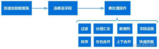
Because the analysis here is relatively simple and the original data is already standardized, there is no need to perform these operations on the source data table for the time being, and some filtering operations can be done later in the process of creating analysis charts.
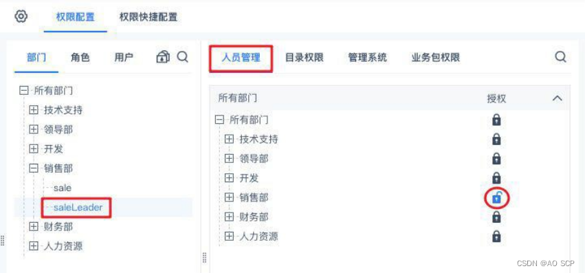
In fact, before the self-service data set, there is a function that was not mentioned. FineBI has an administrator's statement, which will be involved in enterprise deployment. Administrators can assign data with different permissions to different people. For example, financial staff can only see financial and sales data, or some financial staff can only see data in specific business packages, or some data tables. These are all issues. Considering data security and process management. After the administrator prepares the data, it can be assigned to different personnel accounts and data with partial permissions. If it is for personal use, such as the analysis to be introduced in this article, and the BI system is deployed locally, then you are the administrator and have the highest authority. The analysis in this article does not require the permission function for the time being, so only a brief introduction is given here.
5. Visual analysis
Now that the data is ready, formal analysis begins.
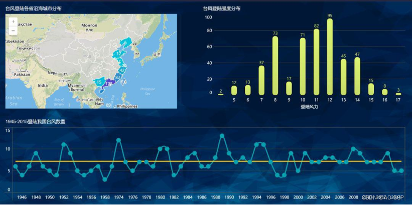
Let’s first observe this data. This data was downloaded from the Internet. It shows the information of typhoons that landed in my country from 1945 to 2015, including time, landing province and city, and typhoon intensity.
Then we can compile statistics on which provinces and cities have been visited most frequently by typhoons over the years, which time of year is the most frequent typhoon day, and the distribution of typhoon intensity.
1. Create a new dashboard, which is what we call visual reports and dashboards. There are many names.
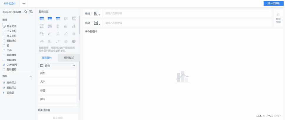
2. Create a new visualization component and add the data set just imported.
(Charts, query filter boxes, etc. are called components and are components of the finebi dashboard .)
Analysis 1: Number of typhoons that land in my country in each year
After adding the data set, you will enter the analysis interface. Drag and drop the fields to be analyzed (number of records - an indicator of the number of typhoons, landfall time - only the year dimension is displayed here)
It should be noted here that
There are multiple rows of records for a typhoon in the source data table. This is because a typhoon may land in two areas at the same time and record two pieces of information. Therefore, the number of records depends on the CMA number statistics (pull down the small triangle on the right side of the record number) to avoid duplication.
Secondly, another indicator is added here to count the average number of typhoons each year.
Finally, beautify the sub-chart a little, usually in the graphic properties and component styles:
① Modify line color: Graphic Properties—Color
② Modify the connection line to a smooth curve, and adjust the presence or absence of marker points
③ Modify the title of the component: Component Style - Title, you can adjust the font style.
Finally, you will get the following picture:
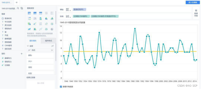
It can be clearly felt that the typhoons that land in my country show a 2-4 year fluctuation, and since 2000, the overall number of typhoons that hit my country has slightly decreased.
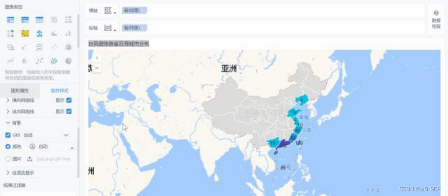
Analysis 2: Distribution of typhoons landing in coastal cities in various provinces—data map
Here is a demonstration of the production of a data map, using the map to visually display the distribution of typhoons landing in various coastal provinces and cities in my country.
Dimensions must be created as map roles to generate latitude and longitude.

After matching the data, the province (longitude) and province (latitude) fields are generated. Here you should pay attention to check whether some matches are correct. I encountered a bug that matched Liaoning Province to Ningxia. If there is any problem with the matching, you can adjust it at any time.
Then drag the fields to the horizontal axis and vertical axis respectively, and a filled map will be automatically generated. In addition, there are point maps, heat maps, etc. Here we use filled maps as an example.
As the name suggests, the filled map uses the color of the area to distinguish the size of the values. Here, drag the record number to the graphic properties-color to see the difference (the color can be selected in the drop-down box). Then drag the record number to the label to display the number of typhoons that have landed in that province or city.
In Component Style - Background, you can modify the GIS map style as follows:
Note: Regarding the styles of chart components, such as title names (font size and color), axis lines, color matching, chart layout, etc., you can select them in the graphic properties and component styles. There are many options, readers are invited to use their own aesthetic talents! Operations such as numerical calculation, filtering and sorting can be found in the drop-down boxes of the indicator dimensions on the horizontal and vertical axes.
6. Visual reporting
Other analyzes are similar and the space is limited. Only two examples are given above.
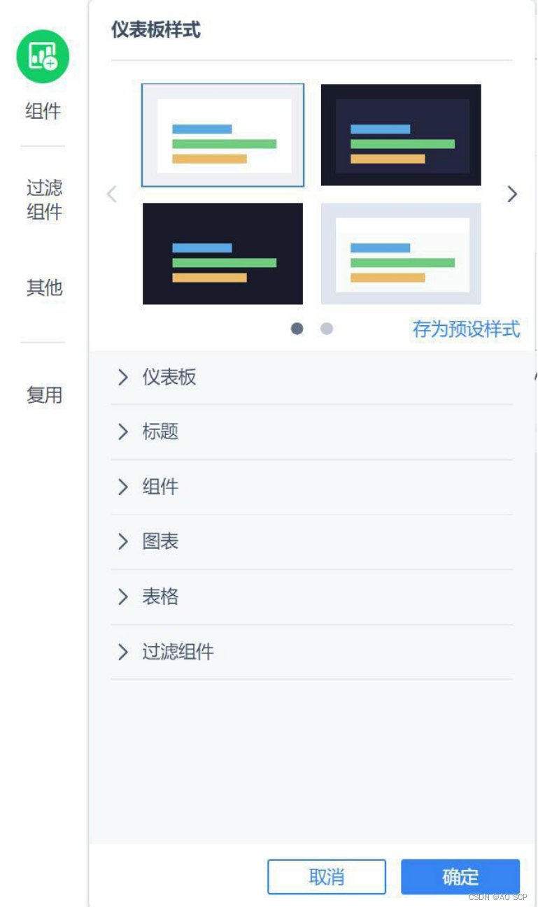
After the chart analysis component is completed, it is time to build the visual report (dashboard).
There are preset templates in the dashboard style that can be applied directly. The following is a template that the author randomly applied. It has a more template-like style. I later adjusted the style and color of each chart. Whether it looks good or not depends entirely on personal aesthetics.
summary
In general, the most important thing when using FineBI to produce visual reports lies in data processing. Once the data is processed, the report can be drawn with ease. Since the data has been processed in excel before, the data obtained can basically be analyzed directly.
After you have fully mastered data processing skills, you can focus more on various visual graphics. FineBI has many built-in colors and styles. Next, you can use your imagination to create a variety of cool visual reports, and try to understand the drawing methods and style adjustments of all built-in graphics in visual production.