Preface
In Compose, if we want to implement a text input box, we usually use TextField or OutlinedTextField in the Material package.
However, because these two components belong to the Material package, they naturally need to comply with the Material design specifications, which will result in a loss of a lot of flexibility when using them.
If we want to implement some cool effects that do not comply with the Material specification, or other design styles, then continuing to use TextField or OutlinedTextField will become very painful or even impossible.
Fortunately, Compose provides a component called BasicTextField, which is lower level than the above two (the above two are located in the androidx.compose.material package, while it is located in the androidx.compose.foundation.text package). Compared with They have great flexibility. In fact, the above two components are encapsulation of BasicTextField.
Next, we will take the imitation of a WeChat search box as an example to explain how to use BasicTextField.
start
Analyze layout
Before we begin, let’s first analyze what WeChat’s search box looks like.
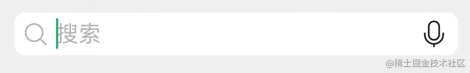
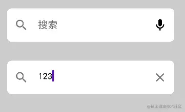
This is when there is no input:
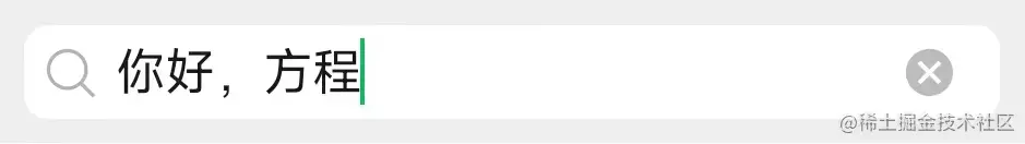
This is after typing the content:
It can be seen that before there is any input, the input box has a leading icon to display search, a light-colored placeholder character in the middle input box, and finally a trailing icon to display voice input.
After entering the content, the placeholder characters are cleared and the trailing icon changes to a clear icon.
After such analysis, it seems that it is not difficult. It can be achieved directly using OutlinedTextField.
Yeah? Then let’s try to imitate it directly using OutlinedTextField.
Use OutlinedTextField directly
According to the above analysis, it is nothing more than an OutlinedTextField plus a leading icon, a trailing icon, and placeholder characters, so we can easily write code like this:
var inputText by remember { mutableStateOf("") }
OutlinedTextField(
value = inputText,
onValueChange = {
inputText = it
},
leadingIcon = {
Icon(imageVector = Icons.Outlined.Search, contentDescription = null)
},
trailingIcon = {
if (inputText.isNotEmpty()) Icon(imageVector = Icons.Outlined.Close, contentDescription = null)
else Icon(imageVector = Icons.Outlined.Mic, contentDescription = null)
},
placeholder = {
Text(text = "搜索")
},
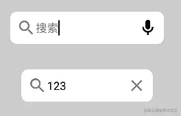
)The post icon uses inputText.isNotEmpty() to determine whether the input content is empty. If it is empty, the microphone icon will be displayed. If it is not empty, the clear icon will be displayed. The running effect is as follows:
At first glance there seemed to be nothing wrong, but upon closer inspection I found something was wrong.
By the way, the background color of the input box is wrong, and WeChat’s input box has rounded corners, so change it.
The first is to add rounded corners and add parameters:
shape = RoundedCornerShape(8.dp)
Then change the background color. Here we modify the background color by re-specifying a colors color configuration file and modifying the backgroundColor field:
colors = TextFieldDefaults.outlinedTextFieldColors(
   backgroundColor = Color.White
)
Modification completed, run again:
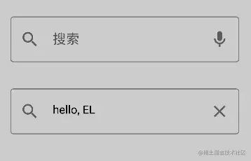
Does it seem right now? wrong! Something is still wrong. First of all, WeChat's input box has no border; secondly, even if the input box gets the focus border in WeChat, it will not change color; and WeChat's rear voice icon is black, not gray.
Then let's change it again.
The first is the color of the voice input icon. This is not difficult. Just use the tint parameter to recolor it:
Icon(imageVector = Icons.Outlined.Mic, contentDescription = null, tint = Color.Black)
The next step is to remove the border, which is difficult to do.
I looked through the documents and found that there was no place to set the border size. I looked at the source code again and sure enough, the border size was written directly:
After calling OutlinedTextField, the TextFieldImpl function will be called, and the border width will be obtained through TextFieldTransitionScope.Transition.
The definition of border width in TextFieldTransitionScope.Transition is as follows:
val indicatorWidth by transition.animateDp(
    label = "IndicatorWidth",
    transitionSpec = { tween(durationMillis = AnimationDuration) }
) {
    when (it) {
        InputPhase.Focused -> IndicatorFocusedWidth
        InputPhase.UnfocusedEmpty -> IndicatorUnfocusedWidth
        InputPhase.UnfocusedNotEmpty -> IndicatorUnfocusedWidth
    }
}
You can see that this is an animation defined here, but it doesn't matter. We only need to care about the final width value after the animation is completed. Check the above two constant values:
privateval IndicatorUnfocusedWidth =1.dp
privateval IndicatorFocusedWidth =2.dp
You can see that the width is 2 dp when it has focus and 1 dp when it has no focus.
However, since we can't define the border width ourselves, can we change the color? Change the border color to the same as the background color, which is equivalent to no border.
Changing the border color still involves modifying the colors configuration information. Here you need to change the focus and defocus colors to white:
colors = TextFieldDefaults.outlinedTextFieldColors(
            backgroundColor = Color.White,
            focusedBorderColor = Color.White,
            unfocusedBorderColor = Color.White
        )
Final complete code:
var inputText by remember { mutableStateOf("") }
OutlinedTextField(
value = inputText,
onValueChange = {
inputText = it
},
leadingIcon = {
Icon(imageVector = Icons.Outlined.Search, contentDescription = null)
},
trailingIcon = {
if (inputText.isNotEmpty()) Icon(imageVector = Icons.Outlined.Close, contentDescription = null)
else Icon(imageVector = Icons.Outlined.Mic, contentDescription = null, tint = Color.Black)
},
placeholder = {
Text(text = "搜索")
},
shape = RoundedCornerShape(8.dp),
colors = TextFieldDefaults.outlinedTextFieldColors(
backgroundColor = Color.White,
focusedBorderColor = Color.White,
unfocusedBorderColor = Color.White
)
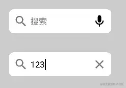
)Now let’s take a look at the effect:
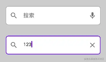
It seems almost done? Haha, take a closer look.
Found the problem?
That's right, although it looks similar in general, the margins of text and icons relative to the input box are obviously wrong.
I looked through the documents and source code again, but I didn't find the place to set margins. Forget it, it's too troublesome. Let's use BasicTextField to customize one.
Customize using BasicTextField
The parameters of BasicTextField are quite similar to those of OutlinedTextField:
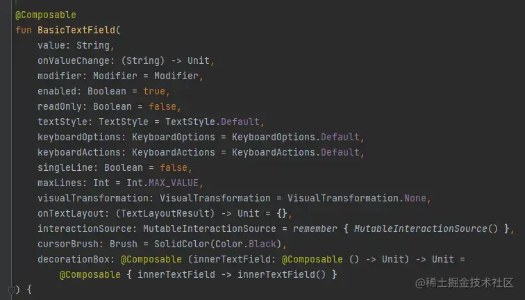
But it has one more key parameter decorationBox. Thanks to this parameter, we can do whatever we want.
According to the documentation:
decorationBox - Composable lambda that allows to add decorations around text field, such as icon, placeholder, helper messages or similar, and automatically increase the hit target area of the text field. To allow you to control the placement of the inner text field relative to your decorations, the text field implementation will pass in a framework-controlled composable parameter “innerTextField” to the decorationBox lambda you provide. You must call innerTextField exactly once.
To put it simply, this parameter is an anonymous function with scope Composable and parameter innerTextField.
And innerTextField is also a Composable anonymous function, and it is the implementation function of the input box.
In other words, we can customize the text box we need by customizing the calling position of innerTextField in decorationBox.
It should be noted that, as mentioned above, innerTextField is the implementation of the input box, so we must and can only call this function once, otherwise there will be no input box in our component.
To still implement the above WeChat search box, we can write like this:
var inputText by remember { mutableStateOf("") }

BasicTextField(
    value = inputText,
    onValueChange = {
        inputText = it
    },
    decorationBox = { innerTextField ->
        Box {
            Surface(
                // border = BorderStroke(1.dp, Color.Gray),
                shape = RoundedCornerShape(8.dp)
            ) {
                Row(
                    modifier = Modifier.padding(8.dp),
                    verticalAlignment = Alignment.CenterVertically
                ) {
                    Icon(imageVector = Icons.Outlined.Search, contentDescription = null, tint = Color(0x88000000))

                    Box(modifier = Modifier.padding(start = 4.dp, end = 4.dp)) {
                        if (inputText.isEmpty()) Text(text = "搜索", color = Color(0x88000000))
                        innerTextField()
                    }

                    if (inputText.isNotEmpty()) Icon(imageVector = Icons.Outlined.Close, contentDescription = null, tint = Color(0x88000000))
                    else Icon(imageVector = Icons.Outlined.Mic, contentDescription = null, tint = Color(0xFF000000))
                }
            }
        }
    }
)
There is nothing much to say elsewhere, let’s focus on analyzing the contents of decorationBox.
First, our root component selected Surface, which is one of the components in Material. It is officially called "plane". Simply put, it means that the content it contains can be configured in a unified style (such as borders, shadows, rounded corners) etc.) into the same "plane".
Because we need to add rounded corners to the input box, we select it as the root component and set the rounded corners of 8dp shape = RoundedCornerShape(8.dp).
因为输入框的三个主要组件:前置图标、输入框(占位字符)、后置图标是水平排列的,所以接下来用了一个 Row ,并设置垂直对齐方式为居中 verticalAlignment = Alignment.CenterVertically 。
然后根据需求设置前置图标,后置图标,以及配置颜色和边距等这里就不过多赘述了,重点需要注意占位文本和输入框(innerTextField())的摆放。
因为占位文本和输入框实际上应该是属于同一个位置的,虽然在输入框有内容后就不会显示占位文本了,但是我们依旧需要把他们放到 Box 中,即堆叠到同一个位置,否则将会变成这样:
没看出区别?仔细看光标,输入框已经被挤到占位文本之后了。
加上 Box 后效果如下:
这样看起来是不是对味多了?
总结
我们通过模仿微信搜索框的方式讲解了如何使用 BasicTextField 自定义文本输入框效果。
当然,这里只是抛砖引玉,只是简单的介绍了使用方法,并没有做什么酷炫的组件,但是知道了如何使用 BasicTextField 想要实现什么酷炫的输入框效果那还不是手到擒来?