Variable description:
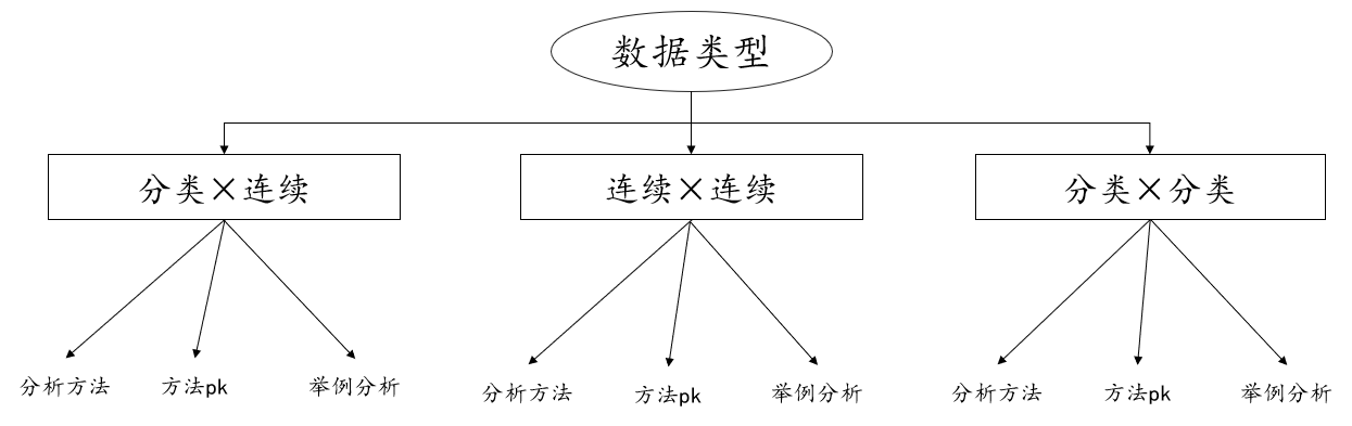
Before determining the analysis method, we need to understand the type of data in hand. This is the most basic and necessary. Among all data types, we divide the data type into categorical variables, also known as categorical variables, and continuous variables, also known as quantitative variables. Variables, so what are classified variables? What are quantitative variables?
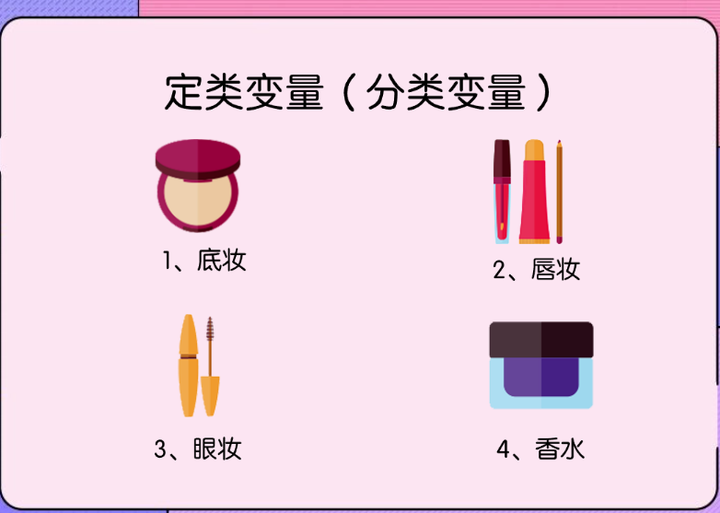
Generally speaking, the size of categorical variables does not have comparative significance. For example, in gender, 1 represents male and 2 represents female, which only represent categories. For example, in the picture below, 1 represents base makeup and 2 represents lip makeup, etc., which are only category relationships.
Quantitative variables generally speaking, the size of the number has comparative significance. For example, when surveying the height of teenagers, 1.4m is taller than 1.3m. The number itself has comparative significance. For example, in the price of the sofa in the picture below, the larger the number, the more expensive it is, and the smaller the number, the cheaper it is. , numbers can be compared. Through the explanation of data types, in this discussion we classify and explain the different data types, which are categorical and continuous variables, continuous and continuous variables, and categorical and categorical variables.

1. Classification × Continuous

If the type of data is categorical variables and continuous variables, what methods are there for correlation analysis or difference analysis? Next is the explanation.
1. Analysis method
If the data are categorical variables and continuous variables, then when analyzing, the analysis methods can be roughly divided into three categories: parametric tests, non-parametric tests and visual graphics. Parametric tests include t-tests and analysis of variance, and non-parametric tests include MannWhitney statistics. Quantity, Kruskal-Wallis statistics. And it can also be viewed using visual graphics.
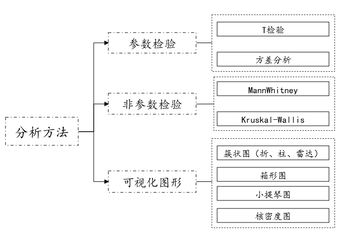
01. Parameter test
- T test
T test description
T test (independent sample t test) generally studies the difference between categorical variables and categorical variables Gender, and classify the categorical variable as a binary variable. For example, study whether there is a significant difference between gender and salary. Gender includes men and women.
T test data format
Before conducting data analysis, the data need to be organized into the correct data format and then analyzed, then the t test (strictly speaking, independent What is the data format of sample t-test)? Instructions:

T-test data generally has two columns. The first column is the group (two categories), and the second column is the corresponding analysis item. For example, if you want to study whether there is a significant difference in height between different genders, the correct data format as follows:

T test operation
After organizing the data into the correct format, the next step is to prepare for analysis using T test. What is the analysis operation? Take SPSSAU as an example to illustrate:
[General method: t test] → [Drag and drop analysis items] → Click to start analysis;

General form of T test results

Generally, the mean standard deviation, t statistic, and p value will be provided in the results.
- Analysis of variance
Explanation of analysis of variance
Analysis of variance (one-way analysis of variance) generally studies the differences between categorical variables and categorical variables sex, and the categorical variables are multi-categorical variables. For example, to study whether there is a significant difference between academic qualifications and salary. Educational qualifications include below a bachelor's degree, a bachelor's degree, and above.
ANOVA data format
The data format of analysis of variance (strictly speaking, one-way analysis of variance) is as follows:

The data of variance analysis generally has two columns. The first column is the group (multiple categories), and the second column is the corresponding analysis item. For example, in the above table, 1=undergraduate degree, 2=undergraduate degree, 3= Bachelor degree or above.
Variance analysis operation
[General method: variance analysis] → [Drag and drop analysis items] → Click to start analysis;

The general form of variance analysis results

Generally, the mean standard deviation, F statistic, and p value will be provided in the results.
02. Non-parametric test
- MannWhitney statistic
MannWhitney description
The MannWhitney non-parametric test generally studies the difference between categorical variables and categorical variables, and determines Class variables are binary variables, such as studying whether there is a significant difference between gender and salary. Gender includes men and women. Its data format is similar to the independent sample t-test, with one column for the group and one column for the corresponding quantitative variable.
MannWhitney operation
[General method: non-parametric test] → [Drag and drop analysis items] → Click to start analysis;

MannWhitney result general form
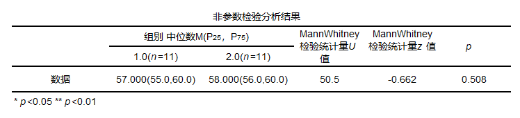
Generally, the median as well as statistics and p-values are provided in the results.
- Kruskal-Wallis statistic
Kruskal-Wallis description
The Kruskal-Wallis non-parametric test generally studies the relationship between categorical variables and categorical variables The difference, and the categorical variables are multi-categorical variables, for example, to study whether there is a significant difference between academic qualifications and salary. Educational qualifications include below bachelor's degree, bachelor's degree and above. Its data format is similar to one-way variance. The operation is consistent with MannWhitney (SPSSAU will automatically determine the number of categories of categorical variables and then determine whether to use MannWhitney or Kruskal-Wallis), its general form is as follows:
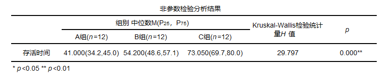
Generally, the median, statistics and p-value will be provided in the results.
03. Visual graphics
- Visual graphics
In addition to using hypothesis testing for analysis, you can also use graphics for simple judgment analysis. Since the data is classified and quantitative, you can use line charts, bar charts, column charts, radar charts, box plots, violin charts, Kernel density plot, etc. Among them, line charts, bar charts, column charts, and radar charts can be collectively referred to as cluster charts. The data formats of cluster charts, box charts, violin charts, and kernel density charts are classified as one column, and quantified as one column. They can be found in SPSSAU Visualization section for selected analysis. An example looks like this:


2. Method PK
Categorical variables and continuous variables can be subjected to parametric tests, non-parametric tests and visual graphics. So how to choose these methods? Next is the explanation:
01. Parametric test PK non-parametric test

Classification is based on hypothesis testing categories, which are divided into parametric tests and non-parametric tests. If the data is a binary variable, for example, the categorical variable is gender including male and female, or the two groups are divided into the first group and the second group. Generally consider using t test (parametric test) or mannwhitney (non-parametric test) if the categorical variable is a multi-categorical variable, for example, the categorical variable is a major including science, agriculture, medicine or the categorical variable is an academic level including junior college, bachelor's degree, master's degree, and doctorate. Generally, analysis of variance (parametric test) or Kruskal-Wallis (non-parametric test) is considered. So what is the difference between parametric and non-parametric tests?
The difference between parametric test and non-parametric test:Parametric test assumes that the data obeys a certain distribution (usually normal distribution) and uses the estimator of the sample parameters (x±s) Test the overall parameters, such as t test, u test, variance analysis, etc. Non-parametric tests do not need to assume the overall distribution form and directly test the distribution of data. However, the efficiency of parametric testing is higher than that of non-parametric testing, and it has a certain tolerance for t-test and analysis of variance in empirical research. If the normal distribution is not seriously not satisfied, t-test or analysis of variance can be used for analysis. .
02. Visual graphics PK
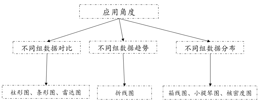
Visual graphics between categorical data and continuous data can be divided into three categories from an application perspective. The first category is mainly used for comparison of different data. You can consider using column charts, bar charts, radar charts, such as different genders. Comparison of salary levels. The second type is mainly used to view the changing trends of different groups of data. Generally, you can consider using line charts, such as the changes in scores in different majors. The third category is mainly used for the distribution of different groups of data. You can consider using box plots, violin plots or kernel density plots, such as the height distribution in the south and north. Generally, during analysis, it is recommended to combine inspection and visual graphics for analysis and then draw corresponding conclusions.
3. Example analysis
For example, you want to analyze the following data:
Group 1: 44, 55, 67, 45, 46, 56, 69, 34, 59, 78, 99;
Group 2: 49, 59, 62, 56, 68, 45, 77, 89, 99, 102, 45;
Analyze correlations (differences) between different groups.
Analysis: Since we are analyzing the correlation (difference) between different groups, and since the group is a binary variable, we consider using t-test or non-parametric test. Since the data basically obeys the normal distribution, we use t-test and visualization. Graphs are combined for analysis.
The results of the histogram (normality test) are as follows:
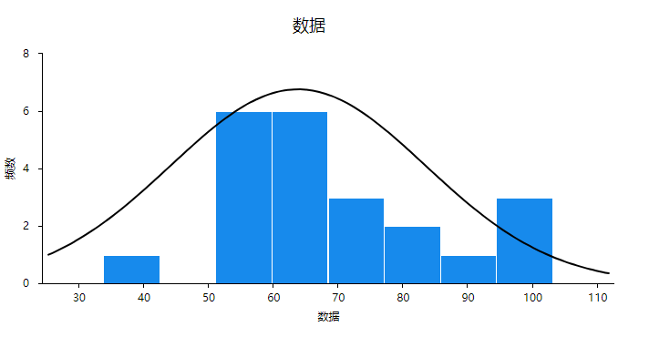
From the results, we can see that the histogram appears similar to an "inverted bell shape", so we believe that the data basically obeys a normal distribution.
01. Analysis process

The analysis process of T test can be roughly divided into four steps:
- Organize into the correct data format;
- Verify the prerequisites of t test; (prerequisite: normal distribution,)
- perform operations;
- Analysis of T-test results;
Step1:
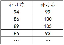
The format of organizing data is that the group is one column and the data is one column, so the result of sorting is as follows:

Step2:
Prerequisites for T test:
- Sample independent
- normal distribution
- homogeneity of variances
Step3: t test operation

After uploading the data, click on the t-test of the general method, then drag the analysis item to the corresponding analysis box, and click to start analysis.
Step4: Analysis of T-test results;
02. Interpret the analysis results
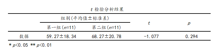
It can be seen from the t test analysis results that the mean of the first group is 59.27 and the mean of the second group is 68.27. It can be seen from the mean that the average level of the second group of data is greater than the first group of data, and then the t statistic is - 1.077, the p value of 0.294 is greater than the significance level, indicating that the model is not significant, that is, there is no difference between the first set of data and the second set of data. At the same time, we can also use column charts or bar charts for visual analysis:
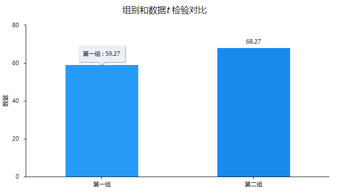
It can be seen from the visual graphics that the mean value of the second group of data is greater than the first group of data, but only the points can be seen in the column chart. A simple comparison of the two groups of data is still needed for model analysis or significance judgment. Conduct hypothesis testing.
03. Interpretation of indicators
How to calculate the t value in the t test?
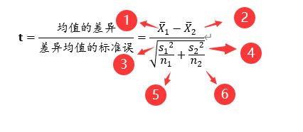
- The mean of sample 1 is 59.27 in this example;
- The mean of sample 2 is 68.27 in this example;
- The variance of sample 1, in this example is (18.34)^2=336.3556;
- The variance of sample 2, in this example is (20.78)^2=431.8084;
- The sample size of sample 1, in this example is 11;
- The sample size of sample 2, which is 11 in this example,
The calculated t value is: -1.077; calculations of other indicators can be viewed on the SPSSAU official website.
2. Continuous × Continuous
If the type of data is continuous variables and continuous variables, what methods are there for correlation analysis or difference analysis? Next is the explanation.
1. Analysis method
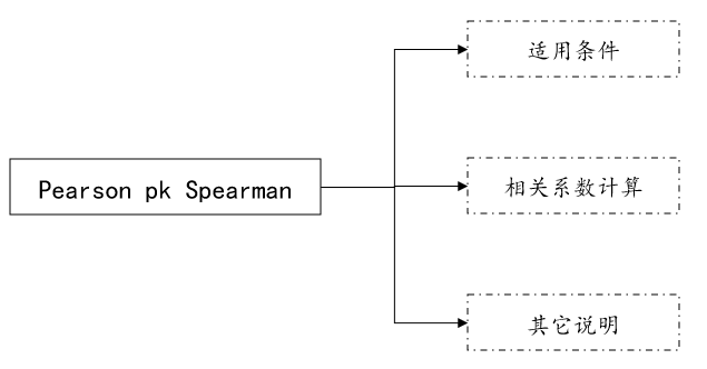
If the data is continuous data and continuous variables, then when analyzing, the analysis methods can be roughly divided into four categories: correlation analysis, parametric testing, non-parametric testing and visual graphics. Correlation analysis generally includes Pearson correlation coefficient and S Spearman correlation coefficient. If the sample sizes of continuous variables and continuous variables are the same, you can consider using the paired t test in parametric tests, non-parametric tests include paired wilcoxon, and scatter plots can be considered for visualization graphics.
01. Related analysis
Related analysis instructions
Correlation analysis generally studies the correlation between quantitative data and quantitative data, as well as the correlation between variables and the degree of correlation, such as studying whether there is a correlation between height and weight, etc.
Related analysis data format
Before conducting data analysis, the data needs to be organized into the correct data format and then analyzed. So what is the data format for related analysis? As follows:
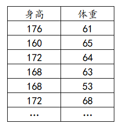
The data format of related analysis is that one analysis item is one column. For example, in the figure above, if height and weight are studied, then height is one column and weight is one column.
Related analysis operations
After sorting the data into the correct format, the next step is to prepare for relevant analysis. What is the analysis operation? Take SPSSAU as an example to illustrate:
[General method: Related analysis] → [Drag and drop analysis items] → Click to start analysis;

General form of correlation analysis results
The analysis results generally include correlation coefficients, p-values and sample sizes. Generally, just check the p-value during analysis.
Correlation coefficient judgment standard

Different literatures have different judgment standards for correlation coefficients. If you are doing analysis, it is recommended to refer to the referenced literature. For example, the above literature comes from Jia Junping, He Xiaoqun, Jin Yongjin. Statistics. 7th Edition [M] . China Renmin University Press, 2018.
02. Parameter test
Paired t test instructions
Paired t-test is generally used to study the difference between paired quantitative data and quantitative data, such as studying whether there is a difference in Chinese language scores before and after tutoring in a certain class.
Data format for paired t test
The data format of the paired t test is relatively special, because not only does it need to be a quantitative variable, but the data also needs to be paired data, that is, the sample size of the two sets of data needs to be the same, generally as follows:
Paired t test operation
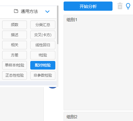
[General method: Paired t test] → [Drag and drop analysis items] → Click to start analysis;
General form of paired t-test
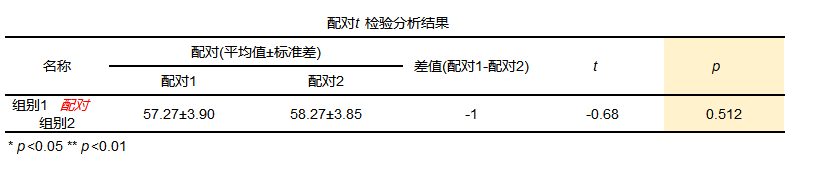
Analysis results generally include paired means and standard deviations, statistical t-values, and p-values.
03. Non-parametric test
- Paired wilcoxon
Paired wilcoxon description
Paired wilcoxon generally studies the difference between paired quantitative data and quantitative data, such as studying a certain class Is there any difference in Chinese language scores before and after tutoring?
The data format of paired wilcoxon
The data format is consistent with the paired t test.
Paired wilcoxon operation
[Experimental/medical research: Paired sample wilcoxon] → [Drag and drop analysis items] → Click to start analysis;

General form of paired wilcoxon

The analysis results generally include the paired median, statistic z-value and p-value.
04. Visual graphics
- Scatter plot
Scatter plot description
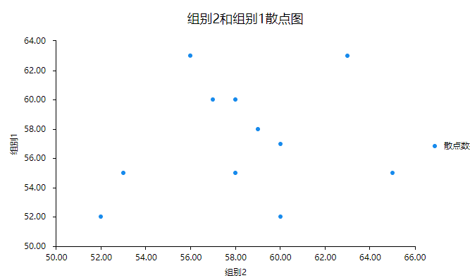
Scatter plots are generally used to draw quantitative data and study the relationship between quantitative data. For example, if you want to observe the relationship between height and weight, you can use scatter plots for research.
Data format for scatter plots
The data format for scatter plots is consistent with related analyses.
Scatter plot operations
[Visualization: Scatter Plot] → [Drag and drop analysis items] → Click to start analysis;

The general form of a scatter plot
2. Method PK
Continuous variables and continuous variables can be used for correlation analysis, parametric testing, non-parametric testing and visual graphics. So how to choose these methods? Next is the explanation:
01. Correlation coefficient PK
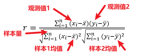
The Pearson correlation coefficient is also called the Pearson product-moment correlation coefficient, usually represented by r. To use the Pearson correlation coefficient, the data needs to meet:
- Linear
- normal distribution
- no outliers
If the conditions are not met, you can consider using the spearman correlation coefficient, and the calculation of the pearson correlation coefficient is as follows:
The Speaman calculation formula is as follows:

If the Pearson correlation coefficient cannot identify non-linear relationships and is sensitive to one or several outliers, the Spearman correlation coefficient can be used instead. The Spearman correlation coefficient is sometimes also called the level correlation coefficient or the rank correlation coefficient. This correlation coefficient Correlation analysis is performed based on the ranks of two variables. Spearman correlation can be used to measure whether there is a monotonic correlation between two variables. When the value is 1, it means that one variable increases monotonically with another variable. When the value is -1, it means that one variable decreases monotonically with another variable.
02. Parametric test PK non-parametric test

is classified according to the hypothesis test category, which is divided into parametric tests and non-parametric tests. If it obeys the normal distribution, you can use the paired t test. If it does not meet the normal distribution, you can use the paired wilcoxon test. For parametric tests and non-parametric tests The difference in inspection can be viewed in the previous module. For scatter plots, they are generally used together with correlation analysis to explore the relationship between data before correlation analysis.
3. Example analysis
To understand whether there is a relationship between the years of education of mothers of high school students and the scientific literacy of students, the data on the years of education of mothers of 19 students and the scientific literacy of students are measured as follows.

Analysis: Since we are analyzing the correlation (difference) between different groups, and since the group is a binary variable, we consider using t-test or non-parametric test. Since the data basically obeys the normal distribution, we use t-test and visualization. Graphs are combined for analysis.
The results of the normality test are as follows:

As can be seen from the results, the model is not significant, and accepting the null hypothesis indicates that the data obeys a normal distribution.
01. Analysis process

The relevant analysis process of this case can be roughly divided into five steps:
- Organize into the correct data format;
- View scatter plot;
- Verify the prerequisites for relevant analysis; (prerequisite: normal distribution,)
- perform operations;
- Relevant result analysis;
Step1:
Organize the data format, one analysis item is one column, so the organized results are as follows:
Step2:
Prerequisites for pearson correlation analysis:
- The two variables are continuous variables
- There is a linear relationship between the two variables
- The two variables present a normal distribution
Step3:Draw a scatter plot
Simply check the relationship between the data.
Step4:Related analysis operations

After uploading the data, click on the relevant analysis of the general method, then drag the analysis item to the corresponding analysis box, and click to start analysis.
Step5: Related result analysis;
02. Interpret the analysis results
1) Scatter plot

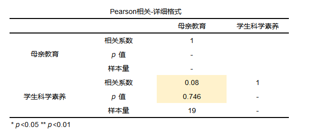
It can be seen from the scatter plot that the scatter points are messy. From the plot, it seems that there is probably no relationship between students' scientific literacy and the mother's years of education. You can further check the related analysis.

It can be seen from the results of the correlation analysis that the correlation coefficient is 0.08, indicating that the relationship between the two is extremely weak, and that the p value is greater than 0.1, indicating that the overall model is not significant, rejecting the null hypothesis, and there is no correlation between the two.
03. Interpretation of indicators
How to calculate the Pearson correlation coefficient specifically?
The calculation process is as follows:

3. Classification × Classification
1. Analysis method
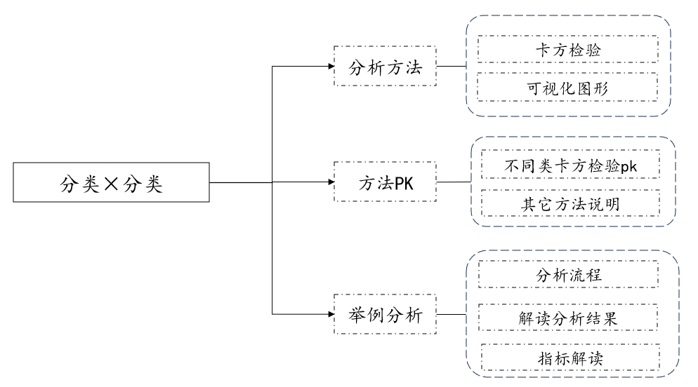
If the data are categorical variables and categorical variables, then when analyzing, the analysis methods can be roughly divided into three categories: chi-square test and visual graphics. The chi-square test includes pearson chi-square, fisher chi-square, yates corrected chi-square, and cochran -armitage test, linear trend chi-square, and can also be viewed using visual graphics (stacked column chart, bar chart).

01. Chi-square test
- Chi-square test
Chi-square test instructions
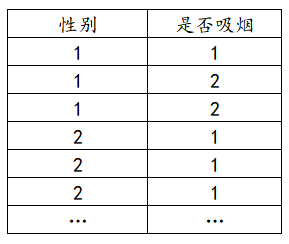
The chi-square test generally studies the difference between categorical data and categorical data, such as studying the significant difference between gender and whether or not you smoke.
Chi-square test data format
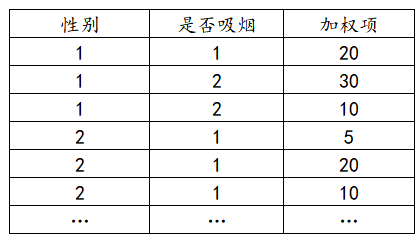
The data format of the chi-square test is that one analysis item is one column. If there is a weighted format, the weighted format is a separate column, as explained below:
(1) Ordinary format
(2) Weighted format
Chi-square test operation
After sorting the data into the correct format, the next step is to perform the chi-square test. What is the analysis operation? Take SPSSAU as an example to illustrate:
[Experimental/Medical Research: Chi-square test] → [Drag and drop analysis items] → Click to start analysis;

General form of chi-square test results
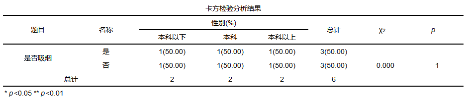
Generally, the mean standard deviation, chi-square value and p-value will be provided in the results.
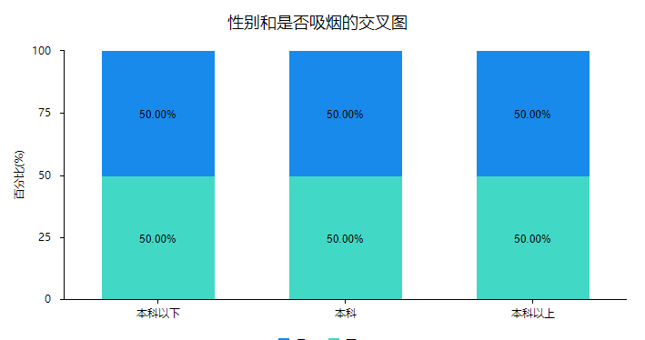
02. Visual graphics
In order to express the proportion of each category more clearly, a column chart or a bar chart can be used.
2. Method PK
(1) Different types of chi-square tests pk
(2) Other method descriptions
In addition to using the chi-square test, you can also use visual graphics to describe the relationship between categorical variables and categorical variables. For example, you can use stacked column charts and stacked bar charts to describe, which is more intuitive and can be combined with your own analysis during analysis. methods for mapping studies.
03. Example analysis
(1) Analysis process
If you want to investigate the eating habits (rice food, pasta) of different genders (male and female), you should use the Pearson chi-square test for the classification of the chi-square test.

(2) Interpret the analysis results
From the analysis results, it can be seen that men prefer to eat pasta, accounting for 60%, and women prefer rice, accounting for about 80% of the survey. From the data, there are differences in the eating habits of different genders. The chi-square value in the model is 16.667, with the p value less than 0.05. The null hypothesis is rejected, indicating that the model is significant and there are differences in the eating habits of different genders. And from the stacked column chart, we can also intuitively see that men like to eat pasta more, and women like to eat rice more.

(3) Interpretation of indicators

Where Ai is the observed frequency at level i, Ei is the expected frequency at level i, and k is the number of cells.
for example:
The calculation is as follows:

references:
[1] Zhu Yuxiang, Jiang Jianmin, Zhao Liang, et al. Review of the application of correlation analysis of different calculation forms in meteorology [J]. Journal of Tropical Meteorology, 2021, 37(1):1-13.