Preface Function Introduction
I recently encountered a function that allows the table columns to be configured.
Users can change which header columns are displayed and which are hidden according to the data they want to see.
So I made two versions. The first version is freely matched.
Just number all the columns in advance, and then you can drag them to the desired position and order.
You can also add a second-level header, customize a name, and drag all the headers into it to form a multi-level header table. But this kind of thing is complicated after all.
The second version is simpler. It has fixed columns. For example, ten columns are written, and then the user can only choose to display or hide which ones among these ten columns.
The position cannot be moved, nor can the text. Just show hidden columns
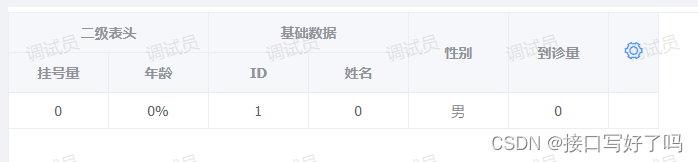
renderings
What the table looks like outside, click the small gear on the right to start setting up
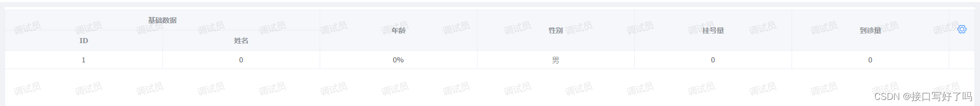
This is what it looks like after opening. You can check the required columns on the left and they will be added to the right. Then you can drag it on the right to the desired order. You can also add a blue header with a custom name, and then drag the black one into it to form a multi-level header table.
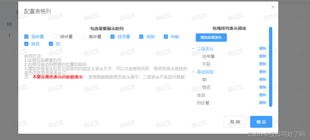
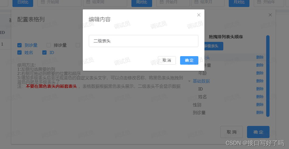
You can modify the blue header name
Video demonstration of free matching version
el-table custom column display and hide free collocation version
code
html part
<el-table :data="tableDatas" border style="width: 100%" v-loading="loadings" :height="height"
                    ref="configurationTable">
                    <el-table-column v-for="(arrd,index) in headers" :key="Math.random()" :label="arrd.title"
                        align="center" width='100' show-overflow-tooltip>
                        <!-- 有子级 -->
                        <el-table-column v-for="(arrd2,index2) in arrd.children" align="center" :label="arrd2.title"
                            show-overflow-tooltip width='100' :key="Math.random()">
                            <template slot-scope="{row, $index}">
                                <span>{

    {

    row[arrd2.key]}}</span>
                            </template>
                        </el-table-column>
                        <!-- 无子级 -->
                        <template slot-scope="{row, $index}">
                            <span>{

    {

    row[arrd.key]}}</span>
                        </template>
                    </el-table-column>
                    <el-table-column align="center" width="50">
                        <template slot="header" slot-scope="scope">
                            <i class="el-icon-setting" style="font-size:20px;cursor: pointer;color: #409EFF;"
                                @click="createInfo"></i>
                        </template>
                    </el-table-column>
                </el-table>
                <!-- 组件:自定义表头(getherders是接受返回的表头,deflist是默认表头) -->
                <dynamiccolumn ref="dynamic_column" @getherders="getherders" :deflist="defList"></dynamiccolumn>
data
defList:[{


                            type: 'zdy',
                            title: '基础数据',
                            id:Math.random(),
                            children: [{


                                title: 'ID',
                                key: 'id'
                            }, {


                                title: '姓名',
                                key: 'name'
                            }]
                        },
                        {


                            title: '年龄',
                            key: 'age'
                        },
                        {


                            title: '性别',
                            key: 'sex'
                        },
                        {


                            title: '挂号量',
                            key: 'ghl'
                        },
                        {


                            title: '到诊量',
                            key: 'dzl'
                        },
                    ]
methods
// 初始化表头
            createInfo(){


                this.$refs.dynamic_column.createInfo(this.defList) //打开编辑列弹框
            },
            // 修改表头返回
            getherders(arr){


                this.headers=arr //表头列数据
                this.$nextTick(() => {


                    this.$refs.configurationTable.doLayout(); // 解决表格错位
                });
            },
components
Let’s briefly talk about the logic:
1. The parent page calls the sub-component pop-up box through the createInfo initialization method. And display the information
2. After the subcomponent is opened, call the method getColumnConfig to obtain a configuration of all columns. Then display it in the pop-up box, and pass a copy to the parent component table
3. Move the header column position through the drag event that comes with the tree. Add multi-level headers above. Add a custom name. For example, if you want to put several columns under a certain header, and these columns belong to basic information, then I can add a blue header and click on it to rename it basic information. Then drag all the black headers in to get a multi-level header like this.
Note here:
Black can only be dragged into blue, and headers cannot be nested within black headers
The key corresponding to the black header The data in the background needs to be aligned with the background. This free-matching writing method needs to be coordinated with each other. If you find it troublesome, just use the following fixed writing method
<template>
  <div>
    <!-- 表格列配置 -->
    <el-dialog title="配置表格列" :visible.sync="columnShow" width="60%">
      <el-row>
        <el-col :span="16">
          <p
            style="
              text-align: center;
              color: #333;
              font-weight: bold;
              margin-bottom: 10px;
            "
          >
            勾选需要展示的列
          </p>
          <el-checkbox-group v-model="columnCheckList" @change="getCheckList">
            <el-checkbox
              :label="item.key"
              v-for="(item, index) in columnAll"
              :key="'cols' + index"
              style="margin-bottom: 5px"
              >{

    {

     item.title }}</el-checkbox
            >
          </el-checkbox-group>
          <p style="margin-top: 20px; color: #999">使用方法:</p>
          <p style="color: #999">1:左侧勾选需要的列</p>
          <p style="color: #999">2:右侧可拖动到想要的位置和顺序</p>
          <p style="color: #999">
            3:增加多级表头后会出现蓝色的自定义表头文字,可以点击修改名称,将黑色表头拖拽到蓝色内就是多级表头了
          </p>
          <p style="color: #999">
            注:<span style="color: red;font-weight:bold">不要在黑色表头内嵌套表头</span>
            ,表格数据根据黑色表头展示,二级表头不会显示数据
          </p>
        </el-col>
        <el-col :span="8" style="max-height: 500px; overflow: auto">
          <p
            style="
              text-align: center;
              color: #333;
              font-weight: bold;
              margin-bottom: 10px;
            "
          >
            拖拽排列表头顺序
          </p>
          <el-button
            @click="append2"
            size="mini"
            style="margin-left: 20px; margin-bottom: 10px"
            type="primary"
            >增加多级表头</el-button
          >
          <el-tree
            :data="data"
            node-key="id"
            default-expand-all
            :expand-on-click-node="false"
            draggable
            :props="defaultProps"
          >
            <span class="custom-tree-node" slot-scope="{ node, data }">
              <span
                :style="{ color: data.type == 'zdy' ? '#409EFF' : '' }"
                @click="editNodeInfo(data)"
                >{

    {

     node.label }}</span
              >
              <span>
                <!-- <el-button type="text" size="mini" @click="() => append(data)">
                                    add
                                </el-button> -->
                <el-button
                  type="text"
                  size="mini"
                  @click="() => remove(node, data)"
                >
                  删除
                </el-button>
              </span>
            </span>
          </el-tree>
        </el-col>
      </el-row>
      <span slot="footer" class="dialog-footer">
        <el-button @click="columnShow = false">取 消</el-button>
        <el-button type="primary" @click="setUpColumn">确 定</el-button>
      </span>
    </el-dialog>
    <!-- 编辑tree表头内容 -->
    <el-dialog title="编辑内容" :visible.sync="columnShow2" width="400px">
      <div>
        <el-input placeholder="请输入内容" v-model="input" clearable>
        </el-input>
      </div>
      <span slot="footer" class="dialog-footer">
        <el-button @click="columnShow2 = false" size="mini">取 消</el-button>
        <el-button type="primary" @click="setUpTitle" size="mini"
          >确 定</el-button
        >
      </span>
    </el-dialog>
  </div>
</template>

<script>
module.exports = {


  name: "test",
  props: ["deflist"],//默认数据
  data() {


    return {


      eid: "",
      input: "", //编辑多级菜单名称
      data: [], //tree
      //tree配置
      defaultProps: {


        children: "children",
        label: "title",
      },
      columnShow: false, //设置也弹框显示
      columnShow2: false, //编辑tree表头内容
      columnAll: [], //表头总列
      columnCheckList: [], //列勾选项
      columnCheckList2: [], //列勾选项2
      pxHeader: [], //排序表头
      copyTreeList: [], //备份tree
    };
  },
  mounted() {


    this.pxHeader = this.deflist;
    this.getColumnConfig();
  },
  methods: {


    // 初始化
    createInfo(e) {


      this.pxHeader = e;
      this.getColumnConfig(); //获取所有列数据
      this.columnShow = true;
    },
    // 添加节点
    append(data) {


      const newChild = {


        id: id++,
        title: "自定义表头",
        children: [],
      };
      console.log(data, "data");
      if (!data.children) {


        this.$set(data, "children", []);
      }
      data.children.push(newChild);
    },
    // 添加一个节点
    append2() {


      const newChild = {


        id: id++,
        title: "自定义表头" + id,
        type: "zdy",
        children: [],
      };
      this.data.unshift(newChild);
    },
    // 编辑节点信息
    editNodeInfo(e) {


      if (e.type == "zdy") {


        this.eid = e.id;
        this.input = e.title;
        this.columnShow2 = true;
      }
    },
    // 保存节点信息
    setUpTitle() {


      this.data.forEach((item) => {


        if (item.id && item.id == this.eid) {


          item.title = this.input;
          return;
        }
        if (item.children) {


          item.children.forEach((i) => {


            if (i.id && i.id == this.eid) {


              i.title = this.input;
              return;
            }
          });
        }
      });
      this.columnShow2 = false;
    },
    // 删除节点信息
    remove(node, data) {


      const parent = node.parent;
      const children = parent.data.children || parent.data;
      const index = children.findIndex((d) => d.id === data.id);
      children.splice(index, 1);
      //删除节点时把勾选项取消
      let ckIndex = this.columnCheckList.indexOf(data.key);
      if (ckIndex !== -1) {


        this.columnCheckList.splice(ckIndex, 1);
        this.columnCheckList2 = JSON.parse(
          JSON.stringify(this.columnCheckList)
        );
      }
      if (data.type == "zdy") {


        this.columnCheckList = this.getAllId([], this.data);
        this.columnCheckList2 = JSON.parse(
          JSON.stringify(this.columnCheckList)
        );
      }
    },
    // 创建节点dom
    renderContent(h, {

      node, data, store }) {


      return `<span class="custom-tree-node">
                    <span>{node.label}</span>
                    <span>
                    <el-button size="mini" type="text" on-click={ () => this.append(data) }>Append</el-button>
                    <el-button size="mini" type="text" on-click={ () => this.remove(node, data) }>Delete</el-button>
                    </span>
                </span>`;
    },
    // 筛选勾选列表头
    getCheckList(e) {


      // 筛选勾选中的列数据
      let result = this.columnAll.filter((item) => {


        if (e.length == 0) {


          return this.columnAll;
        } else {


          return e.some((curVal) => curVal === item.key);
        }
      });
      let arr = [];
      // 按顺序把列头排列
      e.forEach((item) => {


        result.forEach((i) => {


          if (item == i.key) {


            arr.push(i);
          }
        });
      });
      this.pxHeader = arr; //排序展示出来
      let chazhi = [...this.columnCheckList2].filter((x) =>
        [...e].every((y) => y != x)
      ); //差值删除
      let chazhiDelete = [...e].filter((x) =>
        [...this.columnCheckList2].every((y) => y != x)
      ); //差值新增
      // 有差值变动
      if (chazhi.length && this.columnCheckList2.indexOf(chazhi[0]) !== -1) {


        this.removeObjects(this.data, chazhi[0]);
        this.columnCheckList2 = e;
      } else {


        this.columnAll.forEach((item) => {


          if (item.key == chazhiDelete[0]) {


            this.data.push(item);
          }
        });
        this.columnCheckList2 = e;
      }
    },
    // 获取所有表头配置
    getColumnConfig() {


      http
        .get(
          "group_data",
          {


            page: 1,
            limit: 1000,
            gid: 136,
            hospital_id: userinfo.hosId,
          },
          {


            headers: {


              hosId: userinfo.hospital_id,
            },
          }
        )
        .then((res) => {


          this.columnAll = res.data.data.list;
          this.columnCheckList = [];
          this.columnCheckList2 = [];
          // 默认排序列配置
          //   this.pxHeader = [];
          let headers = JSON.parse(JSON.stringify(this.pxHeader)); //默认表头展示
          this.$emit("getherders", headers); //列配置传给父组件
          this.columnCheckList = this.getAllId([], this.pxHeader); //默认列勾选项
          this.columnCheckList2 = this.getAllId([], this.pxHeader); //默认列勾选项保存副本(用于后面比对)
          this.data = this.pxHeader; //默认tree展示结构
        });
    },
    // 设置表格列展示
    setUpColumn() {


      let headers = JSON.parse(JSON.stringify(this.data)); //表头展示
      if (this.filterObjects(headers, "zdy")) {


        this.$emit("getherders", headers); //列配置传给父组件
        this.columnShow = false; //关闭弹框
      } else {


        this.$message({


          type: "info",
          message: "黑色表头内不能嵌套其他表头!",
        });
      }
    },
    // 递归:获取所有key值
    getAllId(keys, dataList) {


      if (dataList && dataList.length) {


        for (let i = 0; i < dataList.length; i++) {


          keys.push(dataList[i].key);
          if (dataList[i].children) {


            keys = this.getAllId(keys, dataList[i].children);
          }
        }
      }
      return keys;
    },
    // 递归:找到对应数据删除
    removeObjects(arr, key) {


      // 数组不存在不执行
      if (!arr) {


        return;
      }
      // 遍历数组
      for (let i = 0; i < arr.length; i++) {


        // 检查当前对象是否符合条件
        if (arr[i].key == key) {


          // 删除当前对象
          arr.splice(i, 1);
          // 由于已经删除了一个对象,所以需要调整索引以避免跳过下一个对象
          i--;
        } else {


          // 如果当前对象不符合条件,则递归检查其子对象
          this.removeObjects(arr[i].children, key);
        }
      }
    },
    // 递归:判断黑色表头是否有子级
    filterObjects(arr, key) {


      // 数组不存在不执行
      if (!arr) {


        return;
      }
      // 遍历数组
      for (let i = 0; i < arr.length; i++) {


        let item=arr[i]
        // 条件:数据如果没有type字段并且还有子级的,代表是黑色表头但是嵌套了表头,不允许通过
        if (!item.type && item.children && item.children.length > 0) {


          return false;
        }
        if (item.children) {


          this.filterObjects(item.children, key);
        }
      }
      return true;
    },
  },
};
</script>

  <style>
</style>
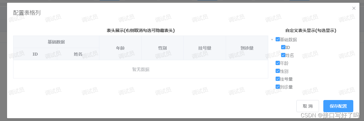
Fixed column to show hidden version
renderings
What the table looks like outside
Open the component pop-up box, display the table header on the left, check the table header on the right, uncheck it to hide the columns, and then save and return to the table Head to parent component
Fixed version video demonstration
el-table custom column display and hide fixed collocation version
html page code
introduces the component and then displays the getherders on the page to return the checked header to you.
The following children and label are displayed in the tree and table within the configuration component
<!-- 组件:表格自定义列 -->
        <dynamiccolumnrole ref="dynamic_column_role" @getherders="getherders" :children="'children'" :label="'title'">
        </dynamiccolumnrole>
methods
This method is to call the method in the component and pass in the default header data
// 初始化表头
            createInfo() {


                this.$refs.dynamic_column_role.createInfo(this.headers) //打开编辑列弹框
            },
My data default array structure. The id and isshow must be present in the header here. If there are no fields, add them yourself.
headers: [{


                        title: '基础数据',
                        id: 7,
                        isshow: true,
                        children: [{


                            id: 5,
                            isshow: true,
                            title: 'ID',
                            key: 'id'
                        }, {


                            id: 6,
                            isshow: true,
                            title: '姓名',
                            key: 'name'
                        }]
                    },
                    {


                        id: 1,
                        isshow: true,
                        title: '年龄',
                        key: 'age'
                    },
                    {


                        id: 2,
                        isshow: true,
                        title: '性别',
                        key: 'sex'
                    },
                    {


                        id: 3,
                        isshow: true,
                        title: '挂号量',
                        key: 'ghl'
                    },
                    {


                        id: 4,
                        isshow: true,
                        title: '到诊量',
                        key: 'dzl'
                    },
                ],
component code
The component is commented, which is relatively easy to understand.
Let me talk about the important points: to use this component, you only need to introduce it and then use it as a component.
Then note that a header is passed in by default for the first time. It is the header of your backend request.
Then the header structure needs to have the fields id and isshow (true is to display, false is to hide) , If you haven't added it yourself.
Let’s briefly describe the logic: display the tree structure of the table header through tree, and then listen to whether it is canceled or checked through the callback function handleCheckChange after checking, and then find the data corresponding to the id through recursion and give it to him isshow field change display and hiding, in the table Show and hide this field for application v-if. Update table data display through itemKey variable. Finally, the header data is returned to the parent component, and the parent component table is also displayed and hidden through v-if control.
<template>
  <div>
    <!-- 表格列配置 -->
    <el-dialog title="配置表格列" :visible.sync="columnShow" width="60%" top="10vh">
      <el-row>
        <el-col :span="18">
          <p
            style="
              text-align: center;
              color: #333;
              font-weight: bold;
              margin-bottom: 10px;
            "
          >
            表头展示(右侧取消勾选可隐藏表头)
          </p>
          <div style="max-width: 100%; overflow: auto">
            <el-table
              :data="tableData"
              border
              style="width: 100%"
              ref="configurationTable"
              :key="itemKey"
              :cell-style="tableCellStyle"
              :header-cell-style="tableHeaderCellStyle"
            >
              <template v-for="(arrd, index) in headers">
                <el-table-column
                  :key="'yi' + index"
                  :label="arrd[label]"
                  align="center"
                  show-overflow-tooltip
                  v-if="arrd.isshow"
                >
                  <template v-for="(arrd2, index2) in arrd[children]">
                    <!-- 有子级(第二层表头) -->
                    <el-table-column
                      align="center"
                      :label="arrd2[label]"
                      show-overflow-tooltip
                      :key="'er' + index2"
                      v-if="arrd2.isshow"
                    >
                      <template v-for="(arrd3, index3) in arrd2[children]">
                        <!-- 有子级(第三层表头) -->
                        <el-table-column
                          align="center"
                          :label="arrd3[label]"
                          show-overflow-tooltip
                          :key="'san' + index3"
                          v-if="arrd3.isshow"
                        >
                        </el-table-column>
                      </template>
                    </el-table-column>
                  </template>
                </el-table-column>
              </template>
            </el-table>
          </div>
        </el-col>
        <el-col :span="6" style="max-height: 500px; overflow: auto">
          <p
            style="
              text-align: center;
              color: #333;
              font-weight: bold;
              margin-bottom: 10px;
            "
          >
            自定义表头显示(勾选显示)
          </p>
          <el-tree
            ref="tree"
            :data="data"
            node-key="id"
            default-expand-all
            :expand-on-click-node="false"
            show-checkbox
            :props="defaultProps"
            @check-change="handleCheckChange"
          >
            <span class="custom-tree-node" slot-scope="{ node, data }">
              <span>{

    {

     node.label }}</span>
            </span>
          </el-tree>
        </el-col>
      </el-row>
      <span slot="footer" class="dialog-footer">
        <el-button @click="columnShow = false">取 消</el-button>
        <el-button type="primary" @click="setUpColumn">保存配置</el-button>
      </span>
    </el-dialog>
  </div>
</template>

<script>
module.exports = {


  name: "column",
  props: {


    // tree节点和表格表头的子级的字段名
    children: {


      type: String,
      default() {


        return "children";
      },
    },
    // tree节点和表格表头的字段名
    label: {


      type: String,
      default() {


        return "title";
      },
    },
  },
  data() {


    return {


      itemKey: 0, //更新表格的key
      defaultKeys: [], //默认选中tree勾选框
      tableData: [], //表格数据
      headers: [], //表头
      data: [], //tree
      //tree配置
      defaultProps: {


        children: this.children,
        label: this.label,
      },
      columnShow: false, //设置弹框
    };
  },
  methods: {


    // tree勾选
    handleCheckChange(data, checked, indeterminate) {


      // 取消勾选
      if (checked == false&&indeterminate==false) {


        this.getTreeItem2(this.headers, data.id);
      }
      // 勾选
      if (checked == true) {


        this.getTreeItem(this.headers, data.id);
      }
      // 多级表头判断:子级全部为隐藏状态,父级也隐藏,自己存在显示状态,父级就显示
      this.headers.forEach(item => {


        if(item[this.children]){


          let num=1
          item[this.children].forEach(i=>{


            if(i.isshow==true){


              num=2
            }
          })
          if(num==1){


            this.getTreeItem2(this.headers, item.id);
          }
          if (num==2) {


            this.getTreeItem(this.headers, item.id);
          }
        }
      });
      this.itemKey++; //更新表格,防止数据不更新
    },
    // 初始化
    createInfo(e) {


      this.headers = JSON.parse(JSON.stringify(e)); //传入默认表头
      this.data = JSON.parse(JSON.stringify(this.headers)); //默认tree展示结构
      this.defaultKeys = this.getAllIds([], e); //默认tree选中勾选
      this.defaultChecked()//默认选中,父子关联时仍然可以再父级选中状态下不全选子级
      this.columnShow = true; //打开弹框
    },
    // 设置表格列展示
    setUpColumn() {


      this.$emit("getherders", this.headers); //处理好的表头传给父级
      this.columnShow = false; //关闭弹框
      this.$message({


        message: "保存配置成功!",
        type: "success",
      });
    },
    // 递归:获取所有id值
    getAllIds(keys, dataList) {


      if (dataList && dataList.length) {


        for (let i = 0; i < dataList.length; i++) {


          if (dataList[i].isshow == true) {


            keys.push(dataList[i].id);
          }
          if (dataList[i].children) {


            keys = this.getAllIds(keys, dataList[i].children);
          }
        }
      }
      return keys;
    },
    // 递归:找到对应id数据修改字段为true或者false
    getTreeItem(data, id) {


      data.map((item) => {


        if (item.id == id) {


          item.isshow = true; // 结果赋值
        } else {


          if (item.children) {


            this.getTreeItem(item.children, id);
          }
        }
      });
    },
    getTreeItem2(data, id) {


      data.map((item) => {


        if (item.id == id) {


          item.isshow = false; // 结果赋值
        } else {


          if (item.children) {


            this.getTreeItem2(item.children, id);
          }
        }
      });
    },
    // 修改 table cell边框的背景色
    tableCellStyle() {


      return 'border-color: #999;'
    },
    // 修改 table header cell的背景色
    tableHeaderCellStyle() {


      return 'border-color: #999;'
    },
    // 默认选中:父子关联时,默认数组中没有的id不会选中
    defaultChecked () {


      this.$nextTick(() => {


        const arr = []
        this.defaultKeys.forEach(item => {


          if (!this.$refs.tree.getNode(item).childNodes || !this.$refs.tree.getNode(item).childNodes.length) {


            arr.push(item)
          }
        })
        this.$refs.tree.setCheckedKeys(arr)
      })
    },
  },
};
</script>

  <style>
</style>