1. Introduction
This Codelab is mainly based on the dialog and button components to implement several custom effects of pop-up windows. The specific effects are:
1. Warning pop-up window, click the confirmation button to close the pop-up window.
2. In the confirmation pop-up window, click the Cancel button or Confirm button to trigger the corresponding operation.
3. The loading pop-up window shows the loading effect.
4. Prompt pop-up window allows users to input content and click cancel and confirm buttons to trigger corresponding operations.
5. Progress bar pop-up window, showing progress bar and percentage.
Related concepts
dialog component: custom pop-up window container component.
button component: button component.
Complete example
Source code download
Basic usage of pop-up windows (JS).zip

2. Environment construction
We first need to complete the establishment of the HarmonyOS development environment. Please refer to the following steps.
Software requirements
DevEco Studio version: DevEco Studio 3.1 Release.
HarmonyOS SDK version: API version 9.
Hardware requirements
Device type: Huawei mobile phone or Huawei mobile phone device simulator running on DevEco Studio.
HarmonyOS system: 3.1.0 Developer Release.
Environment setup
1. Install DevEco Studio. For details, please refer to Download and Install Software .
2. Set up the DevEco Studio development environment. The DevEco Studio development environment depends on the network environment. You need to be connected to the network to ensure the normal use of the tool. You can configure the development environment according to the following two situations:
● If you have direct access to the Internet, you only need to download the HarmonyOS SDK .
● If the network cannot directly access the Internet, it needs to be accessed through a proxy server. Please refer to Configuring the Development Environment .
3. Developers can refer to the following link to complete the relevant configuration for device debugging:
● Use a real machine for debugging
● Use the simulator for debugging
3. Interpretation of code structure
This Codelab only explains the core code. For the complete code, we will provide it in the source code download or gitee.
├──entry/src/main/js // 代码区│ └──MainAbility│ ├──common│ │ └──images // 图片资源│ ├──i18n // 国际化中英文│ │ ├──en-US.json│ │ └──zh-CN.json│ ├──pages│ │ └──index│ │ ├──index.css // 页面整体布局以及弹窗样式│ │ ├──index.hml // 自定义弹窗展示页面│ │ └──index.js // 弹窗显示关闭逻辑以及动画逻辑│ └──app.js // 程序入口└──entry/src/main/resources // 应用资源目录
4. Build application pages
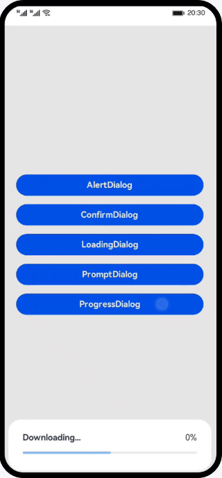
The interface mainly consists of two parts: the button list page and the custom pop-up window. We can set up the pop-up window by adding custom components in the dialog tag. The specific effect is as shown in the figure:
First, build the button page in index.hml, which mainly includes 5 common pop-up windows, namely AlertDialog, ConfirmDialog, LoadingDialog, PromptDialog and ProgressDialog.
<!--index.hml--><div class="btn-div"><button type="capsule" value="AlertDialog" class="btn" onclick="showAlert"></button><button type="capsule" value="ConfirmDialog" class="btn" onclick="showConfirm"></button><button type="capsule" value="LoadingDialog" class="btn" onclick="showLoading"></button><button type="capsule" value="PromptDialog" class="btn" onclick="showPrompt"></button><button type="capsule" value="ProgressDialog" class="btn" onclick="showProgress"></button></div>
Then create an AlertDialog custom pop-up window in index.hml, as shown in the figure:

<!-- index.hml --><!-- AlertDialog自定义弹窗 --><dialog id="alertDialog" class="alert-dialog"><div class="dialog-div"><div class="alert-inner-txt"><text class="txt">AlertDialog</text></div><div class="alert-inner-btn"><button class="btn-single" type="capsule" value="Confirm"onclick="confirmClick('alertDialog')"></button></div></div></dialog>
Create a ConfirmDialog custom pop-up window, as shown in the figure:

<!-- index.hml --><!-- ConfirmDialog自定义弹窗 --><dialog id="confirmDialog" class="dialog-main"><div class="dialog-div"><div class="inner-txt"><text class="txt">ConfirmDialog</text></div><div class="inner-btn"><button type="capsule" value="Cancel" class="btn-txt-left"onclick="cancelClick('confirmDialog')"></button><button type="capsule" value="Confirm" class="btn-txt-right"onclick="confirmClick('confirmDialog')"></button></div></div></dialog>
Create a LoadingDialog custom pop-up window, the effect is as shown in the figure:

<!-- index.hml --><!-- LoadingDialog自定义弹窗 --><dialog id="loadingDialog" class="low-height-dialog"><div class="dialog-loading"><text>Loading...</text><image class="loading-img img-rotate" id="loading-img"src="/common/images/ic_loading.svg"></image></div></dialog>
Create a PromptDialog custom pop-up window, as shown in the figure:

<!-- index.hml --><!-- PromptDialog自定义弹窗 --><dialog id="promptDialog" class="dialog-prompt"><div class="dialog-div-prompt"><div class="inner-txt-prompt"><text class="txt">PromptDialog</text></div><input class="prompt-input" type="password" placeholder="please enter password"></input><div class="inner-btn"><button type="capsule" value="Cancel" class="btn-txt-left"onclick="cancelClick('promptDialog')"></button><button type="capsule" value="Confirm" class="btn-txt-right"onclick="confirmClick('promptDialog')"></button></div></div></dialog>
Create a ProgressDialog custom pop-up window, the effect is as shown in the figure:
<!-- index.hml --><!-- ProgressDialog自定义弹窗 --><dialog id="progressDialog" class="low-height-dialog" oncancel="onCancel"><div class="dialog-progress-div"><div class="inner-txt-progress"><text class="download-txt">Downloading...</text><text>{ { percent + '%' }}</text></div><div class="progress-div"><progress class="min-progress" type="horizontal" percent="{ { percent }}"secondarypercent="50"></progress></div></div></dialog>
Then implement the click events of different buttons in the index.js file and display the corresponding custom pop-up window:
// index.jsexport default {data: {...},// 展示AlertDialogshowAlert() {this.$element('alertDialog').show();},// 展示ConfirmDialogshowConfirm() {this.$element('confirmDialog').show();},// 展示LoadingDialogshowLoading() {...this.animation = this.$element('loading-img').animate(frames, options);this.animation.play();this.$element('loadingDialog').show();},// 展示PromptDialogshowPrompt() {this.$element('promptDialog').show();},// 展示ProgressDialogshowProgress() {...}}
5. Summary
You have completed this Codelab study and learned the following knowledge points:
1. Use of dialog custom pop-up window container component.
2. Use of button button component.