1. Introduction
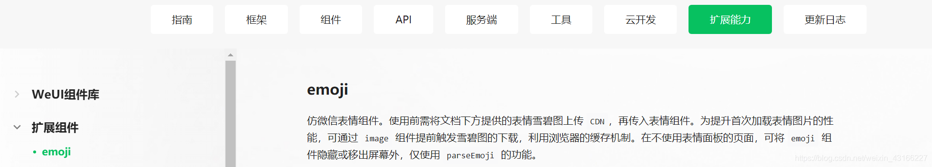
How does the mini program send emoticons? The official document "Extended Capabilities" of the WeChat mini program provides us with emoji components , which are imitated WeChat emoticon components.
2. Development process
(1) Build using npm
//初始化项目,在node开发中使用npm init会生成一个pakeage.json文件,
//这个文件主要是用来记录这个项目的详细信息的,它会将我们在项目开发中所要用到的包,
//以及项目的详细信息等记录在这个项目中。
- npm init 或 npm init -y
//安装生产环境
- npm install --production
//安装vant,Vant Weapp 是移动端 Vue 组件库 Vant 的小程序版本,
//两者基于相同的视觉规范,提供一致的 API 接口,助力开发者快速搭建小程序应用。
- npm i vant-weapp -S --production
//安装emoji
- npm install @miniprogram-component-plus/emoji
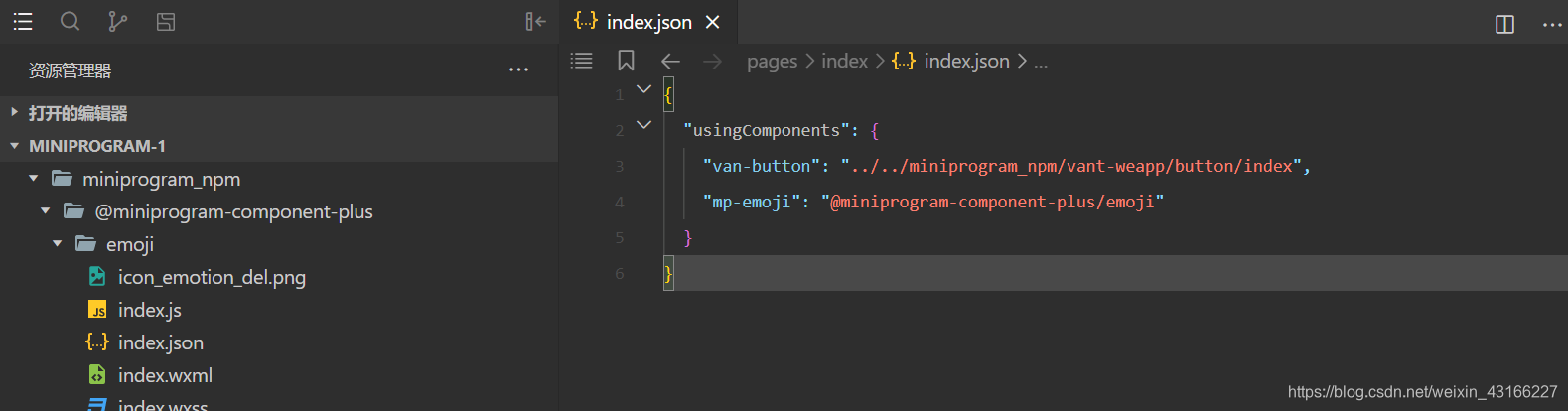
- 微信开发工具-->工具-->构建npm
- page.json引入组件:
{
"usingComponents": {
"mp-emoji": "@miniprogram-component-plus/emoji"
}
}
(2) Copy directly from the source code of the official component library, and use the same method as above.
(3) Official demonstration

(4) Source code analysis
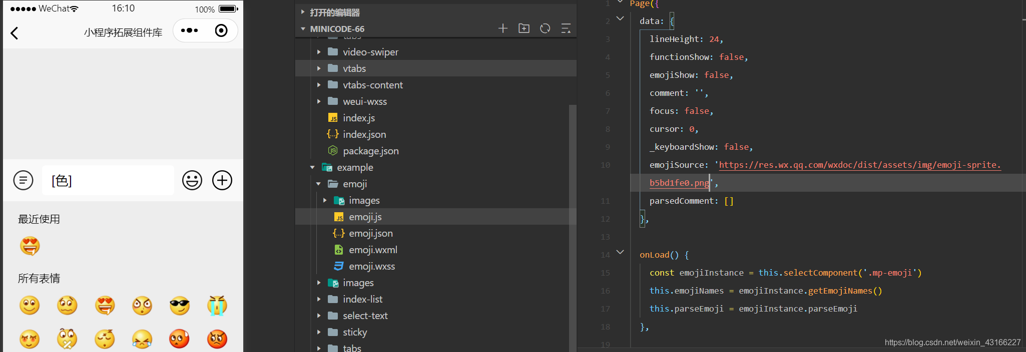
-
Component selector to create emoji instances
const emojiInstance = this.selectComponent('.mp-emoji') //表情中文列表 this.emojiNames = emojiInstance.getEmojiNames() //parseEmoji 解析函数 this.parseEmoji = emojiInstance.parseEmoji -
The component renders
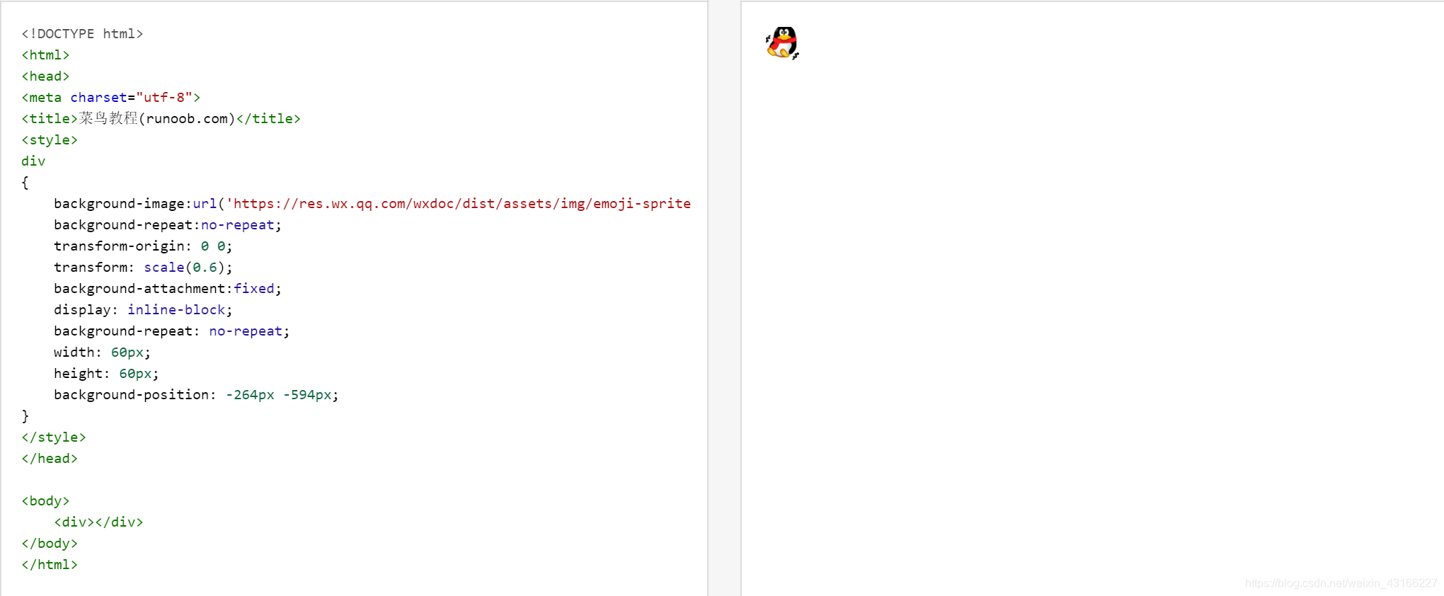
the hidden control element display, mp-emoji references the component, source specifies the sprite image address, bindinsertemoji clicks on the expression to obtain the emoticon text such as "[smile]", binddelemoji implements the delete key, and bindsend implements the send key.<view class="reply_panel { {emojiShow ? 'show': ''}}" hidden="{ {!emojiShow}}"> <mp-emoji source="{ {emojiSource}}" class="mp-emoji" bindinsertemoji="insertEmoji" binddelemoji="deleteEmoji" bindsend="onsend"></mp-emoji> </view> -
Text parsing
const = comment = '啊的四个[微笑]撒地方' //文本解析,type为1代表普通文本,2为表情,并给出imageClass样式。 const parsedCommnet = parseEmoji(comment) [ { type: 1, content: '啊的四个'}, { type: 2, content: '[微笑]', imageClass: 'smiley_4'}, { type: 1, content: '撒地方'}, ] -
Text output
js parses the text and outputs an array, and we loop the array. Determine the text type according to the type attribute, which is 1 for normal output, and 2 for specifying the emoticon image style according to imageClass. Display principle: background-image specifies the background view of the view element, background-position: -66px -264px sets the starting position of the background image, transform-origin: 0 0 sets the base point of the view transformation, transform: scale(height/64) sets the expression scaling ratio. The size of the background image emoticon is 64px.<view class="comment"> <block wx:for="{ {parsedComment}}" wx:key="item"> <block wx:if="{ {item.type === 1}}">{ {item.content}}</block> <view wx:if="{ {item.type === 2}}" style="display: inline-block; width: { { lineHeight}}px; height: { { lineHeight}}px"> <view class="{ {item.imageClass}}" style="background-image: url({ {emojiSource}});transform-origin: 0 0; transform: scale({ { lineHeight / 64}});"></view> </view> </block> </view>