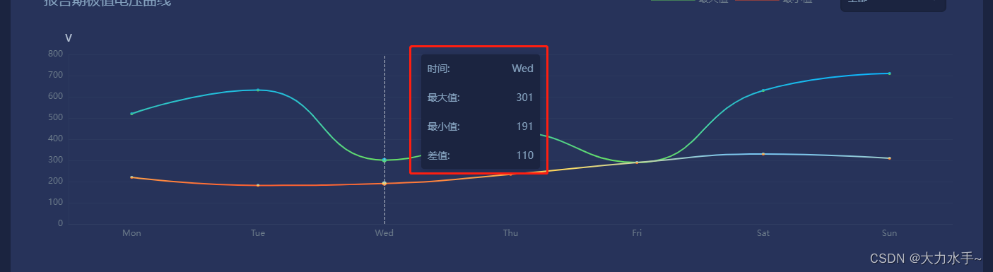
1. The tooltip line chart is required to display the maximum and minimum values and the difference between the two data.
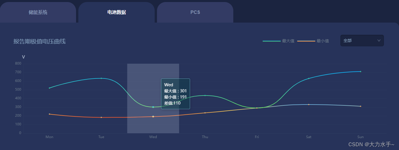
A. tooltip setting code display
        tooltip: {


          show: true,
          backgroundColor: "rgba(13, 64, 71, 0.50)",
          trigger: "axis",
          borderColor: "rgba(143, 225, 252, 0.60)",
          // padding: 8,
          textStyle: {


            color: "#fff",
          },
          axisPointer: {


            type: "line",
          },
          formatter: function (params) {


            console.log(params)
            var result = params[0].name; // 获取当前坐标轴的名称
            let max = 0;
            let min = 0;
            params.forEach(function (item) {


              // 遍历所有的数据项
              result += "<br/>" + item.seriesName + " : " + item.value; // 将每个数据项的名称和值添加到 tooltip 中
              if(item.seriesName == '最大值'){


                  max = item.value;
                  console.log(max)
              }else{


                min = item.value;
                console.log(min)
              }
            });
            result = result + "<br/>差值:" + (max-min)
            return result;
          },
        },
B. Effect
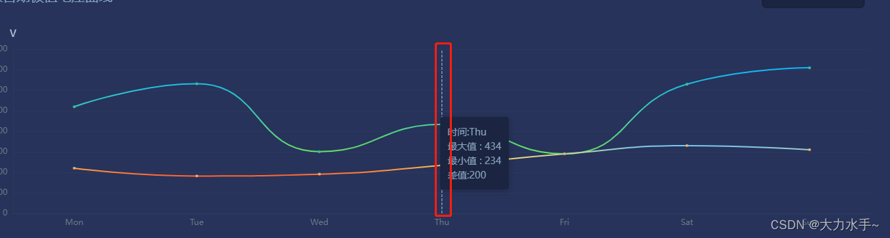
C.ps (the tooltip display showdow and line are set in xAxis:{})
        xAxis: [
          {


            type: "category",
            data: ["Mon", "Tue", "Wed", "Thu", "Fri", "Sat", "Sun"],
            axisPointer: {


              type: "line",//tooltip 是直线
            },
            axisLine: {


              //不显示x轴
              show: true,
              lineStyle: {


                color: "rgba(108,123,138,0.08)",
              },
            },
            axisTick: {


              //不显示x轴刻度
              show: false,
            },
            axisLabel: {


              textStyle: {


                color: "#6C7B8A", //更改坐标轴文字颜色
                fontSize: 12, //更改坐标轴文字大小
              },
            },
          },
        ],
D. Customize tooltip style
       tooltip: {


          show: true,
          backgroundColor: "#1B2440",
          trigger: "axis",
          borderColor: "#1B2440",
          padding: 8,
          textStyle: {


            color: "#86A3C0",
          },
          axisPointer: {


            type: "line",
          },
          formatter: function (params) {


            console.log(params)
            var result = '<div style="width:150px;display:flex;justify-content:space-between;margin-bottom:20px;">'+'<div>'+'时间:' +'</div>'+'<div>'+ params[0].name+'</div>' +'</div>'; // 获取当前坐标轴的名称
            let max = 0;
            let min = 0;
            params.forEach(function (item) {


              // 遍历所有的数据项
              result += '<div style="width:150px;display:flex;justify-content:space-between;margin-bottom:20px;">'+'<div>'+item.seriesName+':' +'</div>'+'<div>'+item.value+'</div>' +'</div>';
              if(item.seriesName == '最大值'){


                  max = item.value;
                  console.log(max)
              }else{


                min = item.value;
                console.log(min)
              }
            });
            result = result +  '<div style="width:150px;display:flex;justify-content:space-between;">'+'<div>'+'差值:' +'</div>'+'<div>'+(max-min)+'</div>' +'</div>';
            return result;
          },
        },
E:Effect