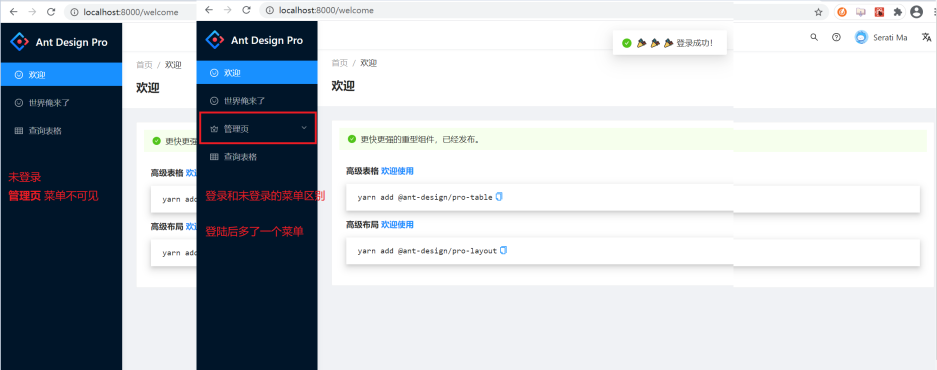
welcome page
If you access the project without logging in, the initial page will jump directly to the Welcome* page. From the routing configuration, we can see that if we access http://localhost:8000/ , the only matching routes will be * redirected to the * Welcome* component.
Framework layout and core components
The routing passes through the SecurityLayout **, BasicLayout component, and the BlankLayout ** component at the top . So what are the functions of these three components?

BlankLayout component
Component location: src/layouts/BlankLayout , this component is the top-level component of the project and can better display error prompts in development mode. The current component can be understood as a blank component.
import React from 'react';
import { Inspector } from 'react-dev-inspector';

const InspectorWrapper = process.env.NODE_ENV === 'development' ? Inspector : React.Fragment;

const Layout: React.FC = ({ children }) => {
  // {children} 是dom内容,可以理解为 vue中的插槽
  // dom的内容会直接被解析到这里
  // InspectorWrapper 是根据是否为开发模式而替换为 Inspector 或正常的React虚拟组件
  // Inspector 可以使我们在开发阶段 代码报错 提示的更友好
  return <InspectorWrapper>{children}</InspectorWrapper>;
};

export default Layout;
SecurityLayout component
Component location: src/layouts/SecurityLayout , as the name suggests, this component should have some control over security access.
Here, the logical judgment of whether to log in is implemented: If you are logged in, <PageLoading /> the component will be displayed; if you are not logged in, you will be redirected to /user/login ; if the login is successful, then Return the child component.
render() {
  // 组件是否渲染完毕
    const { isReady } = this.state;
  // loading为获取user用户信息的网络请求状态 由dva-loading管控
    const { children, loading, currentUser } = this.props;

    // You can replace it to your authentication rule (such as check token exists)
    // 你可以把它替换成你自己的登录认证规则(比如判断 token 是否存在)
    const isLogin = currentUser && currentUser.userid;
    const queryString = stringify({
      redirect: window.location.href,
    });
     // 未登录 且在loading状态 或者组件未渲染完毕
    if ((!isLogin && loading) || !isReady) {
      return <PageLoading />;
    }
      // 未登录 且跳转未非登录页
    if (!isLogin && window.location.pathname !== '/user/login') {
      return <Redirect to={`/user/login?${queryString}`} />;
    }
    return children;
  }
BasicLayout component
The current component is the main component of the backend page layout, and is implemented using ProLayout .
ProLayout is an advanced component packaged on the basis of ant-design. ProLayout can provide a standard yet flexible middle and backend standard layout, and at the same time provide one-click Switch layout forms, automatically generate menus and other functions. Used in conjunction with PageContainer, it can automatically generate breadcrumbs, page titles, and provide a low-cost solution to access the footer toolbar. Functions related to
page permissionsAuthorized are controlled through a combination of component and route configuration. The general idea is to compare the current user's role * with the permissions of the component Authorized attribute * authoritynoMatch to control whether the component content is rendered or rendered into the corresponding component. This implementation idea It is roughly the same as the idea we have in the vue-element-admin template, but it is different from the idea of dynamic permissions in our course. The permissions part will be explained in detail later, so you can skip it for now.
/**
* Ant Design Pro v4 use `@ant-design/pro-layout` to handle Layout.
* @see You can view component api by: https://github.com/ant-design/ant-design-pro-layout
*/
...
return (
<ProLayout
logo={logo}
formatMessage={formatMessage}
{...props}
{...settings}
onCollapse={handleMenuCollapse}
onMenuHeaderClick={() => history.push('/')}
menuItemRender={(menuItemProps, defaultDom) => {
if (
menuItemProps.isUrl ||
!menuItemProps.path ||
location.pathname === menuItemProps.path
) {
return defaultDom;
}
return <Link to={menuItemProps.path}>{defaultDom}</Link>;
}}
breadcrumbRender={(routers = []) => [
{
path: '/',
breadcrumbName: formatMessage({ id: 'menu.home' }),
},
...routers,
]}
itemRender={(route, params, routes, paths) => {
const first = routes.indexOf(route) === 0;
return first ? (
<Link to={paths.join('/')}>{route.breadcrumbName}</Link>
) : (
<span>{route.breadcrumbName}</span>
);
}}
footerRender={() => {
if (settings.footerRender || settings.footerRender === undefined) {
return defaultFooterDom;
}
return null;
}}
menuDataRender={menuDataRender}
rightContentRender={() => <RightContent />}
postMenuData={(menuData) => {
menuDataRef.current = menuData || [];
return menuData || [];
}}
>
// 这里是权限控制 可以通过当前用户的角色 和authority 的角色列表做对比
// 当前项目不用考虑页面权限, 具体实现会在后续的教程里体现
<Authorized authority={authorized!.authority} noMatch={noMatch}>
{children}
</Authorized>
</ProLayout>
);
};
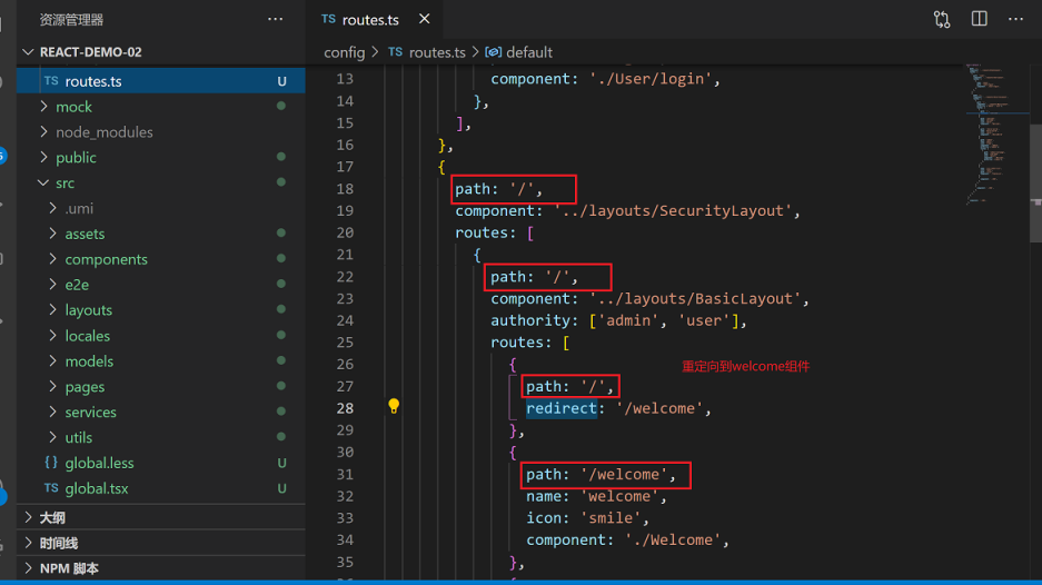
比如 config/route.ts 路由部分权限配置
...
routes: [
{
path: '/admin/sub-page',
name: 'sub-page',
icon: 'smile',
component: './Welcome',
authority: ['admin'],
},
],UserLayout component
The current component is a container component that wraps the user login page. You can set the web page title, meta, internationalization options, login page logo, footer and other functions through the current component.
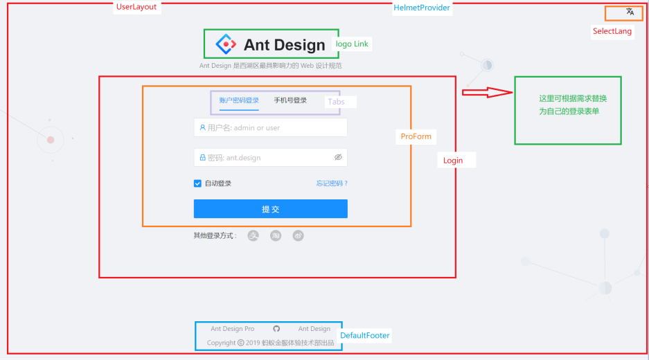
return (
    <HelmetProvider>
      <Helmet>
        <title>{title}</title>
        <meta name="description" content={title} />
      </Helmet>

      <div className={styles.container}>
        <div className={styles.lang}>
          <SelectLang />
        </div>
        <div className={styles.content}>
          <div className={styles.top}>
            <div className={styles.header}>
              <Link to="/">
                <img alt="logo" className={styles.logo} src={logo} />
                <span className={styles.title}>Ant Design</span>
              </Link>
            </div>
            <div className={styles.desc}>
              <FormattedMessage
                id="pages.layouts.userLayout.title"
                defaultMessage="Ant Design 是西湖区最具影响力的 Web 设计规范"
              />
            </div>
          </div>
                    // Login组件在这里渲染
          {children}
        </div>
        <DefaultFooter />
      </div>
    </HelmetProvider>
  );
Login page
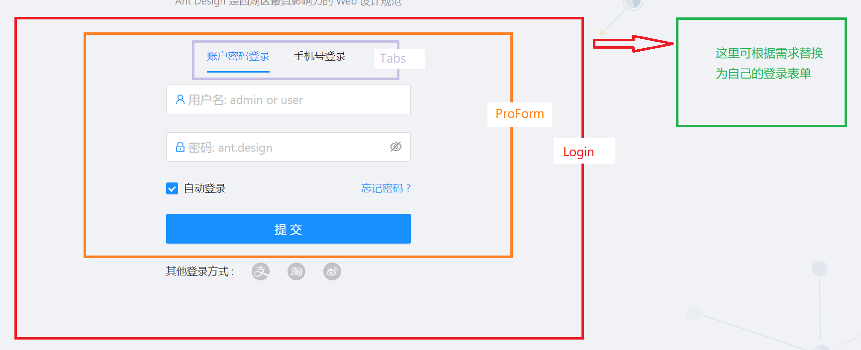
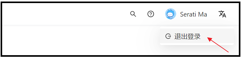
We can directly access http://localhost:8000/user/login to jump to the login page, or click to launch in the background to jump to the login page. After logging in to the corresponding component of the login page, the pages/User/login/index.tsx
sideBar has an additional management page function. This page will only appear after logging in and the user role is * admin* of.
src/layouts/BasicLayout.tsx Code part for permission control:
/** Use Authorized check all menu item */

const menuDataRender = (menuList: MenuDataItem[]): MenuDataItem[] =>
  menuList.map((item) => {
    const localItem = {
      ...item,
      children: item.children ? menuDataRender(item.children) : undefined,
    };
    // 使用Authorized鉴权判断当前sideItem是否被渲染
    return Authorized.check(item.authority, localItem, null) as MenuDataItem;
  });
Summarize
We have basically figured out the basic structure of the ant design pro backend framework template. Next, we need to develop according to our own needs. Because the
login page of the default template is relatively complex and does not meet our needs, we can replace the required login by ourselves. Template. We will start the specific development in the next section.