constraint layout
1 Introduction
ConstraintLayout ConstraintLayout is a ViewGroup that can be used in Android systems above Api9. Its appearance is mainly to solve the problem of excessive nesting of layouts, and to position and adjust widgets in a flexible way. Starting from Android Studio 2.3, the official template uses ConstraintLayout by default.
Official documentation: ConstraintLayout
2. Basic attributes and their use
To define the position of a view in a ConstraintLayout, you must add at leasta horizontal constraintanda vertical constraint. Each constraint represents a connection or alignment to other views, parent layouts, or invisible guides. Each constraint defines the view's position on the vertical or horizontal axis; therefore each view must have at least one constraint on each axis, but often more are required.
2.1 Relative positioning
2.1.1 Properties
1. layout_constraintLeft_toLeftOf
   当前View的右侧和另一个View的右侧位置对齐
   与RelativeLayout的alignLeft属性相似
2. layout_constraintLeft_toRightOf
   当前view的左侧会在另一个View的右侧位置
   与RelativeLayout的toRightOf属性相似
3. layout_constraintRight_toLeftOf
   当前view的右侧会在另一个View的左侧位置
   与RelativeLayout的toLeftOf属性相似
4. layout_constraintRight_toRightOf
   当前View的右侧和另一个View的右侧位置对其
   与RelativeLayout的alignRight属性相似
5. layout_constraintTop_toTopOf
   头部对齐,与alignTop相似
6. layout_constraintTop_toBottomOf
   当前View在另一个View的下侧 与below相似
7. layout_constraintBottom_toTopOf
   当前View在另一个View的上方 与above相似
8. layout_constraintBottom_toBottomOf
   底部对齐,与alignBottom属性相似
9. layout_constraintBaseline_toBaselineOf
   文字底部对齐,与alignBaseLine属性相似
10. layout_constraintStart_toEndOf
   同left_toRightOf
11. layout_constraintStart_toStartOf
   同left_toLeftOf
12. layout_constraintEnd_toStartOf
   同right_toLeftOf
13. layout_constraintEnd_toEndOf
   同right_toRightOf
Let’s look at a simple example first: (If we want to implement the following layout, the
code is as follows:
<?xml version="1.0" encoding="utf-8"?>
<androidx.constraintlayout.widget.ConstraintLayout xmlns:android="http://schemas.android.com/apk/res/android"
    xmlns:app="http://schemas.android.com/apk/res-auto"
    xmlns:tools="http://schemas.android.com/tools"
    android:layout_width="match_parent"
    android:layout_height="match_parent"
    tools:context=".MainActivity">
    <TextView
        android:id="@+id/textView1"
        android:layout_width="100dp"
        android:layout_height="60dp"
        android:background="#D6E1AA"
        android:gravity="center"
        android:text="textview1"
        android:textColor="@color/black"
        android:textSize="25sp"
        android:textStyle="bold"
        app:layout_constraintBottom_toBottomOf="parent"
        app:layout_constraintEnd_toEndOf="parent"
        app:layout_constraintStart_toStartOf="parent"
        app:layout_constraintTop_toTopOf="parent"
        tools:ignore="HardcodedText" />

    <TextView
        android:id="@+id/textView2"
        android:layout_width="138dp"
        android:layout_height="111dp"
        android:background="#E8C99B"
        android:gravity="center"
        android:text="textview2"
        android:textColor="@color/black"
        android:textSize="25sp"
        android:textStyle="bold"
        app:layout_constraintBottom_toBottomOf="@+id/textView1"
        app:layout_constraintEnd_toStartOf="@+id/textView1"
        tools:ignore="HardcodedText" />
</androidx.constraintlayout.widget.ConstraintLayout>
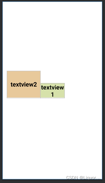
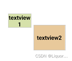
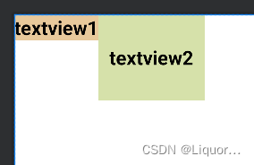
The most important two lines of code in textview2:
 app:layout_constraintBottom_toBottomOf="@+id/textView1"
 app:layout_constraintEnd_toStartOf="@+id/textView1"
We align the bottom of textview2 with the bottom of textview1, and align the right side of textview2 with the left side of textview1 to determine the position of textview2.
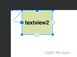
There is a more interesting attribute: layout_constraintBaseline_toBaselineOf
Baseline refers to the text baseline, which can be realized by changing the above xml code.
    <TextView
        android:id="@+id/textView1"
        .../>
    <TextView
        android:id="@+id/textView2"
        ...
        app:layout_constraintLeft_toRightOf="@+id/textView1"
        app:layout_constraintBaseline_toBaselineOf="@+id/textView1"
        />
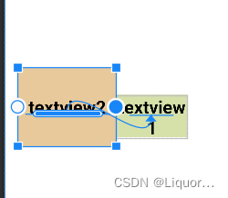
You can see that we align the text baselines of textview1 and textview2.
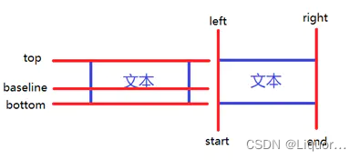
- The relative positioning of ConstraintLayout is similar to that of RelativeLayout. Here is a picture to summarize relative positioning:
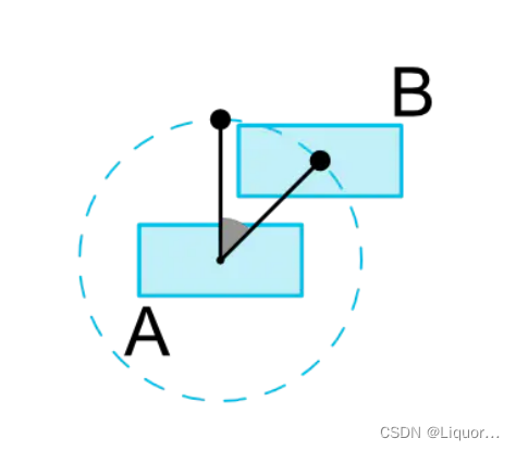
2.2 Angle positioning
One widget center can be constrained relative to another widget center at an angle and distance. This allows you to position a widget on a circle.
2.2.1 Properties
layout_constraintCircle : 引用另一个小部件 id
layout_constraintCircleRadius : 到另一个小部件中心的距离
layout_constraintCircleAngle : 小部件应该在哪个角度(以度为单位,从 0 到
    <TextView
        android:id="@+id/textView1"
        .../>
    <TextView
        android:id="@+id/textView2"
        ...
        app:layout_constraintCircle="@+id/textView1"
        app:layout_constraintCircleAngle="120"
        app:layout_constraintCircleRadius="150dp"
        />
It means that the center of TextView2 is 120 degrees from the center of TextView1, and the distance is 150dp.
2.3 Margins
2.3.1 Properties
android:layout_marginStart //距离开始
android:layout_marginEnd //距离结束
android:layout_marginLeft //距离左边
android:layout_marginTop //距离上边
android:layout_marginRight //距离右边
android:layout_marginBottom //距离下边
android:layout_marginBaseline //距离基线
- It looks no different from other layouts, but in fact, to implement margin in ConstraintLayout, the control mustConstrain firstThe position of the control in ConstraintLayout, for example:
<?xml version="1.0" encoding="utf-8"?>
<android.support.constraint.ConstraintLayout xmlns:android="http://schemas.android.com/apk/res/android"
    xmlns:tools="http://schemas.android.com/tools"
    android:layout_width="match_parent"
    android:layout_height="match_parent"
    xmlns:app="http://schemas.android.com/apk/res-auto">
    <TextView
        android:id="@+id/TextView1"
        android:layout_width="wrap_content"
        android:layout_height="wrap_content"
        android:background="#E8C99B"
        android:gravity="center"
        android:text="textview1"
        android:textColor="@color/black"
        android:textSize="25sp"
        android:textStyle="bold"
        android:layout_marginLeft="100dp"
        android:layout_marginTop="100dp"/>
</android.support.constraint.ConstraintLayout>
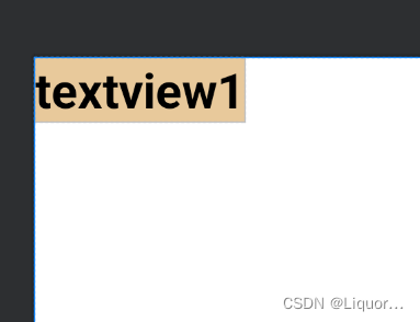
We will find that the textview does not have a margin of 100dp from the left and top of the border. In ConstraintLayout, it does not take effect because there is no constraint on the position of the textview in the layout.
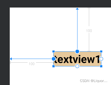
The correct way to write it is as follows:
<?xml version="1.0" encoding="utf-8"?>
<android.support.constraint.ConstraintLayout xmlns:android="http://schemas.android.com/apk/res/android"
    xmlns:tools="http://schemas.android.com/tools"
    android:layout_width="match_parent"
    android:layout_height="match_parent"
    xmlns:app="http://schemas.android.com/apk/res-auto">
    <TextView
        android:id="@+id/TextView1"
        android:layout_width="wrap_content"
        android:layout_height="wrap_content"
        android:background="#E8C99B"
        android:gravity="center"
        android:text="textview1"
        android:textColor="@color/black"
        android:textSize="25sp"
        android:textStyle="bold"
        android:layout_marginLeft="100dp"
        android:layout_marginTop="100dp"

        app:layout_constraintLeft_toLeftOf="parent"
        app:layout_constraintTop_toTopOf="parent"
        />
</android.support.constraint.ConstraintLayout>
Constrain the left and top of the textview to the left and top of the parent, so that the margin will take effect. The effect is as follows:
When using margin, pay attention to two points:
- Controls must constrain a relative position in the layout
- margin can only be greater than or equal to 0
2.3.2 Invisibility behavior (goneMargin)
goneMargin is mainly used for the margin value used when the visibility of the constraint control is set to gone. The properties are as follows:
layout_goneMarginStart //距离开始
layout_goneMarginEnd
layout_goneMarginLeft
layout_goneMarginTop
layout_goneMarginRight
layout_goneMarginBottom
<?xml version="1.0" encoding="utf-8"?>
<android.support.constraint.ConstraintLayout xmlns:android="http://schemas.android.com/apk/res/android"
    xmlns:tools="http://schemas.android.com/tools"
    android:layout_width="match_parent"
    android:layout_height="match_parent"
    xmlns:app="http://schemas.android.com/apk/res-auto">
    <TextView
        android:id="@+id/textview1"
        android:layout_width="wrap_content"
        android:layout_height="wrap_content"
        android:background="#E8C99B"
        android:gravity="center"
        android:text="textview1"
        android:textColor="@color/black"
        android:textSize="25sp"
        android:textStyle="bold"
        app:layout_constraintLeft_toLeftOf="parent"
        app:layout_constraintTop_toTopOf="parent"/>
    <TextView
        android:id="@+id/textView2"
        android:layout_width="138dp"
        android:layout_height="111dp"
        android:background="#D6E1AA"
        android:gravity="center"
        android:text="textview2"
        android:textColor="@color/black"
        android:textSize="25sp"
        android:textStyle="bold"
        app:layout_constraintTop_toTopOf="parent"
        app:layout_constraintLeft_toRightOf="@+id/textview1"
        />
</android.support.constraint.ConstraintLayout>
The effect is as follows:
change the code
- Add to textview1:
android:visibility="gone"
- The corresponding constraints for textview2 are changed to:
app:layout_constraintTop_toTopOf="parent"
app:layout_constraintLeft_toRightOf="@+id/textview1"
app:layout_goneMarginLeft="50dp"
In this way, after setting textview1 to be invisible, textview2 will be 50dp away from the left, and the effect is as follows:
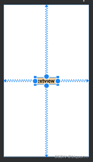
2.4 Centering and offsetting
2.4.1 Centering
In RelativeLayout, the method of placing controls in the middle of the layout is:
android:layout_centerInParent="true"
The writing method in Constraintlayout is:
app:layout_constraintBottom_toBottomOf="parent"
app:layout_constraintLeft_toLeftOf="parent"
app:layout_constraintRight_toRightOf="parent"
app:layout_constraintTop_toTopOf="parent"
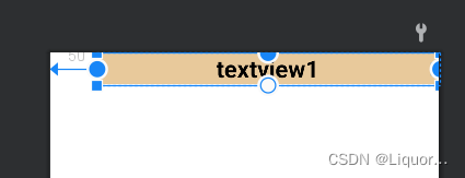
It means to constrain the top, bottom, left, and right of the control to the top, bottom, left, and right of the layout, so that the control can be placed in the middle of the layout, and the effect is as follows.
2.4.2 Offset
layout_constraintHorizontal_bias //水平方向偏移
layout_constraintVertical_bias //垂直方向偏移
To display the effect, add a sentence to the xml code:
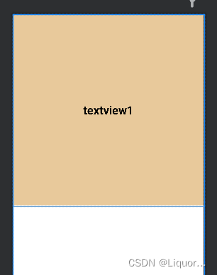
app:layout_constraintHorizontal_bias="0.3"
水平方向距父布局开始位置偏移百分之三十
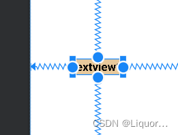
At this time, we found that textvew1 has shifted horizontally.
2.5 Size constraints
2.5.1 Constraints
The size of a control can be specified in four different ways:
- use the specified size
- Use wrap_content to let the control calculate its own size
When the height or width of the control is wrap_content, you can use the following properties to control the maximum and minimum height or width:
android:minWidth minimum width
android:minHeight minimum height
android:maxWidth maximum width
android:maxHeight maximum height
- Using 0dp (MATCH_CONSTRAINT)
officially does not recommend using match_parent in ConstraintLayout. You can set 0dp (MATCH_CONSTRAINT) to match constraints instead of match_parent. For example:
<TextView
        android:id="@+id/TextView1"
        android:layout_width="0dp"
        android:layout_height="wrap_content"
        android:layout_marginLeft="50dp"
        ......
        app:layout_constraintLeft_toLeftOf="parent"
        app:layout_constraintRight_toRightOf="parent"
        app:layout_constraintTop_toTopOf="parent" />
The width is set to 0dp, the left and right sides constrain the left and right sides of the parent, and the left margin is set to 50dp, the effect is as follows:
- Aspect Ratio
When at least one dimension of width or height is set to 0dp, you can pass the attributelayout_constraintDimensionRatioSet the aspect ratio, for example:
<TextView
        android:id="@+id/TextView1"
        android:layout_width="0dp"
        android:layout_height="wrap_content"
        ......
        app:layout_constraintDimensionRatio="1:1"
        app:layout_constraintLeft_toLeftOf="parent"
        app:layout_constraintRight_toRightOf="parent"
        app:layout_constraintTop_toTopOf="parent"
        app:layout_constrainedWidth="true"
        app:layout_constrainedHeight="true"/>
In addition, when setting the value of the aspect ratio, you can also add W or H in front to specify the width or height limit respectively. For example:
app:layout_constraintDimensionRatio="H,2:3" refers to height: width=2:3
app:layout_constraintDimensionRatio="W,2:3" refers to width: height=2:3
- important hint:
MATCH_PARENT is deprecated for ConstraintLayout. Similar behavior can be defined by setting the corresponding left/right or top/bottom constraints to "parent" via MATCH_CONSTRAINT.
WRAP_CONTENT (added in 1.1): Enforce Constraints
If dimensions are set to WRAP_CONTENT, they will be treated as literal dimensions in versions prior to 1.1 -- that is, the constraint will not restrict the resulting dimension. You may wish to use WRAP_CONTENT, but continue to enforce constraints to limit the resulting dimensions. In this case, one of the corresponding properties can be added:
app:layout_constrainedWidth="true|false"
app:layout_constrainedHeight="true|false"
MATCH_CONSTRAINT dimension (added in 1.1)
When dimension is set to MATCH_CONSTRAINT, the default behavior is to have the result size occupy all available space. Several additional modifiers are available:
- layout_constraintWidth_min and layout_constraintHeight_min
will set the minimum size for this dimension- layout_constraintWidth_max and layout_constraintHeight_max
will set the maximum size of this dimension- layout_constraintWidth_percent and layout_constraintHeight_percent
set the size of this dimension as a percentage of the parent dimension
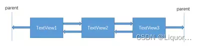
2.6 chain
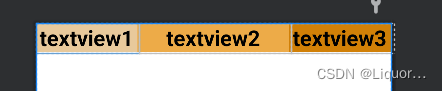
If two or more controls are constrained together as shown in the figure below, they can be considered as a chain (the picture shows a horizontal chain, and the same goes for the vertical).
Simple to use, expressed in code as:
    <TextView
        android:id="@+id/TextView1"
        ......
        app:layout_constraintHorizontal_chainStyle="spread"
        app:layout_constraintTop_toTopOf="parent"
        app:layout_constraintLeft_toLeftOf="parent"
        app:layout_constraintRight_toLeftOf="@+id/TextView2" />

    <TextView
        android:id="@+id/TextView2"
        ......
        app:layout_constraintLeft_toRightOf="@+id/TextView1"
        app:layout_constraintRight_toLeftOf="@+id/TextView3"
        app:layout_constraintTop_toTopOf="parent"
        app:layout_constraintRight_toRightOf="parent" />

    <TextView
        android:id="@+id/TextView3"
        ......
        app:layout_constraintLeft_toRightOf="@+id/TextView2"
        app:layout_constraintTop_toTopOf="parent"
        app:layout_constraintRight_toRightOf="parent" />
The three textviews are mutually constrained, and the two textviews at both ends are respectively constrained by the parent to form a chain. The first control of each chain is the chain header of the chain. We can set the layout_constraintHorizontal_chainStyle
property in the chain header to change the style of the entire chain.
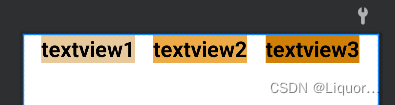
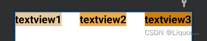
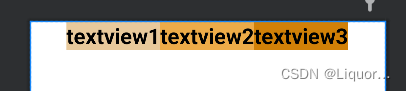
chains provides 3 styles, namely:
- spread expands the element (default)
- spread_inside expands the element, but the two ends of the chain are close to the parent
- The elements of the packet chain will be packed together.
The spread_inside
packet
example above creates a style chain, in addition to the style chain , a weight chain can also be created .
The width of the 3 textviews used above is wrap_content. If we set the width to 0dp, we can set the horizontal weight in each texttiew at this timelayout_constraintHorizontal_weight(constraintVertical is vertical) to create a weight chain, the xml code is as follows:
<TextView
        android:id="@+id/TextView1"
        android:layout_width="0dp"
        ......
        app:layout_constraintHorizontal_weight="2" />

    <TextView
        android:id="@+id/TextView2"
        android:layout_width="0dp"
        ......
        app:layout_constraintHorizontal_weight="3" />

    <TextView
        android:id="@+id/TextView3"
        android:layout_width="0dp"
         ......
        app:layout_constraintHorizontal_weight="2" />