Globally register component steps
imitation element button
New button component Vbtn.vue
<template>
  <!--以后封装组件可以以插槽的方式封装-->
  <!--插槽 内置组件 slot 做为承载分发内容的出口-->
  <button class="default" :class="[type, disabled]" @click="handleClick">
    <slot>按钮</slot>
  </button>
</template>

<script>
export default {


  props: ["type"],
   computed: {


    disabled() {


      // console.log("数据", "disabled" in this.$attrs);//遍历
      if ("disabled" in this.$attrs) {


        return "is-disabled";
      } else {


        return "";
      }
    },
  },
  methods: {


    handleClick(e) {


      /* "两种方法都可行" */
      // this.$emit("click", e);
      this.$listeners.click(e);
    },
  },
};
</script>
New button component Vbtn.css
.default {


    display: inline-block;
    line-height: 1;
    white-space: nowrap;
    cursor: pointer;
    background: rgb(255, 255, 255);
    border: 1px solid #dcdfe6;
    color: #606266;
    -webkit-appearance: none;
    text-align: center;
    box-sizing: border-box;
    outline: none;
    margin: 0;
    transition: .1s;
    font-weight: 500;
    -moz-user-select: none;
    -webkit-user-select: none;
    -ms-user-select: none;
    padding: 8px 22px;
    font-size: 14px;
    border-radius: 4px;
}

.default:hover {


    color: #464646;
    background-color: rgb(207, 207, 207);
}

.default:active {


    color: #464646;
    background-color: rgb(163, 163, 163);
}

.primary {


    color: #409eff;
    border-color: #409eff;
}

.primary:hover {


    color: #fff;
    background-color: rgb(64, 158, 255);
}

.primary:active {


    color: #fff;
    background-color: rgb(58, 142, 230);
}

.success {


    color: #67c23a;
    border-color: #67c23a;
}

.success:hover {


    color: #fff;
    background-color: #67c23a;
}

.success:active {


    color: #fff;
    background-color: rgb(93, 175, 52);
}
.is-disabled {


    cursor: no-drop;
}
Register the button component globally in main.js
and mount the style to the global
import Vbtn from '../src/components/Vbtn.vue'
Vue.component('Vbtn', Vbtn)
import "../src/assets/css/Vbtn.css"
Can be used on any vue page
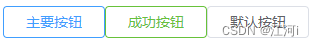
<template>
  <div class="home">
    <Vbtn type="primary" @click="set">主要按钮</Vbtn>
    <Vbtn type="success">成功按钮</Vbtn>
    <Vbtn disabled>默认按钮</Vbtn>
  </div>
</template>
<script>
export default {


  name: "Home",
  methods: {


    set(e) {


      console.log("点击事件触发了", e);
    },
  },
};
</script>