Day1 WeChat Mini Program
- Project directory structure and its composition
- Getting to Know the Mini Program Page
- Small program host environment
-
- Contains
- Mini Program Hosting Environment - Communication Model
- Mini Program Hosting Environment - Operating Mechanism
- Mini Program Hosting Environment - Components
- Mini Program Hosting Environment - Components
Project directory structure and its composition

pages folder
The pages of WeChat applets are all stored in the pages folder, each page corresponds to a folder, and the folder of each page consists of four basic files:
| Page Four Basic Documents |
|---|
| .js file (script file of the page, storing page data, event processing function, etc.) |
| .json file (the configuration file of the current page, the appearance and performance of the configuration window, etc.) |
| .wxml files (template structure files for pages) |
| .wxss files (stylesheet files for the current page) |
For example, the index page consists of the above four basic files

json configuration file
In the applet project: Through different json configuration files, the applet project can be configured at different levels.
There are four kinds of json configuration files in the applet project, namely:
① app.json configuration file in the project root directory
② project.config.json configuration file in the project root directory
③ sitemap.json configuration file in the project root
directory④ .json configuration files in each page folder
app.json configuration file
app.json is the global configuration of the current applet, including all page paths, window appearance, interface performance, bottom tab, etc. of the applet.
// Briefly understand the functions of these 4 configuration items:
// pages : used to record the path of all pages of the current applet
// window : globally define the background color, text color, etc. of all pages of the applet
// style : globally defined The style version used by the applet component
// sitemapLocation: used to indicate the location of sitemap.json
{


  "pages":[
    "pages/index/index",
    "pages/logs/logs"
  ],
  "window":{


    "backgroundTextStyle":"light",
    "navigationBarBackgroundColor": "#fff",
    "navigationBarTitleText": "Weixin",
    "navigationBarTextStyle":"black"
  },
  "style": "v2",
  "sitemapLocation": "sitemap.json"
}
project.config.json file
// project.config.json is a project configuration file, which is used to record the personalized configuration we made to the applet development tool, for example: //
setting saves compilation-related configuration
//projectname saves the project name
/ /appid stores the account ID of the applet
{


  "description": "项目配置文件",
  "packOptions": {


    "ignore": [],
    "include": []
  },
  "setting": {


    "bundle": false,
    "userConfirmedBundleSwitch": false,
    "urlCheck": true,
    "scopeDataCheck": false,
    "coverView": true,
    "es6": true,
    "postcss": true,
    "compileHotReLoad": false,
    "lazyloadPlaceholderEnable": false,
    "preloadBackgroundData": false,
    "minified": true,
    "autoAudits": false,
    "newFeature": false,
    "uglifyFileName": false,
    "uploadWithSourceMap": true,
    "useIsolateContext": true,
    "nodeModules": false,
    "enhance": true,
    "useMultiFrameRuntime": true,
    "useApiHook": true,
    "useApiHostProcess": true,
    "showShadowRootInWxmlPanel": true,
    "packNpmManually": false,
    "enableEngineNative": false,
    "packNpmRelationList": [],
    "minifyWXSS": true,
    "showES6CompileOption": false,
    "minifyWXML": true,
    "babelSetting": {


      "ignore": [],
      "disablePlugins": [],
      "outputPath": ""
    }
  },
  "compileType": "miniprogram",
  "libVersion": "2.19.4",
  "appid": "wx5f3029ce323f1f01",
  "projectname": "miniprogram-92",
  "condition": {

    },
  "editorSetting": {


    "tabIndent": "insertSpaces",
    "tabSize": 2
  }
}
sitemap.json file
WeChat has now opened the search within the mini program, and the effect is similar to the SEO of PC web pages. The sitemap.json file is used to configure whether WeChat indexing is allowed on Mini Program pages.
When the developer allows WeChat to index, WeChat will use the form of crawlers to index the page content of the Mini Program. When the user's search keyword matches the index of the page successfully, the page of the Mini Program may be displayed in the search results.
{


  "desc": "关于本文件的更多信息,请参考文档 https://developers.weixin.qq.com/miniprogram/dev/framework/sitemap.html",
  "rules": [{


  "action": "allow",//是否允许被索引,当等于disallow时不被允许
  "page": "*" //表示小程序中所有页面都允许被微信使用爬虫索引
  }]
}
The json configuration file of the page
For each page in the applet, you can use the .json file to configure the window appearance of this page, and the configuration items in the page will override the same configuration items in the window of app.json. For example: in app.json we set the global property "navigationBarBackgroundColor": "#fff", the property is set to white, in index.json we set "navigationBarBackgroundColor": "#00FF00" to green, then the page property will override the global Attributes

Getting to Know the Mini Program Page
New applet page
You only need to add the storage path of the page in app.json -> pages (remember to ctrl+s to save), and the applet developer tool can help us automatically create the corresponding page file, for example:

Modify project home page
You only need to adjust the order of the page paths in the app.json pages array to modify the home page of the project. The applet will render the first-ranked page as the project home page, as shown in the figure:


What is WXML
WXML (WeiXin Markup Language) is a set of labeling languages designed by the Mini Program framework, which is used to construct the structure of Mini Program pages, and its function is similar to HTML in web development.
Difference Between WXML and HTML
① Different tag names
HTML (div, span, img, a)
WXML (view, text, image, navigator)
② Different attribute nodes
<a href="#"> hyperlink
<navigator url="/pages/home/home" ></navigator>
③ Provides template syntax similar to Vue,
data binding,
list rendering,
conditional rendering
What is WXSS
WXSS (WeiXin Style Sheets) is a style language used to describe WXML component styles, similar to CSS in web development.
The difference between WXSS and CSS
① Added the rpx size unit
● CSS needs to manually convert the pixel unit, such as rem
● WXSS supports the new size unit rpx at the bottom layer, and the applet will automatically convert it on screens of different sizes
Provides global styles and local styles
● app.wxss in the root directory of the project will be applied to all applet pages
. The .wxss style of partial pages will only take effect on the current page. WXSS
② only supports partial
CSS selector class and #id
● element
● Union selector, descendant Selectors
Pseudo-class selectors such as ::after and ::before
The .js file in the applet
It is not enough for a project to only provide interface display. In the applet, we handle user operations through .js files. For example: responding to user clicks, obtaining the user's location, etc.
Classification of .js files in Mini Programs
The JS files in the applet are divided into three categories, namely: app.js is the entry file of the entire applet project, and the .js file that starts the entire applet page by calling the App() function is the entry file of the page. Call the Page() function to create and run the page ③ Ordinary js file It is an ordinary function module file, which is used to encapsulate public functions or attributes for page use
Small program host environment
Contains
- communication model
- operating mechanism
- components
- API
Mini Program Hosting Environment - Communication Model
The main body of communication
The main body of communication in the applet is the rendering layer and the logic layer, in which:
① WXML template and WXSS style work in the rendering layer
② JS scripts work in the logic layer
Small program communication model
The communication model in the applet is divided into two parts:
①Communication between rendering layer and logic layer
●Forwarded by WeChat client
②Communication between logic layer and third-party server
●Forwarded by WeChat client
Mini Program Hosting Environment - Operating Mechanism
The process of starting the applet:
① Download the code package of the applet to the local
② Parse the app.json global configuration file
③ Execute the app.js applet entry file, call App() to create an instance of the applet and render the home page of the applet
⑤ Start the applet Complete
the page rendering process:
① Load the .json configuration file of the parsed page
② Load the .wxml template and .wxss style of the page
③ Execute the .js file of the page, call Page() to create a page instance
④ Page rendering is complete
Mini Program Hosting Environment - Components
Classification of components in applets
The components in the applet are also provided by the host environment, and developers can quickly build beautiful page structures based on the components. Officially, the components of the applet are divided into 9 categories, namely:
① view container
② basic content
③ form component
④ navigation component
⑤ media component
⑥ map map component
⑦ canvas canvas component
⑧ open capability
⑨ barrier-free access
Commonly used view container class components
view
● Common view area
● Similar to div in HTML, it is a block-level element
● Commonly used to achieve page layout effect
scroll-view
● Scrollable view area
● Commonly used to achieve scrolling list effect
swiper and swiper-item
● Carousel Graph container component and carousel graph item component
Mini Program Hosting Environment - Components
Basic use of view components
Practice arranging three view components horizontally
pages/list/list.wxml
<!--pages/list/list.wxml-->
<view class="container1">
  <view>A</view>
  <view>B</view>
  <view>C</view>
</view>
pages/list/list.wxss
/* pages/list/list.wxss */
/*后代选择器*/
.container1 view{


  width : 100px;
  height : 100px;
  text-align: center;/*横向剧中*/
  line-height: 100px;/*纵向剧中*/
}
/*C3伪类选择器*/
.container1 view:nth-child(1) {


  background-color : lightgreen;
}
.container1 view:nth-child(2) {


  background-color : lightskyblue;
 }
 .container1 view:nth-child(3){


   background-color : lightpink;
  }

.container1{

    /*设置父级元素属性*/
  display: flex;/*设置横向排列*/
  justify-content : space-around;/*横向上分散对齐*/
}
Running effect diagram

Basic usage of scroll-view component
Practice vertical sliding
pages/list/list.wxml
<!--pages/list/list.wxml-->
<!-- scroll-y 属性 : 允许纵向滚动-->
<!-- scroll-x 属性 : 允许横向滚动-->
<!-- 注意 : 使用竖向滚动时,必须给 scroll-view 一个固定高度-->
<scroll-view class="container_y" scroll-y="true">
  <view class="container1">
    <view>A</view>
    <view>B</view>
    <view>C</view>
  </view>
</scroll-view>
pages/list/list.wxss
/* pages/list/list.wxss */
/*后代选择器*/
.container1 view{


  width : 100px;
  height : 100px;
  text-align: center;/*横向剧中*/
  line-height: 100px;/*纵向剧中*/
}
/*C3伪类选择器*/
.container1 view:nth-child(1) {


  background-color : lightgreen;
}
.container1 view:nth-child(2) {


  background-color : lightskyblue;
 }
 .container1 view:nth-child(3){


   background-color : lightpink;
  }

.container_y{

    /*设置父级元素属性*/
  border : 1px solid red;
    /* 给scroll-view固定宽度高度 */
  width : 100px;
  height : 120px;
}
Running effect:

practice horizontal sliding
pages/list/list.wxml
<scroll-view class="container_x" scroll-x="true">
  <view class="container2">
    <view>A</view>
    <view>B</view>
    <view>C</view>
  </view>
</scroll-view>
pages/list/list.wxss
/*后代选择器*/
.container2 view{


  width : 100px;
  height : 100px;
  text-align: center;/*横向剧中*/
  line-height: 100px;/*纵向剧中*/
}
/*C3伪类选择器*/
.container2 view:nth-child(1) {


  background-color : lightgreen;
}
.container2 view:nth-child(2) {


  background-color : lightskyblue;
 }
.container2 view:nth-child(3){


   background-color : lightpink;
}

.container2{

    /*设置父级元素属性*/
  background-color: rgb(94, 29, 114);
  width: 300px;
  height: 100px;
  display: flex;/*设置横向排列*/
}
.container_x{


  border:1px solid rgb(236, 154, 60) ;
    /* 给scroll-view固定宽度高度 */
  width: 120px;
  height: 100px;
}
running result:

Basic use of swiper and swiper-item components
Realize the carousel effect as shown in the figure:
pages/list/list.wxml
<!--pages/list/list.wxml-->
<!-- 轮播图的结构 -->
<swiper class="swiper-container" indicator-dots 	indicator-color="pink" 	indicator-active-color="blue" 	autoplay 	interval="2000" circular>
<!-- 第一个轮播图 -->
  <swiper-item>
   <view class="item">A</view>
  </swiper-item>
<!-- 第二个轮播图 -->
  <swiper-item>
    <view class="item">B</view>
  </swiper-item>
<!-- 第三个轮播图 -->
  <swiper-item>
    <view class="item">C</view>
  </swiper-item>
</swiper>
pages/list/list.wxss
/* pages/list/list.wxss */
/* 轮播图的样式 */
.swiper-container {


  height : 150px;

}
.item {


  height : 100%;
  line-height : 150px;
  text-align : center;
}
/*C3伪类选择器*/
swiper-item:nth-child(1) .item {


  background-color : lightgreen;
}
swiper-item:nth-child(2) .item{


 background-color : lightskyblue;
}
swiper-item:nth-child(3) .item{


  background-color : lightpink;
}
Renderings:

swiper attribute description
See the official website for attribute description: Portal
Commonly used basic content components
① text
●Text component
●Similar to the span tag in HTML, it is an inline element
② rich-text
●Rich text component
●Support rendering HTML string into WXML structure
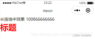
Basic use of the text component
Through the selectable attribute of the text component, realizeLong press the effect of selecting text content:
In the applet, only the text component supports long press to select
<view>
长按选中效果
<text selectable>100866666666</text>
</view>
The nodes attribute of the rich-text component renders the HTML string into a WXML structure
<rich-text nodes="<h1 style='color:red;'>标题</h1>"></rich-text>
renderings
Other common components
① Button component
●The function is richer than the button button in HTML
● Various functions provided by WeChat can be invoked through the open-type attribute (customer service, forwarding, obtaining user authorization, obtaining user information, etc.) ② image ●
Picture
component
● The default width of the image component About 300px, height about 240px
③ navigator
The page navigation component is similar to a link in HTML
The basic use of the button button
pages/list/list.wxml
<!--pages/list/list.wxml-->
<!-- 按钮组件的基本使用 -->
<view>~~~~~~~~~通过type指定按钮类型~~~~~~~~</view>
<button>普通按钮</button>
<button type="primary">主色调按钮</button>
<button type="warn">警告按钮</button>
<view>~~~~~~~~~size="mini"小尺寸按钮~~~~~~~~</view>
<button size="mini">普通按钮</button>
<button type="primary"  size="mini">主色调按钮</button>
<button type="warn" size="mini">警告按钮</button>
<view>~~~~~~~~~plain镂空按钮~~~~~~~~</view>
<button size="mini" plain>普通按钮</button>
<button type="primary"  size="mini" plain>主色调按钮</button>
<button type="warn" size="mini" plain>警告按钮</button>
Renderings:

Basic use of the image component
The mode attribute of the image component The mode attribute of the image component is used to specify the cropping and zooming mode of the image. Commonly used mode attribute values are as follows:
<!--pages/list/list.wxml-->
<!-- image图片组件 -->
<image></image>
<image src="/images/1.jpg" mode="heightFix"></image>
/* pages/list/list.wxss */
image{


  border: 1px solid red;
}
running result:
