Today, we study two simple ways to realize the carousel function.
Table of contents
Layui realizes the carousel map
Binding change event in script
Swiper realizes the carousel map
Layui realizes the carousel map
Code cloud download
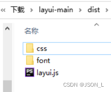
extract static files
After decompressing the file, extract the static resource files in the dist to the project static resource directory.
example
Modify the static resource path in the official website example to the local resource path.
<!DOCTYPE html>
<html lang="en">
<head>
    <meta charset="UTF-8">
    <title>layui实现轮播图</title>
    <link rel="stylesheet" href="./css/layui.css" media="all">
</head>
<body>
    <h1>layui.carousel</h1>
    <div class="layui-carousel" id="test1">
        <div carousel-item>
            <div>条目1</div>
            <div>条目2</div>
            <div>条目3</div>
            <div>条目4</div>
            <div>条目5</div>
        </div>
    </div>
    <!-- 条目中可以是任意内容,如:<img src=""> -->
    <script src="./js/layui.js"></script>
    <script>
        layui.use('carousel', function(){
            var carousel = layui.carousel;
            //建造实例
            carousel.render({
                elem: '#test1'
                ,width: '100%' //设置容器宽度
                ,arrow: 'always' //始终显示箭头
                //,anim: 'updown' //切换动画方式
            });
        });
    </script>
</body>
</html>
Notice
1) The class="layui-carousel" of the outer element is used to identify it as a carousel container.
2) The attribute carousel-item of the inner element is used to identify the item.
Parameter Description
| optional |
illustrate |
type |
Defaults |
| elem |
Point to the container selector, such as: elem: '#id'. Can also be a DOM object |
string/object |
none |
| width |
Set the width of the carousel container, support pixels and percentages |
string |
'600px' |
| height |
Set the height of the carousel container, support pixels and percentages |
string |
'280px' |
| full |
Whether full screen carousel |
boolean |
false |
| anim |
Carousel switching animation mode, optional values are: default (left and right switching) updown (switch up and down) fade (fading and fading switching) |
string |
'default' |
| autoplay |
Whether to switch automatically |
boolean |
true |
| interval |
Automatic switching time interval, unit: ms (milliseconds), not less than 800 |
number |
3000 |
| index |
Initial starting entry index |
number |
0 |
| arrow |
Toggle the default display state of the arrow, the optional values are: hover (hover display) always (always displayed) none (never displayed) |
string |
'hover' |
| indicator |
Indicator position, optional values are: inside (inside the container) outside (outside the container) none (do not display)
|
string |
'inside' |
| trigger |
Trigger event for indicator (for toggle) |
string |
'click' (default click) |
Effect
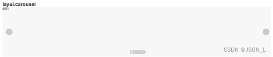
Change to Carousel
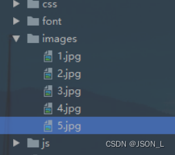
Add image resource files
Set the image resources displayed in the carousel
Carousel column modification
Change the original column div to an img tag to load pictures, so that all pictures can be displayed, and if only img is set inside the div, some images will be displayed.
<div class="layui-carousel" id="test1">
    <div carousel-item>
        <img src="./images/1.jpg" alt="">
        <img src="./images/2.jpg" alt="">
        <img src="./images/3.jpg" alt="">
        <img src="./images/4.jpg" alt="">
        <img src="./images/5.jpg" alt="">
    </div>
</div>
<div class="layui-carousel" id="test1">
    <div carousel-item>
        <div><img src="./images/1.jpg" alt=""></div>
        <div><img src="./images/2.jpg" alt=""></div>
        <div><img src="./images/3.jpg" alt=""></div>
        <div><img src="./images/4.jpg" alt=""></div>
        <div><img src="./images/5.jpg" alt=""></div>
    </div>
</div>
Effect 1

Effect 2

Switch up and down instead
The anim parameter in the script is changed to 'updown'
var carousel = layui.carousel;
// 建造实例
carousel.render({
    elem: '#test1'
    ,width: '60%' //设置容器宽度
    ,arrow: 'always' //始终显示箭头
    ,anim: 'updown' //切换动画方式
});
Effect

toggle event
Add lay-filter= ” test1 ” to the layui-carousel container
Right now:
<div class="layui-carousel" id="test1" lay-filter="test1">
Binding change event in script
// 触发轮播切换事件
carousel.on('change(test1)', function(obj){
    console.log(obj.index); //当前条目的索引
    console.log(obj.prevIndex); //上一个条目的索引
    console.log(obj.item); //当前条目的元素对象
});
Controller view

Here you can set the business that switches the corresponding column to trigger the corresponding event.
Swiper realizes the carousel map
download swiper
Download Swiper - Swiper Chinese Website
download to local
Download the latest to the local environment

load swiper
Place static files
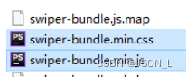
The files that need to be used are swiper-bundle.min.js and swiper-bundle.min.css files.
After decompression, find the swiper-bundle.min.js and swiper-bundle.min.css files, and place them in the project resource directory.
Import static files
Introduce the swiper js and css files in the html page respectively.
<!DOCTYPE html>
<html lang="en">
<head>
    <meta charset="UTF-8">
    <title>Swiper实现轮播图</title>
    <link rel="stylesheet" href="./css/swiper-bundle.min.css">
</head>
<body>
<script src="./js/swiper-bundle.min.js"></script>
</body>
</html>
add html content
The default container of Swiper7 is '.swiper'.
<div class="swiper">
    <div class="swiper-wrapper">
        <div class="swiper-slide">Slide 1</div>
        <div class="swiper-slide">Slide 2</div>
        <div class="swiper-slide">Slide 3</div>
    </div>
    <!-- 分页器 -->
    <div class="swiper-pagination"></div>

    <!-- 导航按钮 -->
    <div class="swiper-button-prev"></div>
    <div class="swiper-button-next"></div>
</div>
<!--导航等组件可以放在Swiper容器之外-->
Set swiper height and width
You need to set the height and width of the swiper container before initializing the swiper, otherwise it cannot be used.
<style>
    .swiper {
        width: 60%;
        height: 300px;
    }
</style>
Initialize Swiper
<script>
    var mySwiper = new Swiper ('.swiper', {
        //direction: 'vertical', // 垂直切换选项
        loop: true, // 循环模式选项

        // 分页器
        pagination: {
            el: '.swiper-pagination',
        },

        // 前进后退按钮
        navigation: {
            nextEl: '.swiper-button-next',
            prevEl: '.swiper-button-prev',
        },
    })
</script>
In this way, the swiper can be used for normal switching, and then if you can modify the parameters through the demonstration to achieve the desired effect.
Change to Carousel
Html content modification
<div class="swiper-wrapper">
<div class="swiper-slide"><img src="../images/1.jpg" alt=""></div>
<div class="swiper-slide"><img src="../images/2.jpg" alt=""></div>
<div class="swiper-slide"><img src="../images/3.jpg" alt=""></div>
<div class="swiper-slide"><img src="../images/4.jpg" alt=""></div>
<div class="swiper-slide"><img src="../images/5.jpg" alt=""></div>
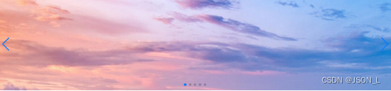
</div>Effect
Set pager click switch
Add parameters in the pager settings in the script
// 分页器
pagination: {
    el: '.swiper-pagination',
    clickable: true,
},
auto switch
Set the autoplay property in the script, and the time interval is 3000 milliseconds
autoplay: {
    delay: 3000,
    disableOnInteraction: false,
},
Summarize
Both Layui and Swiper can implement the carousel function relatively easily. The difference is that swiper can realize more carousel functions, more gorgeous styles, and more examples.