Table of contents
3 Case and Matlab code implementation
3.3 Matlab code implementation
1 Overview
The application of information visualization holds great promise for the power industry, but its potential has yet to be fully exploited by the visualization community. Previous work on power system visualization is limited to depicting raw or processed information on top of geographic layouts. Little effort has been devoted to visualizing the physics of the grid, which ultimately determines the condition and stability of the electricity infrastructure. The development of power systems is still in the stage of data visualization, which mainly represents data in the form of graphics. There is still a lack of visualization technology for mining potential laws and relationships among data. In massive power data, only by reasonably arranging and removing noise can we provide a reliable data source for visualization and provide more valuable strategic services for power system managers. Scientific visualization is a multidisciplinary technology that integrates computer graphics Science, data mining, man-machine interface theory, combined with applied science, provides an intuitive display method for valuable data in the engineering field, and provides means for operators to explore and research. physical phenomenon. In recent years, the application of visualization technology in power system has become more and more extensive, and more and more display methods are provided, and the visual effect is getting better and better, but these cannot meet the high requirements of power system dispatchers. How to make visualization technology more practical is an urgent problem to be solved. This paper proposes several ways to visualize real-world research. Based on the applications that have been deployed in the power system, it analyzes how to improve the practicability of scientific visualization of the power system, and introduces how to use visualization technology for advanced applications in the power system [3].
The utility industry's use of visualization has long been underutilized. AREVA's Energy Management System (EMS) and PowerWorld 's simulators represent two of the most widely used tools to provide visualization support within the industry. However, their main function is mainly to describe the collected or processed information with colors or icons on the basis of geographic layouts such as geographic maps. This presentation-oriented approach to visualization, while popular, fails to take advantage of the analytical advantages that visualization itself naturally acquires.
2 PowerWorld
However, since 2000, many power system control centers have adopted more advanced visualization techniques, especially for wide-area displays. For example, it is now common to use color contours to show changes in voltage magnitude over large areas. Animated arrows can be used to show line flow direction, while dynamically sized pie charts are used to indicate transmission lines and transformers that are approaching or exceeding their limits or out of service. Figure 1 provides an example of the use of these techniques.
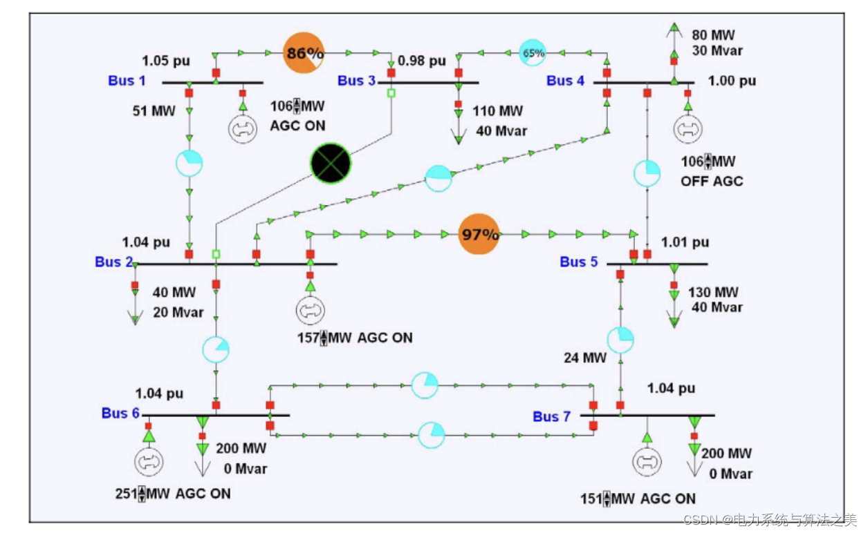
Figure 1 Visualization of small system transport flow
3 Case and Matlab code implementation
3.1 Case
Taking a local power grid as an example to conduct a visual analysis of the model in this paper. The network is shown in Figure 4.1. IEEE30 nodes are modeled, and grid lines, hydroelectric generators, wind turbines, photovoltaics, and loads (including residential areas, factories, and tertiary industries) are also included. The network parameter table is written in the matrix L1 in the appendix; the load data of residential areas, factories, and tertiary industries; the output data of photovoltaic, wind turbine, and hydroelectric generator sets; see the appendix for the correlation between active power and reactive power .

Figure 4.1 Network structure diagram
3. 2 Results display
For the generating power of each unit and various loads, the simulation is carried out on the Matlab2018a platform, and the loads of residents, factories, schools, and the output of wind turbines, photovoltaics, and wind energy are shown in Figure 4.2.1.
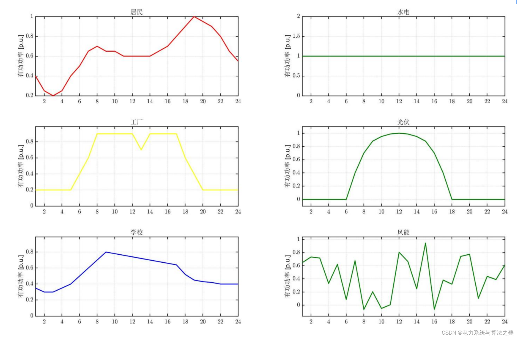
Figure 4.2.1 Various load demands and output of various generator sets
Then take node 7 as the relaxed node to obtain the voltage of each point, as shown in Figure 4.2.2:
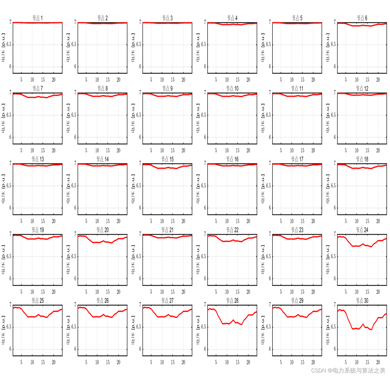
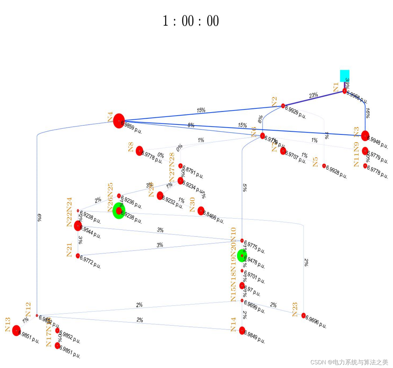
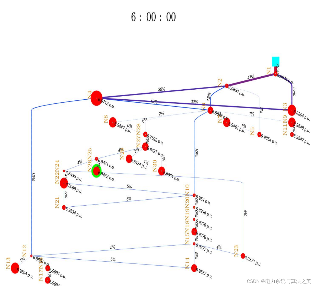
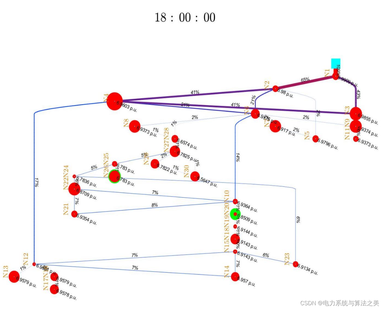
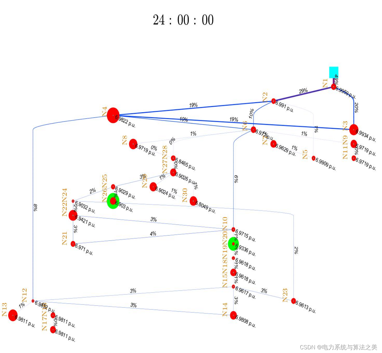
The following is a 24-hour visualization (only a few important moments are selected):