1. Popconfirm bubble confirmation box
Click the element to pop up a bubble-like confirmation box.
2. When to use
When the operation of the target element requires further confirmation from the user, a floating layer prompt will pop up near the target element to ask the user.
Compared with the full-screen centered modal dialog box popped up by confirm, the interactive form is lighter.
The component code comes from: Bubble confirmation box Popconfirm - Ant Design
3. Preparation before local verification
Refer to the article [react project + antd component-demo:hello-world react project + antd component-demo:hello-world_Western Jin’s no1 blog-CSDN blog ], https://ant.design/components/popconfirm-cn Copy the code that needs to be used locally in App2.js to cover all the code in App2.js , start the code, and view the phenomenon and change the code locally.
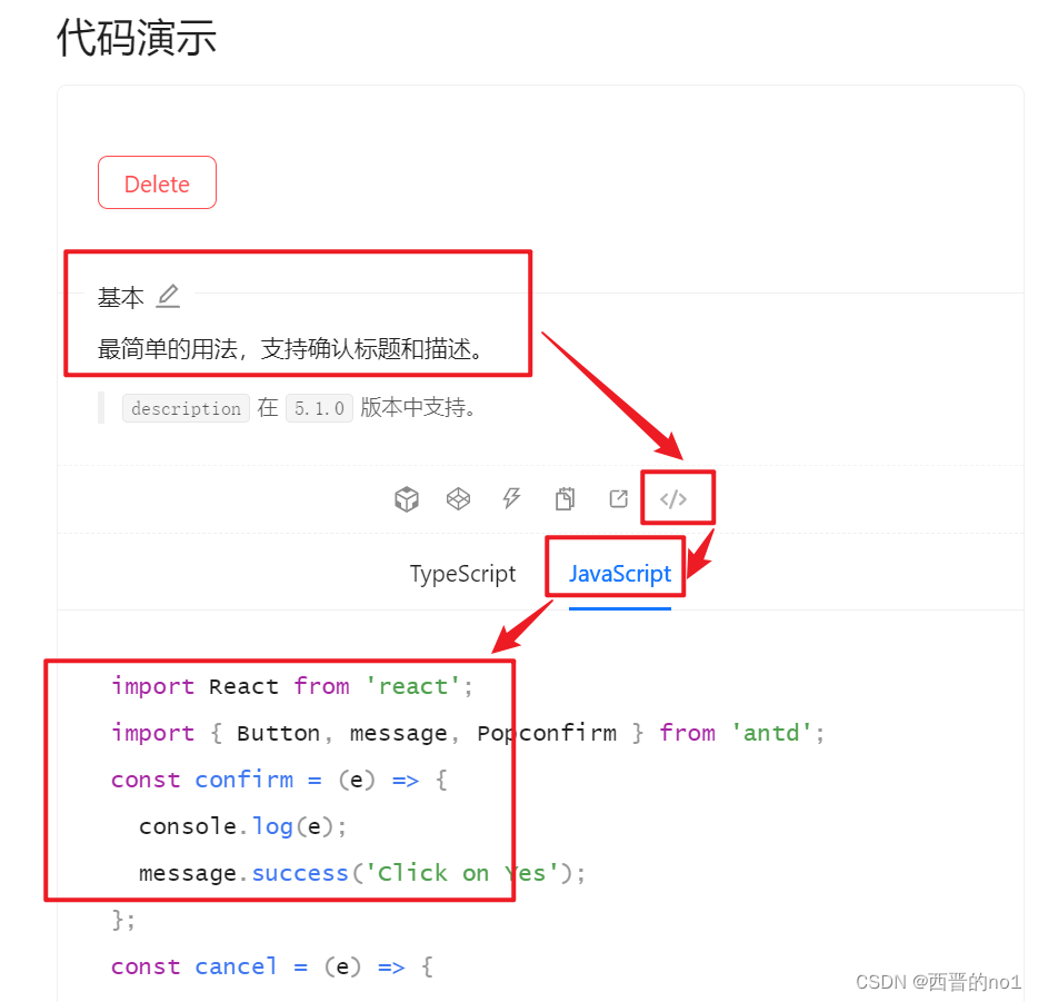
4. Simple usage of local verification Popconfirm .
Copy the code shown in the figure below to understand the simple usage of Popconfirm.
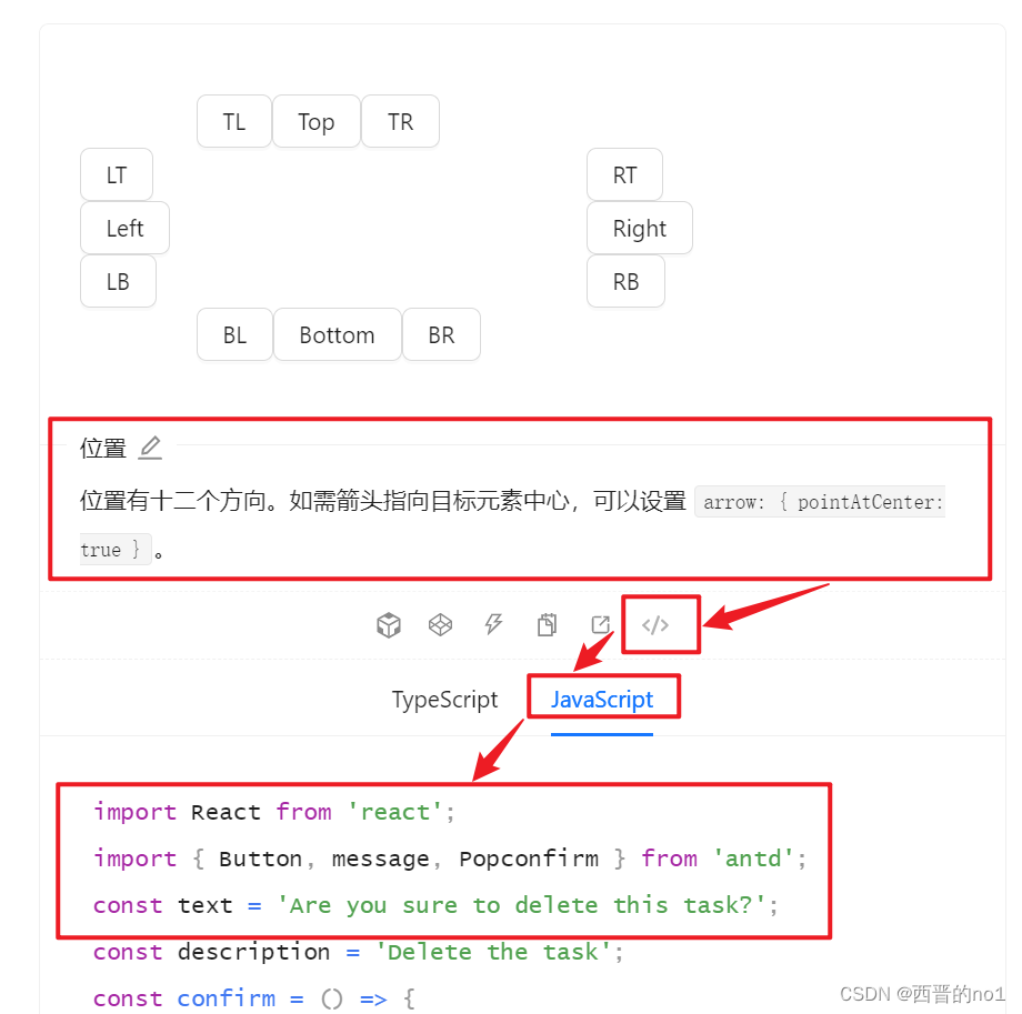
5. View the method of setting the 12 directions of the bubble: placement
Copy the code shown in the figure below to learn how to set the 12 directions of the bubble: placement.
The position of the bubble box, optional top left right bottom topLeft topRight bottomLeft bottomRight leftTop leftBottom rightTop rightBottom.
For specific usage, refer to the source code below.
This article only introduces part of the component Popconfirm. For more information, please refer to the official document: Bubble confirmation box Popconfirm - Ant Design