foreword
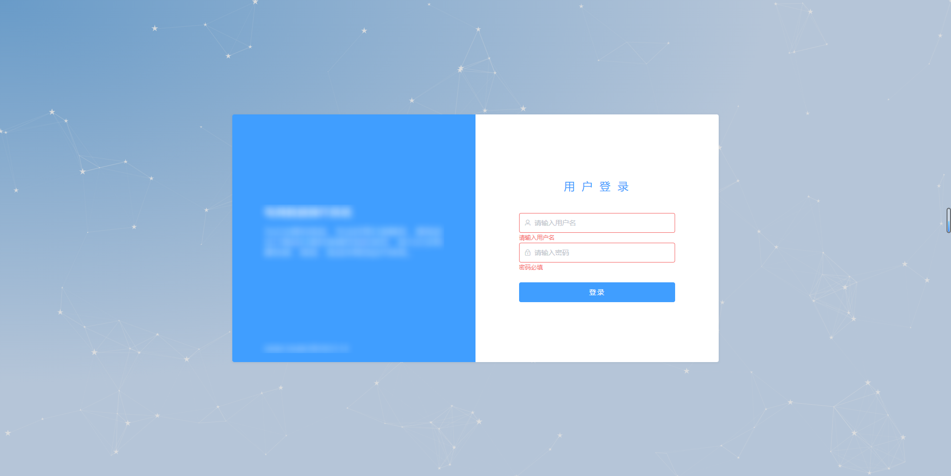
The book continues from the previous chapter. We did not make the sunset afterglow login page. To put it bluntly, it is just a background image. I feel that it needs to be further optimized to make a taller effect. 所图所示,我想要背后的动态粒子效果, let’s get started, based on the old code: vue2 and elementUI create a sunset afterglow login page and slider verification
import plugin
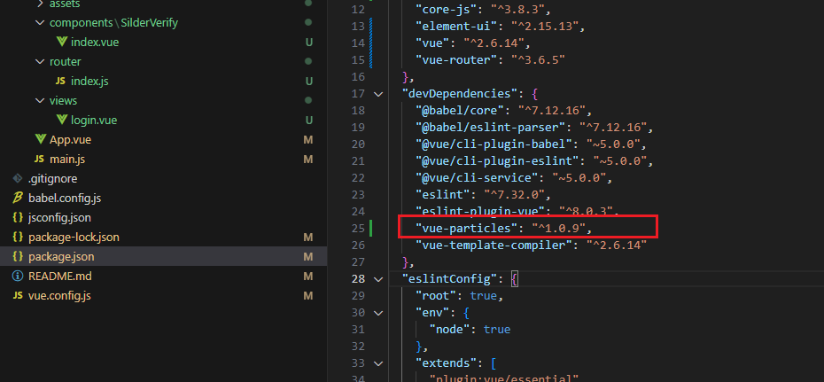
npm install vue-particles --save-dev
After the import is successful, there will be one more line
Change setting
import Vue from 'vue'
import router from './router'
import ElementUI from 'element-ui';
import 'element-ui/lib/theme-chalk/index.css';

import App from './App.vue'

// 动态粒子特效
import VueParticles from 'vue-particles'
Vue.use(VueParticles)

Vue.use(ElementUI);
Vue.config.productionTip = false

new Vue({


  router,
  render: h => h(App),
}).$mount('#app')
modify login page
<template>
  <div>
    <div>
      <el-form>
       ......
      </el-form>
    </div>

    <div class="particles">
      <vue-particles
        color="#dedede"
        shapeType="star"
        linesColor="#dedede"
        hoverMode="grab"
        clickMode="push"
        style="height: 100%"
      ></vue-particles>
    </div>
  </div>
</template>
To delete the previous background style first, and then write a particle, it can be achieved
.particles {


  position: absolute;
  top: 0;
  left: 0;
  height: 100vh;
  width: 100%;
  z-index: -1;
  background: radial-gradient(ellipse at top left, rgba(105, 155, 200, 1) 0%,rgba(181, 197, 216, 1) 57%);
}
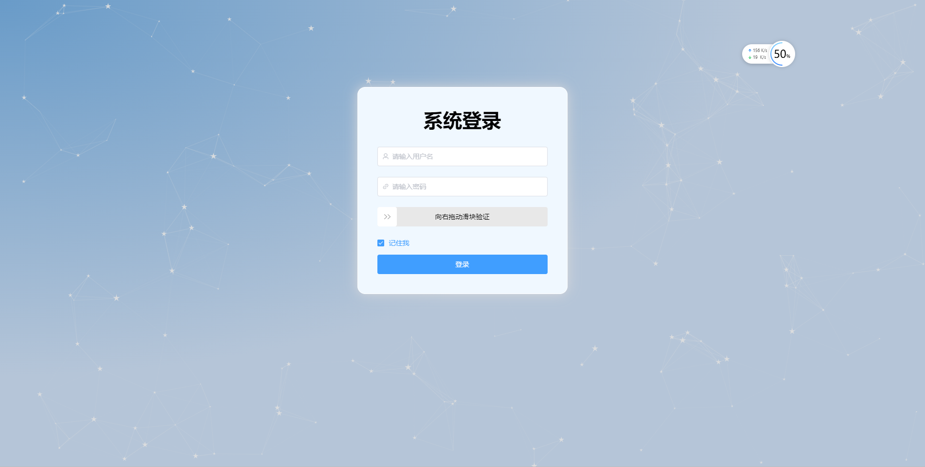
Effect preview
It seems that the effect is not bad. This kind of dynamic particles makes the overall quality of the login page rise exponentially!
Old demo, download link: https://download.csdn.net/download/QQ727338622/87789070
Attachment properties
- color: String type. Default '#dedede'. Particle color.
- particleOpacity: Number type. The default is 0.7. Particle transparency.
- particlesNumber: Number type. The default is 80. number of particles.
- shapeType: String type. Defaults to 'circle'. Available particle appearance types are: "circle", "edge", "triangle", "polygon", "star".
- particleSize: Number type. The default is 80. individual particle size.
- linesColor: String type. Default '#dedede'. Line color.
- linesWidth: Number type. The default is 1. line width.
- lineLinked: Boolean type. The default is true. Is the cable available.
- lineOpacity: Number type. The default is 0.4. Line transparency.
- linesDistance: Number type. The default is 150. line distance.
- moveSpeed: Number type. Default 3. Particle speed.
- hoverEffect: Boolean type. The default is true. Whether there is a hover effect.
- hoverMode: String type. The default is true. Available hover modes are: "grab", "repulse", "bubble".
- clickEffect: Boolean type. The default is true. Whether there is a click effect.
- clickMode: String type. The default is true. Available click modes are: "push", "remove", "repulse", "bubble".