Under normal circumstances, to make the height of the picture change with the width, it only needs to not give the picture height, just set the height, but not in uniapp, this is a headache
<template>
	<div class="banner">
		<center>//center标签,使内容居中
			<image src="/static/bg.jpg" alt="">
		</center>
	</div>
</template>
<style>
	.banner image {
		width: 95vw;
		margin-top: 3vh;
	}
</style>
In the code, I give the picture width 95% of the device width, and the height is not set. Normally, the height of the picture will change with the width adaptation, but uniapp is not
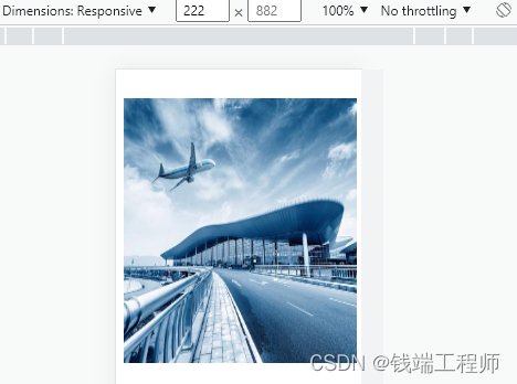

It can be seen that the height of the picture is fixed and has been obviously deformed. Then right-click the picture and check to find this. It should be the default height set for the picture when uniapp is compiled.

Just change the code to the following
<template>
	<div class="banner">
		<center>//center标签,使内容居中
			<image src="/static/bg.jpg" alt="">
		</center>
	</div>
</template>
<style>
	//.banner image {
	//	width: 95vw;
	//	margin-top: 3vh;
	//}
	.banner {
		margin-top: 3vw;
		width: 100%;
		height: 0;
		padding-bottom: 70%;
		/*根据图片宽高比计算出的高度占比*/
		position: relative;
		overflow: hidden;
		/* 防止单独设置 paddingBottom 值的情况下,图片超出容器造成的影响 */
	}

	.banner image {
		position: absolute;
		left: 0;
		/*防止图片超出容器影响布局*/
		width: 100%;
		height: 100%;
		object-fit: contain;
		/*根据图片本身宽高比自适应*/
	}
</style>
Then the picture will not be deformed, and then fine-tune it according to the desired style.

