foreword
Low-code development platform (LCDP) is a low-code or no-code way to complete the development and launch of an application through rapid configuration. Visual low-code is a visual DSL. Its advantage is more of source visualization. Relatively, its limitations also come from visualization. Complex business logic may be more complicated with low-code. Low-code should be a simplification and abstraction of problems in a specific field. It doesn't make much sense to simply convert the original coding work into a GUI mode.
background
With the deepening of the cooperation between JD.com’s WeChat domain business and Tencent, as the carrier of traffic, the demand for mini-programs is increasing. Since 2017, c-1, c-2, c-3 and other departments have their own business mini-programs. So far, there are tens of thousands of WeChat mini-programs in the group. Whether so many mini-programs have commonality and can empower each other? The answer is yes. Based on various considerations, we have started research and planning on the construction of mini-programs
architecture design
1. Think
The essence of construction is to improve efficiency, so it is better to get started quickly with low learning cost, perpendicular to a certain business line, or general enough to meet any business scenario, but it is better to have a high learning cost
Too general: high access cost, high learning cost, high development cost
Too vertical: high access efficiency, low learning cost, and poor scalability
2. Function
1. Quickly generate applications with zero code or low code
2. Provide a visual interface for development
3. Realize project construction through drag and drop + configuration
3. Layered architecture + iOC architecture
Layered, the system is divided into several horizontal layers, each layer has a clear role and division of labor, does not need to know the details of other layers, and communicates between layers through interfaces & protocols
Simply put, iOC is to decompose a complex system into objects that cooperate with each other. After these object classes are encapsulated, the internal implementation is transparent to the outside, thereby reducing the complexity of problem solving, and can be reused and expanded flexibly. The point of view put forward by the IOC theory is generally as follows: by means of a "third party" to achieve decoupling between objects with dependencies
4. Process arrangement
The ideal process orchestration nodes should be more abstract and cohesive business nodes to express the flow of business processes. However, the design and development of these nodes is actually a very challenging thing.
5. Convention is greater than configuration
The front-end is downstream in the entire R&D process. If there is no unified specification for the upstream requirements description, UI design, and back-end interface protocol, a lot of work will be done due to various compatibility issues caused by inconsistent specifications. There is no reuse and abstraction at all. In order to simplify the construction process, reduce construction costs, and achieve out-of-the-box effects, requirements specifications, design specifications, component specifications, and interface specifications are essential. In the future, the efficiency and development of the entire front-end will be more advanced.
6. The choice of building requirements
What we need to do to build a platform is subtraction. We need to think about what not to do. The platform itself does not have to support all requirements 100%. In that case, we are equivalent to converting code into GUI. Such a platform is worthless, so it is better to develop code directly. What we need to solve is 80% of common business scenarios, so we have two ways to support the remaining 20%
1. Code output, the built product is delivered with source code for secondary development
2. Business components, for the complex interaction or data processing of component classes, we can combine the development of business components with the construction platform to complete the construction of the entire requirement
Platform Introduction
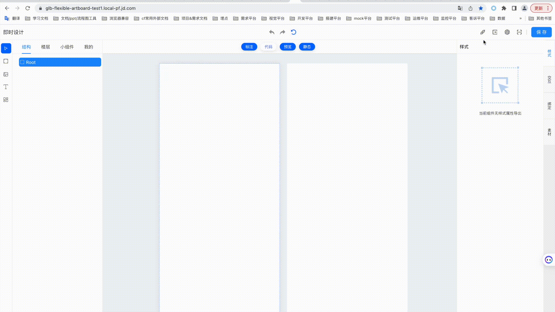
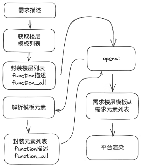
The real-time design platform is a development platform for building c-end floors in real time. It supports Ui2Code by importing the url of the relay design draft, and completes the front-end visual construction on this basis. At the same time, it supports the completion of one-sentence requirements through ChatGPT . The built floors are automatically synchronized with the ihub floor market, and provided foruse on construction platforms such as Babel Tower and Columbus .
1. Function
Instant design provides canvas content type (block, image, text, list) addition, deletion, level adjustment, copy, etc., style configuration, data interface configuration, state management configuration, content and data binding, click interaction and exposure interaction, Relay design draft import and conversion into canvas content with styles, instant preview of canvas content, QR code applet preview of canvas content, code viewing and support for secondary editing, ChatGPT natural language dialogue operation page function adjustment, etc.
The page structure is mainly composed of upper and lower structures, which are divided into the top menu area and the main body area. The theme area is a four-column structure, which are the "Selection and Drawing Tools" area, the "Structure, Floor, Widgets, My" horizontal tab tab area, the "Canvas and Preview" area, and the "Element Style, Interaction, Binding Function" vertical tab tab area.
2. Top menu area
The menu distinguishes left, center and right layouts
• On the left is the page title, ie "Instant Design"
• In the middle is the canvas operation button area
• The right side is the canvas function entry button area

page title area
The page title reads "Instant Design"
Operation button area
Action buttons include the following:
•Back: Back up to the previous step by selecting, adding, editing, deleting and other operations on the page, up to 20 steps back;
• Redo: Undo the redo after the rollback operation is supported;
• Empty: Support to clear the entire canvas content, that is, restore to the new canvas state;
Function entry button area
Contains the function entry buttons of "Data Source", "Relay Import", and "Preview".
• Data source: Click to display a page-level pop-up window, which supports functions such as configuring data sources and status management;
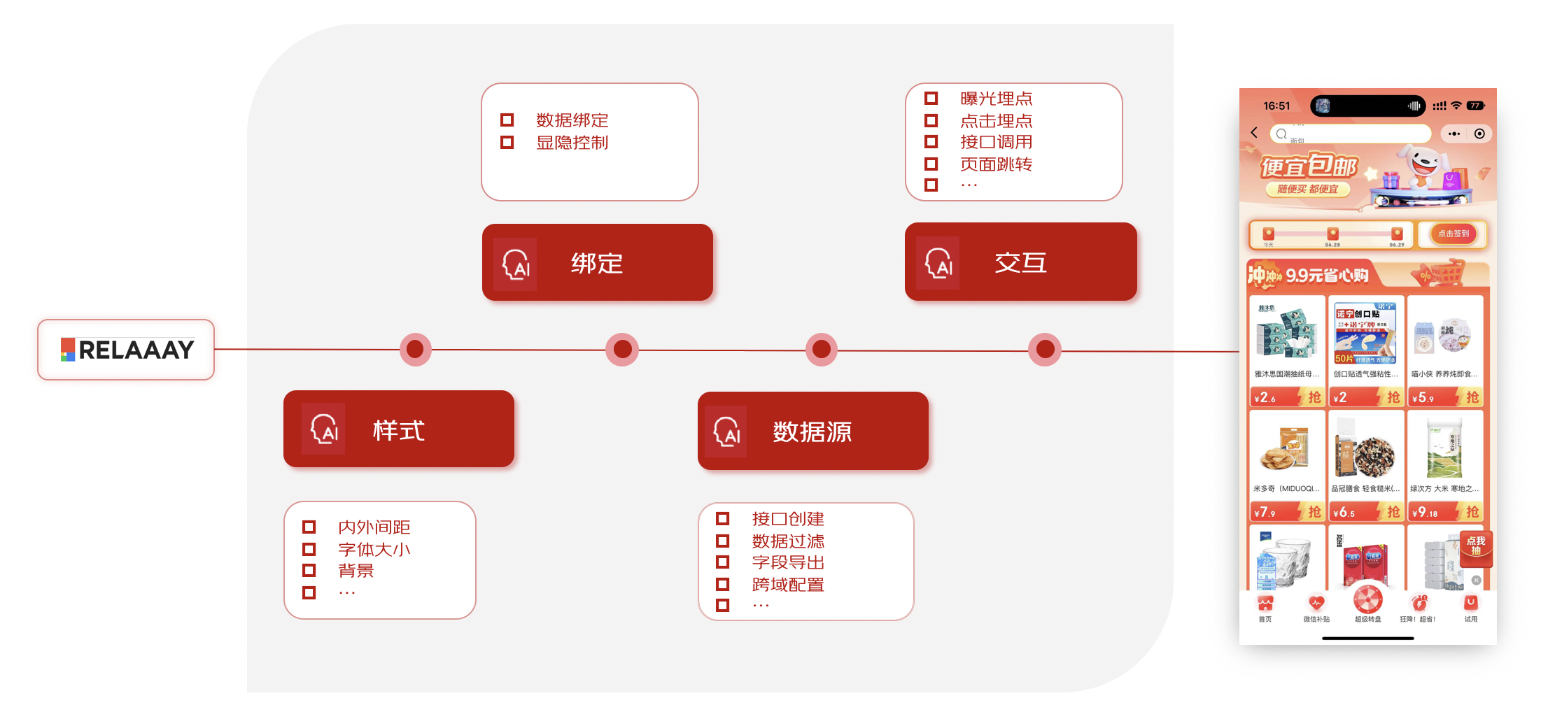
• RelayImport: Click to display a page-level pop-up window, which supports inputting Relaythe link of the design draft. By clicking the confirm button, the specified design draft will be quickly imported into the current canvas, including the position, style, etc.;
• Preview: click to display a page-level pop-up window, displaying the preview QR code, and scan the QR code through WeChat on the mobile phone to preview the current canvas content in the preview applet;
•Save: Click to pop up a page-level pop-up window, which includes name, category, description information, upload preview image or click to generate preview image, publish to private or market, online environment synchronization, etc. By clicking submit, the current canvas will be saved to the (public) floor or "My" personal, which is convenient for opening or editing next time
data source
The content of the data source page-level pop-up window includes two parts: data request and status management.
The data request contains three columns: request list, request information configuration, and response information configuration.
• Request list, including upper and lower groups such as direct outbound interface and interactive interface, the list supports functions such as editing interface name, copying interface, deleting interface, creating new interface, refreshing interface data, etc.;
•Request information, including request link, request precondition configuration, interface type option (whether it is a cross-domain interface, that is, non-xxx.jd.com domain name ) , attribute parameter (Query, Header, Body, etc.) information configuration, among which attribute parameters support adding strings, numbers, Boolean values, arrays, object types of data, support editing, selecting values from state management, selecting values from page parameters, and exporting to material classification, etc.
•Response information, including display of returned content of Body data, display of Header information, and data processing configuration. Currently, data processing only supports processing and filtering of "data source array key data". When the sub-attribute key supports input of "_index", it means to filter the array index. When the sub-attribute key supports input of "_length", the operator selects "-%", and the comparison value is filled with numbers, which means that the length of the filtered array is taken as an integer multiple of the comparison value;
State management supports the configuration of global data, supports data of string, number, boolean value, array, and object type, which is convenient for data interface, binding, and interactive use, and supports export to style and material areas.

3. The drawing tool area (canvas) on the left
This area is the type of drawing tools supported by the canvas area, including five types: "select", "block", "image", "text", and "list".
• Select (select), after clicking to select, you can click in the canvas area to select the canvas element, drag and drop the content position and size;
• Rectangle (block), after clicking to select, you can click and move in the canvas area to pull out a rectangle (block) element with width, height, size and position;
• Image (image), after clicking to select, you can click and move in the canvas area to pull out an image (image) element with width, height, size and position;
• Text (text), after clicking to select, you can pull out a text (text) element with width, height, size and position by clicking and moving in the canvas area;
• List (list), after clicking to select, you can click and move in the canvas area to pull out a list (list) element with width, height, size and position;
4. Tabs on the left
The current area contains 4 horizontal tabbed pages, namely "Structure", "Floor", "Widgets", and "My".
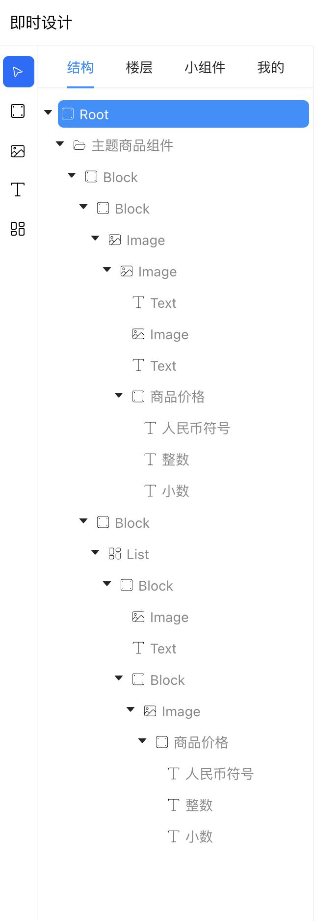
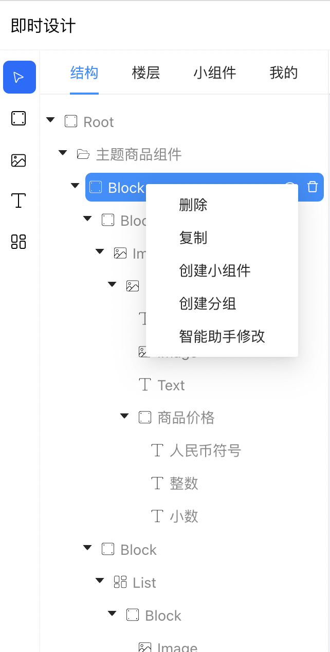
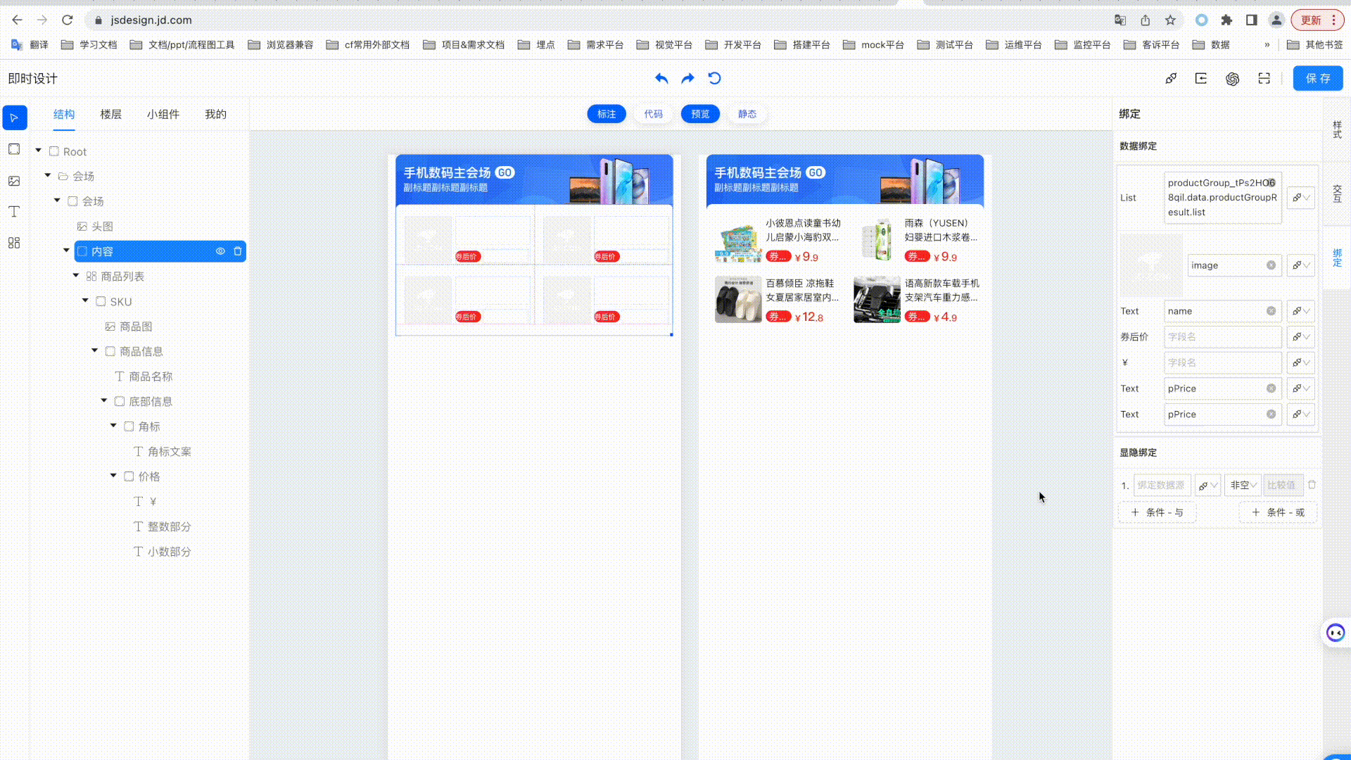
structure (canvas)
This structure is a hierarchical list of the tree structure corresponding to the elements in the canvas area.
•In the default new state, there is only one named Rootroot node. By Relayimporting or drawing elements in the canvas area, nodes will be added to the current tree structure, and the hierarchical relationship between nodes is the inclusion relationship of nodes;
•The content of the node line contains the collapse/expand icon, type icon, type name or edit name, show/hide (eye icon) button, delete (trash can icon) button
• Node types include root (Root), rectangle (block), picture (image), text (text), list (list), component (component), etc.
•The default name of the node is the capitalized word of the type, namely Root, Block, Image, Text, List, Component, etc.
• Non- Rootnode supports double click to edit name
• For non- Rootnodes, after clicking to select, a right-aligned display (eye icon) button and delete (trash can icon) button will be displayed on the right side of the name. Click the display button to switch the display and hiding status of the current element and its sub-elements. Click the delete button to delete the current node in the tree structure (support clicking the undo button in the menu area to restore)
• RootAfter non-node support is selected, drag and drop the position in the tree structure to adjust the level of the node in the tree structure
• There is a folded/expanded black triangle icon on the left side of the non-leaf nodes, click on the image to switch the collapsed or expanded state of the node subset
• For non- Rootnodes, right-click a node to pop up an operation list, which includes functions such as delete, copy, create widget, create group, cancel group, etc.
•By right-clicking the node copy function, a copied node is automatically added to the sibling node of the copied node, only the name is appended with "-copy", and the other contents are the same
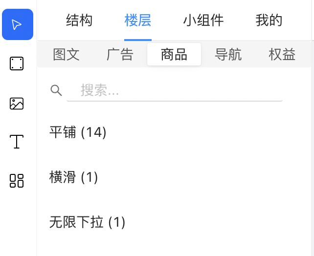
Floors (published public floors)
The floor is to display the public floor components that have been saved and released to the market, and are displayed according to the established first-level classification (graphics, advertisement, product, navigation, rights and interests) and second-level classification (tile, horizontal slide, carousel, nested, floating layer, infinite drop-down, ceiling, bottom, sidebar, uncategorized).
Widgets (published public widgets)
Widgets are public widgets that have been saved and released to the market, and are displayed separately according to the established first-level classification (graphics, advertisements, products, navigation, benefits), second-level classification of pictures (graphics, buttons, mask), second-level classification of products (product card, product image, product name, product price, product label, product button), and second-level classification of benefits (coupons, Jingdou, red envelopes). Preview image and name.
mine
The "My" tab page is to display the saved floors and widget lists of the currently logged-in user.
5. Central canvas area
This area is divided into upper and lower areas: top function button area and canvas area.
The top function button area is a horizontally centered button area, including:
• Annotation: Click to switch to enable or disable the element auxiliary dotted line in the canvas editing area, which is enabled by default;
•Code: Click to switch the pop-up drawer area from the bottom of the page to display the WeChat applet code directory and file content generated by the current canvas content, which is closed by default;
•Preview: Enabled by default. When enabled, the canvas area displays the editing area and preview area of the same size as the left and right structures; when you click to switch off, the preview area is not displayed, and the canvas editing area is enlarged by 2 times;
• Static: Enabled by default. When enabled, the preview area displays static content data, that is, the data content displayed in the canvas editing area; when disabled, the preview area displays bound data for some content elements bound to dynamic data, such as data source interface data and state management data;
The canvas distinguishes the editing area and preview area of the left and right structures.
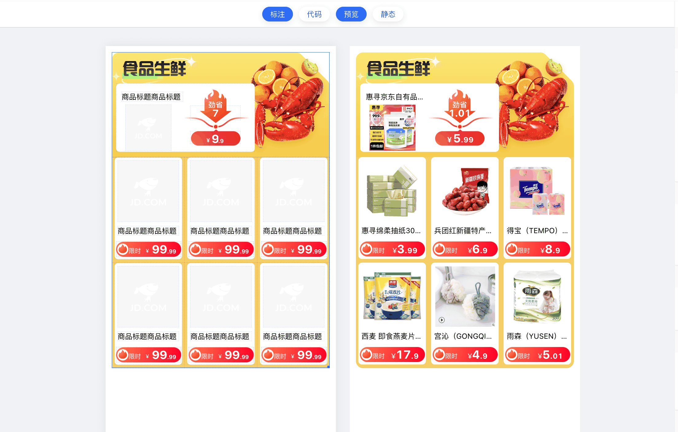
Canvas editing area
The current area is Relaythe content area drawn in the canvas area by importing or manually selecting the canvas tool.
In this area, the following operations can be performed
•By selecting the drawing tool-rectangle/picture/text/list, click and move in the canvas area without releasing it, and pull out an element with width, height, size and position;
•By selecting the drawing tool - select (select), click the existing content element in the canvas area, switch the selected element/drag and drop the position of the absolute positioning element/click the lower right corner of the element to support zooming in and out of the element, and right-click the element to support delete/copy/create widget/create group/ungroup function;
• Click to select an element. If the element is an absolutely positioned element, you can adjust the position of the element in the canvas by long-pressing and dragging;
•Right click on the canvas element to pop up a custom menu list, including delete, copy, create widget, create group and ungroup button functions;
canvas preview area
The current area is the display area where the content of the canvas area is simulated on the PC side for actual rendering, and is used for instant preview and generation of preview images.
Features:
• When the preview function is turned on, the editing area and the preview area are of the same size and arranged in a left-right layout; when it is turned off, the preview area is not displayed, and the canvas editing area is magnified by 2 times;
• When the static function is turned on, the preview area displays static content data, that is, the data content displayed in the canvas editing area; when it is turned off, the preview area displays bound data, such as data source interface data and state management data, for some content elements bound to dynamic data;
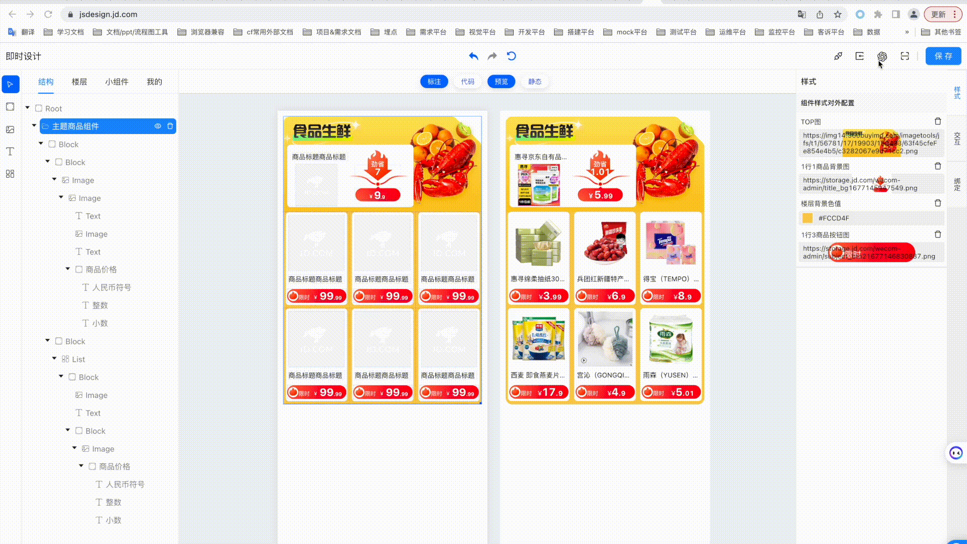
Sixth, the right functional area
The functional area includes the style configuration area, interaction configuration area, binding configuration area, and material configuration area, which are displayed in the form of vertical tabs on the right.
• RootWhen a node is selected, all four areas of the functional area are displayed, and the content is the configuration of the export item of the related configuration;
• RootWhen a non-node is selected, only the display configuration area, interactive configuration area, and binding configuration area;
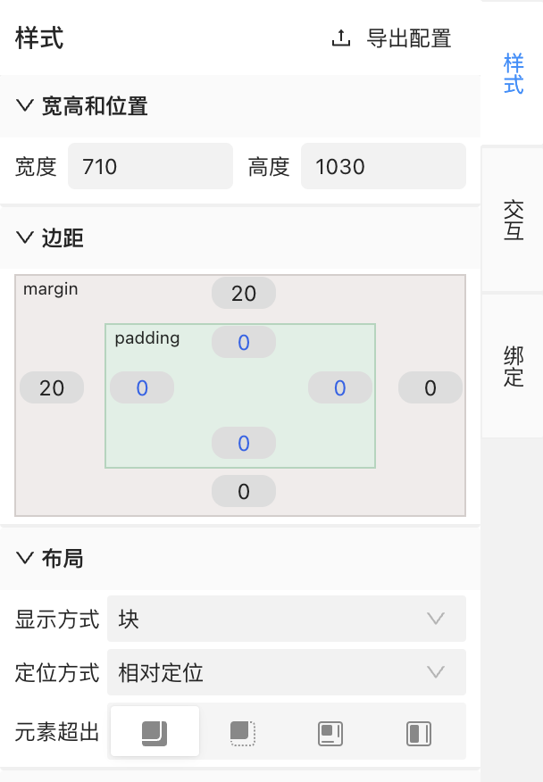
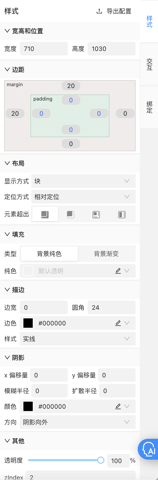
Style (configuration area)
The style configuration area displays the configuration list of the main style information of the selected node element and the export configuration button.
The export configuration button is located on the right side of the title "Style". After clicking, the drawer will display a list of all styles without grouping. It supports checking and editing aliases. After checking, the checked export configuration items will be displayed in the style area when selecting or component nodes, so as to quickly modify the value of the specified Rootconfiguration Component;
Among them, the content of the style list is displayed in practical groups, including:
• Width, height and position: width (width), height (height), (absolute positioning) distance from the top (top), (absolute positioning) distance from the left (left);
•边距:padding-left、padding-right、padding-top、padding-bottom、margin-left、margin-right、margin-top、margin-bottom;
• Layout: display method (display), positioning method (position), element overflow (overflow)
• Picture: picture address (background-image), picture size (background-size), picture position X (background-position-x), picture position Y (background-position-y), picture repetition (background-position), picture height adaptive
• Font: font (font-family), font weight (font-weight), font color (color), font size (font-size), font line height (line-height), font alignment (text-align), content (text), font decoration line (text-decoration), font wrapping rule (white-space), font display line number (webkit-line-clamp)
•Fill: background-color, background gradient (background)
•Stroke: border-width, border-radius, border-color, border-style
• Shadow: shadow x offset (shadowOffsetX), shadow y offset (shadowOffsetY), shadow blur radius (shadowBlurRadius), shadow spread radius (shadowSpreadRadius), shadow color (shadowColor), shadow direction (shadowInset)
• Miscellaneous: opacity, z-index, custom
Interaction (configuration area)
The interaction area displays the click interaction/exposure interaction function and the export configuration button of the selected node element.
The export configuration button is located on the right side of the title "Interaction". After clicking, the drawer will display all jump lists without grouping. It supports checking and editing aliases. After checking, the checked export configuration items will be displayed in the interactive area when selecting or component nodes, so as to quickly modify the value of the specified Rootconfiguration Component;
Among them, click interaction/exposure interaction is laid out in the form of horizontal tabs. Both click interaction and exposure interaction support adding events. Events that can be added together include preconditions, jumps, interface calls, state management, toast, and re-rendering. Events that can be added only for click interactions include click points, and events that can be added only for exposure interactions include exposure points.
•Click buried point/exposure buried point: support configuration of event id (eventId) and event parameters (eventParams);
•Precondition: It is the condition configuration of other types of events. When it passes, continue to execute the next event, otherwise skip the next event; the configuration content includes the return result of state management/data source/page parameter data value comparison;
• Jump: supports jumping to h5/native pages/native pages of other applets, and supports configuration of applet appId, jump path, and path parameters;
• Interface call: By selecting the data interface that has been built by the data source, it supports modifying the parameters under the interface, and supports setting the state management/data source data value according to the returned interface data after the interface call is successful;
• Status management: configure and update data values in status management;
• toast: configure prompt information and display time;
• Re-rendering: Configure whether to trigger floor re-rendering in the current event link;

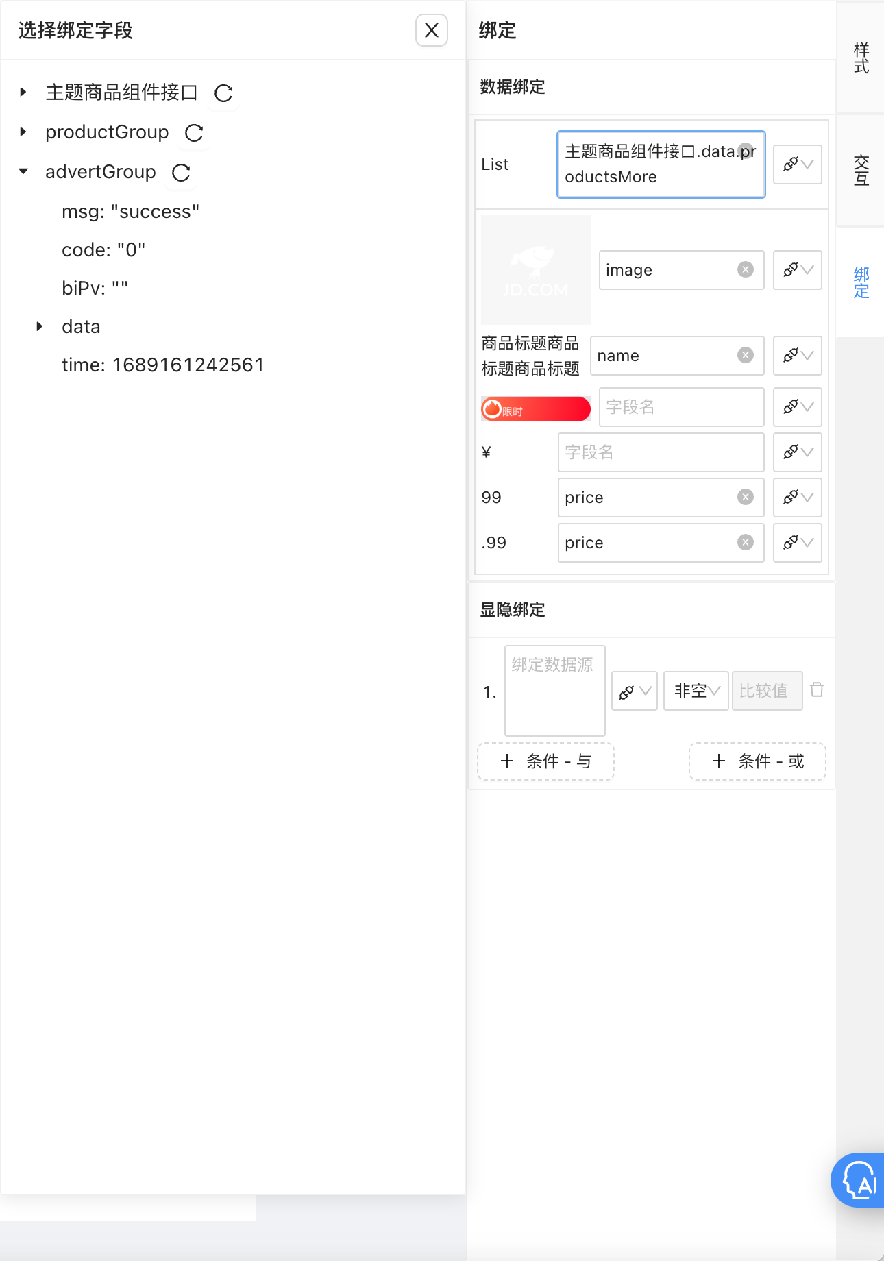
Binding (configuration area)
The content of the binding area includes data binding, data processing and explicit and implicit binding.
• Data binding: when text (text) and picture (image) are selected, it supports binding data source interface fields and fields in state management;
• Data processing: when text is selected, it supports special case processing after data binding, such as split display of the price field content, check the integer, the bound data will only display the integer part, check the decimal, the bound data will only display the decimal part, check to add 2 digits of 0, and the bound data will display the decimal part with 0;
• Visible and hidden binding: By adding conditions, selecting data source/status management/page parameters, when the floor is used and running, compare the selected value with the filled comparison value, and obtain the control result of displaying or hiding the node element;
Materials (configuration area)
The material area is displayed when a node is selected Rootand can be clicked to expand. Its content is displayed in the data source or state management configuration. If the configuration item of the export item is checked, it will be displayed separately in this area for quick modification of some high-frequency change values.
7. Ui2Code

8. ChatGPT
Q&A Assistant
create floor
Change setting

The 8 most in-demand programming languages in 2023: PHP strong, C/C++ demand slow Programmer's Notes CherryTree 1.0.0.0 released CentOS project declared "open to everyone" MySQL 8.1 and MySQL 8.0.34 officially released GPT-4 getting more and more stupid? The accuracy rate dropped from 97.6% to 2.4%. Microsoft: Intensify efforts to use Rust Meta in Windows 11 Zoom in: release the open source large language model Llama 2, which is free for commercial use. The father of C# and TypeScript announced the latest open source project: TypeChat does not want to move bricks, but also wants to fulfill the requirements? Maybe this 5k star GitHub open source project can help - MetaGPT Wireshark's 25th anniversary, the most powerful open source network packet analyzerAuthor: Jingdong Retail Zhang Zhipeng
Source: JD Cloud Developer Community