Target:
Different screens will appear on some models, so the adaptation scheme is used to adapt the mobile terminal project, and the plug-in method is introduced here as an example.
Use process:
-
Downloading two plug-in dependencies
cnpm/ npm / yarn install [email protected] --save-devrequires a specified version, otherwise errors may occur! ! !
cnpm/ npm / yarn install lib-flexible --save -
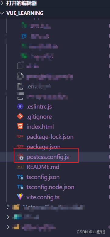
Create a postcss.config.js file in the root directory, and write the following code, just copy it directly.
module.exports = {
plugins: {
'postcss-pxtorem': {
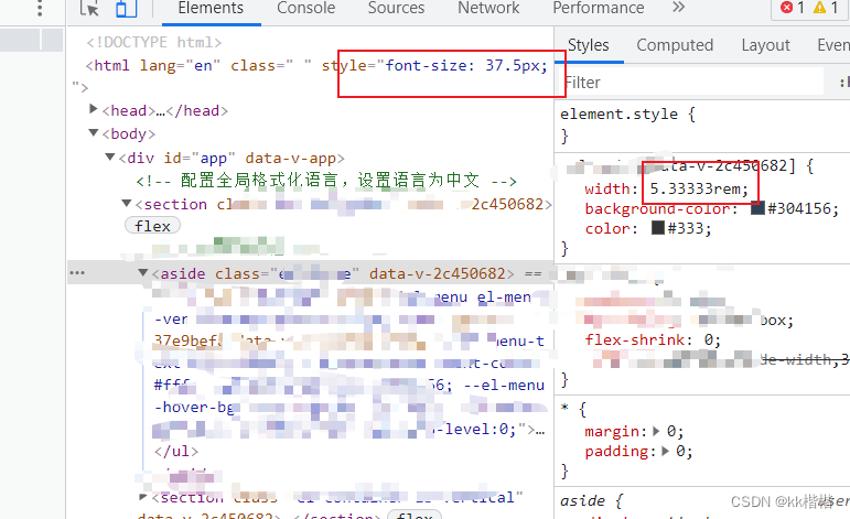
rootValue: 37.5,
// 根字体大小是 37.5
propList: ['*'],
selectorBlackList: ['.no__rem']
// 过滤掉.no__rem-开头的class,不进行rem转换处理
}
}
}
- Create a new rem.js file in the tool class file
// 设置基础根文件大小
let baseSize = 37.5
// rem 函数
function setRem () {


  // 设计稿一般都是以375的宽度
  const scale = document.documentElement.clientWidth / 375
  // 设置页面根节点字体大小(“Math.min(scale, 2)” 指最高放大比例为2,可根据实际业务需求调整)
  document.documentElement.style.fontSize = baseSize * Math.min(scale, 2) + 'px'
}
// 调用方法
setRem()

// 监听窗口在变化时重新设置跟文件大小
window.onresize = function () {


  setRem()
}
- Introduce the rem, js method in the main.ts file
import './utils/rem'
- You're done! Automatically convert px units to rem units.