1.pages.json
{
	"pages": [
		{
			"path": "pages/index/index"
		},
		{
			"path":"pages/news/news",
			"style":{

			}
		},
		{
			"path": "pages/cart/cart"
		},
		{
			"path": "pages/member/member"
		}
	],
	"globalStyle": {
		"navigationBarTextStyle": "white",
		"navigationBarTitleText": "高格商城",
		"navigationBarBackgroundColor": "#CD0000",
		"backgroundColor": "#DBDBDB"
	},
	"tabBar":{
		"color":"#CCCCCC",
		"selectedColor":"#CD0000",
		"list":[
			{
				"text":"首页",
				"pagePath":"pages/index/index"
				// "iconPath":"",
				// "selectedIconPath":""
			},
			{
				"text":"资讯",
				"pagePath":"pages/news/news"
			},
			{
				"text":"购物车",
				"pagePath":"pages/cart/cart"
			},
			{
				"text":"会员",
				"pagePath":"pages/member/member"
			}
		]
	}
}
2. Carousel
Circular: Whether to use the connection sliding, that is, to return to the beginning after playing to the end
indicator-dots: Whether to display panel indicator dots
autoplay: whether to switch automatically
interval: automatic switching interval
duration: sliding animation duration
<template>
	<view >
		<!-- banner轮播图 -->
		<view class="page-section-spacing">
			<swiper class="swiper" circular="true" indicator-dots="true" autoplay="true" interval="3500" duration="600">
				<swiper-item class="swiper-list" v-for="(item, index) in bannerList" :key="index">
					<view class="swiper-item uni-bg-red">
						<image class="swiper-img" :src="item.imageUrl" mode=""></image>
					</view>
				</swiper-item>
			</swiper>
		</view>
	</view>
</template>

<script>
	export default {
		data() {
			return {
				// tip:"点击「添加小程序」,下次访问更便捷",
				bannerList: [
					{
						imageUrl: 'https://cdn.zhoukaiwen.com/zjx_banner.png',
					},
					{
						imageUrl: 'https://cdn.zhoukaiwen.com/zjx_banner3.png',
					},
					{
						imageUrl: 'https://cdn.zhoukaiwen.com/zjx_banner1.png',
					},
					{
						imageUrl: 'https://cdn.zhoukaiwen.com/zjx_banner2.png',
					}
				],
			}
		},
		onLoad() {

		},
		methods: {

		}
	}
</script>

<style lang="scss">
	.swiper-item {
		width: 100%;
		height: 100%;
		image {
			width: 100%;
			height: 100%;
		}
	}
</style>
3. Navigation
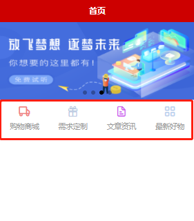
<template>
	<view >
	    <!-- 导航 -->
		<view>
			<view class="nav">
				<view class="nav-item">
					<view>
						<u-icon name="car" color="#F08080" size="48"></u-icon>
					</view>
					<text>购物商城</text>
				</view>
				<view class="nav-item">
					<view>
						<u-icon name="gift" color="#B0C4DE" size="48"></u-icon>
					</view>
					<text>需求定制</text>
				</view>
				<view class="nav-item">
					<view>
						<u-icon name="file-text" color="#D15FEE" size="48"></u-icon>
					</view>
					<text>文章资讯</text>
				</view>
				<view class="nav-item">
					<view>
						<u-icon name="grid" color="#BCD2EE" size="48"></u-icon>
					</view>
					<text>最新好物</text>
				</view>
			</view>
		</view>
	</view>
</template>

<script>
	export default {

	}
</script>

<style lang="scss">
	.nav {
		display: flex;
		width: 100%;
		text-align: center;
		height: 50rpx;
		line-height:50rpx;
		color: #999999;
		margin: 10rpx auto;
		.nav-item {
			width: 25%;

		}
	}
</style>
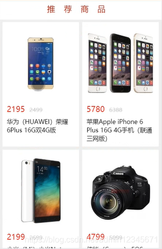
4. Commodity list structure

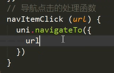
5. Click on the navigation to jump to a different page
data:

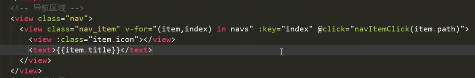
methods:
6. Encapsulate the product list component (reuse)
Subassembly:

Parent component pass value:


7. Implement pull-up to load more and pull-down to refresh

(1) onReachBottom pull up to load more


(2) enablePullRefresh pull-down refresh (configure in pages.json first)

onPullDownRefresh


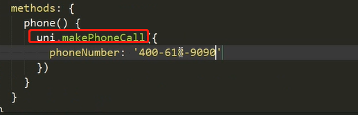
8. Make a call uni.makePhoneCall
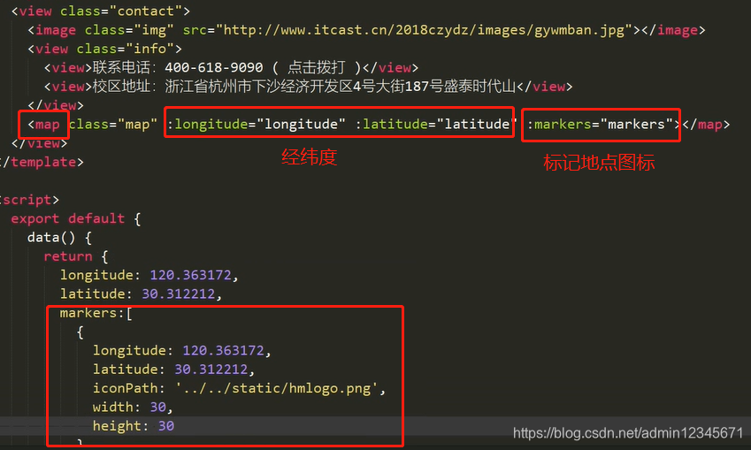
9. Map
<map></map>
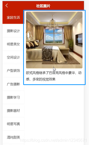
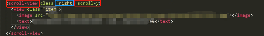
10. Realize the classification navigation bar on the left

(1) scroll-view is a scrollable view area component. Attribute scroll-y: scroll vertically


(2) Click to highlight (click to be a category, the style is different)

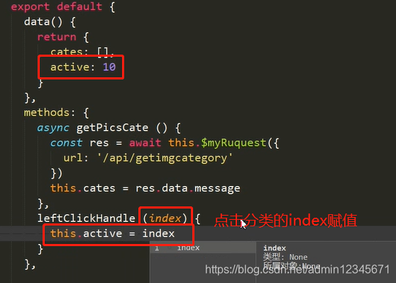

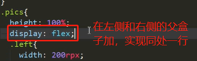
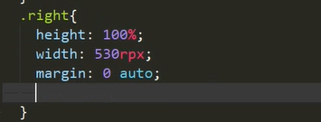
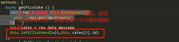
11. Classify the data on the right corresponding to the left
(1) Get the id of the click category (the id returned by the background): request parameters

(2) Send request: the parameter is the id of the click

(3) Display the right side
(4) Left initialization display
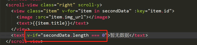
(5) Handle no data
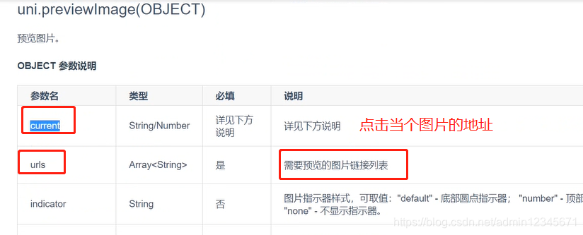
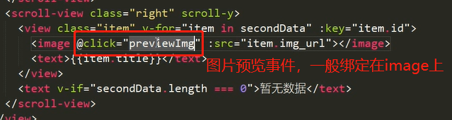
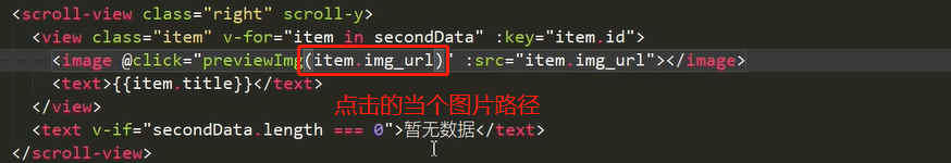
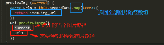
12. Image preview
uni.previewImage parameters current, urls
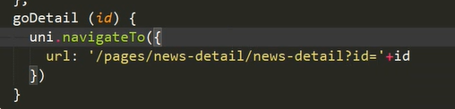
13. Jump to the details page (id)
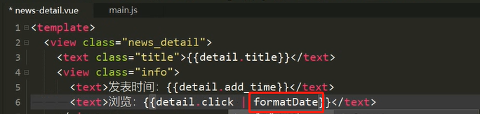
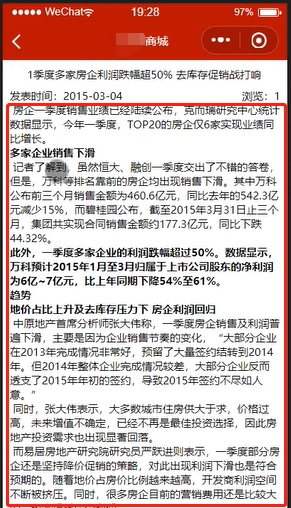
14. Processing time Global filter

15.rich text rich text
(1)
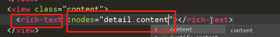
(2) Handle overflow

App.vue global styles

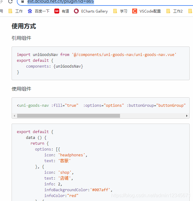
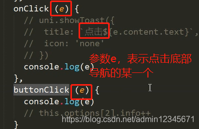
16. Product details page bottom navigation (extension component uni ui)
https://ext.dcloud.net.cn/plugin?id=865
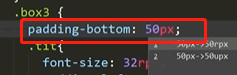
Not displayed, hierarchical reasons.
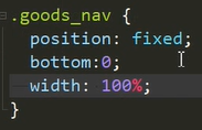
Bottom navigation affects top padding-bottom
17. Small programs packaged and released
18.h5 packaging
19. Android Packaging