Table of contents
1. 2D conversion
- One of the subversive features in CSS3, which can realize the displacement, rotation, scaling and other effects of elements
- Move: translate
- Rotation: rotate
- Zoom: scale
1. Two-dimensional coordinate system
- x-axis horizontally to the right
- y-axis vertically down
2. Move
transform:translate(x,y);
transform:translateX(n);
transform:translateY(n);
<style>
        div {


            width: 200px;
            height: 200px;
            background-color: pink;
            /* 移动盒子的位置: ①定位 ②盒子的外边距 ③2d转换移动 */
            transform: translate(20px, 20px);
        }
    </style>
- Defines the movement in the transformation, moving the element along the x and y axes
- The biggest advantage of translate: it will not affect the position of other elements
- The percentage unit in translate is relative to the translate of its own element: (50%, 50%)
4. It has no effect on inline tags
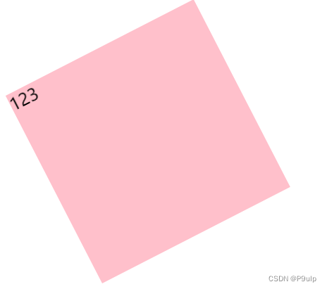
3. Rotate
transform:rotate
 <style>
        div {


            width: 200px;
            height: 200px;
            background-color: pink;
            margin: 200px auto;
            /* 旋转45° */
            transform: rotate(45deg);
        }
    </style>
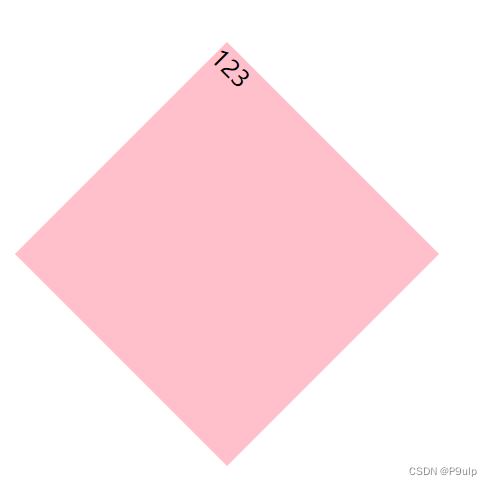
- Rotate is followed by degrees, the unit is deg, such as 45deg
- Angle is positive, clockwise
- negative time, counterclockwise
- The center point of the element when the default rotation center point
4. Center point
transform-origin:x y;
 <style>
        div {


            width: 200px;
            height: 200px;
            background-color: pink;
            margin: 100px auto;
            /* 过度 */
            transition: all 1s;
            /* 设置中心点 */
            transform-origin: left bottom;
        }

        div:hover {


            /* 旋转360° */
            transform: rotate(360deg);
        }
    </style>
- xy should be separated by spaces
- The center point of xy default conversion is the center point of the element (50% 50%)
- You can also set pixels or orientation nouns for xy (top bottom left right center)
5. Zoom
control element size
transform:scale(x,y)
- xy separated by commas
- (1,1): The width and height are doubled, compared to no enlargement
- (2,2): twice the width and height
- (2): Only write one parameter, the second parameter is the same as the first parameter
- (0.5,0.5): zoom out
- The biggest advantage: you can set the conversion center point to scale, the default is to scale by the center point, and it does not affect other boxes
2. Animation
- One of the subversive features in CSS3, you can precisely control one or a group of animations by setting multiple nodes, and it is often used to achieve complex animation effects
- Compared with transition, animation can achieve more changes, more control, continuous automatic playback and other effects
1. Basic use of animation
- Define the animation first
@keyframes 动画名称{
    0%{
        width:100px;
    }
    100%{
        width:200px
    }
}
animation sequence
- 0% is the start of the animation, 100% is the completion of the animation.
- Specify a certain css style in keyframes to create an animation effect that changes from the current style to the new style
- Animation is the effect of an element gradually changing from one style to another. You can change as many styles as you want any number of times
- Please use % to specify the time when the change occurs, or use the keywords from and to , which are equivalent to 0% and 100%
- reuse animation
 /* 调用动画 */
            animation-name: 动画名称;
            /* 持续时间 */
            animation-duration: 持续时间;
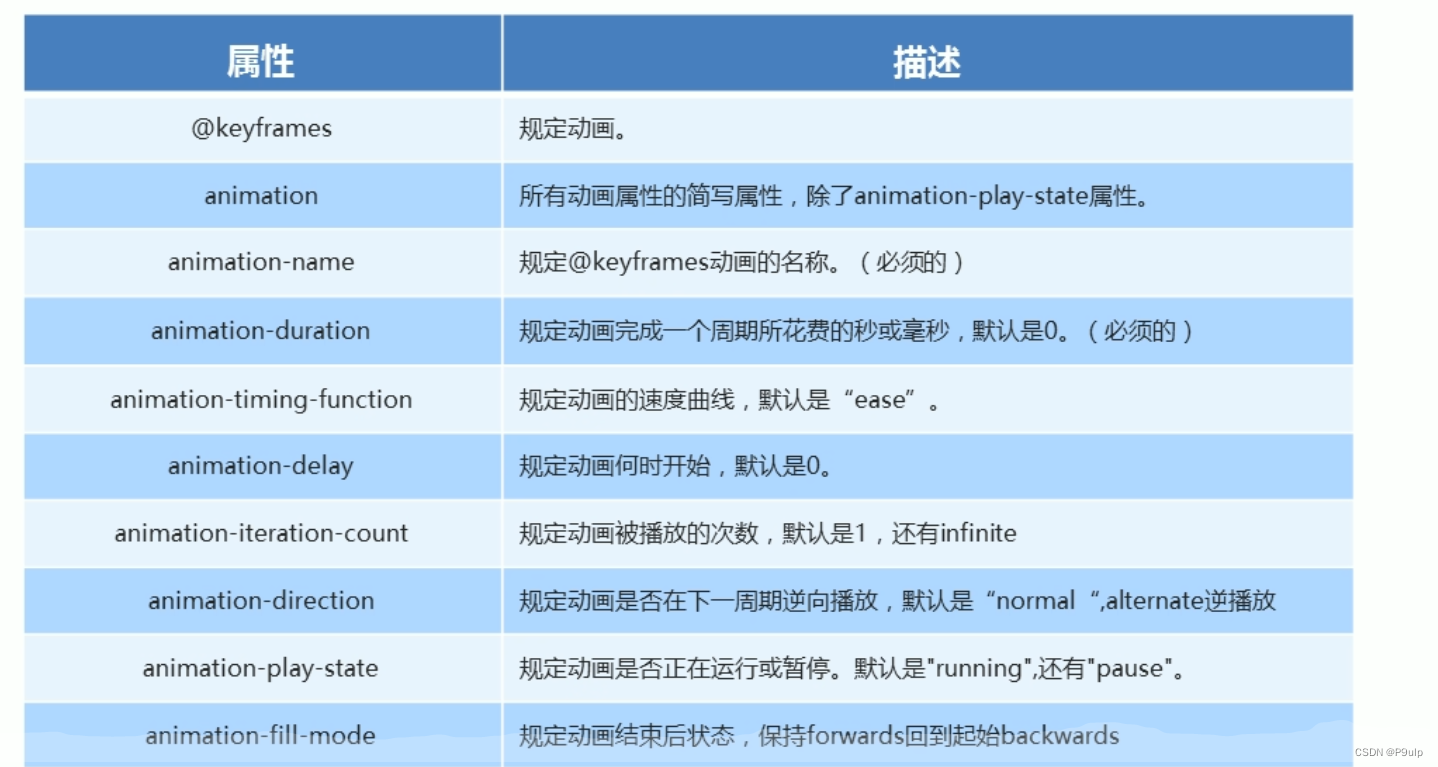
2. Common attributes of animation
3. 3D conversion
features
- kindergarten elementary school
- Obscuration behind the object is invisible
1. Three-dimensional coordinate system
- X: right positive left negative
- Y: Bottom positive and top negative
- Z: Positive on the outside and negative on the inside
2. 3D movement
On the basis of 2D, an additional Z-axis direction is added
Notice:
- translateZ moves along the Z axis
- The unit behind translateZ is generally the same as px
- Shorthand: translate3d(x,y,z)
3. 3D Perspective
On the 2D plane, the near-large and far-small visual stereoscopic effect is generated, but the effect is only two-dimensional
- If you want to produce a 3D effect on a web page, you need perspective (understood as a 3D object projected on a 2D plane)
- Perspective is also called the viewing distance: the viewing distance is the distance from the human eye to the screen
- The closer to the visual point, the larger the image on the computer plane, and vice versa
- The unit of perspective is pixels
Perspective d written on the parent box of the observed element
: sight distance, the distance from the human eye to the screen
z: z axis, the distance between the object and the screen, the larger z is, the larger the object we see
4. 3D rotation
More Z than 2D, other similar
Rotation: Left-Handed Criterion
- The thumb of the left hand points to the positive direction of the X-axis
- The bending direction of the remaining fingers is the direction in which the element rotates along the X axis
5. 3D rendering transform-style
- Control whether the sub-element opens the 3D environment
- transform-style: The flat sub-element does not enable 3D stereoscopic space by default
- transform-style: preserve-3d element opens 3D stereoscopic space
- Code is written to the parent, but affects child boxes
the case
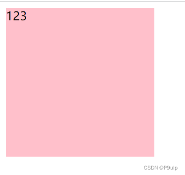
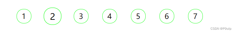
1. Example of pagination button
<!DOCTYPE html>
<html lang="en">

<head>
    <meta charset="UTF-8">
    <meta http-equiv="X-UA-Compatible" content="IE=edge">
    <meta name="viewport" content="width=device-width, initial-scale=1.0">
    <title>Document</title>
    <style>
        li {


            list-style: none;
            float: left;
            width: 30px;
            height: 30px;
            border: 1px solid #1f1f;
            border-radius: 15px;
            text-align: center;
            line-height: 30px;
            margin: 15px;
            cursor: pointer;
            transition: all .4;
        }

        li:hover {


            transform: scale(1.2);
        }
    </style>
</head>

<body>
    <ul>
        <li>1</li>
        <li>2</li>
        <li>3</li>
        <li>4</li>
        <li>5</li>
        <li>6</li>
        <li>7</li>
    </ul>
</body>

</html>
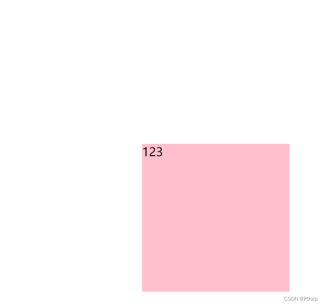
double sided box
<!DOCTYPE html>
<html lang="en">

<head>
    <meta charset="UTF-8">
    <meta http-equiv="X-UA-Compatible" content="IE=edge">
    <meta name="viewport" content="width=device-width, initial-scale=1.0">
    <title>Document</title>
    <style>
        body {


            perspective: 350px;
        }

        .box {


            position: relative;
            height: 300px;
            width: 300px;
            margin: 100px auto;
            transition: all .6s;
            transform-style: preserve-3d;
        }

        .box:hover {


            transform: rotateY(180deg);
        }

        .front,
        .back {


            position: absolute;
            top: 0;
            left: 0;
            width: 100%;
            height: 100%;
            border-radius: 50%;
            font-size: 30px;
            color: aliceblue;
            text-align: center;
            line-height: 300px;

        }

        .front {


            background-color: pink;
            z-index: 1;
            backface-visibility: hidden;
        }

        .back {


            background-color: skyblue;
            transform: rotateY(180deg);
        }
    </style>
</head>

<body>
    <div class="box">
        <div class="front">你好呀</div>
        <div class="back">王浩文</div>
    </div>
</body>

</html>
running bear
<!DOCTYPE html>
<html lang="en">

<head>
    <meta charset="UTF-8">
    <meta http-equiv="X-UA-Compatible" content="IE=edge">
    <meta name="viewport" content="width=device-width, initial-scale=1.0">
    <title>Document</title>
    <style>
        body {


            background-color: #ccc;
        }

        div {


            position: absolute;
            width: 200px;
            height: 100px;
            margin: 100px 0;
            background: url(y小熊.png) no-repeat;
            animation: bear 1s steps(8) infinite, move 3s forwards;
        }

        @keyframes bear {


            0% {


                background-position: 0 0;
            }

            100% {


                background-position: -1600px 0;
            }
        }

        @keyframes move {


            0% {


                left: 0;
            }

            100% {


                left: 50%;
                transform: translateX(-50%);
            }
        }
    </style>
</head>

<body>
    <div></div>
</body>

</html>
3D navigation
<!DOCTYPE html>
<html lang="en">

<head>
    <meta charset="UTF-8">
    <meta http-equiv="X-UA-Compatible" content="IE=edge">
    <meta name="viewport" content="width=device-width, initial-scale=1.0">
    <title>3D导航</title>
    <style>
        * {


            margin: 0;
            padding: 0;
        }

        ul {


            margin: 100px;
        }

        ul li {


            float: left;
            width: 120px;
            height: 35px;
            list-style: none;
            perspective: 500px;
            margin-left: 10px;
        }

        .box {


            position: relative;
            width: 100%;
            height: 100%;
            transform-style: preserve-3d;
            transition: all .4s;
        }

        .box:hover {


            transform: rotateX(90deg);
        }

        .front,
        .back {


            position: absolute;
            left: 0;
            top: 0;
            width: 100%;
            height: 100%;

            text-align: center;
        }

        .front {


            background-color: pink;
            z-index: 1;
            transform: translateZ(17.5px)
        }

        .back {


            background-color: skyblue;
            transform: translateY(17.5px) rotateX(-90deg);

        }
    </style>
</head>

<body>
    <ul>
        <li>
            <div class="box">
                <div class="front">你好呀</div>
                <div class="back">HI</div>
            </div>
        </li>
        <li>
            <div class="box">
                <div class="front">你好呀</div>
                <div class="back">HI</div>
            </div>
        </li>
        <li>
            <div class="box">
                <div class="front">你好呀</div>
                <div class="back">HI</div>
            </div>
        </li>
        <li>
            <div class="box">
                <div class="front">你好呀</div>
                <div class="back">HI</div>
            </div>
        </li>
        <li>
            <div class="box">
                <div class="front">你好呀</div>
                <div class="back">HI</div>
            </div>
        </li>
        <li>
            <div class="box">
                <div class="front">你好呀</div>
                <div class="back">HI</div>
            </div>
        </li>

    </ul>
</body>

</html>
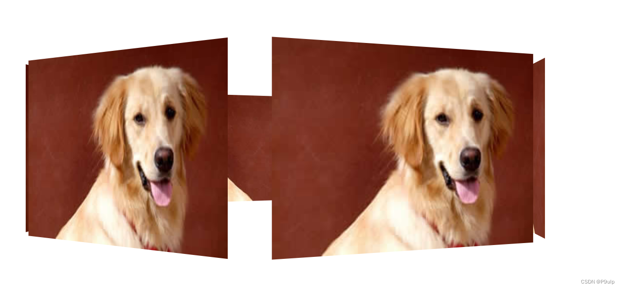
carousel
<!DOCTYPE html>
<html lang="en">

<head>
    <meta charset="UTF-8">
    <meta http-equiv="X-UA-Compatible" content="IE=edge">
    <meta name="viewport" content="width=device-width, initial-scale=1.0">
    <title>Document</title>
    <style>
        body {


            perspective: 1000px;
        }

        section {


            position: relative;
            width: 300px;
            height: 200px;
            margin: 150px auto;
            transform-style: preserve-3d;
            animation: rotate 10s linear infinite;

        }

        @keyframes rotate {


            0% {


                transform: rotateY(0);
            }

            100% {


                transform: rotateY(360deg);
            }
        }

        section div {


            position: absolute;
            top: 0;
            left: 0;
            width: 100%;
            height: 100%;
            background: url(dog.jpg) no-repeat;
        }

        section div:nth-child(1) {


            transform: translateZ(400px);
        }

        section div:nth-child(2) {


            transform: rotateY(60deg) translateZ(300px);
        }

        section div:nth-child(3) {


            transform: rotateY(120deg) translateZ(300px);
        }

        section div:nth-child(4) {


            transform: rotateY(180deg) translateZ(300px);
        }

        section div:nth-child(5) {


            transform: rotateY(240deg) translateZ(300px);
        }

        section div:nth-child(6) {


            transform: rotateY(300deg) translateZ(300px);
        }
    </style>
</head>

<body>
    <section>
        <div></div>
        <div></div>
        <div></div>
        <div></div>
        <div></div>
        <div></div>
    </section>
</body>

</html>